• Hey, guest user. Hope you're enjoying NeoGAF! Have you considered registering for an account? Come join us and add your take to the daily discourse.

Games that tastelessly overuse graphical gimmicks

lazygecko

Member
You know how it goes. Whenever there's a breakthrough in graphical technology in the industry, certain developers will be all over that shiny new thing like a kid who suddenly discovers the lens flare in their cracked Photoshop. After a while when things have settled down people can start utilizing these features in a more modest fashion.

When the SNES came out with a couple of hardware-supported effects like rotation using Mode7, some games felt to mee a bit "overeager" in their application of this. I think early Konami titles are the most guilty of this, with the worst being Contra 3 and its top down levels. IIRC you used the shoulder buttons to rotate the entire level for navigation. The fact that they removed them from the GBA version is a testament to what a poor call that was.

contra-3-super-nes-scgmupe.png


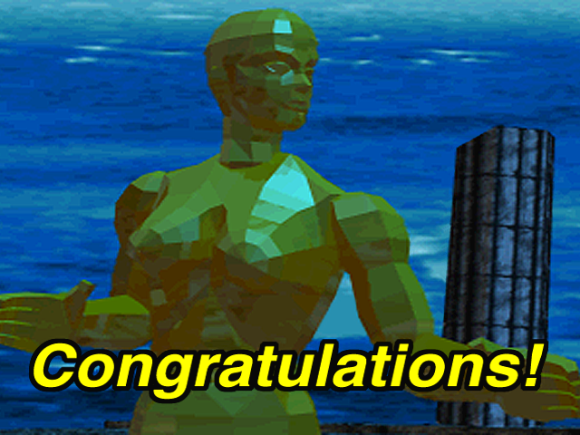
Throughout the 90's there were a bunch of advancements on the 3D acceleration front with new tricks constantly trickling in like colored lighting, transparency and alpha allowing for things like lens flares etc. I have a hard time thinking of titles that really shoved this in your face to such an extent though. One thing that comes to mind is a chrome robot character in Virtua Fighter 2/3 whom I presume was pretty much made just to show off fancy reflection effects on the model.


I think it was in the previous console generation when things really started getting out of hand. Specifically, this was when games started relying extensively on post-processing effects. Suddenly there are these tools available which enable developers to mimick cinematic or photographic artifacts and phenomenoms which occur in other mediums.

One of the earliest post-processing implementations was bloom and HDR. Plenty of games from the mid 00's are guilty of overusing this but one of the most infamous examples is Oblivion, perfectly demonstrated in this sarcastic screenshot.


Other things that annoyed me were usage of film grain overlays and an obnoxious amount of often primitive looking depth of field effects. Dragon Age Origins used insanely distracting DoF during dialogue which bothered me to no end. Can't find any screenshot of this unfortunately.

Overemphasized normal maps was another problem. A normal map is a texture layer which specifically interacts with the lighting to fake depth on what would otherwise be a flat surface. I think Doom 3/idtech 4 was pushing it a bit sometimes, likely a result of the engine relying much more on real time lighting than others. I distinctively recall when Quake 4 came out, and people modded the game to increase the specularity of the normals by like 200-300% in order to "improve" the graphics. I couldn't believe people genuinely thought that looked better. It was like everything was covered in vaseline which is the typical result of overindulgence in normals.
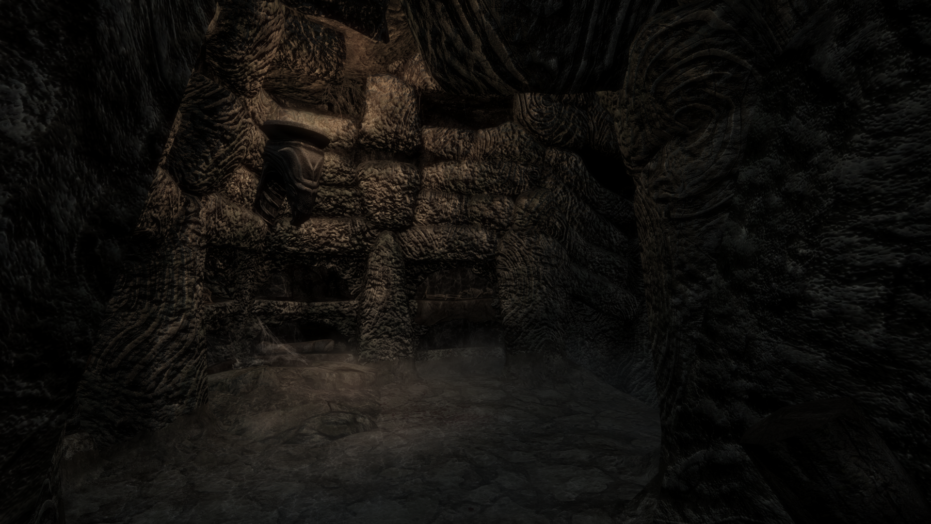
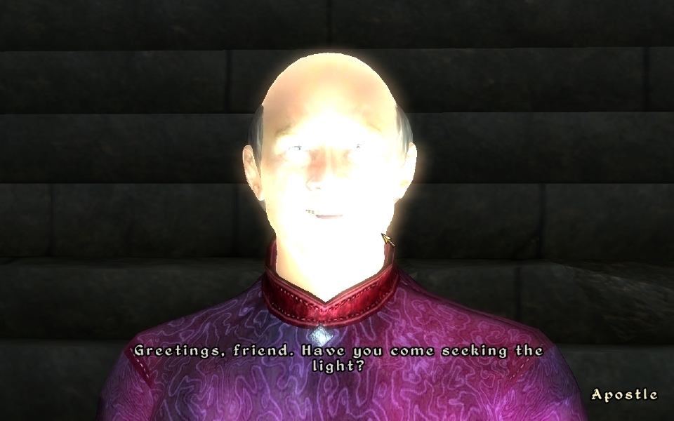
Nowadays this issue mostly seems relegated to hobbyist-made HD texture mods for PC games. All too often people seem to think that overly detailed and noisy normals makes things look visually superior. In this case here a HD texture mod for Skyrim:


Blobbers

Member
Honestly, the new Zelda looks like crap. What's with these filters? Is that foggy effect supposed to represent smoke from the fire? Why is there so much bloom and flare? Not a fan of the artstyle either, the root thingies at the bottom on the enemy look bad. Are those shadows painted on?

SaE21xw.jpg


dvmMkoT.jpg


What is with the whiteness?

An unfinished game and an off-screen shot?

Perfecto.
 
Damnit, I saw the title and was going to post the Oblivion picture. Bloom was all the rage in 2006 apparently, so I don't get why Nintendo has decided to use it all of a sudden.
 

Cindres

Vied for a tag related to cocks, so here it is.
I remember Half Life 2 suffering from some bloom issues on my old old PC at the time when that was released also, like it was unbelievably bright so I had to turn it all off. Now I keep it on, not sure if it was the game bugged, my PC/GPU at the time or both.
 
Honestly, the new Zelda looks like crap. What's with these filters? Is that foggy effect supposed to represent smoke from the fire? Why is there so much bloom and flare? Not a fan of the artstyle either, the root thingies at the bottom on the enemy look bad. Are those shadows painted on?

SaE21xw.jpg


dvmMkoT.jpg


What is with the whiteness?

Is this a joke post?
 

Dereck

Member
Honestly, the new Zelda looks like crap. What's with these filters? Is that foggy effect supposed to represent smoke from the fire? Why is there so much bloom and flare? Not a fan of the artstyle either, the root thingies at the bottom on the enemy look bad. Are those shadows painted on?

SaE21xw.jpg


dvmMkoT.jpg


What is with the whiteness?
lol
 

phanphare

Banned
Honestly, the new Zelda looks like crap. What's with these filters? Is that foggy effect supposed to represent smoke from the fire? Why is there so much bloom and flare? Not a fan of the artstyle either, the root thingies at the bottom on the enemy look bad. Are those shadows painted on?

SaE21xw.jpg


dvmMkoT.jpg


What is with the whiteness?

first post bringing the lulz I guess
 
I remember when the PS360 gen first started everything looked super wet/shiny. It was really weird. I can't find any examples cus I'm on mobile atm but Oblivion is another good one.

Also, Zelda U looks amazing so I don't see what that person is complaining about...
 

danmaku

Member
Kane and Lynch 2: Chromatic Aberration

I don't agree. They wanted the game to look like low quality footage from a cellphone or a cheap digital camera. The art direction is consistent through the whole game. Many people hated it but I thought it was great. Gives the game an unsettling "snuff movie" feeling.
 
I don't agree. They wanted the game to look like low quality footage from a cellphone or a cheap digital camera. The art direction is consistent through the whole game. Many people hated it but I thought it was great. Gives the game an unsettling "snuff movie" feeling.

The game totally wears its aesthetic well. It's just a shame that it doesn't play very well at all.


good post

don't know if I should blame the first reply or all the responses to it that contribute nothing
 
Honestly, the new Zelda looks like crap. What's with these filters? Is that foggy effect supposed to represent smoke from the fire? Why is there so much bloom and flare? Not a fan of the artstyle either, the root thingies at the bottom on the enemy look bad. Are those shadows painted on?


What is with the whiteness?

image.php


I will hold judgment till the game releases.
 

Krejlooc

Banned
Super Castlevania IV is terrible about this. Entire rooms where all you do is stand still while you watch the background slowly rotate.
 

MrBadger

Member
Knuckles Chaotix has sprites growing and shrinking and changing colour for seemingly no reason all the time. It's almost as if Sega are bragging that they can now do stuff that the SNES could already do.
 

RoboPlato

I'd be in the dick
That is actually very hard to watch!

But back to chromatic aberration; I don't know why anyone would want to add an effect to a video game that is seen as detrimental to the picture quality of a digital camera.

It works when you're trying to simulate being filmed with an old/shitty camera (Kane and Lynch 2, Alien Isolation) but outside of that I don't know why it's used as much as it is.
 

Iorv3th

Member
What about all the brown gritty shooters. I don't think thats a graphical effect, just a poor choice of color palette. But man I got sick of those fast.
 
It works when you're trying to simulate being filmed with an old/shitty camera (Kane and Lynch 2, Alien Isolation) but outside of that I don't know why it's used as much as it is.

I see your point.

Next on the list is lens flare. I remember a racing game on the PC years ago called Ultimate Race Pro and I'm sure that featured lens flare heavily.
 
Lately it seems like almost every 2D indie game is using the "paper doll" rig to animate the characters rather than actually animating the sprites using hand-drawn frames. It obviously saves a lot of time, and results in smooth movements, but if not done properly it can look really cheap and lifeless. I get that redrawing the character for every frame is too time-consuming when doing very detailed sprites, but a lot of the time the characters aren't even that detailed to begin with!
 

SerTapTap

Member
Everything that treats the player's face as a camera. There's dirt IN MY EYES? My EYES have been chromatically aberated because my point of view moved? There's ridiculously short depth of field because my EYES apparently can only focus on my immediate surroundings? My eyes have lens flare?

Battlefield 3 as mentioned does basically all of this and it's all stupid.

Though it was pretty cool when Outlast used camera visual quirks when you are actually using a camera. To a lesser extent it might be okay for a third person camera, but I really hate first person games that treat what is supposed to be your personal vision as if it were a camera on a tripod shooting a movie.

What about all the brown gritty shooters. I don't think thats a graphical effect, just a poor choice of color palette. But man I got sick of those fast.

Sometimes there are filters, but graphical effect or not I hate it. Makes Bayonetta 1 really hard to play. There are actual colors in Bayo 2 so I put down 1 in favor of it. Bayo 1 looks like I'm using a camera lens made out of piss.
 

SmithnCo

Member
I remember Perfect Dark Zero being one of the early offenders with shiny surfaces. Devs really wanting to show their normal maps.

Also anything with lens flare. My eye is not a camera.
 

Aroll

Member
Honestly, the new Zelda looks like crap. What's with these filters? Is that foggy effect supposed to represent smoke from the fire? Why is there so much bloom and flare? Not a fan of the artstyle either, the root thingies at the bottom on the enemy look bad. Are those shadows painted on?

SaE21xw.jpg


dvmMkoT.jpg


What is with the whiteness?

Obviously I have no real opinion until I can play it for myself, but I believe the first screenshot is recreating a hot summer "haze" affect, because that's exactly what I see when looking at it. I've seen views just like that in the real world during the summer. the second I can't really explain. Though if your referring to the "coast" section right by the water...
 

jimi_dini

Member
dvmMkoT.jpg


What is with the whiteness?

Nintendo wanted to make the footage look as if it was shot off-screen. They totally nailed that look. I doubt anyone could make it look any more real.

And I still have no clue how they managed to make the footage look as if it was processed by perspective correction in photoshop.

They are truly wizards.
 
Any game ever that throws dust on my eyeballs to simulate a non-eyeball camera effect can go straight to Hades and live a sad afterlife forever.
 
Battlefield 3 lens flare anyone? So overdone.

This game legitimately made me stop liking FPS for a while, until I found Counter Strike again.

Moving foliage, fog, sweat, lens flare, dirt spots, flashlights blinding you, lasers blinding you.

All that plus the huge levels = could never spot enemies, just wondering around forever, no wonder all that people played was Metro level where it was just halls of chaos.
 
Top Bottom