-
Hey, guest user. Hope you're enjoying NeoGAF! Have you considered registering for an account? Come join us and add your take to the daily discourse.
You are using an out of date browser. It may not display this or other websites correctly.
You should upgrade or use an alternative browser.
You should upgrade or use an alternative browser.
Games that tastelessly overuse graphical gimmicks
- Thread starter lazygecko
- Start date
Emulated Hype
Member
GTAV has some pretty obnoxious post processing effects going on with the next gen version. I thought there was something wrong with my tv when I saw a giant blue streak across the bottom of the screen that wouldn't go away while I was swimming. Nope, it was just lense flare. From the sun. That wasn't even on the screen at the time. :
joeygreco1985
Member
Any game ever that throws dust on my eyeballs to simulate a non-eyeball camera effect can go straight to Hades and live a sad afterlife forever.
As someone who wears glasses, I actually appreciated the dust effect since dust specks do get on my lenses from time to time, and it actually can look like that in real life.
sixteen-bit
Member
Gen 5 racers were all about that lens flare.
CapitalismSucks DonkeyBalls
Banned
Personally I think it is all three, overused, tasteless and an annoyance to what is otherwise a fantastic game.
Didn't see the last half of your post. I agree, the effects were certainly overused and tasteless. I didn't care for the unskippable cutscenes either but it wasn't as bad as the awful effects.
Does bloom in Oblivion count?

too late, read the thread.
Piston Hyundai
Member

LastOne2100
Member
As mentioned earlier, basically any game that makes any real use of chromatic aberration.
Lords of the fallen is a particularly bad example of a game completely abusing it to the point where it was actually hard to look at.
At least they eventually realized the error and added the ability to disable it. Seriously, I'm not sure why any game developer would go to the work of making nice art and textures etc etc and then destroying it all with that terrible of a blur effect.
Corronchilejano
Member
Contra 3 isa pretty gross overrated gamenot of my liking. The overhead stages in Super C are somuch betterdifferent and I enjoy them better.
FTFY, also, not on topic.
Bloom and HDR can make looking at the screen a nightmare. I mean, Lost Izalith man...

coredecepts
Member
This thread reminded me that I wanted to try out Kane and Lynch Dog Days and hey, it's $5 on PSN right now.
The chromatic aberration in Killzone 2's menus got to me. But that game overall turned my eyes into jelly after playing it nonstop for a weekend.
The chromatic aberration in Killzone 2's menus got to me. But that game overall turned my eyes into jelly after playing it nonstop for a weekend.
wait what
how did anyone ever think that this was a good idea, or made any goddamn sense at all
I think Kane & Lynch 2 gets a pass because it is very consciously going for the online cam footage aeshetic. I think it was very interesting how it pulled that off.
Now, the day I start seeing chromatic abberation applied to medieval fantasy games is the day I start truly weeping.
It's in Lords of the Fallen and is one of the worst implementations of the effect I've seen.
Yeah, I have glasses as well so I'm used to mentally filtering out stuff like that. I don't even notice until someone points it out.As someone who wears glasses, I actually appreciated the dust effect since dust specks do get on my lenses from time to time, and it actually can look like that in real life.
DOWN
Banned

Shiny Skin = HD Skin
It looks good tho
It's like candlelit music video


Better than the overly flat and dated skin on the Witcher 3
Max Payne 3 cutscenes
Awful, just awful.
Going back to replay Bioshock 2, I think the game really, really, really overuses the sort of "starglow" effects when the Big Sisters screech at you, there's some sort of explosion, or such. It's far more distracting than a simple glow.
I'm having a hard time finding an example in stills, though.
I'm having a hard time finding an example in stills, though.
FTFY, also, not on topic.
Problem is, the decision to use the Mode 7 graphical effect directly impacted the way those awful overhead levels are designed. It's an instance where a graphical gimmick really impacts the mechanical functions of the game itself.
The Max Payne 3 screen effects; which were lifted from 1 or two scenes from Man on Fire. They were used constantly through out cut scenes and the game. They were nice effects, but massively over used.
Coupled with the dialogue quotations, that would appear randomly on the screen, made the game feel like some amateur was trying to make a Linkin Park tribute video for YouTube in After Effects.
EDIT: Took too long to type, ekim beat me to it and gave a good example.
Coupled with the dialogue quotations, that would appear randomly on the screen, made the game feel like some amateur was trying to make a Linkin Park tribute video for YouTube in After Effects.
EDIT: Took too long to type, ekim beat me to it and gave a good example.
James Scott
Banned
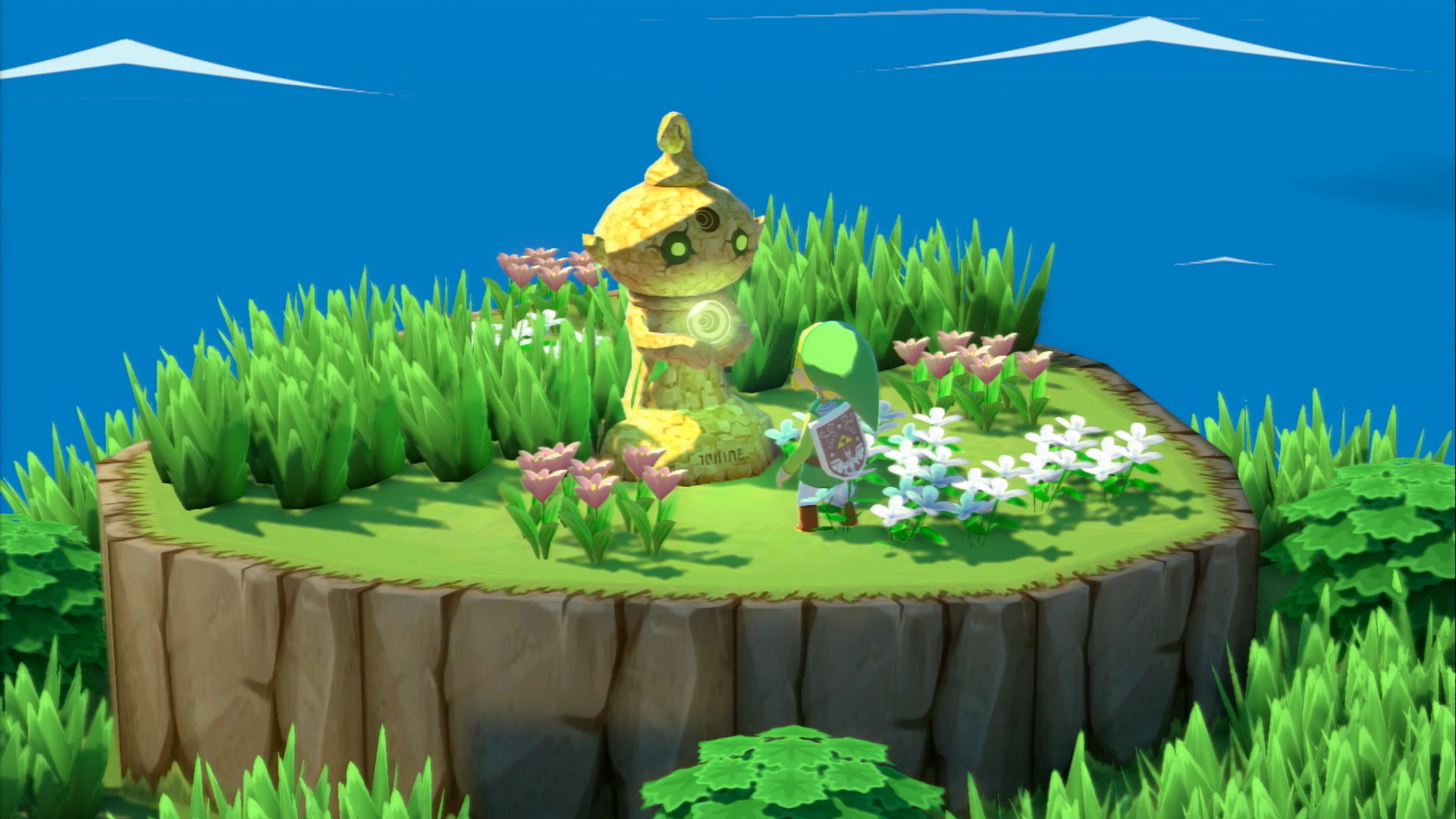
I still think Wind Waker's bloom fits the game quite well (sunny tropical environment) the only really awful effect in that game is when Link comes close to a light source and he looks like clay
DOWN
Banned
The Max Payne 3 screen effects; which were lifted from 1 or two scenes from Man on Fire. They were used constantly through out cut scenes and the game. They were nice effects, but massively over used.
Coupled with the dialogue quotations, that would appear randomly on the screen, made the game feel like some amateur was trying to make a Linkin Park tribute video for YouTube in After Effects.
EDIT: Took too long to type, ekim beat me to it and gave a good example.
This makes me wonder if people remember that the games are supposed to be presented in the style of a graphic novel on screen...
AtomicShroom
Member
As I've come to learn from my VC Epilepsy thread, apparently a lot of people disliked the uber-cool and realistic flashing of the screen whenever an animal buddy carrying a flashlight would turn around in SNES Donkey Kong Country games. If you were amongst them, you'll be glad to hear that they removed the flash in the VC releases.
DownGrader
Member
I still think Wind Waker's bloom fits the game quite well (sunny tropical environment) the only really awful effect in that game is when Link comes close to a light source and he looks like clay
Huh. After I saw that effect I kinda wanted new "Toon Link" Zelda to be clay-like.
Overused specular highlights and reflection mapping.
Particularly, wet streets & walls almost everywhere for no good reason.
The vast amount of time it's not even raining, nor had rained. Just thrown in there because a memo must have went out saying gamers can't get enough of that sh!t. IMO, it's a really cheap trick - when overused - to cover up poor art and to fool the brain that the image is prettier than it actually is.
joeygreco1985
Member
The Max Payne 3 screen effects; which were lifted from 1 or two scenes from Man on Fire. They were used constantly through out cut scenes and the game. They were nice effects, but massively over used.
The screen effects were used to great effect in the latter parts of the game though,
my interpretation was that they're meant to be a visual representation of Max's sobriety and how his drinking can cloud his judgement and vision, and when he stops drinking and sobers up later in the game the visual effect is greatly reduced to make things look more clear.
All the post-process garbage in Battlefield 3. None of it looked good and most of it hurt gameplay.
So much this. Stopped me from playing, and from getting BF4.
No, I don't need to be completely blinded by a flashlight from someone on the other side of a field during the middle of the day, thanks.
Shiny Skin = HD Skin
Glossy lips in Bioware games will become one soon enough.
Isn't those WW HD shots from the initial reveal? I heard something about the bloom being toned down a bit for the final version of the game. From the shots I've seen, the bloom doesn't look as bad as in those shots.
Wind Waker HD hasn't looked like that since the initial reveal. The bloom was toned down by release.
I've been playing it the past couple weeks and it still looks bad. It wasn't toned down enough, or as the other guy said it needs an option to be turned off completely. It's really distracting.
Gurgelhals
Member
I'm really not a fan of those various types of pseudo-anti-aliasing, i.e. post-processing filters that don't really do proper anti-aliasing, but are just blurring the entire scenery. That's right, I'm looking at you, FXAA.
I know that implementing "real" anti-aliasing support can be rather tricky in modern engines, especially if you want to get rid of all types of aliasing, but that's no excuse for only offering a cheap FXAA option as so many games these days do.
I know that implementing "real" anti-aliasing support can be rather tricky in modern engines, especially if you want to get rid of all types of aliasing, but that's no excuse for only offering a cheap FXAA option as so many games these days do.
I still think Wind Waker's bloom fits the game quite well (sunny tropical environment) the only really awful effect in that game is when Link comes close to a light source and he looks like clay
I think bloom fits Wind Waker really well, but I think it's absolutely overused.
Here is Wind Waker emulated in Dolphin with bloom added through Sfx and I think it looks much better when applied more sparingly.
DOWN
Banned
Crysis 3 and visible facial pores.
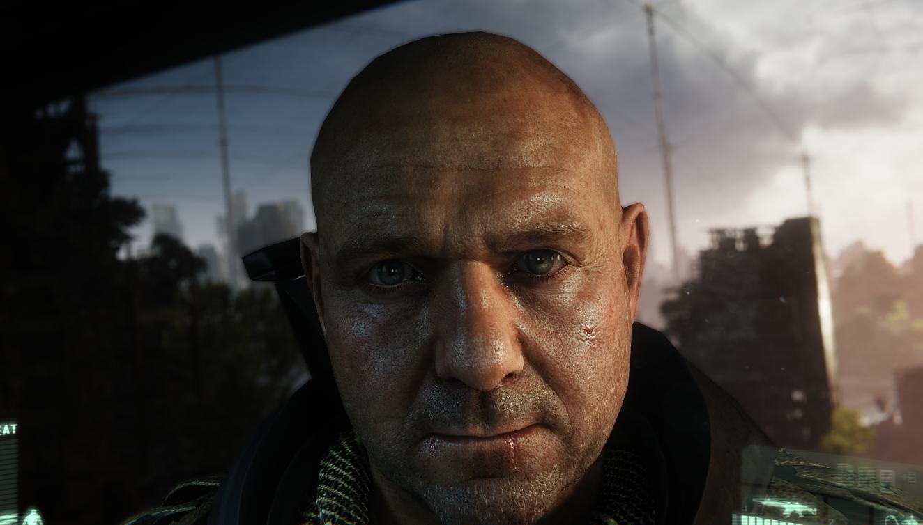

That's stunning. Not sure if I'd get tired of it since it looks utterly detailed beyond what consoles ever do.
djplaeskool
Member
Came for Jim Power
Leaving satisfied.
Leaving satisfied.
Coonce
Member
What about Perfect Dark Zero's obsession with making everything look like shiny plastic?

Early 360 games loved that heavy bump map effect, for no real reason it seemed.
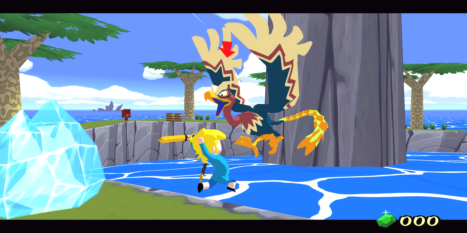
Honestly, the new Zelda looks like crap. What's with these filters? Is that foggy effect supposed to represent smoke from the fire? Why is there so much bloom and flare? Not a fan of the artstyle either, the root thingies at the bottom on the enemy look bad. Are those shadows painted on?


What is with the whiteness?
I. Can't.
James Scott
Banned
I like the new added shadows in the world and how nice the grass looks in the HD versionI think bloom fits Wind Waker really well, but I think it's absolutely overused.
Here is Wind Waker emulated in Dolphin with bloom added through Sfx and I think it looks much better when applied more sparingly.
DOWN
Banned
I like the new added shadows in the world and how nice the grass looks in the HD version
Damn that looks good
Breakfast at Noon
Member
Blur.
I fucking hate blur, and the worst offending mother fucker for this? Perfect dark zero on the 360.
when you turn to the right the gun blurs on the right side of the gun.. you turn left and it blurs on the left side of the gun..
I fucking hate blur, and the worst offending mother fucker for this? Perfect dark zero on the 360.
when you turn to the right the gun blurs on the right side of the gun.. you turn left and it blurs on the left side of the gun..
Man Called Aerodynamics
Member
I agree with this. It actually made it hard to fight at times because you couldn't see what the heck was going on.
I think that's part of the point, to be distracting and make it harder to see/fight when you're near death.
Lactose_Intolerant
Member
Brigandine's 3d battle animations


Think like Fire Emblem animations but longer and with terrible models even for psx standards.
They were so bad they took them out of the Grand Edition I believe
Think like Fire Emblem animations but longer and with terrible models even for psx standards.
They were so bad they took them out of the Grand Edition I believe
Lol. This reminds me of this. I think this gen looks like it will be the gen where everything is always wet:Honestly, the new Zelda looks like crap. What's with these filters? Is that foggy effect supposed to represent smoke from the fire? Why is there so much bloom and flare? Not a fan of the artstyle either, the root thingies at the bottom on the enemy look bad. Are those shadows painted on?
What is with the whiteness?


I still think Wind Waker's bloom fits the game quite well (sunny tropical environment) the only really awful effect in that game is when Link comes close to a light source and he looks like clay
I prefer the flat shaded look of the original to the HD version. It's more of a cartoon approximation while HD doesn't try to hide the fact that you're looking at a 3D model.
ctrl+f "syndicate"
gaf, you dissapoint!
I'm very tolerant to bloom, but Syndicate is in a league of it's own.
Gamesradar wrote an article about it.
Gamesradar said:Right, screw it. Syndicate, I am giving you no more excuses. This is just ridiculous. What the hell is causing the bloom in this room? What? Are my character's cyber-eyes covered in vaseline and cleaning agent from a recent polish and re-insertion? Right, the gloves are off. Let's see how deep this rabbit hole goes...(Spoiler: It goes DEEP)
Wind Waker HD has some pretty nasty bloom. At least it has selfies.

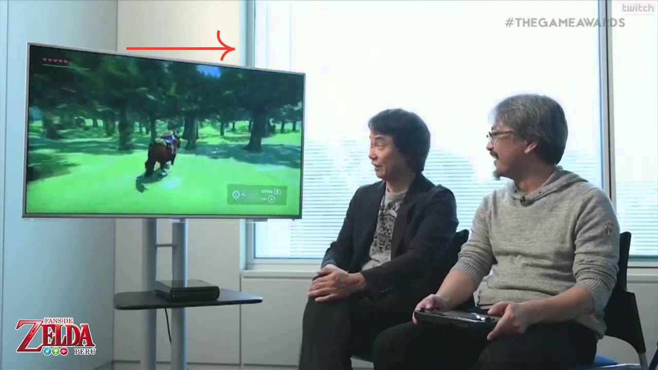
What's with people using pre-release shots of Zelda games? The final release looks better than these shots
Breakfast at Noon
Member
Agreed, my windwaker did not look that washed out.What's with people using pre-release shots of Zelda games? The final release looks better than these shots
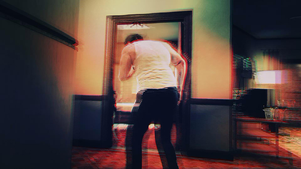
That thing in shooters where all the color in the screen goes away and it turns to black and white when you're low on health. "I can't see shit captain!" Hell, obviously if I'm low on health, I'm already getting my ass kicked, why pile on me more and make it so I can't see anything? Add to that the previously mentioned bloody screen and/or blurring effects that some games give you, why the F#$% did you make such a great looking game and then smear a bunch of effects all over the screen so that I can't see any of it? I'd be pissed if I were the art designers on these games.
All the post-process garbage in Battlefield 3. None of it looked good and most of it hurt gameplay.
This. Usually I'm a fan of post-process effects, but this is too much.
