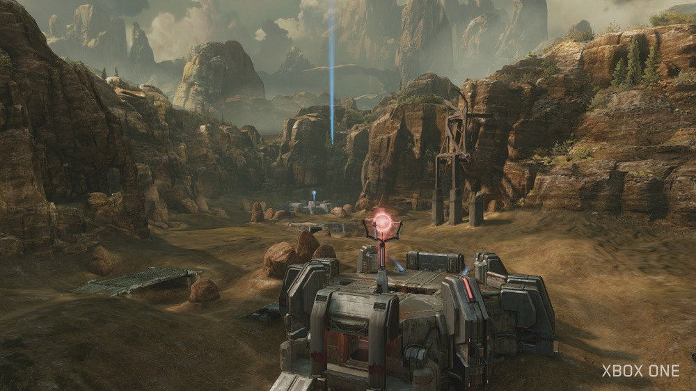
Unity is not at Ultra on consoles. It runs between high and very high depending on the element, and it certainly is missing all of the PC exclusive effects like advanced PhysX, upcoming tessellation, and HBAO+. And Ryse was also 900p with blur on Xbox One. The PC version, like the Crysis 3 image, is definitely clearer than consoles are outputting (higher res + better AA solutions). So does Ryse on PC look more detailed, sure. But not on Xbox One. I can't believe you are trying to argue that consoles match one of the best looking games on PC in technical prowess. Just because you like the looks on consoles, doesn't make them as good as PC in quality.
I comment on the visible detail thanks to the sharpness and clarity of the PC version and get a bunch of sub-1080 examples, many of which have been criticized for their AA or clearly fall short of PC versions.


") Don't use a 21:9 ratio if the device it's going to run on can't output that ratio, if you do at least give us the option to render it in 16:9 (I'd gladly take a graphical hit for that). Otherwise I'll just skip your game no matter how great it might be.
Don't use a 21:9 ratio if the device it's going to run on can't output that ratio, if you do at least give us the option to render it in 16:9 (I'd gladly take a graphical hit for that). Otherwise I'll just skip your game no matter how great it might be.