• Hey, guest user. Hope you're enjoying NeoGAF! Have you considered registering for an account? Come join us and add your take to the daily discourse.

iOS 9: More than meets the eye

Tunesmith

formerly "chigiri"
The icon is smart but I don't really like it. Prefer the night lamp they have been using, it is more charming and obvious.

Can't wait for that feature though. Avid user of f.lux on Mac, tried it on iOS some 3 years ago on jailbroken devices.


Anyway, low power mode toggle when. Better screen rotation options when.

I guess night lamps are too skeuomorphic. I can't live without the feature now though, toggling it on and off in the evenings really puts it into perspective how harsh the cooler standard lighting is.

+1 for a low power toggle. What kind of screen rotation options do you miss?
 

The Real Abed

Perma-Junior
I guess night lamps are too skeuomorphic. I can't live without the feature now though, toggling it on and off in the evenings really puts it into perspective how harsh the cooler standard lighting is.
What's a flashlight then? lol

Sometimes you need a tiny bit of skeuomorphism. Sometimes. Tiny. Also in this case it's called an "icon", not skeuomorphism.

Anyway, I do wish at least I could replace Airplane mode with Low Power mode in the control center. If not squeeze it in as a 6th icon. Also I'd hide AirDrop as I have never used that despite 95% of my friends being iPhone users.
 

Tunesmith

formerly "chigiri"
What's a flashlight then? lol

Sometimes you need a tiny bit of skeuomorphism. Sometimes. Tiny. Also in this case it's called an "icon", not skeuomorphism.

Anyway, I do wish at least I could replace Airplane mode with Low Power mode in the control center. If not squeeze it in as a 6th icon. Also I'd hide AirDrop as I have never used that despite 95% of my friends being iPhone users.

I was jesting, I think the lamp icon they've used on the web would've been fine as well, a moon-eye will do I suppose! Could be place holder.

I think 5 icons are just enough, but let them be interchangeable with other non-default features and sortable via Settings.
 
The bottom row were Apps whereas the top row were OS features previously, that's messed up now.
I prefer the eye logo to the lampshade (lamps don't emit blue light for one...) but reusing the exact same moon from the do not disturb logo is lazy.
At least the lamp would help differentiate it further.


All low power mode does is: turn off mail fetch, turn off background app refresh, turn off automatic downloads and reduces motion.
It really doesn't save as much battery as people think, but without a toggle (which people would then switch on 100% of the time anyway) why not just manually disable those settings...?
 

Vyer

Member
From time to time, I have this weird issue with the progress slider of the default video player. After dragging the knob for about one centimeter, it stops, as if I had lifted my finger. It's annoying.
.

The only time I ever really see this is with embedded/linked videos on a page and it appears to me that it just isn't able to stream or download quickly enough. I usually chalk it up to a problem with the connection or the stream itself.

The bottom row were Apps whereas the top row were OS features previously, that's messed up now.
?

that picture looks like it's still the bottom row. is that not the case anymore? everything below the airdrop toggle still looks like the same positioning.
 

ramyeon

Member
This in 9.3, soo good.

QKwUnt8.jpg


Also confirms Apple is indeed capable of modifying the control center, I didn't believe they had it in them. In 4 years time we will be able to customize it.
Yeah, I'm so glad they added this. I prefer to take off Night Shift when taking photos and editing them so I'm glad I have a quicker way of doing it than fiddling around in the Settings.
 
that picture looks like it's still the bottom row. is that not the case anymore? everything below the airdrop toggle still looks like the same positioning.

It is, but it's being in the bottom row that breaks previous consistency.
The top row were all settings toggles, like turn DND on or off, turn Airplane Mode on or off, turn Bluetooth on or off.
The new Nightshift button works just like this, it turns it on or off.
Everything on the bottom row launched an App (OK Torch doesn't have a separate App icon, but it would have rather than being an option in settings) so there was a clear usability divide between the two sets, further enhanced by them being different shapes.

So yeah, now the Night Shift setting shortcut toggle is a part of the App launching shortcut row.
I get why they've opted for symmetry, 5 and 5 looks better than having 6 icons in the top row and keeping 4 in the bottom, but it 'feels' (to me) as if it doesn't belong.

I'm probably the only person who cares about this :lol but consistent design language is something I like about iOS.
 

The Real Abed

Perma-Junior
I would gladly get rid of the AirDrop row for a second row of app shortcut icons. Even if they just squish the Airdrop button into one of the 5 icons and let me have 4 to customize.

Though to be honest, I can't even think of 4 apps I'd really need down there since all my main apps are on a single home screen page or the first page of a folder located on my main home screen page. Which makes me appreciate having the calculator and camera on the Control Center because it means I can free up two spaces on my main home screen page for two more apps and bury their icons in another folder.


Also, question, is there a difference between turning off Cellular Data and turning off LTE? The LTE option is under Cellular Data Options and has a description that implies if I turn LTE off then all data will use WiFi only. So is LTE all-encompassing? I would think turning off LTE just makes it use 1x or possibly 3G, but the wording makes it seem like turning each off does the same thing.
 

Tunesmith

formerly "chigiri"
All low power mode does is: turn off mail fetch, turn off background app refresh, turn off automatic downloads and reduces motion.
It really doesn't save as much battery as people think, but without a toggle (which people would then switch on 100% of the time anyway) why not just manually disable those settings...?

I use it mainly for games, it's a considerable battery saver in that regard. Having a toggle would be ideal, especially considering Apple has had the forethought of adding such a toggle in the notification that tells you it's turned off due to sufficient charge available but not elsewhere.
 
I would gladly get rid of the AirDrop row for a second row of app shortcut icons. Even if they just squish the Airdrop button into one of the 5 icons and let me have 4 to customize.

Though to be honest, I can't even think of 4 apps I'd really need down there since all my main apps are on a single home screen page or the first page of a folder located on my main home screen page. Which makes me appreciate having the calculator and camera on the Control Center because it means I can free up two spaces on my main home screen page for two more apps and bury their icons in another folder.

I like this idea.
I'm the same way too, all Apps on a single screen, all Apps that have a shortcut are folder-ed.
I could see me adding Calendar, Maps, Reminders and Notes down there if it was an option.
It would be good for the essential-yet-boring stuff.

I use it mainly for games, it's a considerable battery saver in that regard. Having a toggle would be ideal, especially considering Apple has had the forethought of adding such a toggle in the notification that tells you it's turned off due to sufficient charge available but not elsewhere.

I wouldn't use it myself but a toggle should definitely be an option for yourself and everybody else who would find it useful.
There's a rumour that customising the Control Centre was trialled at some point during this iOS9 cycle.
Here's hoping it's something they're holding over for iOS10 rather than being something they drop, like how you could use the silence switch for an orientation lock on iPhones during one the the iOS8 betas.
 

The Real Abed

Perma-Junior
I like this idea.
I'm the same way too, all Apps on a single screen, all Apps that have a shortcut are folder-ed.
I could see me adding Calendar, Maps, Reminders and Notes down there if it was an option.
It would be good for the essential-yet-boring stuff.
It's why I hate that they put TWO separate Spotlight modes in iOS 9 with one to the left again. I hate that. Both are different too. I want an option to get rid of the left end Spotlight and just merge it into the pull-down version. Then I can get rid of the pagination dot and magnifying lens and clean up my home screen again. Why even have two? The second one is just the first one with more stuff on it. Merge them, make them an option for where to access them, and let me get back to my single screen again.


I do the same thing with my LaunchPad. I love LaunchPad, it lets me keep my Dock empty except for folders. (Which I would also put in LaunchPad if it were viable.)


Staring at those similar icons in the Dock make me wish they'd use a nice flat color scheme for each Home folder. Like a different color for each one. So I can tell at a glance which one is Documents, which is Photos, etc... I should make my own and use CandyBar or something. They can be the same icons as now, just make the dark parts colored.
 
It's why I hate that they put TWO separate Spotlight modes in iOS 9 with one to the left again. I hate that. Both are different too. I want an option to get rid of the left end Spotlight and just merge it into the pull-down version. Then I can get rid of the pagination dot and magnifying lens and clean up my home screen again. Why even have two? The second one is just the first one with more stuff on it. Merge them, make them an option for where to access them, and let me get back to my single screen again.

I only use my Plus in landscape which makes the dot being stranded at the bottom alone even more distracting!
It really should only show if you have more than one home screen.
We all know you can swipe left by now, but they should put it in Tips for those who don't...

 
Is anyone else having battery drain? I have background app refresh turned off and Mail is set to manual but in the last 24 hours Mail has 81% usage and my battery is draining hella fast.

iPhone 6S Plus running the latest iOS.
 
Is anyone else having battery drain? I have background app refresh turned off and Mail is set to manual but in the last 24 hours Mail has 81% usage and my battery is draining hella fast.

iPhone 6S Plus running the latest iOS.

I don't think I do. I'm at 74% with 4hr 13 mins of usage and 9hr 19 min of standby. Seems about right. 6S+ user.
 
I don't think I do. I'm at 74% with 4hr 13 mins of usage and 9hr 19 min of standby. Seems about right. 6S+ user.

Yeah that sounds about right.

I charged it to 100% last night before going to bed and it dropped to 96% over night whilst on Airplane Mode which for me is basically unheard of. I've not changed any settings and I barely use the Mail app, especially over the weekend but for some reason it's hitting 81% usage.
 
D

Deleted member 22576

Unconfirmed Member
I'm a twitterific man. It's more simple, the tweetbot UI is pretty heavy handed.

TB is great though, just got it for my girlfriend on her firstniphone (my old 4S) and she likes it quite a bit.
 
So, weird problem: For some reason I was logged out of NeoGAF on my iphone and now it says "javascript is required" to log in and just refreshes the log in page when I try to log in. I double-checked my settings and, yes, javascript is enabled. Any thoughts?
 

Ambitious

Member
So, weird problem: For some reason I was logged out of NeoGAF on my iphone and now it says "javascript is required" to log in and just refreshes the log in page when I try to log in. I double-checked my settings and, yes, javascript is enabled. Any thoughts?

Are you using content blockers? Maybe one of them is interfering. I doubt it, but it's worth a try: Tap and hold the refresh button in the address bar. This will show you an option to reload the page with content blockers disabled.
 
So, weird problem: For some reason I was logged out of NeoGAF on my iphone and now it says "javascript is required" to log in and just refreshes the log in page when I try to log in. I double-checked my settings and, yes, javascript is enabled. Any thoughts?

This happens sometimes and I don't know why. Best thing to do is to log in through regular web GAF (on your mobile), not m.neogaf.
Then go back to mobile page and you should be signed in.
 
So I know this isn't technically the right place to ask this, but oh well. I know a lot of people here use Overcast for their podcasting needs. I just switched, and it's great. One thing I'm confused about: apparently the big 2.0 updated added streaming instead of requiring a podcast to download to play, but I can't seem to get it to work? Every podcast I try to play will just download when I play it. Like it'll seem to start streaming but then just download anyway in the background. Is it possible to set it to stream only, or in this app does streaming just mean it starts playing while the rest downloads?

Thanks!
 

mrklaw

MrArseFace
Is there a way to get the iPhone to automatically mute/silence notifications when I'm in a scheduled meeting? That was a great feature on Windows phone
 

Tunesmith

formerly "chigiri"
Is there a way to get the iPhone to automatically mute/silence notifications when I'm in a scheduled meeting? That was a great feature on Windows phone

Automatically, not without jailbreaking. I typically either have do not disturb mode scheduled for during my work hours or toggle it on via the control center for such occasions though, works well enough.
 

Ambitious

Member
Something's wrong with the Mail app and/or email notifications on my iPad.

Occasionally, one of the following three things happens:
1) Mail.app does not check for new mails in the background at all. I have to manually open the app to do so.
2) When I receive a new email, the iPad plays the "new email" sound, but does not display a notification at the top of the screen. There's nothing in Notification Center either.
3) When I receive a new email, I receive two notifications for the same email at the same time. But there's only one of them in Notification Center.

I have already checked all relevant settings, like the notification configuration of Mail.app, background refresh or the push/update settings of my email accounts. Everything's fine. I've also tried disabling notifications and enabling them again, as well as disabling and re-enabling my email accounts, but this didn't fix anything. The problems might be gone for a while, but sooner or later, one of the three issues I mentioned above happens again.
 

kuppy

Member
About background synching between Mac and iPhone.
Am I missing something or has this never worked 100%? I have background app refresh is turned on.

Yet it happens so often that I edit a note on my iPhone, close the app, look at it on my Mac and see it didn't get pushed at all or not completely. Only way to get it reliably to work is to wait for the spinning icon to finish and then close the app, but come on, I don't like waiting. Same thing with Notes written on my Mac, when I open Notes they mostly have to load in first. Which ends up being kind of confusing and clumsy to navigate through.
And what about unread messages in Mail. When I mark an email as read on my Mac that doesn't seem to transfer over to the iPhone unless I actively open Mail there and wait for it to update.
 

Blackhead

Redarse
I switched to Airmail last year and I'm now using the recently released Airmail iOS app (used Gmail/Outlook before that). It cost money but is well worth it; the best feature is Airmail allows you to configure the notification actions so I can get a full preview and 'Mark as Read' without opening the apps
 

Jubern

Member
Hi guys,

I'm having some problems with notifications on my phone. It actually started a few months ago (likely with the iOS 9 update) but I never got around looking for a solution and now that I am, I can't find one.

The basic rundown is that before, notifications used to disappear from the Notification Center if I clicked on them or checked their content by manually accessing the app.
Now, notifications won't go away unless I delete them manually, which is a bit inconvenient. Furthermore, I think there used to be a limit as to how many notifications could be displayed for a given app (5?) but I can't find that setting anymore and notifications just pile up for stuff like messaging applications (mainly LINE).

I have already restored my phone once because of a different problem a couple of months ago, so I don't think that will do the trick.
Any idea as to where I should look at?
 

Tunesmith

formerly "chigiri"
Hi guys,

I'm having some problems with notifications on my phone. It actually started a few months ago (likely with the iOS 9 update) but I never got around looking for a solution and now that I am, I can't find one.

The basic rundown is that before, notifications used to disappear from the Notification Center if I clicked on them or checked their content by manually accessing the app.
Now, notifications won't go away unless I delete them manually, which is a bit inconvenient. Furthermore, I think there used to be a limit as to how many notifications could be displayed for a given app (5?) but I can't find that setting anymore and notifications just pile up for stuff like messaging applications (mainly LINE).

I have already restored my phone once because of a different problem a couple of months ago, so I don't think that will do the trick.
Any idea as to where I should look at?
The non-disappearing notifications, app specific? I've noted the same behaviour with Tumblr - it only removes the specific notification that's tapped but leaves the rest. But I only have that with Tumblr specifically.

Regarding the second bit, I think the notification limit got taken out.
 

GAMEPROFF

Banned
Automatically, not without jailbreaking. I typically either have do not disturb mode scheduled for during my work hours or toggle it on via the control center for such occasions though, works well enough.

Speaking of, I would love to make extra times for Do Not Disturbed. I wake up on a regular basis on the weekend, because my DND-Mode ends on 8:30...
 

Jubern

Member
The non-disappearing notifications, app specific? I've noted the same behaviour with Tumblr - it only removes the specific notification that's tapped but leaves the rest. But I only have that with Tumblr specifically.

Regarding the second bit, I think the notification limit got taken out.

I feel like it's not really app-specific. What happens is that if I have multiple notifications for the same discussion in LINE or Facebook, Skype or whatever, they all used to go away once I accessed the conversion.
Now, they will only go away if I press every notification individually or clear them manually.

Not sure I'm making myself very clear, sorry about this.
 
I think it depends on the app is programmed to handle being opened from a notification.

I see both styles (all notifications disappear on app open; only one notification disappears on app open) in the apps I use.

I prefer only the one i've interacted with disappearing, as I can then tap the others to more easily get to the part of the app they refer to. It's more effort to try to remember what the notifications were and find their associated content in the app interface.
 

mrklaw

MrArseFace
Are notifications supposed to clear when I've read the thing that generated them? I get a metric ton of notifications from inbox even though I've read the emails. I do often read the messages on a different device though - either inbox on web, or Mail on iPad.
 

Ambitious

Member
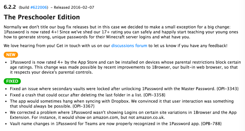
If you put all 1Password changelogs since version 6.0 together, it's over 4000 words. Ridiculous. That's because 1) they always include the full changelog of the last minor version and 2) each changelog is full of useless fluff ("We love you so much!").

But you know, at least they actually mention and explain all changes. That's from their website, which is better formatted than the changelog in iTunes:

1pgqsmx.png


Fluff aside, they list every single change and describe them briefly and concisely. Where applicable, they even reference their internal issue tracker.

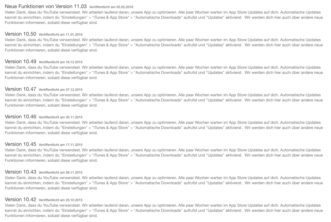
Compare this to apps like YouTube or Spotify, which - at least in my national App Store - only ever use the same copy pasted "We did something! Thanks for using our app." in every single update.

Case in point:

yt8osox.png


"Thanks for using YouTube. We are always working hard to optimize our app", followed by an explanation of how to enable app updates on iOS.
I'm aware that they actually mention the changes in the US App Store. Can't be arsed to translate them, I guess?
 

Vyer

Member
Unfortunately cracked my iPad screen so I'm using a Surface Pro 3 until I get it repaired/replaced.

I still maintain that I like the idea of Surface Pro and would love to replace my work laptop with one, but.... man, does it suck as a tablet. Native app situation is horrible, so you have to use a janky awkward browser solution instead. Scrolling through HBOGo for example is a got damn nightmare as the site seems to be unable to decide if you're scrolling or selecting. At least there's a Netflix app, though performance wise it seems worse than I'm use to.

The "tablet mode" toggle, while an idea I like, seems to alternate between weirdly sensitive or horribly laggy at any time. In non tablet mode touch screen input is hit or miss (for obvious reasons) depending on the function, like even with the keyboard detached it won't pop up the keyboard when you tap in a text field.

Don't like the aspect ratio, its not very comfortable to hold or hold and type, and I don't know if its the distribution or what, but it seems way heavier than it should feel. Especially in portrait. Even the iPad Pro when I held one felt significantly lighter even though I don't think there's a huge difference.

Just not a very good experience in general. I'd still take any iPad - or even the smaller Nexus 7 - over this when it comes to lounging around and streaming/browsing/playing.

I bought a Surface 3 (non-Pro) to try and play Rocket League and to use as a general tablet. I purposefully did not buy the keyboard cover, to see if it was possible. Honestly that thing did NOT like being used as a tablet at all. It fought me at almost every turn, the Windows 10 on-screen keyboard being the biggest offender.

Also it ran Rocket League like complete garbage. It was unplayable. So it got returned in a week
 

Vyer

Member
I bought a Surface 3 (non-Pro) to try and play Rocket League and to use as a general tablet. I purposefully did not buy the keyboard cover, to see if it was possible. Honestly that thing did NOT like being used as a tablet at all. It fought me at almost every turn, the Windows 10 on-screen keyboard being the biggest offender.

Also it ran Rocket League like complete garbage. It was unplayable. So it got returned in a week

I keep forgetting MS gave the non pro option surface another try.

But yeah, considering how poor this is as a tablet, non Pro seems like the worst timeline.


Anyone know how much screen repairs are at the Apple store these days?
 
I keep forgetting MS gave the non pro option surface another try.

But yeah, considering how poor this is as a tablet, non Pro seems like the worst timeline.


Anyone know how much screen repairs are at the Apple store these days?

5s: $129
6: $109
6 Plus: $129
6s: $129
6s Plus: $149

The Apple Store doesn't just replace the screens on iPads, because you're really not SUPPOSED to. It's not meant to be modular like that and a lot of third party repair shops that do either make the repair look like garbage or end up hurting other stuff. Apple would do a whole iPad swap for anywhere from $200 to $350 depending on the model
 

Vyer

Member
5s: $129
6: $109
6 Plus: $129
6s: $129
6s Plus: $149

The Apple Store doesn't just replace the screens on iPads, because you're really not SUPPOSED to. It's not meant to be modular like that and a lot of third party repair shops that do either make the repair look like garbage or end up hurting other stuff. Apple would do a whole iPad swap for anywhere from $200 to $350 depending on the model

I'm guessing Air 2 would be closer to the 350
 
Top Bottom