-
Hey, guest user. Hope you're enjoying NeoGAF! Have you considered registering for an account? Come join us and add your take to the daily discourse.
You are using an out of date browser. It may not display this or other websites correctly.
You should upgrade or use an alternative browser.
You should upgrade or use an alternative browser.
Steel Assault - Zipline-based 2D action (PC, Kickstarter) - Campaign Successful
- Thread starter Tain
- Start date
The new version looks way better and way more appealing imo, you should consider to redo the kickstarter campaign for this new version since it now looks like a new and different game and people would be more aware of it.
Seeing how he already has the budget for this new version, that seems like it'd be a bit unnecessary. :V
NES graphics are awful and there's already too many indie games aping that style so I'm happy with the new direction if he can deliver.
Most indie games aren't actually using "NES graphics" though, they're just using pixel art and maaayyybe have a similar aesthetic. This game was actually going to be made under the limitations of what an NES game could look like.
If this is really what Sri wants to make then so be it, I could still see it being a neat game. I also didn't back the Kickstarter campaign (I don't have a credit card, else I would have) so it's not like I have much to complain about. I mostly just think it's a waste to see what was already done thrown away.
Bloodporne
Member
Just saw the OP and got quite excited about this game, skipped to the last page to get further info not realizing OP was a year old and...what the hell?
I'm more interested in the gameplay aspect than anything, but I personally would've preferred the original, more gloomy, art style.
I'm more interested in the gameplay aspect than anything, but I personally would've preferred the original, more gloomy, art style.
Please show me all of these NES style games. Or are you talking about stuff like Broforce? In reality, there are extremely few indie games that actually try to emulate the limitations games had back then. Trying to make an authentic 8-bit game requires special effort, knowledge, creativity and talent. I'm not saying this game will lack those elements now, obviously, but it'll now be just a nice looking side scroller with pretty pixels.NES graphics are awful and there's already too many indie games aping that style so I'm happy with the new direction if he can deliver.
Regardless, the developer wants the game to look like this, and I guess that's fine since he's offering refunds. Best of luck, I hope the game is good (this is just the art style we're talking about), and I also think it's time to, at the very least, talk more about how this game will play.
Very disappointed in this shift, especially almost a year after the KS ended.
Have to agree with charlequin here. I don't understand what this pivot accomplishes exactly. What's the best case scenario for this kind of change? Are new people going to suddenly back this game? How many customers will this attract based on the initial selling concept? Because the worst case is exactly what charlequin listed right here. I don't think I've heard of many Kickstarter projects that ever said "Well you know, we just had too much money and needed to do something with it." However, there is a pretty substantial list of Kickstarters that have failed because they exceeded their budget for whatever reason.
Maybe if there was more of an update beyond just a gif comparison to show us more of why this is a good thing overall it wouldn't be so bad, but my interest in this has dropped immensely. I really don't care that in the new style it's easily discerned that it's Washington D.C.
This strikes me as an extraordinarily short-sighted choice. This game passed its goal -- barely -- based on its original pitch. If the project delivers on that, it's a ready-made batch of potential ambassadors for your game, convincing other people to buy and try it. By pivoting like this, you drive some people out completely, you leave others feeling uncertain, and you cut out the potential hype for your game before it ever has a chance.
Besides that, budgetary holes are one of the biggest challenges every Kickstarter faces. Almost every project creeps its scope somewhere, goes over its allotted time, burns through more of its budget than it expects to, and has to consider how to limp over the finish line with the available resources. Given the luck to have extra funds, the smart thing to do is to keep your scope exactly where it is and use the extra funds as a cushion to get the project finished.
It very much does not.
Have to agree with charlequin here. I don't understand what this pivot accomplishes exactly. What's the best case scenario for this kind of change? Are new people going to suddenly back this game? How many customers will this attract based on the initial selling concept? Because the worst case is exactly what charlequin listed right here. I don't think I've heard of many Kickstarter projects that ever said "Well you know, we just had too much money and needed to do something with it." However, there is a pretty substantial list of Kickstarters that have failed because they exceeded their budget for whatever reason.
Maybe if there was more of an update beyond just a gif comparison to show us more of why this is a good thing overall it wouldn't be so bad, but my interest in this has dropped immensely. I really don't care that in the new style it's easily discerned that it's Washington D.C.
HellBlazer
Member
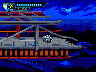
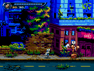
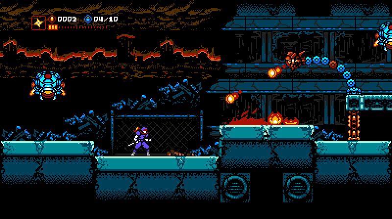
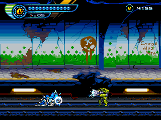
One thing I honestly can't understand is the claim that, even disregarding the change in style, the new art looks visually worse or more generic than the old one. I feel the exact opposite! To me, every single visual element in the new screenshot looks better than that of the old one, on both a technical and aesthetic level. The new screenshot establishes the D.C. environment and its abandoned post-apocalyptic atmosphere (whereas the old level visually has nothing to do with D.C. except the name), it has architecture (a restaurant) that looks more like it has some sort of purpose, the road tiles are better, there's a more atmospheric and less tacky night sky... If the goal is to create a mood and sense of place (and that is my goal with any visual style, far above and beyond any 8-bit/16-bit distinctions), then I simply can't see the old level art winning out. If you disagree with all of this, or place the 8-bit style as your top priority, then I understand why you hate this change in direction. But I 100% believe this is a step forward.
Personally, I don't mind that the new style is closer to 16-bit or whatever. What struck me most when comparing the two screenshots though was that the new one seem to use a color palette that is a lot brighter/more saturated (on the foreground buildings especially). It gave the game a more... cartoonish look, maybe - at least compared to the old style. The old screenshots had a very dark palette that gave the game a nice atmosphere, and fit very well with the post-apocalyptic theme.
Just something to keep in mind when selecting colors, I guess.
If I could have launched the Kickstarter with the current aesthetic, then I would have (and probably would have easily gone over the goal too, instead of haphazardly limping over it). I'd also like to note that, even back then, I was already struggling with the limitations of the NES aesthetic! I wanted more colors on sprites, screen-filling fully animated bosses, and I even put all this in the style guide we created.
Obviously you'd know far better than me about this, but I'm just worried a bit that if you admittedly only "haphazardly limped over the goal"... do you really have sufficient budget bandwidth to completely change the look of the game to a more detailed artstyle? Like, you barely hit the goal for the 8-bit style game, and now you're ditching all the graphics you already had, and re-making them in a more time-consuming style? That seems concerning.
NES graphics are awful and there's already too many indie games aping that style so I'm happy with the new direction if he can deliver.
Where are all these indie games that actually mimick NES style graphics? Keep in mind most pixel games look nothing like the hundreds of games in the NES library.
For example, none of this stuff is in the style of NES graphics: Superbrothers, Broforce, Super Time Force, Knights of Pen and Paper, Fez, Shantae, McPixel, Dungeon of the Endless, Spelunky, Pixel Dungeon, La-Mulana (heard this described as Amiga-like), Binding of Isaac (GBA-ish), Terraria, Risk of Rain, Lone Survivor, Mercenary Kings, Organ Trail (DOS/Apple II), AVGN, Retro City Rampage, Hotline Miami, Mutant Mudds, Quest of Dungeon, Magicite, plus dozens more with what can only be described as modern pixel graphics unlike any old console or computer.
Shovel Knight is one of the uncommon exceptions as a game that goes for a clear NES-like look and takes liberties where appropriate, without abandoning its intended style.
Someone in the NES/Famicom thread said this now looks like a DS game and I have to agree with that spot-on assessment. That's not a bad thing either. It just doesn't look like any SNES or Genesis game I've ever seen.
Personally, I don't mind that the new style is closer to 16-bit or whatever. What struck me most when comparing the two screenshots though was that the new one seem to use a color palette that is a lot brighter/more saturated (on the foreground buildings especially). It gave the game a more... cartoonish look, maybe - at least compared to the old style. The old screenshots had a very dark palette that gave the game a nice atmosphere, and fit very well with the post-apocalyptic theme.
Just something to keep in mind when selecting colors, I guess.
It's definitely a brighter, more colorful game which seems at odds with the before look.
Mackenzie 92
Member
love the new art direction
NoFaceNico
Member
The new version looks way better and way more appealing imo, you should consider to redo the kickstarter campaign for this new version since it now looks like a new and different game and people would be more aware of it.
... and what happens if the new campaign fails? Does he go back to the NES style? Does the game get canceled because such a needless and sudden switch in style is unsustainable with just the original budget? Or does he just continue onward, which would prove that the influx of fresh crowdfunding cash would make no difference?
I don't have any strong feelings toward the new look, really. It's definitely lighter in tone, which I don't prefer, but otherwise it does look nicer despite being beyond the Famicom's abilities.
I still assume the structure, core mechanics, and stage design will be sound, and I'm nowhere close to looking for a refund.
I still assume the structure, core mechanics, and stage design will be sound, and I'm nowhere close to looking for a refund.
charlequin
Banned
Where are all these indie games that actually mimick NES style graphics? Keep in mind most pixel games look nothing like the hundreds of games in the NES library.
Shovel Knight has been well-documented in its efforts to closely simulate the NES aesthetic. The Retro Game Challenge titles aim to emulate the NES (among several other systems) in the individual games, though overall not as close as Shovel Knight. This game I just discovered in the latest Steam Sale thread Life of Pixel makes a go at simulating the pixel aesthetics of 13 old systems including the NES, although just watching the video makes it clear that there's still some significant liberties taken.
As far as I'm aware, that's the full list.
Ghost_Messiah
Member
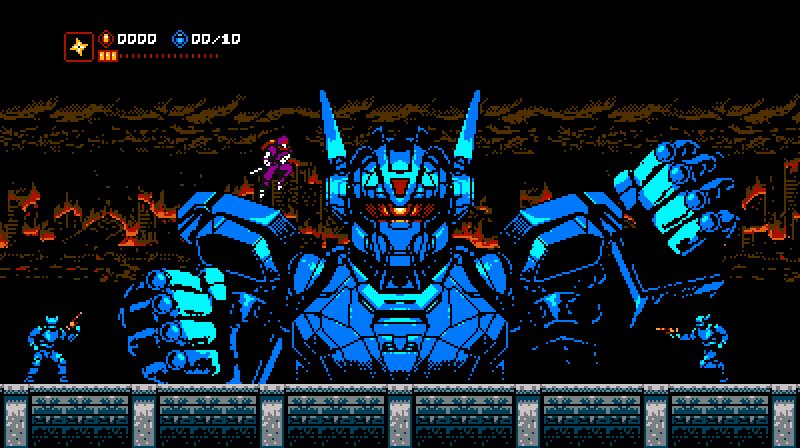
IMO the art direction change is a downgrade. The game goes from a slick, ultra-cool, retro-infused NES throwback game to derivative of one of those archaic Capcom arcade side-scrolling beat-em-ups from the nineties. The look of the game is much worse and the game itself has become far less alluring. The perspective change also hurts the game. It now has a 2.5D look to it that is just unnecessary and didn't need to be implemented negatively affecting the gameplay experience. Ultimately however it's up to the developers as to what they do.
As Charlequin said however the decision appears to me as the very definition of short-sighted. The game just didn't need to be overhauled like this. This is just unnecessary.
As Charlequin said however the decision appears to me as the very definition of short-sighted. The game just didn't need to be overhauled like this. This is just unnecessary.
superNESjoe
Member
Shovel Knight has been well-documented in its efforts to closely simulate the NES aesthetic. The Retro Game Challenge titles aim to emulate the NES (among several other systems) in the individual games, though overall not as close as Shovel Knight. This game I just discovered in the latest Steam Sale thread Life of Pixel makes a go at simulating the pixel aesthetics of 13 old systems including the NES, although just watching the video makes it clear that there's still some significant liberties taken.
As far as I'm aware, that's the full list.
There's also GunWorld, which I developed, on Steam and Xbox One. The biggest liberty it took was paralax scrolling backgrounds with multiple layers (which the game didn't have at launch, they were added flair in the Xbox One version). Like Shovel Knight it took some liberties with the restrictions, but it follows the same color palette, tile size, and simulated screen resolution of the NES. Same thing is being done with GunWorld 2.
Hence my personal disappointment in the art of this game changing direction. I didn't have the balls to strictly adhere to NES limitations, so I did a spin off of it that is NES inspired but not 100% authentic. This is how most NES style pixel games are (however the vast majority of "8-bit pixel games" are nothing like true 8-but games).
Seeing someone stick strictly to NES art in a way I couldn't was inspiring, especially seeing them attempt late-era complex NES. It 100% ruins the appeal of the game for me.
Motherfuckin SHATTERHAND!
Sold.
You might want to read further in the thread.
one of those archaic Capcom arcade side-scrolling beat-em-ups from the nineties.
i'm upset
DannyDanger
Member
new style looks alittle better
overall it doesnt look THAT much different, not enough for outrage
overall it doesnt look THAT much different, not enough for outrage
Ninja Scooter
Member
new style looks alittle better
overall it doesnt look THAT much different, not enough for outrage
I think the "outrage" might come from the fact that, whether or not you think the new style is better or more technology advanced or more "modern", it was sold in large part because of the very specific graphical style of the original game. It would be like someone creating a kickstarter for a monster movie that features stop-motion animation, and then deciding that they've made enough money they want to use CG instead. The movie (and in this case, game) might still be good, and the CG might end up looking better, but people might feel like it's not what they promised. Because of that I commend him for offering refunds, that's stand-up as hell, but it's understandable why some might be disappointed.
Spring Drive
Banned
Update:
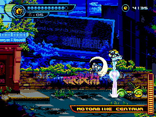
Game has moved on from the 8-bit art style, refunds for people not cool with it. Personally I think it's a nice improvement.
Explanation below.

That's a radical change in style. My interest just dropped to 0.
Odd bump. 
They haven't updated their kickstarter page since last year, but their tumblr has several new gifs:


It looks nice to be honest, just no longer adheres to any NES boundaries.
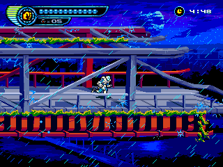
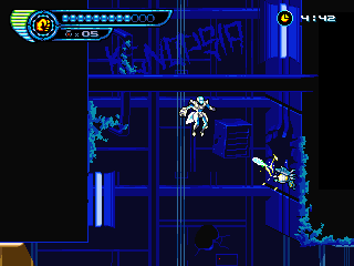
There's another game in development called Cyber Shadow that's apparently using the work made by Steel Assault's original artist, which looks more NES-like.
They haven't updated their kickstarter page since last year, but their tumblr has several new gifs:
It looks nice to be honest, just no longer adheres to any NES boundaries.
There's another game in development called Cyber Shadow that's apparently using the work made by Steel Assault's original artist, which looks more NES-like.
Tertullian
Member
Well... it still looks better than Mighty No. 9.
Cloggerdude
Member
Odd bump.
They haven't updated their kickstarter page since last year, but their tumblr has several new gifs:
It looks nice to be honest, just no longer adheres to any NES boundaries.
That zipline mechanic looks pretty great, honestly. I can understand all the controversy somewhat, but I'll probably grab this when it comes out.
sixteen-bit
Member
Well... it still looks better than Mighty No. 9.
It's better than nothing.
Odd bump.
They haven't updated their kickstarter page since last year, but their tumblr has several new gifs:
It looks nice to be honest, just no longer adheres to any NES boundaries.
There's another game in development called Cyber Shadow that's apparently using the work made by Steel Assault's original artist, which looks more NES-like.
it looks really awesome
Odd bump.
They haven't updated their kickstarter page since last year, but their tumblr has several new gifs:
It looks nice to be honest, just no longer adheres to any NES boundaries.
There's another game in development called Cyber Shadow that's apparently using the work made by Steel Assault's original artist, which looks more NES-like.
Perfect, so we will have both games.
pantsattack
Member
Cyber Shadow looks great. Especially the mech. I thought they went back to the original style!
I'm curious, did anyone bother to get a refund for this game? The developer isn't very communicative and those gifs are pretty much all he's posted in the 6+ months since the "reboot".
They seem to be relatively active on twitter.
We just posted a large Kickstarter update with a ton of GIFs and new information:
https://www.kickstarter.com/projects/43113410/steel-assault/posts/1626948

Also notable is the announcement that all backers of Steel Assault will now get a copy of Cyber Shadow (the 8-bit Metroidvania game which is using SA's old art, and which is in a very similar style) for free. This includes the 4-5 people who asked for refunds previously (I don't know if any of them were from here, but yeah).
Would a mod mind changing the thread title to something like "Steel Assault - Zipline-based 2D action (PC, Kickstarter)" or "Steel Assault - Legit-looking 2D action platformer (PC, Kickstarter)"? I understand the style change is still controversial, and I don't want newcomers to the thread to be misled or disappointed.
https://www.kickstarter.com/projects/43113410/steel-assault/posts/1626948
Also notable is the announcement that all backers of Steel Assault will now get a copy of Cyber Shadow (the 8-bit Metroidvania game which is using SA's old art, and which is in a very similar style) for free. This includes the 4-5 people who asked for refunds previously (I don't know if any of them were from here, but yeah).
Would a mod mind changing the thread title to something like "Steel Assault - Zipline-based 2D action (PC, Kickstarter)" or "Steel Assault - Legit-looking 2D action platformer (PC, Kickstarter)"? I understand the style change is still controversial, and I don't want newcomers to the thread to be misled or disappointed.
Nomadic Sparks
Banned
HOOOLY SHIT!
When is this coming out?
When is this coming out?
D
Deleted member 284
Unconfirmed Member
Very glad I backed this. Good job sir!
We just posted a large Kickstarter update with a ton of GIFs and new information:
Looks fantastic, man. I hope progress is going steady.
Ninja Scooter
Member
Game looks amazing. Not sure why people were unhappy with the change, it's a huge improvement over the original style.
Because it was kickstarted with a specific graphical style in mind. Whether it looks better or worse now is completely subjective, but it's not hard to see why some people might have been upset with the change.
That said, the new look is growing on me. I still like the old Sunsoft style look but this is good too. Like a strange mix of Genesis and SNES.
Crab Milk Mickey
Member
Conceptually this looks so cool. Any broad release estimates out there for the game?