pixelation
Member
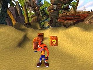
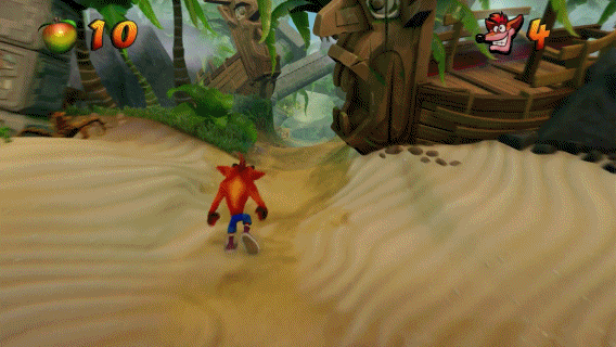
Am i the only one who has noticed this?, the original one(s) look far more colorful and contrasty. The remakes almost look like you're looking at them on a poorly calibrated tv set in comparison, there are a few exceptions like that underground level with the green gooey fluid, but in the open i am not digging the washed out color palette.
I hope that they could at least add some optional "colorful filters" or just straight up fix it.


") _/¯
_/¯