-
Hey, guest user. Hope you're enjoying NeoGAF! Have you considered registering for an account? Come join us and add your take to the daily discourse.
You are using an out of date browser. It may not display this or other websites correctly.
You should upgrade or use an alternative browser.
You should upgrade or use an alternative browser.
Deus Ex: Mankind Divided 101 Trailer, editions detailed, season pass ($30?)
- Thread starter BY2K
- Start date
Bring back Sarif!
adaaaam
SmackAttack
Member
Continues to look excellent. As nice as the steelbook and art book look, I think I'll pass on the CE and just stick to the game. Need to make sure I finish some stuff before this releases.
I like the font change.
http://abload.de/img/fontchanged21sy9.png
http://abload.de/img/fontchange7es90.png
 Nein. Prefer the way it was.
SJRB
Gold Member
Bring back Sarif!

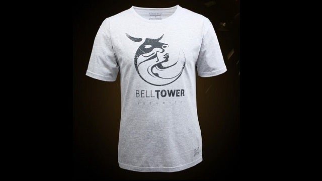
I'm still rocking this shirt from time to time. Still one of the most amazing logos ever created.
Freeman76
Member
I wonder how they will explain away the clusterfuck of HR's ending.
Still, I have high hopes.
There is always one! Wtf was so bad about the ending then, enlighten us.
I'm still rocking this shirt from time to time. Still one of the most amazing logos ever created.
I always wanted the Belltower (the security company) t shirt but missed my chance. Love the designs coming out of this universe.
Conscience Falls
Member
I knew I was excited prior but after this trailer, it has cemented its place as most anticipated game of 2016 pour moi.
I haven't picked up a collectors edition since Second Son but I'll be getting this one.
It'll be a blend of all three. I'm totally fine with this, it fits in with the tone of the universe and I prefer more Adam to simply throwing us into another star system where nothing matters.
I haven't picked up a collectors edition since Second Son but I'll be getting this one.
I wonder how they will explain away the clusterfuck of HR's ending.
Still, I have high hopes.
It'll be a blend of all three. I'm totally fine with this, it fits in with the tone of the universe and I prefer more Adam to simply throwing us into another star system where nothing matters.
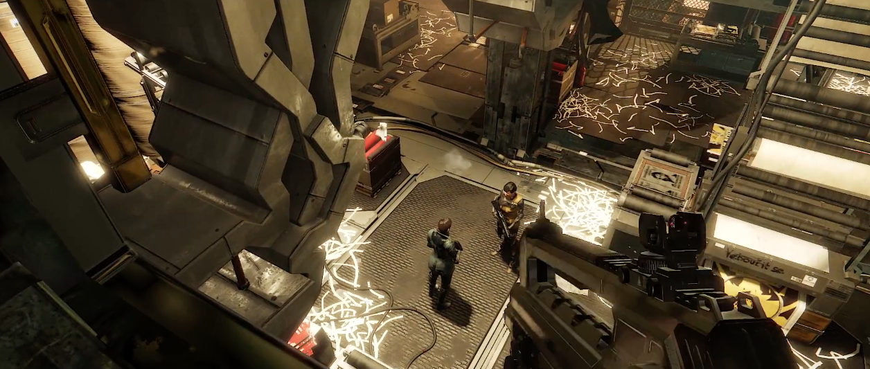
The surfaces look much simpler, but, in a sense, also more believable: I can actually see this running on 2013 Laptop cards. I guess they might save some of the old renderer for the PC version, but might just be too expensive. I still think it looks nice though, and I dont play a Deus Ex ( the first one looked bland, even for 2001) game for the graphics, so not too bothered.Btw, that was console graphics, right?
Pantaghana
Member
There is always one! Wtf was so bad about the ending then, enlighten us.
All that build up and mystery is transformed into: "Here are four buttons, each starts a cinematic that is more idiotic than the last. Pick one."
Comes out of nowhere and doesn't really resolve anything.
Messofanego
Banned
I hope you can still punch random civilians. People on the internet turned it into an art
https://www.youtube.com/watch?v=-A6eeeq_2TE
I watch this and Deus Ex Recut every 3 months, some of the best videogame comedy XD
Deus Ex games are great asshole simulators.
KyanMehwulfe
Member
/snip
Still one of the most amazing logos ever created.
always been a big fan of the company logos tooI always wanted the Belltower (the security company) t shirt but missed my chance. Love the designs coming out of this universe.
/snip
especially fond of Lucky Dot, Tai Yong Medical, Motkun, Belltower Security, and Connaught Technologies


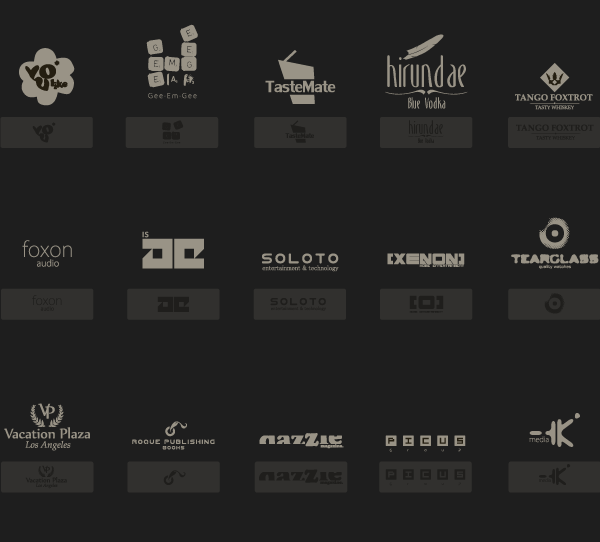


corporate Deus Ex is my favorite part of Deus Ex.
the whole corporate espionage of Sarif Industries by Tai Yong Medical before the plot thickens was up there with my favorite sections of the original Deus Ex.
SchrodingerC
Member
Hot damn.
Those gorgeous cityscapes and the ME-like soundtrack, my hype is hitting critical levels.
I do appreciate the devs showing off both an aggressive and stealth approach.
Those gorgeous cityscapes and the ME-like soundtrack, my hype is hitting critical levels.
I do appreciate the devs showing off both an aggressive and stealth approach.
Miles Quaritch
Member
Am I going crazy or are season passes getting more expensive?
Madness...
Madness...
BigTnaples
Todd Howard's Secret GAF Account
I somehow hadn't been thinking about this lately. God it looks good.
KyanMehwulfe
Member
Rest in peace, Big Rizzle.the graphics are unimpressive RIP
GavinUK86
Member
All that build up and mystery is transformed into: "Here are four buttons, each starts a cinematic that is more idiotic than the last. Pick one."
Comes out of nowhere and doesn't really resolve anything.
You must've never played a Deus Ex game before.
ThoseDeafMutes
Member
Collector's edition for a mere $209.95 in Australia. What a bargain.
I just want a PC steelbook pls. I don't need the superfluous crap.
I just want a PC steelbook pls. I don't need the superfluous crap.
Icyflamez96
Member
I didn't ask for so much awesome today. That trailer was amazing.
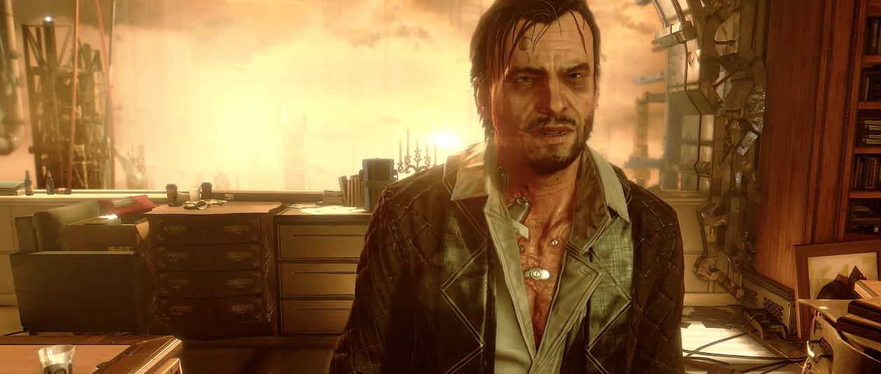
Is it just me or have they improved Adam's lip work?
Is it just me or have they improved Adam's lip work?
snoopeasystreet
Member
Trailer looks rad but Jensen is such a hilarious looking dude. He looks like a cyberpunk Guy Falkes mask.
Messofanego
Banned
Why oh why dear god do they insist on piss filtering out the colors from this game?
What I wouldn't for naturalistic colors instead of this monochrome aesthetic mistake.
Save us, Boris!
We all know you just want it pink and white!
D
Deleted member 102362
Unconfirmed Member
Another reminder that this is my most anticipated game of 2016. Looks amazing, with fantastic music to boot.
So hyped for this game. HR was my first Deus Ex game and it was absolutely wonderful. I like having so many different options to clear a level. I did think it was kinda stupid how u get more experience when going non lethal and stealth. Didn't really provide an incentive to play the game in any other way than stealth, since you end up with less praxis points... I hope the revolver with explosive ammo makes a comeback. That was one awesome to use.
KyanMehwulfe
Member
I liked the piss filter... or as i prefer to think of it, the golden filter :O always thought it was kinda cool imagery that Jensen -> Denton could be represented by gold -> blue... so as Human Revolution's sequels get closer to original Deus Ex, the imagery of the game becomes less gold and more blue... locations or story themes that are more about augs = gold; more about humanity = blue... augs = gold, while nano-augs = blue... the sort of augmentation corporatism of DXHR is gold while the more philosophical DX is blue... DXHR being inspired by renaissance period = golden; DX by the enlightenment period = blue ... i'm not sure, i'm just throwing out random parallels.#bringbackpiss
Less cyberpunky without it
but with the classic Deus Ex art being blue-ish and in general NY/Unatco perhaps being a bit gray/blue, while DXHR is very golden (and slowly using less 'gold' for cutscenes about humanity, e.g. the terrorist attack in the first Mankind Divided trailer is very blue and gray, while the 'aug radicals' scene is golden), they could sort of build in the gold vs blue.... gold (corps), no filter (public), blue (illuminati) or at least gold filter for augs; no filter for humanity; blue filter for nano-augs to create some cool thematic imagery for the universe.
If anything 30 is "cheap" for a season pass, wasn't batman 50? Or was it 40? Seems like 30 was the old standard but more recently games have been higherAm I going crazy or are season passes getting more expensive?
Madness...
Rest in peace, Big Rizzle.
Yeah, rip.
Aces&Eights
Member
Lawd, that soundtrack is so good. I want to be playing it as I sit in my apartment and contemplate the great events in my life.
Abstrusity
Member
My groin is augmented.
I liked DXHR, but I think the marketing campaign was what made it in my eyes. This...well, it'd be pretty much more of the same.
Stealth run as always, with a tricked out handgun I will never use and have 10 blocks of ammo for by the end of the game.
I liked DXHR, but I think the marketing campaign was what made it in my eyes. This...well, it'd be pretty much more of the same.
Stealth run as always, with a tricked out handgun I will never use and have 10 blocks of ammo for by the end of the game.
Am I going crazy or are season passes getting more expensive?
Madness...
This gen indie games have gone from a base of $15 to $20 and season passes have gone from a base of $20 to $30, and in both cases there has been no perceptible benefit to the consumer. They do it because they can.
NotTheGuyYouKill
Member
That was baller as fuck. I'm glad Jensen came back.
HR wasn't even a looker, yet I loved it.
Still was an awesome game. And one of the first few dx11 titles. Bought a 560ti just so I could play that game well (previous card was a 9800gtx)
Can wait for this game to come out as well.
NegativeCero
Banned
Hyped! I wonder how the choosing your allies thing will figure into the story. Hopefully there are multiple endings.
Pantaghana
Member
You must've never played a Deus Ex game before.
I played the first Deus Ex, though I never got around to finishing it. I know it ends in a very similar way.
HR's doesn't stop being terrible because it's a reference or a call back.
Icyflamez96
Member
But seriously I'm almost 33% sure that they improved the lip syncing on Jensen. His face doesn't look nearly as stiff as it usually does.
It almost looks out of character how much his face was moving because I'm not used to that.
It almost looks out of character how much his face was moving because I'm not used to that.
BigTnaples
Todd Howard's Secret GAF Account
I played the first Deus Ex, though I never got around to finishing it. I know it ends in a very similar way.
HR's doesn't stop being terrible because it's a reference or a call back.
God this post makes me want to hurl.
Icyflamez96
Member
One of the things I'm most excited about. Michael McCann is an amazing composer.
The God of Ambience
Edit: And another
Doctor Ironic
Member

I felt like this trailer was quite lame. Didn't make me hyped as DE:HR trailers did.
Maybe that's because the DE:HR trailer is GOAT?
BigTnaples
Todd Howard's Secret GAF Account
I felt like this trailer was quite lame. Didn't make me hyped as DE:HR trailers did.
Well this is a 101 trailer to introduce you to mechanics and the world.
They already released a cinimatic trailer much like the original HR CGI trailer.
However the original HR CGI trailer can't be beat. Probably the best CGI trailer ever.
I always wanted the Belltower (the security company) t shirt but missed my chance. Love the designs coming out of this universe.
There are some t-shirt shops selling a similar shirt only the logo without the company name.