HORRORSHØW
Member
that shit looks fucking awfulThis was the best
that shit looks fucking awfulThis was the best
It's just the web UI they redesigned, to make it in-line with the console and mobile apps. In my opinion, this is not a bad thing. The web UI was atrocious, whereas their console/mobile apps were near perfect.As long as they don't fuck with the PS4 app, I'm good.
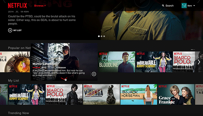
Today, we are excited to unveil the new Netflix website. It’s our first major update in four years, and it’s an experience that has been built from the ground up to make it faster and easier to discover something great to watch for our millions of members around the world.
Over the past four years, web browsers have changed a lot, becoming more sophisticated and allowing for richer visuals and animations. How our members use Netflix has changed too. We’re spending more and more time using mobile and tablet apps.
With the new Netflix website, we’ve created a richer, more visual experience, and a website that works more like an app and less like a series of linked web pages. Information appears in-line and in context rather than on a separate page, which makes exploring the catalog faster than ever before.
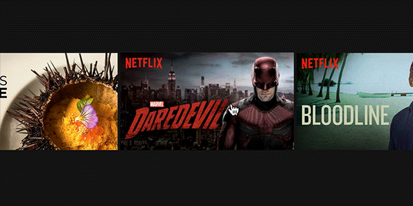
When you hover your mouse over a title, you will now see a slideshow of images from that movie or show. We hope this slideshow will give you a better feel for what the show is about than reading the description alone.
Clicking on the title or synopsis opens an inline details pane, allowing you to browse episodes and read details and reviews. You can also explore similar titles by clicking More Like This, or jump off to titles from the same cast, genre or mood.
Scrolling through rows is now much faster, with a mouse-click advancing a full row at a time.
We’ve designed the website to work whether you are using a mouse, trackpad, or a touch screen. Touch screen users can tap to play or open details, and swipe to scroll through rows of titles.
The website is rolling out globally starting today and may take up to two weeks to reach all members. A small number of members on older versions of popular browsers will be prompted to upgrade their browser before they can access the new site.
We hope you enjoy the new Netflix website. It has been an exciting project for us, and we are thrilled to share it with you.
This reminds me when I had HBO GO and my screen would go crazy if I had the browser window with it running on my 144hz monitor. Had to make sure to keep it on the 60hz one.will it work on 144hz though
edit: yep it does
Hate browsing netflix on the browser. PS4 / TV app are way better
Man fuck the person who removed the Genre lists from the apps..
Man fuck the person who removed the Genre lists from the apps..
Some would say disabling UAC is pants on head stupid.Netflix.com is the only Netflix I use anymore. Mostly because you can't use Windows 8 apps if you've disabled UAC via the registry, which is pants on head fucking STUPID. So I'm glad for this. Works fairly well.
Fucking tabletification of Desktop websites. Hate it.
Less titles on screen, more extra steps to go to where i want. Can we please get the person responsible fired? And can we take away the money that person earned during developing this? Because no one deserves anything for this.
Man fuck the person who removed the Genre lists from the apps..
How about an alphabetic catalog, finally?
Some would say disabling UAC is pants on head stupid.
That said I havent touched UAC on my windows 8.1HTPC I never get asked for permission to launch kodi or Netflix app. Works just fine, not sure why you would need to disable UAC.
 too bad I really like it when it works.
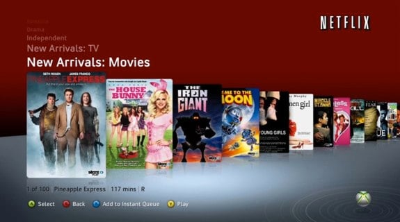
The new one is nice and I have no problem with it but I don't see how it's any more functional than the desktop/browser UI was even five year ago. Hell I still vastly prefer the browser UI from several years ago to literally any other Netflix app I've ever encountered, including Roku and some nasty smart-tv ones.