• Hey, guest user. Hope you're enjoying NeoGAF! Have you considered registering for an account? Come join us and add your take to the daily discourse.

GAF Photography Assignment #101 - Album Covers

Status
Not open for further replies.
Theme: Album Covers

Submissions are due by Thursday, November 4th at 11:59 PM PDT.

Voting begins Friday, November 5th and ends on Monday, November 8th at 11:59 PM PDT.

1) Photos MUST BE 1:1 aspect ratio. Square.

2) Only one photo per person, per assignment.
-- Photos must be taken during the assignment period.
-- Only photos to be posted in this thread are to be submissions.
-- You can change your submission by editing your post.
-- To avoid cluttering up the thread, please avoid quoting images.
-- Photos should be no larger than 800 pixels on the long edge.

3) One vote for your first choice (3 points) and one vote for your runner-up (1 point), which can be based on any criteria you see fit. You cannot vote for your own submission. Non-participants are also welcome to vote. Criticism/comments encouraged.

4) The "winner" should come up with a new theme/time period. Ties are broken first by the number of first choice votes, then by longest time since last win/thread start, then by longest amount of time participating in assignment threads, then by who's the biggest headache to NeoGAF.

In an effort to give a bit of flexibility to this assignment you are tasked to create an album cover from a single photograph. Images must be 1:1 ratio (i suggest 800x800 to fit the size rules.

Your album cover can be ANYTHING YOU WANT. The challenge is that it must be a single image. Album covers are striking and instantly accessible, you should try and include these qualities in your photo.


Have fun, Everyone! I can't wait to see what you guys come up with.

PS: You can add text to your album cover if you wish, Also please describe the concept and genre in your submission post. If you want.

Good Luck!
 
the_log_ride said:
Interesting theme. Do photographers have to include faux album titles and text too?
From the OP:
PS: You can add text to your album cover if you wish, Also please describe the concept and genre in your submission post. If you want.

BTW, the due dates are a little off. November 1st is a Monday.
 

captive

Joe Six-Pack: posting for the common man
TheWiicast said:
No submissions yet? Come on people!
we got time, but seriously dude do i need to buy you a calendar? November first is not a Thursday. :lol
 
okay, i'll get the ball rolling:

2801921.jpg


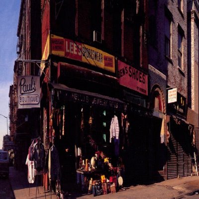
"paul's boutique"

nex-3
f/3.5
iso 200
1/40
16mm
 

sc0la

Unconfirmed Member
Oh man this is exactly what I was always planning to make the challenge if I ever won a photo-gaf.

I guess I have to participate more if I ever wanted to do that though :lol
 

Danielsan

Member
Still very much getting used to my camera. Got a book on exposure this week which i clearly need to read through. However the thread is so barren at the moment that I felt the need to contribute.

Taken today during a walk in the woods:
5126019550_e1e12d780d_z.jpg


Nikon D3100, stock lens 18-55mm, f/3.5-5.6
ISO 100
18mm
f/ 3.5
1/20sec

Initially I though the deadline was November 1st so I might change my entry.
Very overcast day today, I miss the summer already.
 
5130452062_da84d02fd9_z.jpg


Took this shot in a warehouse where all the Black Eyed Peas equipment and touring props were. Not sure what's in the case, but I thought "Stunt Cock" was a great album name.
 

Zyzyxxz

Member
5145281548_cc390378bc_o.jpg


D90, nikkor 35mm

f/1.8, 1/50 sec, ISO 1000

Post Process: white balance adjust to go for more yellow, softened image
 

Album Cover by michaelpatrickryan, on Flickr

Camera model: Canon EOS Digital Rebel XTi
Lens: EF-S 18-55mm f/3.5-5.6
Focal length: 18 mm
Exposure time: 1/10 second
Aperture: f/3.5
ISO: 1600
Post Processing: Arbitrary rotate, correct for lens distortion, crop, add fake vignetting, fill picture frames with gray and noise, slight blur on gray block layer, mono via channel mixer, add text, and resize in GIMP.
What I was smoking: For better or worse, this concept of empty photo frames and the name "diaspora" came to me when I woke up this morning. I imagine some college/garage/indie emo band (and yes "Squirrel Killers" would make a great name for a band) would use this to highlight a theme of loss of family and place. I see parallels to Grant Hart's debut solo 2541 EP, which carried similar themes, but I have to admit that I only realized it after I finished and uploaded it.
 
deadline's passed so i'll collate the entries...i left in text where relevant as this theme might require explanation from some.

345triangle said:
2801921.jpg


"paul's boutique"

Danielsan said:

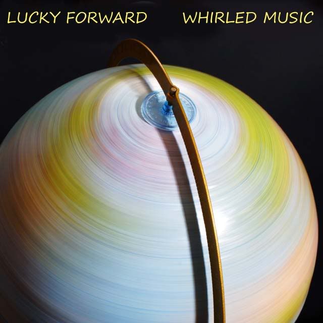
Lucky Forward said:

TheWiicast said:
5130452062_da84d02fd9_z.jpg


Took this shot in a warehouse where all the Black Eyed Peas equipment and touring props were. Not sure what's in the case, but I thought "Stunt Cock" was a great album name.

w1ndst0rm said:
5133522153_8955ba10dc_b.jpg


yeah yeah, prolly some whiney EMO garbage

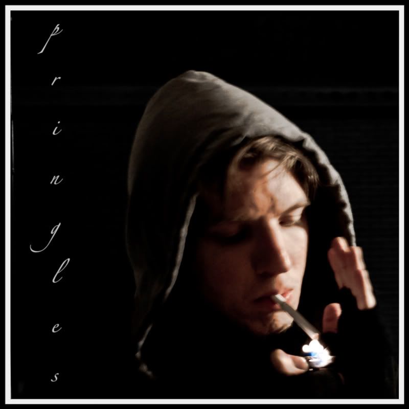
pringles said:

devon the dude said:

Cosmic Bus said:

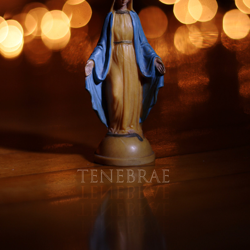
BlueTsunami said:

Human_Shield said:

Zyzyxxz said:

Squirrel Killer said:

Album Cover by michaelpatrickryan, on Flickr
What I was smoking: For better or worse, this concept of empty photo frames and the name "diaspora" came to me when I woke up this morning. I imagine some college/garage/indie emo band (and yes "Squirrel Killers" would make a great name for a band) would use this to highlight a theme of loss of family and place. I see parallels to Grant Hart's debut solo 2541 EP, which carried similar themes, but I have to admit that I only realized it after I finished and uploaded it.


vote.jpg
 
Thank you 345 Triangle. I'm swamped at work, I was going to ask someone to do the round up!

Great job everyone!

1 Blue_tsunami - I'm really in love with this shot
2 Human Shield - Abstract but striking!

Honorable mention: Danielsan - Beautiful!
 

BlueTsunami

there is joy in sucking dick
1: Human_Shield: Really, really like the tones you captured and the colors. Its ghostly. And the composition lends itself to the square crop and as an album cover (as far as allowing for text). I think it works on all aspects.

2: Lucky Forward: Cute album name and I've always loved photos that contain circular or round objects in a square crop. They contrast nicely. Love the use of motion too.
 
Thanks for all the kind words. Tough vote for me this time around, as I'm really digging all the entries.

1. 345triangle
2. BlueTsunami
 
1. human shield
2. blue_tsunami

i think human shield's is the best by far in terms of blending the photo and text in a way that would make it onto a CD shelf. plus it sort of reminds me of panopticon by isis, so there's that.

i like blue_tsunami's the next best for similar reasons of slickness in composition, even though i have no idea what a tenebrae is and it all looks suspiciously metal.

i don't know how successful my entry was. i wanted to recreate paul's boutique by the beastie boys (because it's pretty much my favourite album ever (or at least my favourite album where the cover is nothing but a photo)), and it's about as close a corner as i could find in osaka!

pauls-boutique.jpg
 
First - Human_Shield - The most polished and professional of all the entries, I think, looks like a perfect cover for piano or other mellow music. The faded color of the font fits perfectly, the entire package conveys a relaxing, mellow mood.

Runner-Up - Blue Tsunami - Nice concept, lighting, execution. I like your title and its reflections. My only nit is where you cut off the top of the statue...I guess you were making a point of not showing her eyes. What about if you included all of her head, but arranged the light to throw her face into shadow? Just a thought. :)


Comments for all:

345Triangle - While I think that would work well as an album cover, your post-processing leaves it a little too drab to appeal to me, I think I'm just not into the look you were going for.

Danielsan - Very cheerful, puts me in a good frame of mind, makes me think of a pleasant fall afternoon. I love the soft focus background. If it had a title that conveyed an album concept it might have gotten my vote.

TheWiicast - I like it, and I wanna know what exactly the 'stunt cock' is, too. I wonder, though, if the other random letters and numbers on the case draw attention away from the title...I'd be curious to see a version where those extraneous letters/numbers were cloned out so the stunt cock pops out at you (so to speak.)

w1ndst0rm - I like the bottom third...the bold stripes and colors are very striking and I like the way you have the title arranged. But I don't care for the murky lighting and rumpledness of the top/back two-thirds.

pringles - I really like the concept and the mood (as I did your first entry), but like your first shot I find the blur a bit too much...my eyes want to focus on the picture but they can't.

devon the dude - Cool shot, but I think it needs a concept and a title to sell it as an album cover.

Cosmic Bus - Your first entry was one of my favorites for this assignment, I just don't see where this one works as an album cover.

Zyzyxxz - Just tooo much yellow to appeal to me. Also, I would have hidden the tag a little better.

Squirrel Killer - I really like the concept (very original) and the execution. My only problem is those gray rectangles looking exactly the same shade just shout out 'photoshop manipulation' to me...I don't know if black might have worked better.
 

sneaky77

Member
Lucky Forward said:
Runner-Up - Blue Tsunami - Nice concept, lighting, execution. I like your title and its reflections. My only nit is where you cut off the top of the statue...I guess you were making a point of not showing her eyes. What about if you included all of her head, but arranged the light to throw her face into shadow? Just a thought. :)

.

Interesting.. for me his shot works better cause is cut off.. :D
 
Lucky Forward said:
Comments for all:

345Triangle - While I think that would work well as an album cover, your post-processing leaves it a little too drab to appeal to me, I think I'm just not into the look you were going for.

thanks for the comment, i kind of agree. in mitigation; it was really rainy that day, but i still wanted to give it slightly retro washed-out colours like the original cover (obviously shot on a sunny day), so it doesn't pop very much. i also did the PP on my ipad :/
 

Danielsan

Member
Congrats Human Shield!

Also to both TheWiiCast and Lucky Forward. Thank you for the kind words. Very much appreciated.
 

w1ndst0rm

Member
Lucky Forward said:
w1ndst0rm - I like the bottom third...the bold stripes and colors are very striking and I like the way you have the title arranged. But I don't care for the murky lighting and rumpledness of the top/back two-thirds.
QUOTE]

Me too and me neither. My orignal shot failed so I turned around and came up with that . . . all for the EMO joke. Thank you for the comments.
 
Status
Not open for further replies.
Top Bottom