
I wonder if Windows 8 will take the crown from Vita as the worst product launch of 2012.
The Wii U isn't even out yet, better hold onto that crown.
i keed because love

I wonder if Windows 8 will take the crown from Vita as the worst product launch of 2012.
It's pretty unfortunate how much FUD Windows 8 is receiving from the tech media
Yay another FUD article

The only thing Windows 8 is good at is boot times and shut off times, but that becomes moot when you use an SSD.
.
I like having smartphone-like operations on a desktop. Apps, notifications, lock screens that show todays scheduled events and weather, with PIN unlock. And behind it all is everything Win 7 could ever do. Plus everything is speedier.I've not used it and I have no ill-will towards it, but it does seem to me that the most positive comments are basically "If you change a few things, it's just like Win7". Which doesn't really make me want to actually upgrade.
Are there any tangible, positive reasons to upgrades, rather than just reasons it's not as awful as everyone's saying?

Who turns their computer on and off anymore? Suspend to RAM makes booting on/off obsolete.
When did Win 7 become so great? It is defiantly a downgrade compared to XP from an expert level usability point of view. So many thing take for more clicks or are hidden in layers of newbie view stuff.
And rebooting after updates? what is this 1995? My Fedora install can DL hundreds of updates and never ask to reboot. The other day my win 7 laptop reboot mid-sentence typing, no warning. It was applying some update. Ya, I'm sure their is something buried to turn that off, but that is the default?
Unless of course you happen to have a triple monitor set-up, in which case putting the mouse in the lower left corner (or any corner for that matter) can become a major irritation unless you're willing to slow your 1000dpi mouse to slow-as-molasses speed.
http://blogs.msdn.com/b/b8/archive/2012/05/21/enhancing-windows-8-for-multiple-monitors.aspx said:Improved mouse targeting on the shared edge
A multi-monitor setup brings the major benefit of more real estate, but it also lacks the Fitts' Law benefits of hard edges and corners across displays. While it’s extremely easy to trigger corner UI such as Start, charms, or recently used apps on a single monitor, it isn’t uncommon to overshoot the mouse when the corner appears on a shared edge on a multi-monitor configuration.
With multiple monitors in fact, targeting the shared edge can be downright difficult. Move a few pixels too far and your cursor is suddenly on the wrong monitor. This has been a common challenge in previous versions of Windows as well, like when you’re trying to hit the close button or scroll bars on a maximized window on a shared edge. Many work around this by remembering to move the mouse slowly as it approaches a shared edge or by avoiding window layouts that bump up against those edges. We commonly observe this behavior in our own usage and in field studies.
In the Release Preview, we’re introducing an improved model for shared edges that makes it easier to target UI along a shared edge.
Since corners are even more important for Windows 8, we’ve created real corners along the shared edges to mimic the Fitts’ Law advantages of a single monitor. The red corners in the diagram below demonstrate how these corners can help guide your mouse.

We’ve designed the corners to provide help when you need it and to get out of the way when you don’t. The protruding corner target is 6 pixels in height, which means that it is only noticeable when you’re trying to target the corner of the screen. Also, we’ve designed the corner to only work for the monitor your cursor is on. For example, leaving monitor 2 for monitor 1 in the diagram below, the bottom corner in monitor 1 will not interfere as you move your mouse across the shared edge.

The shared corner isn’t just an improvement for the new Windows 8 UI, but it also makes it easier to target controls on the desktop like Close and Show desktop. As a result, targeting shared corners is fast and fluid. First-hand experience is a must with this design, as you will notice this improvement right away when using the new Release Preview.

The desktop mode doesn't have Aero Glass?Am I the only one who actually liked Aero Glass and is annoyed by the downgrade in window style?
It's pretty unfortunate how much FUD Windows 8 is receiving from the tech media, much like Vista (which was better than XP in every possible way if you had anything but a crappy low spec OEM computer). No doubt we'll see an exodus of people downgrading to Win7 for no rational reason when they buy a computer with Win8 pre-installed.
PCGamesN's Tim Edwards has written a piece on why he's decided to uninstall Windows 8 after a month of use. A couple of choice quotes:
There are certain things that you do with your PC every day that should form the basis of the operating system. Email. Instant Message. Calendars. Media Playing. All of these functions in Windows 8 are carried out through Metro apps, and they are universally awful.
For more on Mr Edwards' rant, follow the link below.
http://www.pcgamesn.com/article/why-i-m-uninstalling-windows-8
Cheech said:It's just dumb. There's no way to get a calendar/clock to be persistant on the screen from what I can tell, and mixing Metro and original Desktop apps doesn't work with a shit, because you have to switch to the Desktop when you're in a Metro app, then switch to the Desktop app itself.
It is a neat toy, I use it on my home laptop, but I really don't see a benefit to putting it on my work computer. Microsoft went after the home user/Apple with this release, and didn't even stop to consider their bread and butter enterprise user.
You don't have to use the Metro apps to do any of that stuff. You can use the same things you are using today. What a turd of an article.
No it does not. It did right up until the final release. They think transparency is tacky now.The desktop mode doesn't have Aero Glass?

Am I the only one who actually liked Aero Glass and is annoyed by the downgrade in window style?
Huh? On multimon systems, there's a hidden "peg" on the shared corners that makes it really easy to hit them. Just slam the mouse to the bottom, slide it over to the edge and it will "catch" on the corner.

Never fails to amuse me when anti-Microsoft statements are dismissed as 'FUD'.
It's like hearing Nintendo fans dismissing something as 'kiddy'.
I think it's fine.
People just don't like change.
If you started on this... Or you were more open-minded to change, it would be seen as a fine OS.
harsh.Glad to see Windows 8 is being exposed as the piece of trash that it is. Don't install this crapware on your PC, guys! Stay strong. Pretty colourful boxes is not a good change.
That's too bad, I'm a fan of the transparency.No it does not. It did right up until the final release. They think transparency is tacky now.
I don't like that it's gone.. But then again I haven't had the chance to use the final version.
Maybe that's just it: I don't view having smartphone-like operations on a device that is not a smartphone, is not controlled like a smartphone and has completely different user interface requirements from a smartphone as a step forward.Luddites attached to their archaic computer interfaces fear change.
Old man yells at cloud.
I mean come on guys, at least Microsoft is trying to move forward here.I like having smartphone-like operations on a desktop.
Luddites attached to their archaic computer interfaces fear change.
Old man yells at cloud.
I mean come on guys, at least Microsoft is trying to move forward here.
I'll say this again:
Show me the improvement here.
And to be clear, by 'improvement', I mean changes that substantially increase functionality for most if not all users.
People aren't complaining about the thought of change. They're complaining about changes that don't benefit them in any substantial way. Why be forced to learn an interface that actually doesn't do anything better than what you have now, in exchange for... what, really?
Tired of hearing anyone who objects to change for change's sake (or change to promote some MS internal agenda of a universal interface across multiple devices, even ones that aren't well-served by it) as a Luddite. That's bull, man.
Terrible article. He chose to be annoyed by Windows 8's Metro Screen.
Should have been first post. Took too long!
I have it start up in the library view when I turn on my desktop. No double clicking or quick launch buttons. Does it all automatically.But how'd you get into Steam in the first place?

Maybe that's just it: I don't view having smartphone-like operations on a device that is not a smartphone and is not controlled like a smartphone with completely different user interface requirements from a smartphone as a step forward.
I know how to work the start menu, but still don't consider it an improvement.People are acting like they need to learn command line Unix. It takes 3 minutes to learn how to navigate the new Start Menu.
I'll say this again:
Show me the improvement here.
And to be clear, by 'improvement', I mean changes that substantially increase functionality for most if not all users.
People aren't complaining about the thought of change. They're complaining about changes that don't benefit them in any substantial way. Why be forced to learn an interface that actually doesn't do anything better than what you have now, in exchange for... what, really?
Tired of hearing anyone who objects to change for change's sake (or change to promote some MS internal agenda of a universal interface across multiple devices, even ones that aren't well-served by it) as a Luddite. That's bull, man.


No it's just people who think like Gabe spouting similar opinions.Gabe was right again.
Luddites attached to their archaic computer interfaces fear change.
Old man yells at cloud.
I mean come on guys, at least Microsoft is trying to move forward here. As someone who has only been using Macs since 2001 I give them props for Windows 8.
Please tell me in what way(s) metro moves the mouse and keyboard controlled desktop interface forward?Luddites attached to their archaic computer interfaces fear change.
Old man yells at cloud.
I mean come on guys, at least Microsoft is trying to move forward here. As someone who has only been using Macs since 2001 I give them props for Windows 8.
You can find posts by me raging against the loss of a start button months ago.
As someone who has used the Win 8 release preview for months now, I can say: I was wrong.
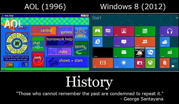
It makes just as much sense to have a big full screen app launcher (Metro) when you want to run something, rather than a tiny Start menu with an annoying series of nested folders you have to hunt and peck through to find your apps. Metro is more like the Win 7 taskbar model, where you pin things you want to it. Who needs to pick through all the clutter that came along with installing applications (uninstallers, readmes, etc?) just show me a big grid of applications and I'm more productive in launching what I want.
And as far as launching it without a button: putting the mouse in the lower left corner accomplishes the same thing without cluttering up the taskbar. Or the Windows key on the keyboard, which has been given an actual use after 15 years by bringing up/hiding the Metro screen.
Metro doesn't have gamepad support and can't be opened on the secondary display (only defaults to primary). Boo![/QUOmTE]
No, you can use Metro on any monitor.
No it does not. It did right up until the final release. They think transparency is tacky now.
I don't like that it's gone.. But then again I haven't had the chance to use the final version.
Maybe that's just it: I don't view having smartphone-like operations on a device that is not a smartphone, is not controlled like a smartphone and has completely different user interface requirements from a smartphone as a step forward.
To everybody saying "lollol just go to the desktop retard", don't you see why this is such a shitty concept? They ripped out one shortcut system and stapled on a new one clearly designed for tablets. You are buying a new OS that is no steps forward, two steps back. Why would a PC user upgrade for a shittier setup, just because they can still do (only) most of the things they used to?
The whole idea is silly. Make PC GUIs for PC, please. Full screen isn't the problem. Big icons easily readable on a TV would be a bonus, even, if the whole setup had nothing to do with a mouse and keyboard. Hell, it doesn't even support Microsoft's own controllers!
One question: have you used it?
Here are the reasons why I installed Windows 8 on my gaming computer. Disclaimer: yes I work for Microsoft, etc. etc., as I've mentioned in every thread on the subject.
It's not change for the sake of change. It's the creation of a single user interface that works well on all form factors. But most importantly, it works well on systems that blend together multiple form factors.
The future will not be today. People won't walk around with a laptop in one hand and a tablet in another, with a Desktop PC sitting at home. The future is a single device that can do all of that stuff - light enough with good enough battery life to use as a tablet for consumption, a keyboard you can plug it into to use it like a laptop, and a dock you can plug it into at home to hook it up to a giant monitor or multiple monitors for productivity.
Yeah I don't like that either. I guess it could be argued that the taskbar is supposed to kind of blend in with the wallpaper... But I think I prefer how it is now on the Release Preview, with transparent windows too.The weird thing is that the taskbar is still transparent, although the windows are not. Would having options have been so bad?
I know how to work the start menu, but still don't consider it an improvement.


