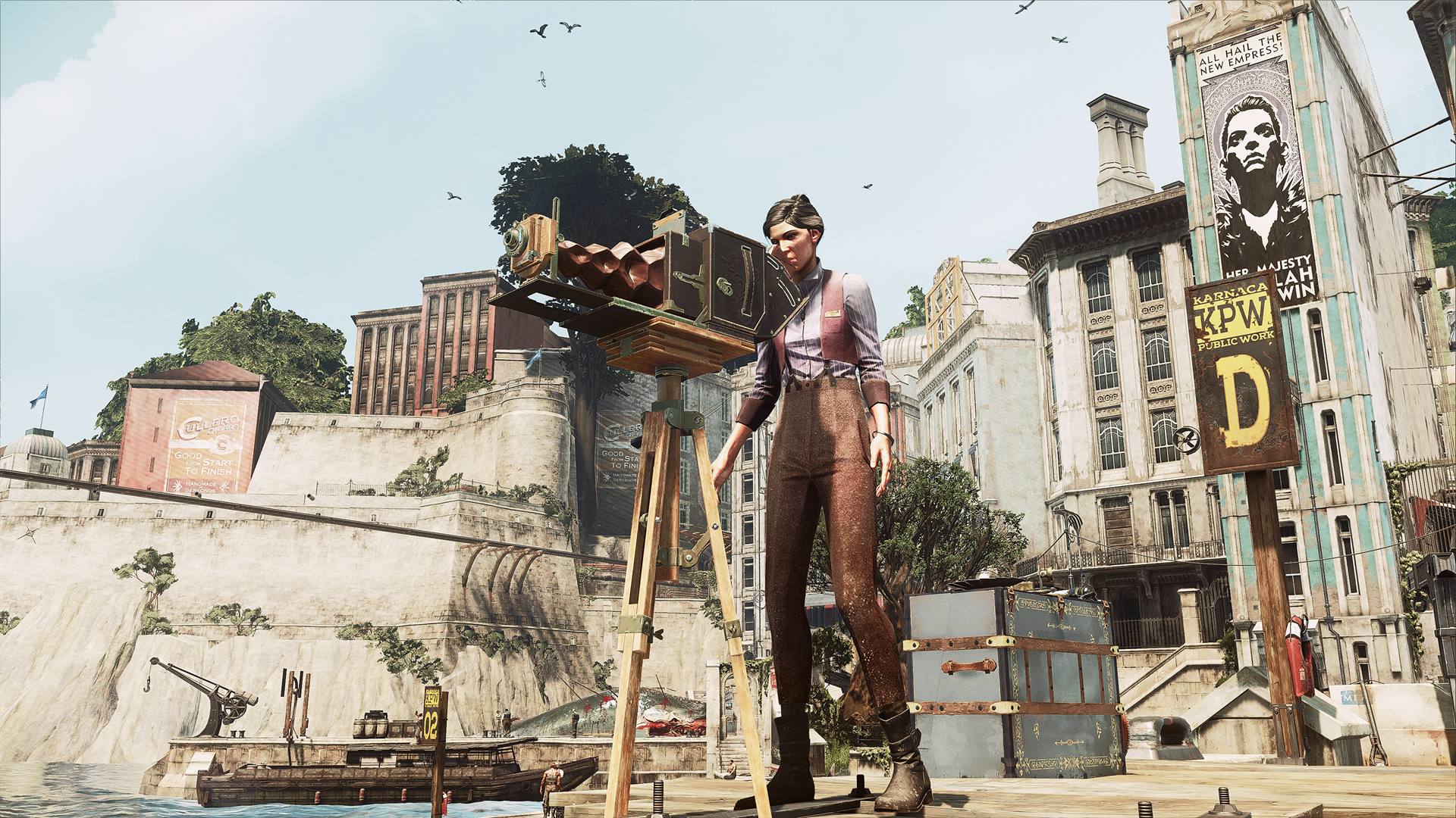
-
Hey Guest. Check out your NeoGAF Wrapped 2025 results here!
You are using an out of date browser. It may not display this or other websites correctly.
You should upgrade or use an alternative browser.
You should upgrade or use an alternative browser.
2017 PC Screenshot Thread
- Thread starter Stallion Free
- Start date
Biocoincoin
Neo Member
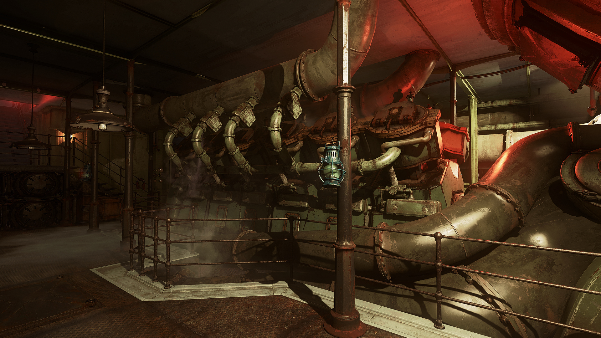
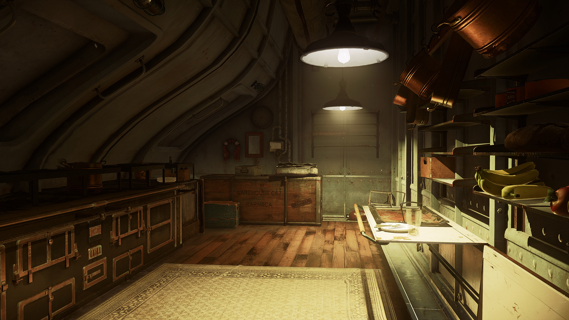
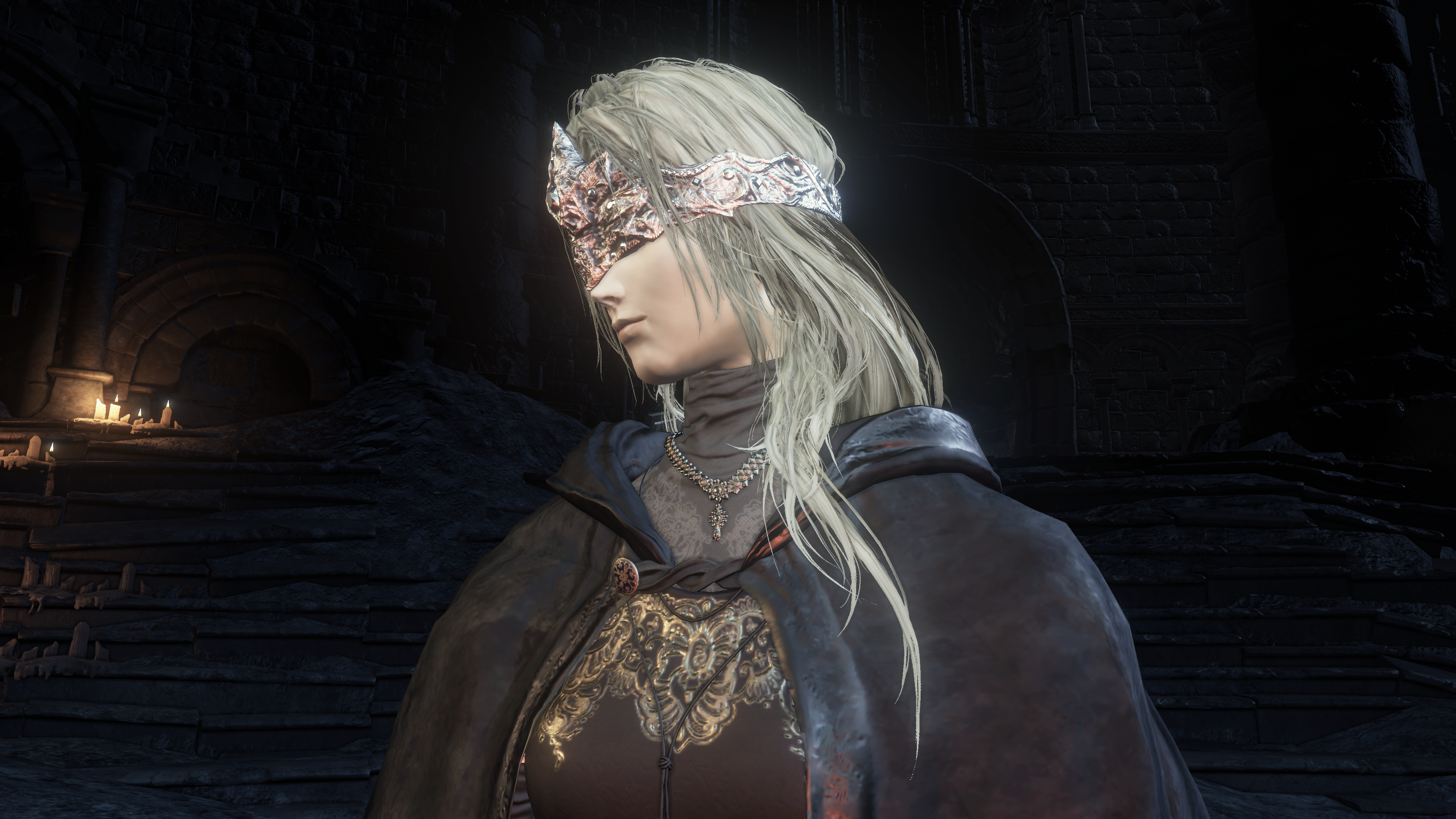
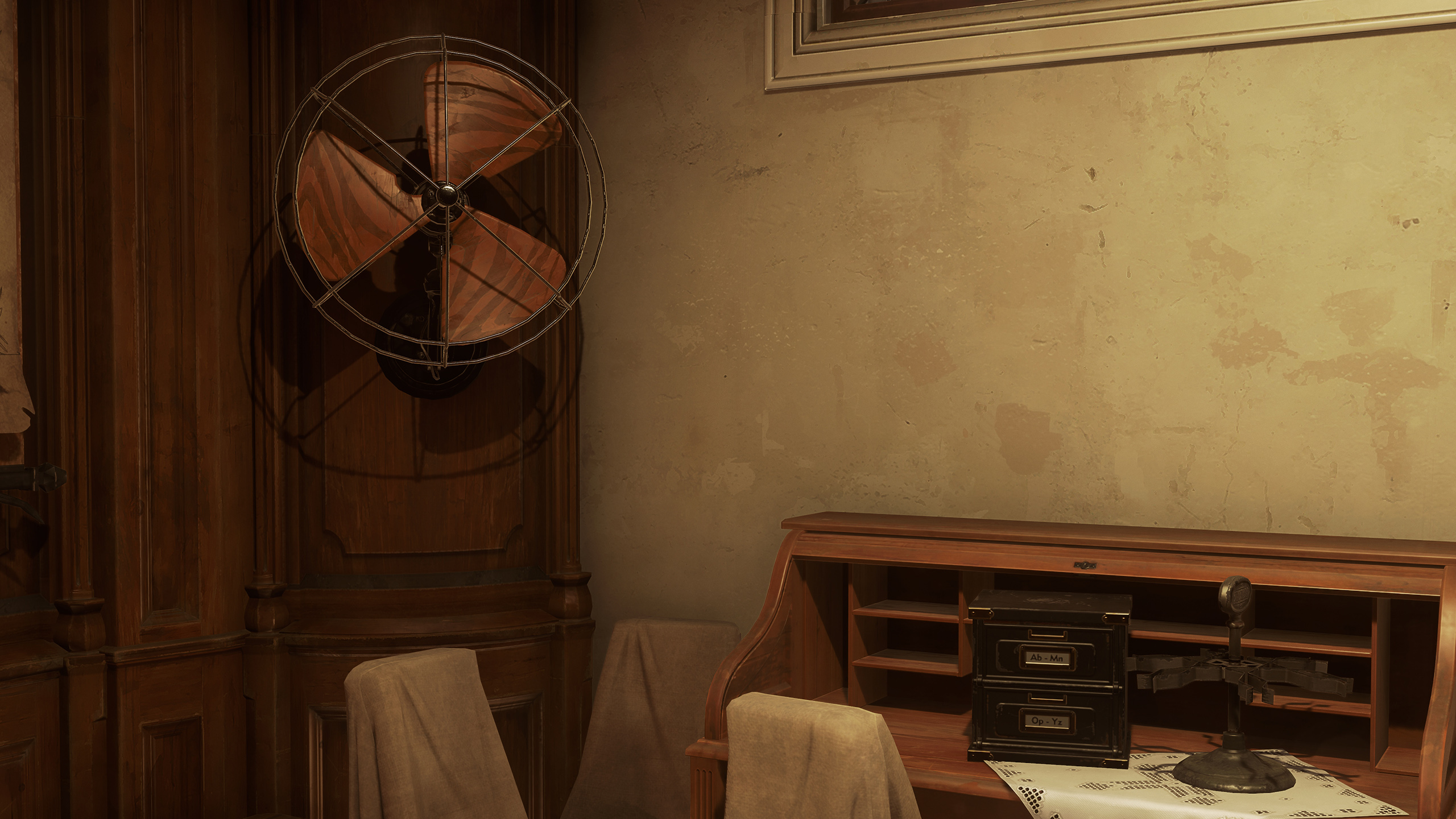
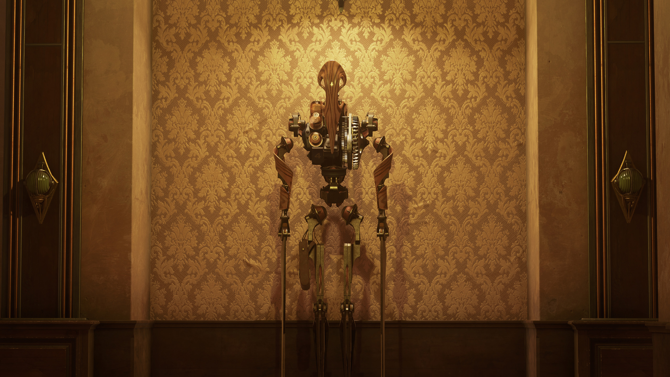
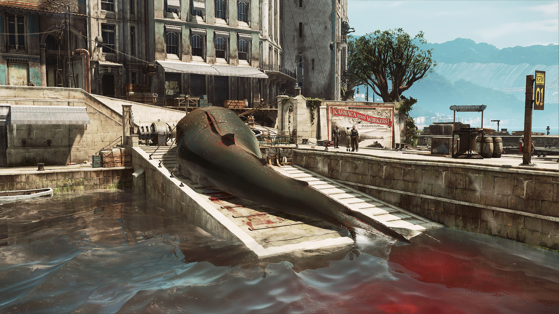
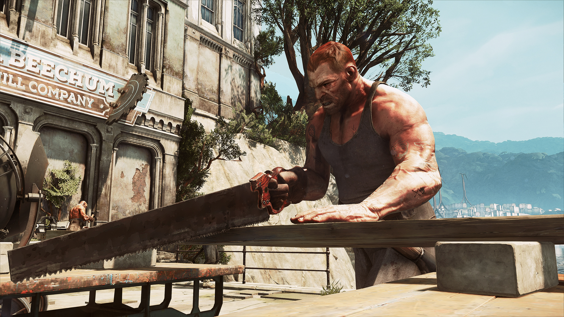
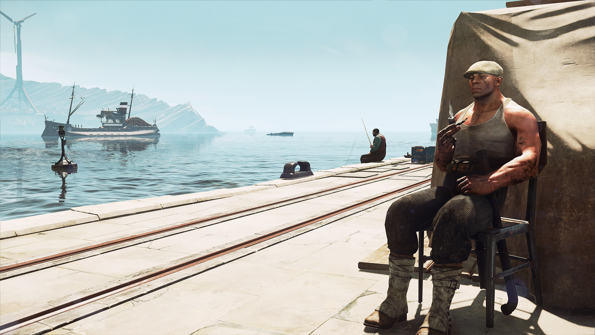
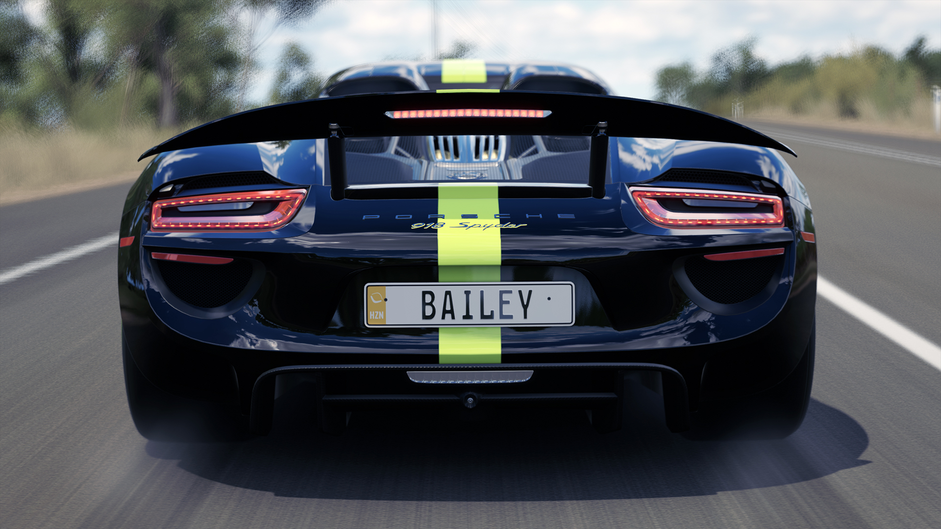
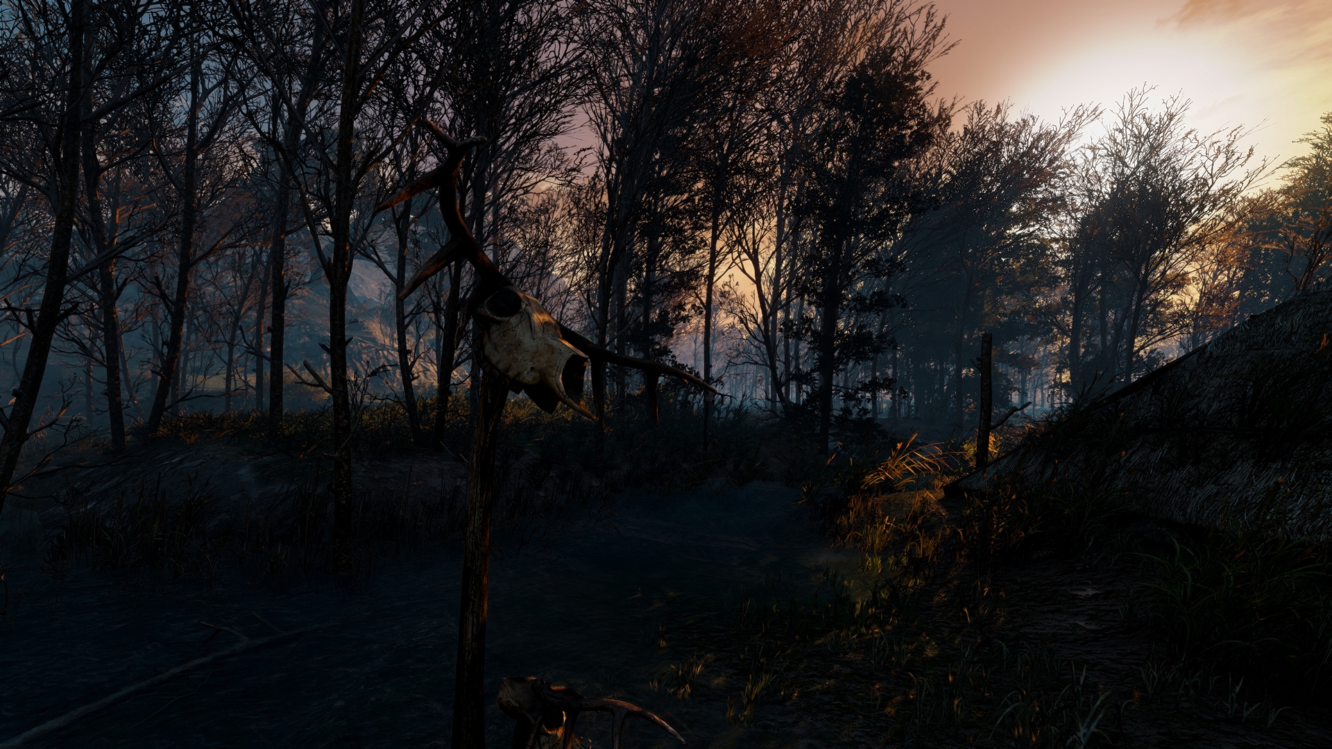
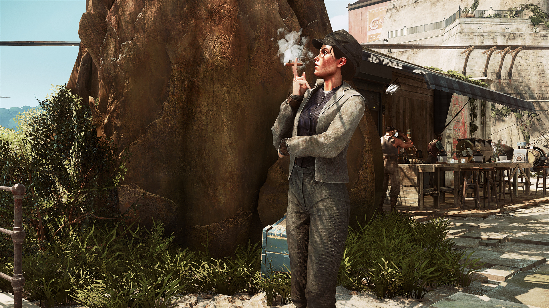
Dishonored 2 (November build) @ 2160p w/ Reshade
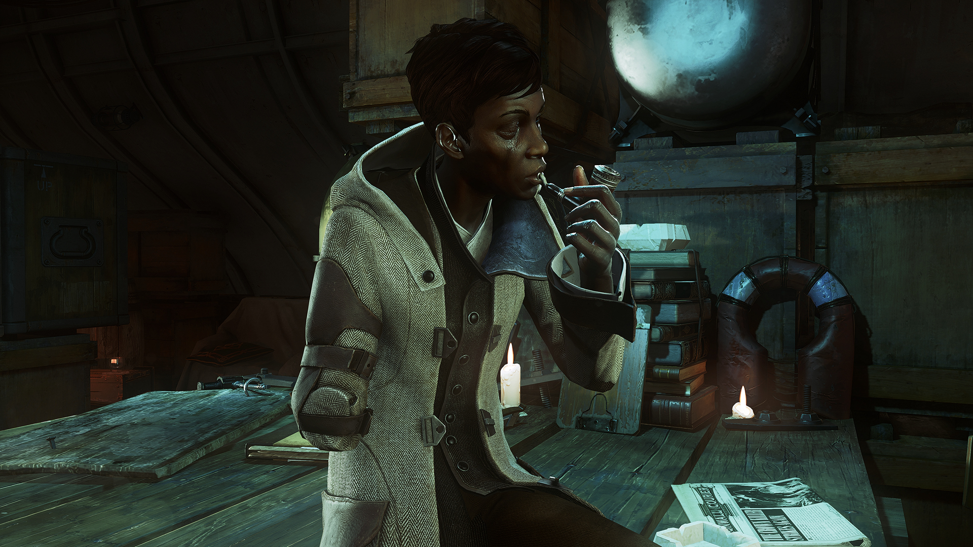
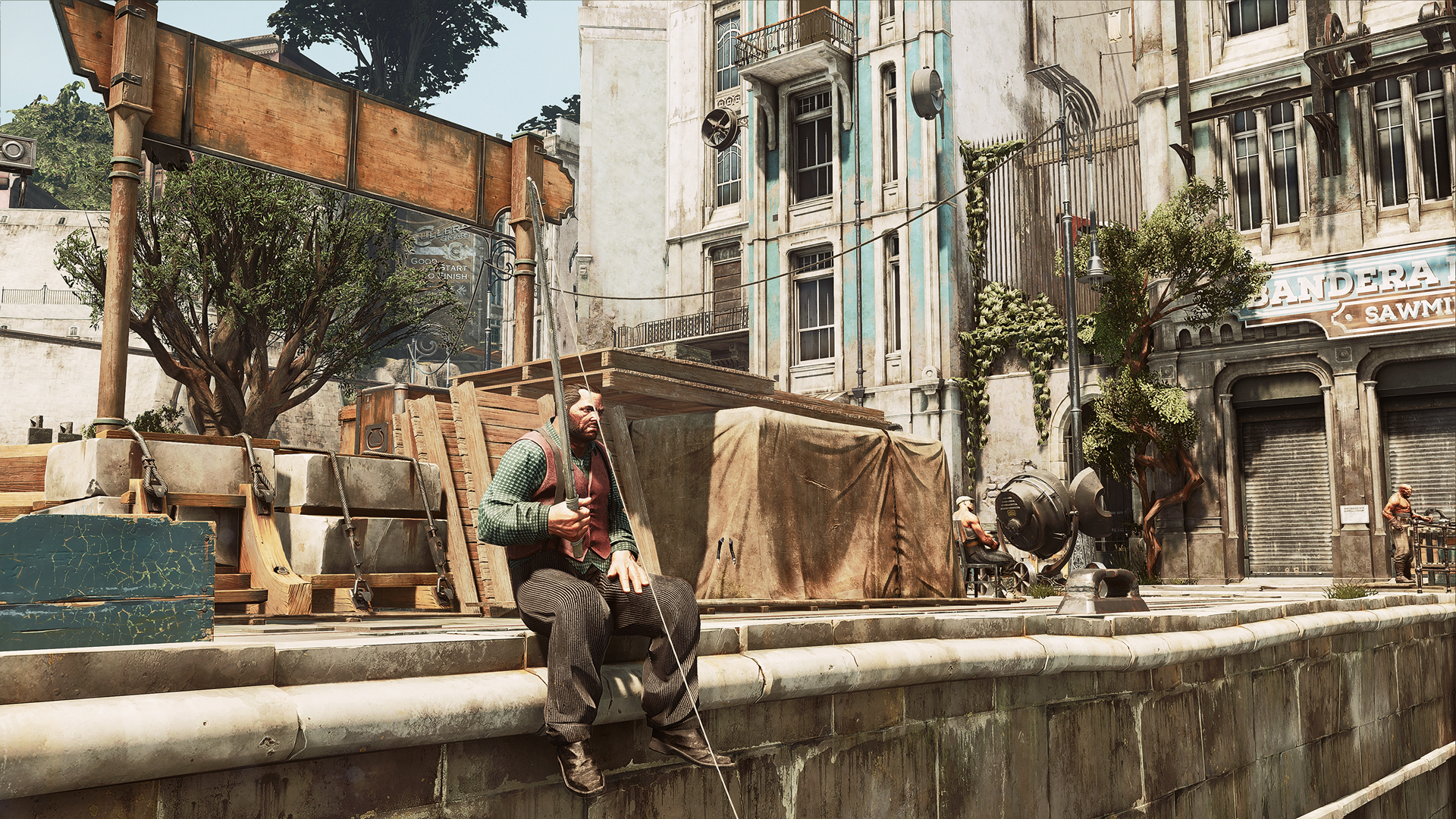
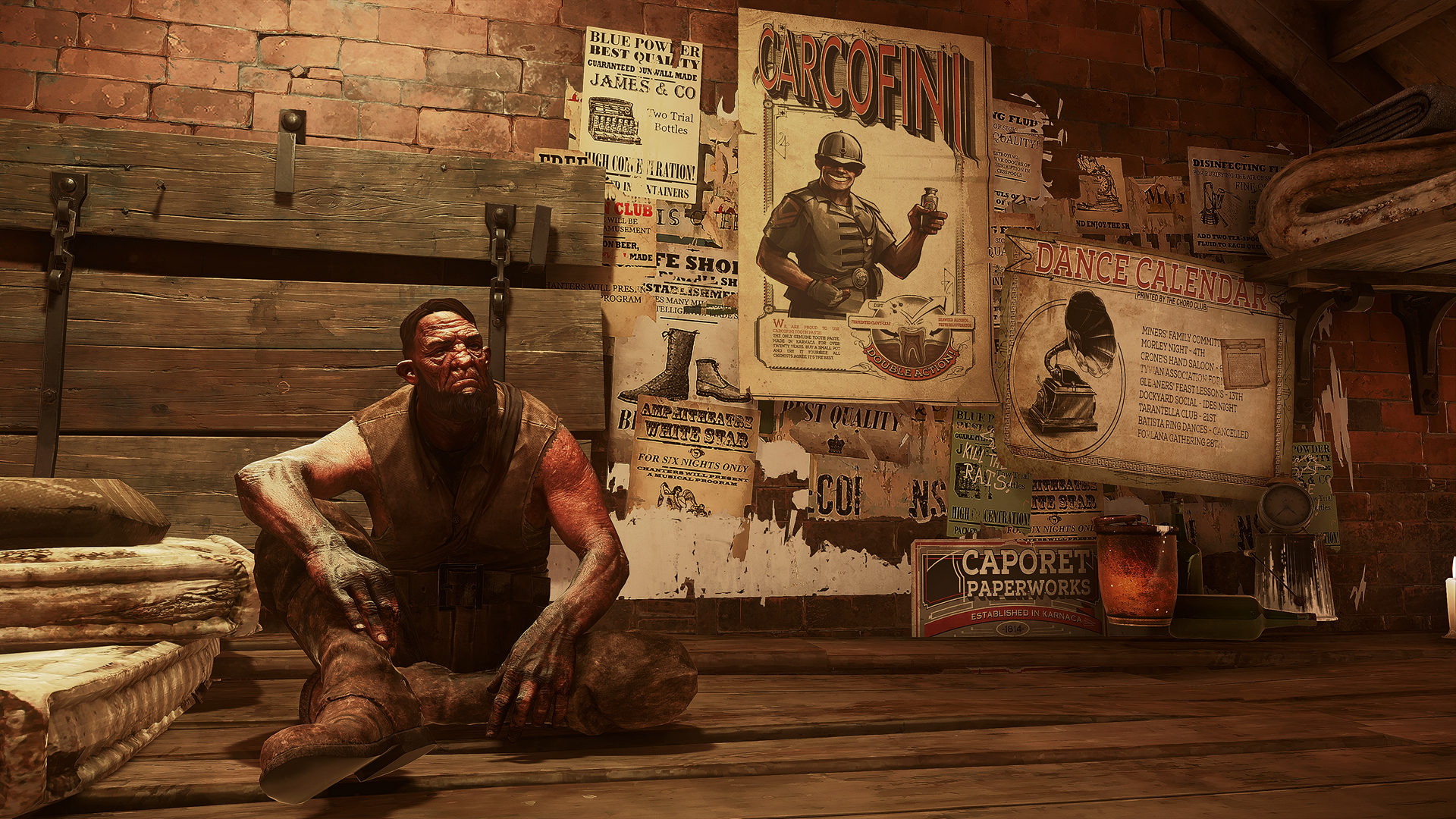
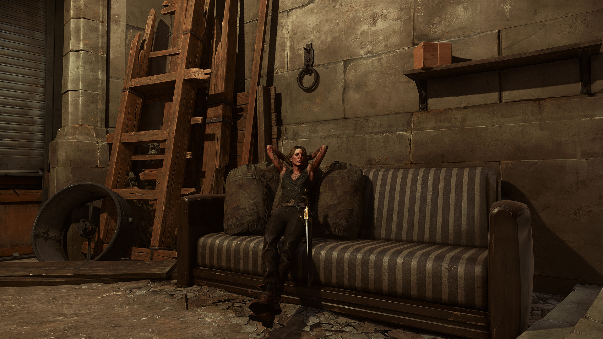
Playing Death of the Outsider right now and it awes me how wonderfull these games are, Void engine really does wonder and produces great atmospheres. Plus the game is great.
It's a shame that Dishonored 2 did not succeed. I would have loved an episodic format with the series.
Playing Death of the Outsider right now and it awes me how wonderfull these games are, Void engine really does wonder and produces great atmospheres. Plus the game is great.
It's a shame that Dishonored 2 did not succeed. I would have loved an episodic format with the series.
The environmental art design is absolutely stunning! That attention to detail is impeccable.
I didn't know it underperformed. I thought the sales were pretty decent?
Noobhammer
Neo Member
The environmental art design is absolutely stunning! That attention to detail is impeccable.
I didn't know it underperformed. I thought the sales were pretty decent?
The PC launch had some performance issues creating some negative feedback.
It's pretty well fixed for most people though is still a pretty demanding game.
I haven't heard of it performing poorly overall. I'm not sure what their profit margins ended up being.
I love the visuals though. I'll straight up call it the greatest looking game.
The concept artists (Sergey Kolesov, Piotr Jabłoński and many more) and environment artists (Yannick Gombart, Geoffrey Rosin and many more awesome people) worked really well together to create a super polished game visually. Everything fits design wise.
I also like that the textures aren't noisy. Too many games (and frequently texture mods) have way too much contrast and grit to their textures in the diffuse map. That stuff needs to be reserved more for roughness. Also the combination of stylised and realistic physically based rendering is so fine.
Example:
DigitalEpicness
Member
Dream_Journey
Member
Woah, this is epic!
And these are fantastic for sure!
Cyborgmatt
Member
Lux R7
Member
InquisitorAles
Member
Noobhammer
Neo Member
Aberration is love. Aberration is life.
All hail our new chromatic aberration overlords!
Noobhammer
Neo Member
Noobhammer
Neo Member
The Janitor
Member
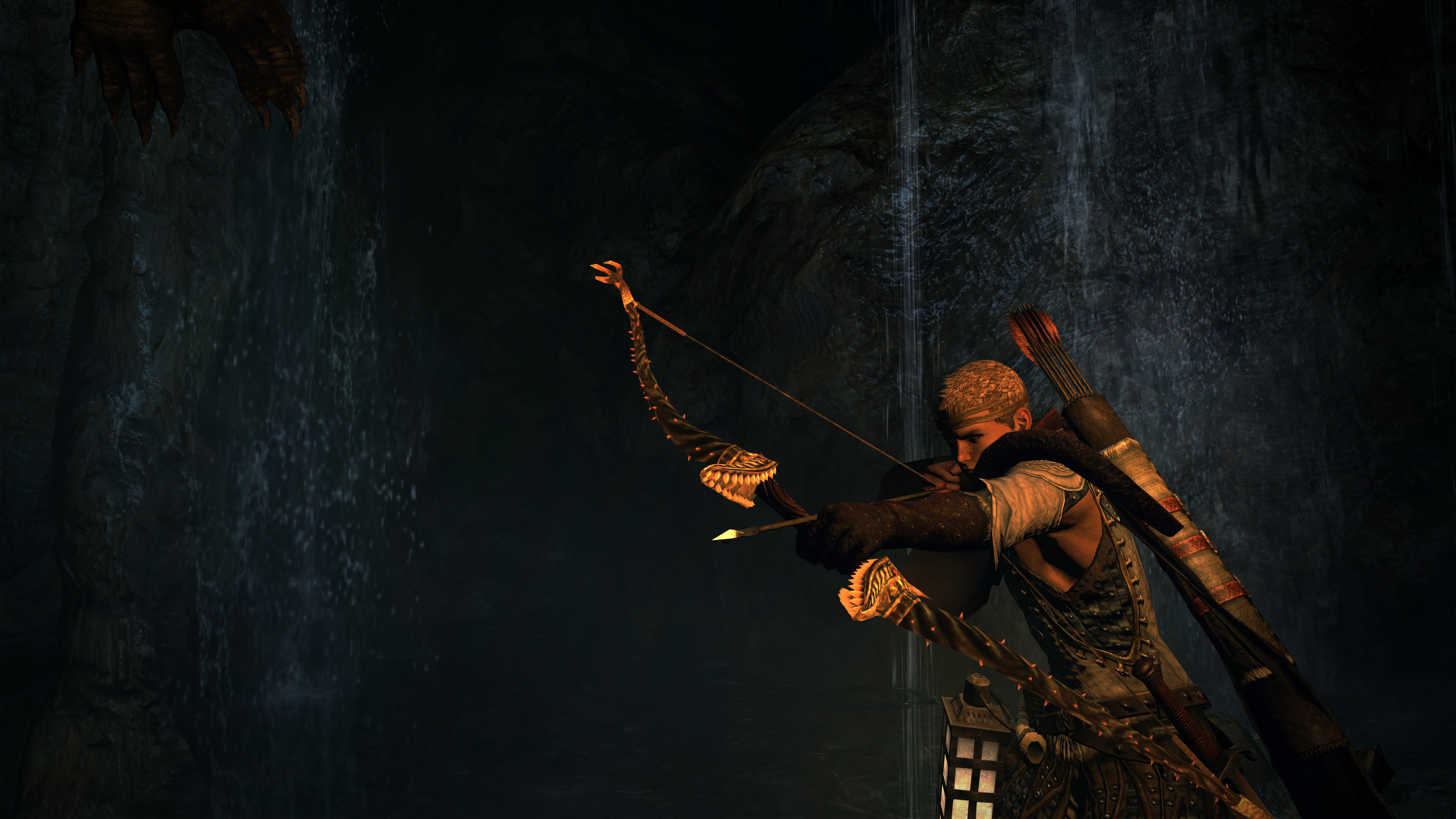
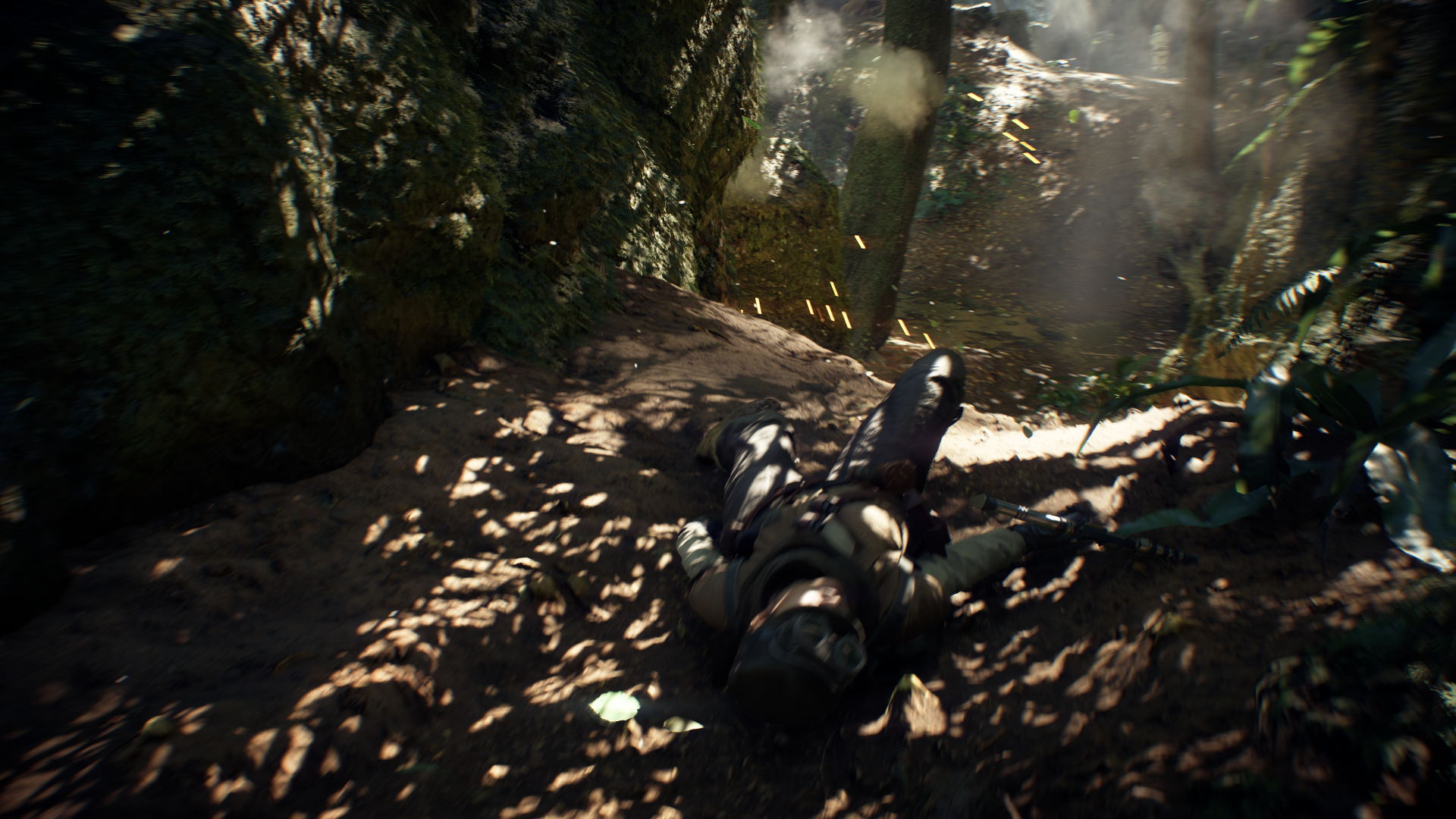
It's hard to take screenshots when people are shooting at you 

InquisitorAles
Member
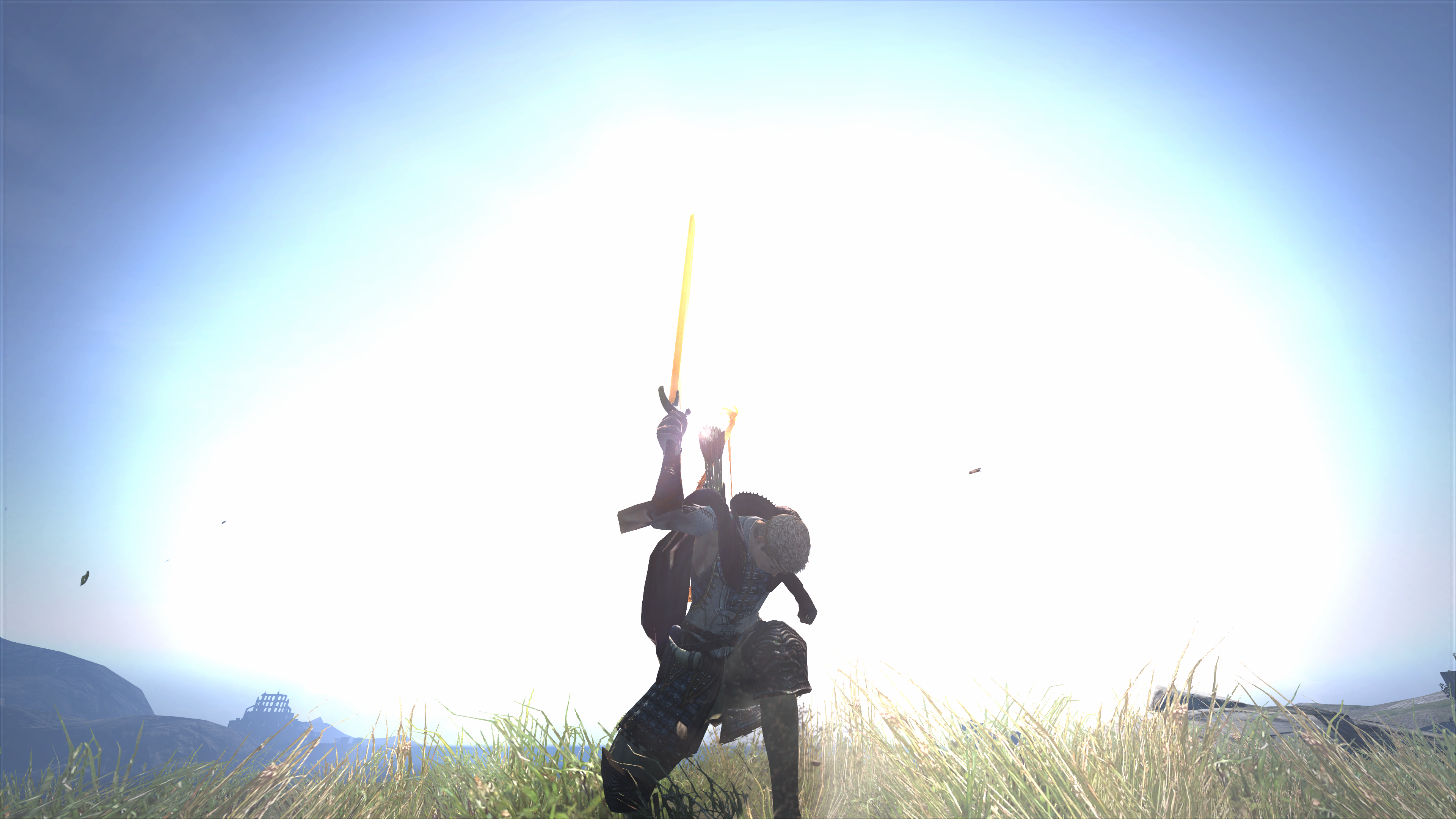
Drop your weapon? Here, take it!
Morrigan Stark
Arrogant Smirk
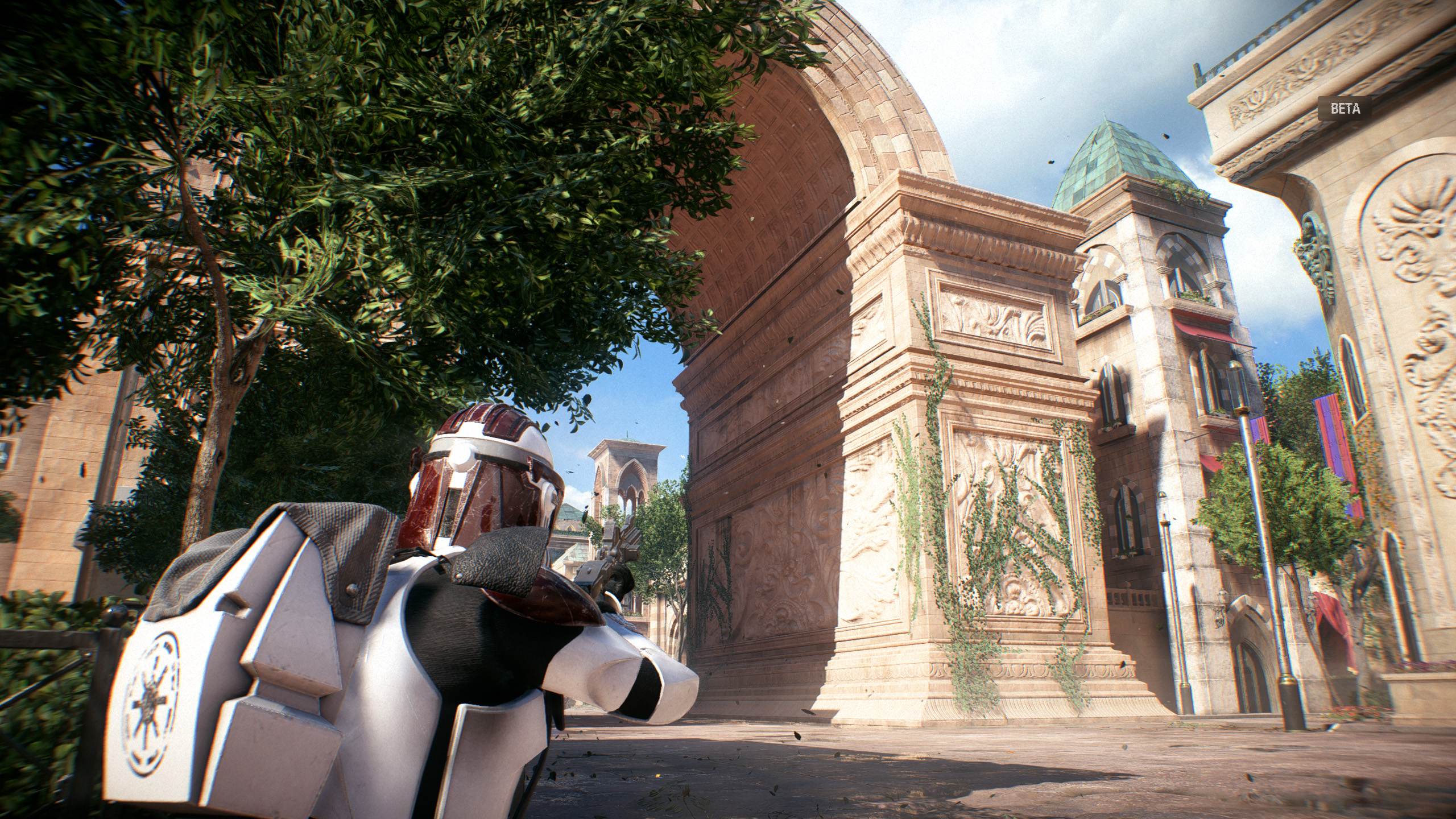
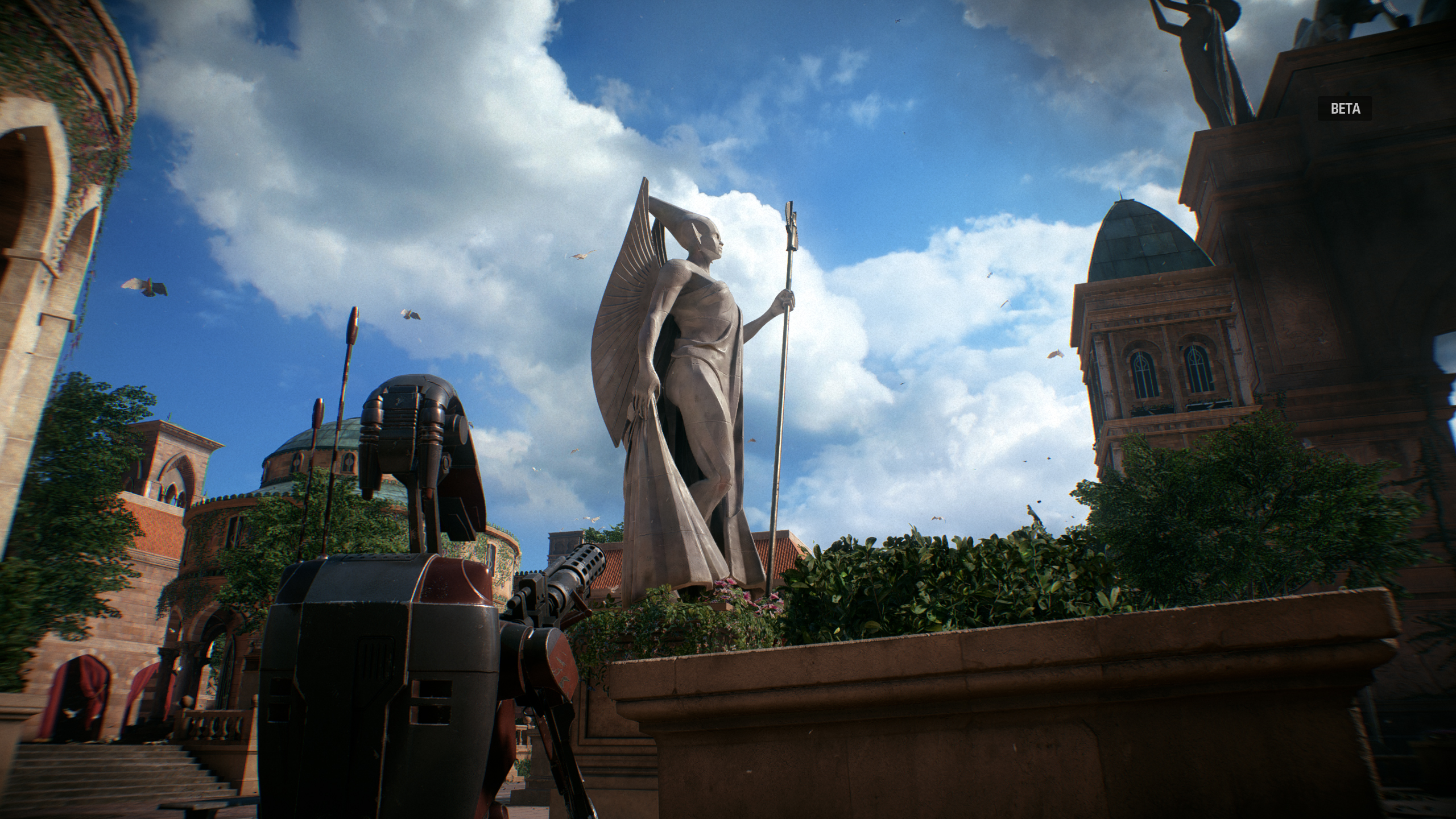
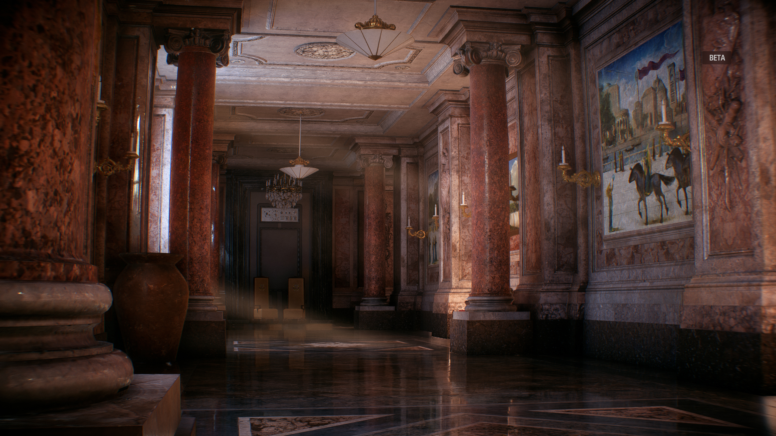
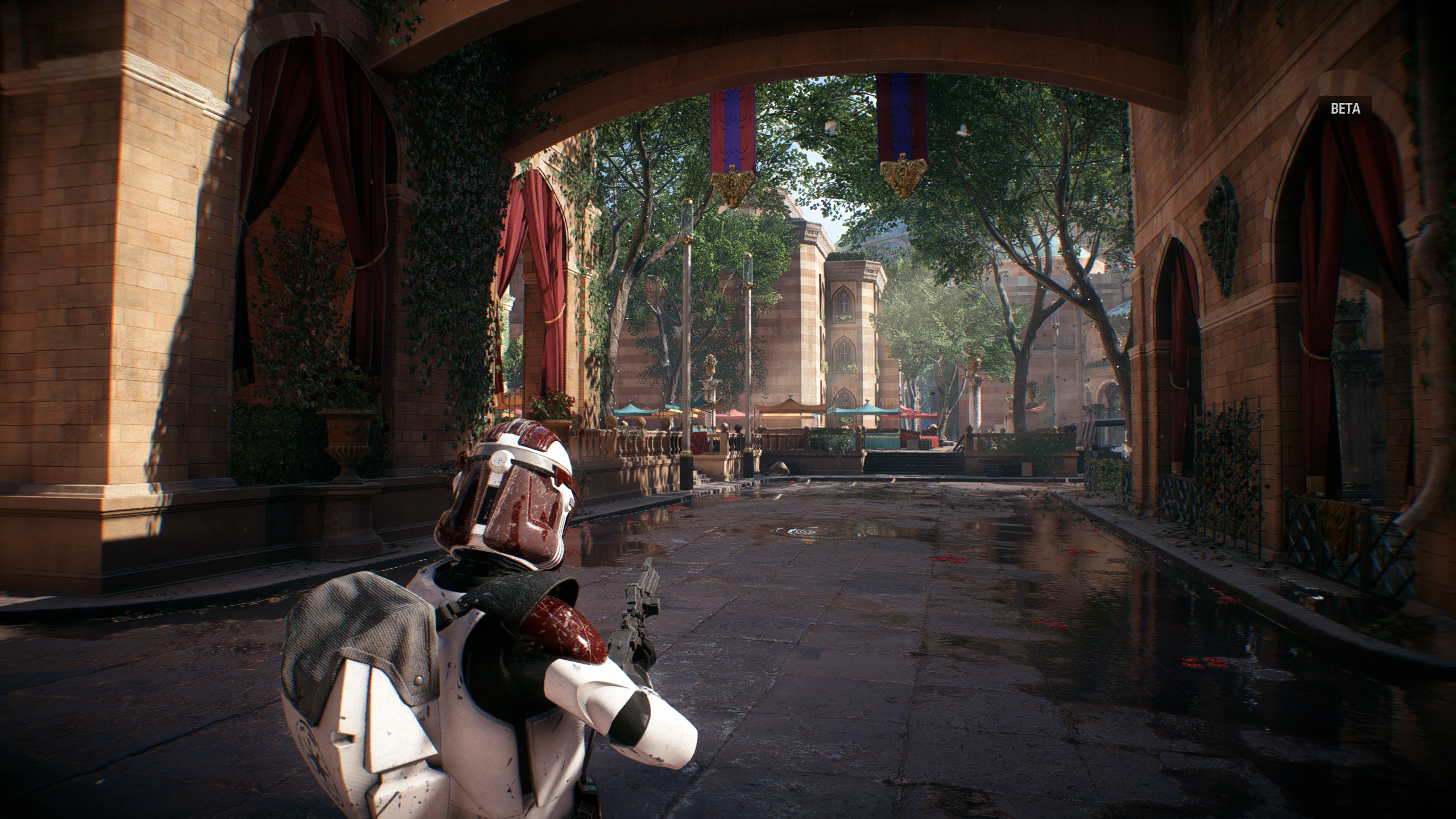
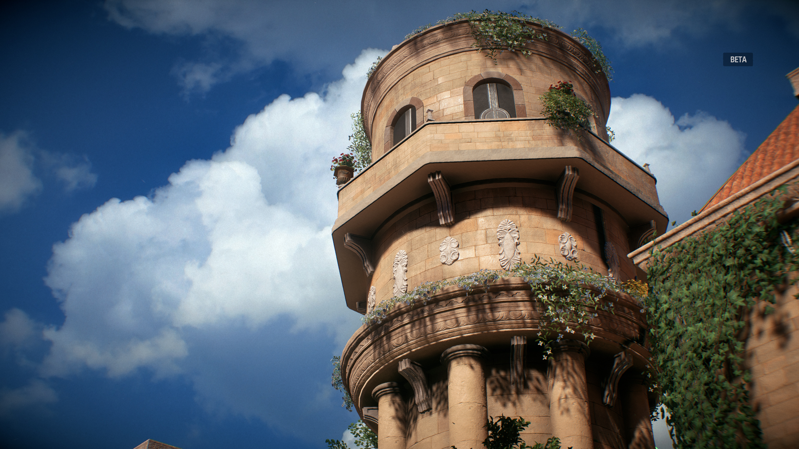
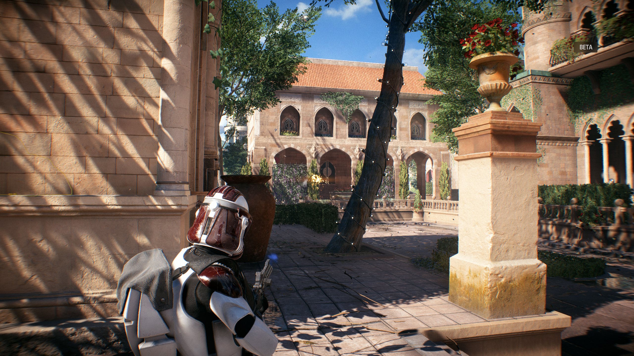
Battlefront 2 looks absolutely insane, just like the previous game. Holy hell.
Those recent Blood and Wine shots though... what's with the ridiculous saturation? Looks like a Disney/Kinkaid artwork lol
Those recent Blood and Wine shots though... what's with the ridiculous saturation? Looks like a Disney/Kinkaid artwork lol
Noobhammer
Neo Member
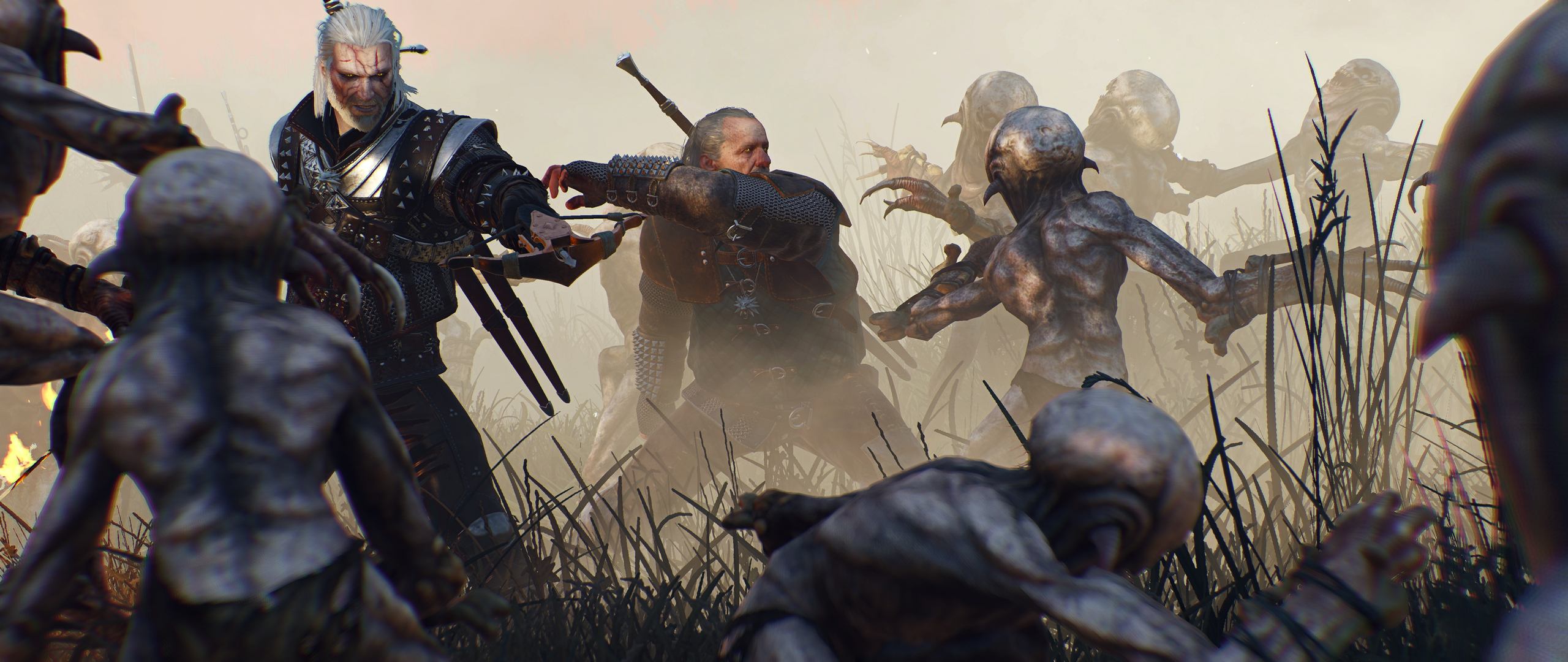
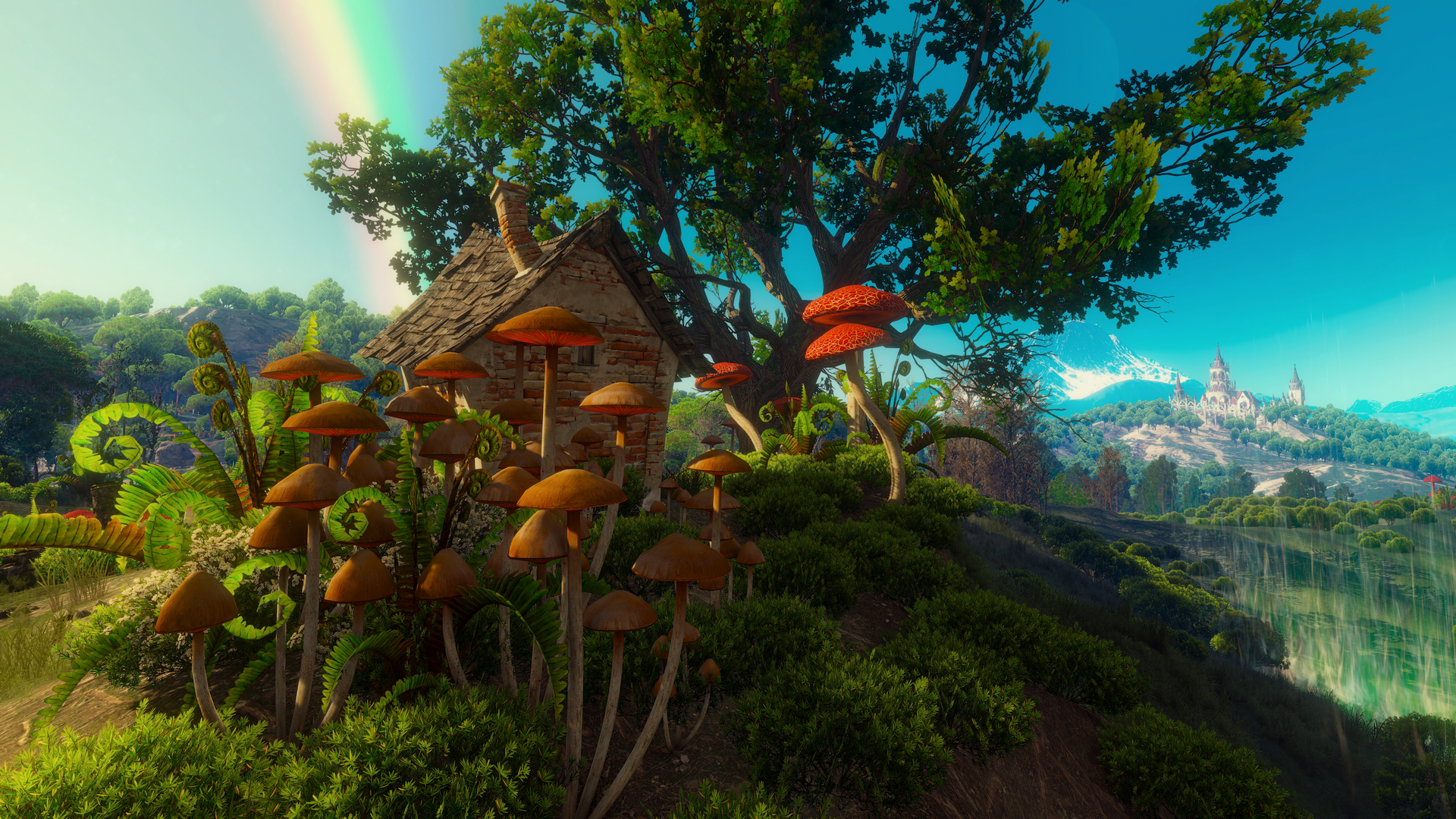
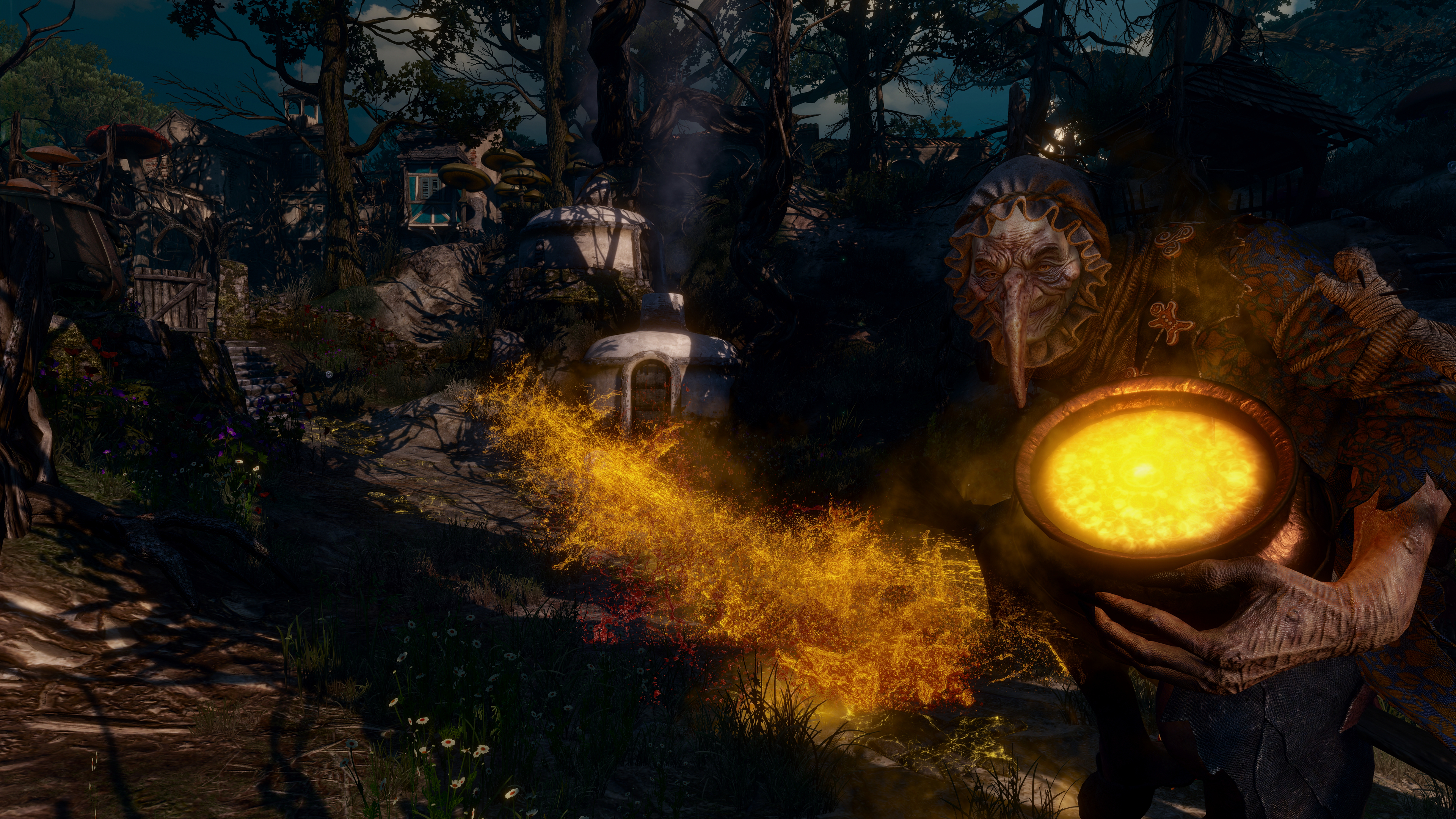
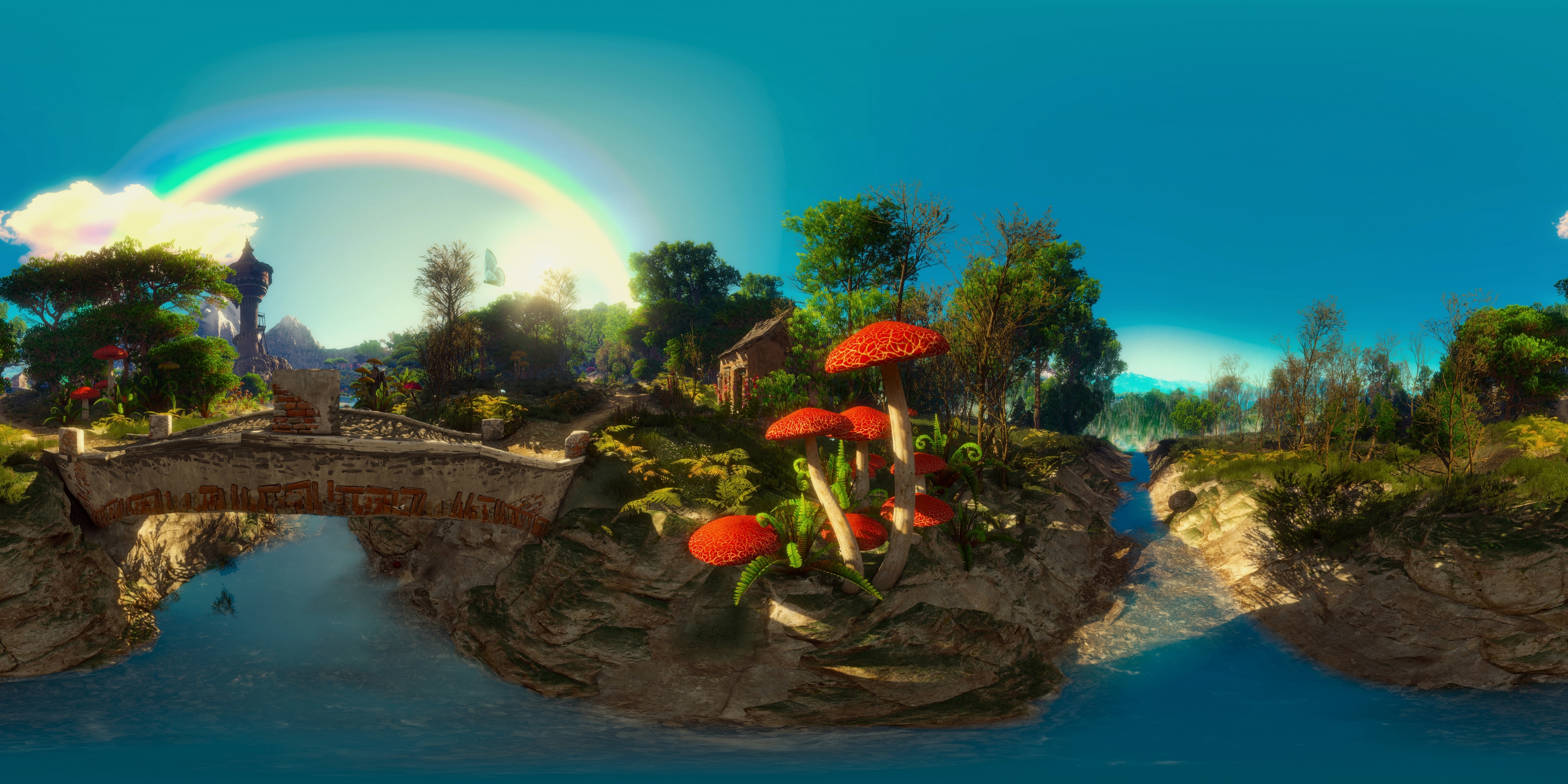
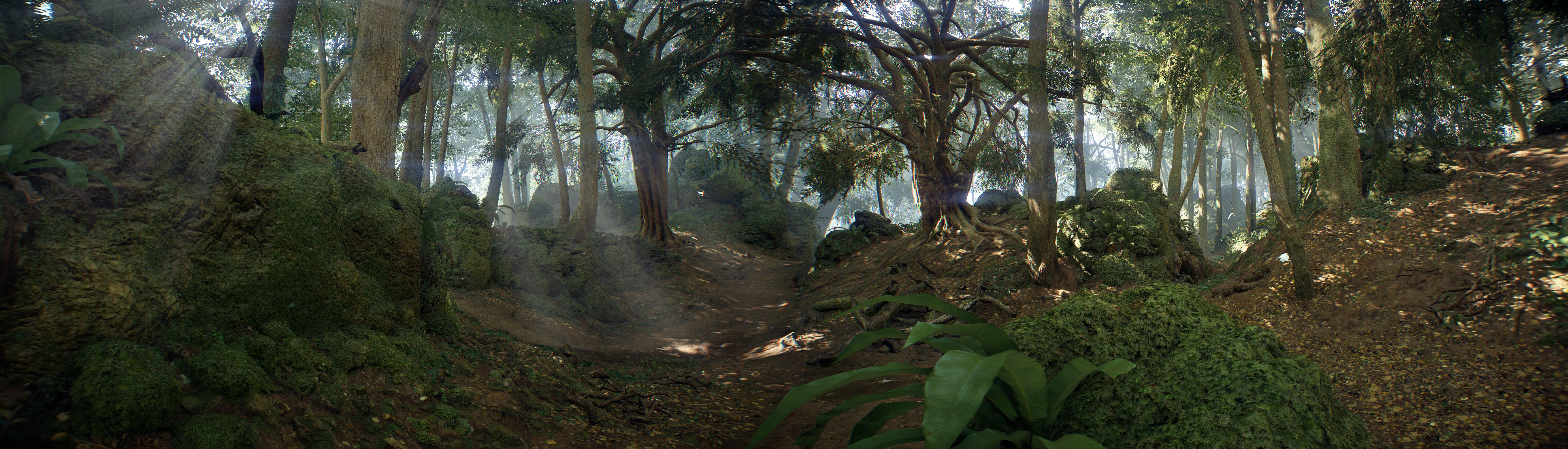
Cant get over how awesome this area looks. Not too sure how to get rid of the banding in the sky around the rainbow though. Still learning how to take good shots, advice would be appreciated
https://abload.de/img/witcherpanoraman7usx.jpg
Those recent Blood and Wine shots though... what's with the ridiculous saturation? Looks like a Disney/Kinkaid artwork lol
Not sure about fixing banding but lowering saturation might help.
I think overall though your palette just needs to be a bit more simplified. You currently have Reds, turqouise, blues, oranges, greens all trying to compete at 90+ levels of saturation. You can go highly saturated if you like, but you just need to balance what colours you want saturated and what ones you don't. Same goes for levels (how bright or how dark parts of an image are). You need a balance for your foreground middleground and background.
That said, even aside from sweetfx tweaks, I'm personally not really a fan of the colour grading in the Witcher. I think it's kind of tricky to fix short of just desaturating it, as it's not like you can have a different sweetfx profile for every area and time of day in the game.
Here are some ideas for balancing out the saturation.
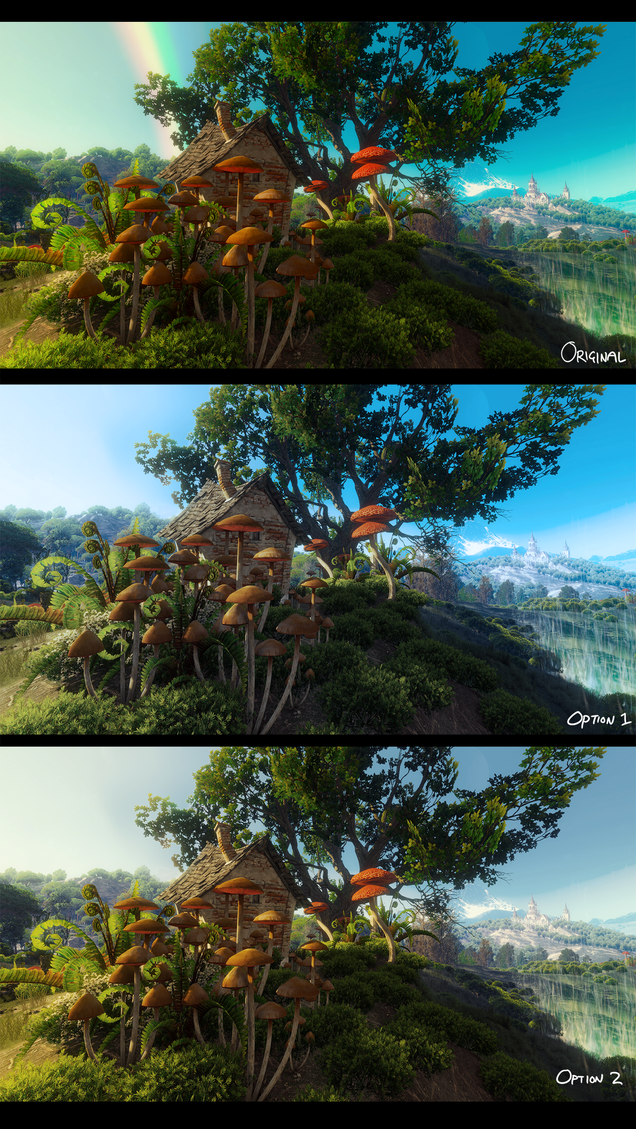
Don't take my comments to heart though, remember I'm just some internet random.
Keep up the screenshotting homie!
")
fabricated backlash
Member
wtf? lol
I love that they included the Bremer Stadtmusikanten. Loved that story as a kid.
Have a Nice Day
Member

DigitalEpicness
Member
Hatti released something to apparently get rid of the CA and also other stuff.Aberration is love. Aberration is life.
All hail our new chromatic aberration overlords!
https://twitter.com/Hattiwatt1/status/916622762617327616

Noobhammer
Neo Member
Hatti released something to apparently get rid of the CA and also other stuff.
https://twitter.com/Hattiwatt1/status/916622762617327616
Sweet! I had to uninstall the Beta early though to stop procrastinating. This time of year is crunch time for both my work and study. I've had my fun for now.
That said, good to know, even if Dice don't fix it for release, we can. Thanks for the headsup GG
Lockjaw333
Member
Aberration is love. Aberration is life.
All hail our new chromatic aberration overlords!
That and the film grain ruin the IQ.
They should be toggle options in the final release.
keraj37
Contacted PSN to add his card back to his account
Noobhammer
Neo Member
That and the film grain ruin the IQ.
They should be toggle options in the final release.
Tbh, I don't hate CA and blur in general. Usually I quite like a little bit of both.
They just pushed it waaay too far. You shouldn't have that many pixels of distortion and that far in from the edge. It's also an effect that is better added on a case by case basis.
I think the grain is fine though. I find it homoginises the image. Makes it look less "videogamey".
Still, like you say, can't hurt to have a toggle. Or better yet: a slider.

Those recent Blood and Wine shots though... what's with the ridiculous saturation? Looks like a Disney/Kinkaid artwork lol
It's by design, which is to say the screenshots haven't been fiddled with. The Disney/Kinkaid comparison is apt as the region they were taken in is actually called the Land of a Thousand Fables and the oversaturated colours give it a warm, otherworldly feel.
Dream_Journey
Member
Noobhammer
Neo Member
It's by design, which is to say the screenshots haven't been fiddled with. The Disney/Kinkaid comparison is apt as the region they were taken in is actually called the Land of a Thousand Fables and the oversaturated colours give it a warm, otherworldly feel.
Christ... well, I guess I direct my criticisms directly at CDPR, haha.
I really don't get the art direction in that game. I guess I'm not much of a "high fantasy" fan in general. Each to their own though. It's visuals are still pretty popular.
Amusingly one of my assignments at university right at the moment is redesign 3 locations from the Witcher 3. No joke.
Reducing the in-game AA reduces the CA, if I recall correctly. Worth a try!Speaking of CA, is there any way to remove it in Mafia III? I thought downsampling would help but unlike bloom the CA scales properly with resolution.
Morrigan Stark
Arrogant Smirk
It's by design, which is to say the screenshots haven't been fiddled with. The Disney/Kinkaid comparison is apt as the region they were taken in is actually called the Land of a Thousand Fables and the oversaturated colours give it a warm, otherworldly feel.
Yeah I figured it was how the game was coloured, not the screenshot taker's settings.
I haven't played Blood and Wine, but is this supposed to be a "dream" sequence or alternate universe or something like that? [Edit: sounds like it is, yeah] Even so, that's a strange choice, that cutesy colour scheme is bleeeech
Haha, well, it is a magical realm created for two young children.