-
Hey Guest. Check out your NeoGAF Wrapped 2025 results here!
You are using an out of date browser. It may not display this or other websites correctly.
You should upgrade or use an alternative browser.
You should upgrade or use an alternative browser.
A NeoGAF iPhone Web App
- Thread starter ckohler
- Start date
- Status
- Not open for further replies.
i was juniored once. i believe being juniored is supposed to be indefinite, but it's definitely possible to become a member again.Well, long-story-short, I got Junior'ed for making voting threads on the Gaming side and "having a bad track record with making threads on the OT side." It took me about a month to finally get some kind of response from the mods as to why I was Junior'ed, and at one point I got banned for two weeks for asking about it in unrelated threads.
After all of my open discussion about being Junior'ed, I guess one of them thought it would be funny to change my tag and avatar to match.
Shit sucks, man. I really miss starting threads and considered leaving GAF altogether after I got Junior'ed (especially after getting the cold shoulder from all the mods), but I decided to just stick it out. I still love this community, even if the moderation can be really harsh.
I hope to at least get my old avatar back someday... GAF Gold. Nevar forget!

yeah, probably a good idea to wait and see how it pans out. i just noticed the second community board now. so weird.I want to wait to see how this sub-forum stuff shakes out before doing anything. If it sticks, having subforums for two major forums is going to impact the design and layout of the drop down menu as well as the forum lists themselves.
Thanks dude. Much appreciated.
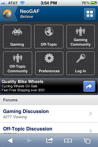
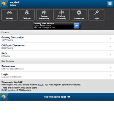
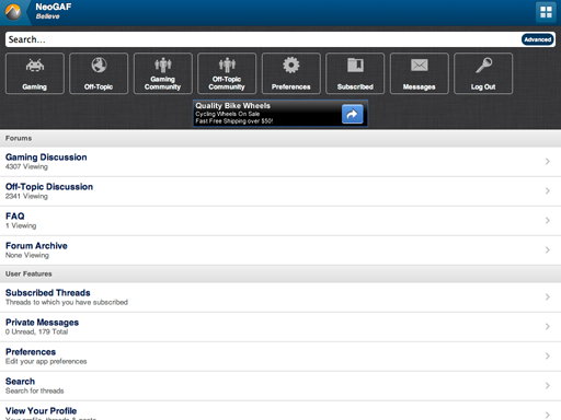
I've been pondering the changes to NeoGAF Prime and how they will affect the mobile app design. Obviously the Shortcuts Menu would need to change. First up, I would like to ditch those always-shown forum buttons. They're ugly, take up too-much vertical space and now there's too many forums anyway. So, here's my idea. Keep in mind that this is just a mockup and that the icons for Gaming Community and Off-Topic Community can look unique.
iPhone Portrait (Logged out and Logged In):
iPhone Landscape (Logged Out and Logged In):
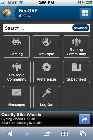
As you can see, I've changed the way the buttons work so that they float to fill the space. They also have a max width now so they utilize more space on tablets. For example:
iPad Portrait (Logged Out and Logged In):
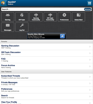
iPad Landscape (Logged In):
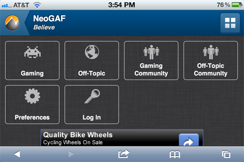
iPhone Portrait (Logged out and Logged In):
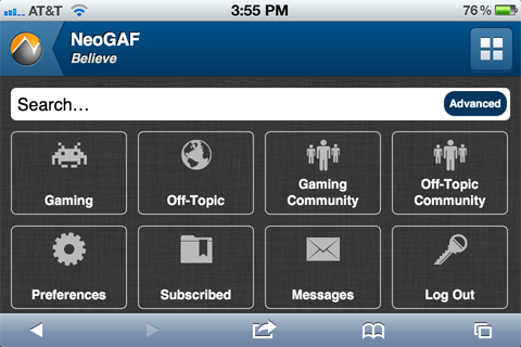
iPhone Landscape (Logged Out and Logged In):
As you can see, I've changed the way the buttons work so that they float to fill the space. They also have a max width now so they utilize more space on tablets. For example:
iPad Portrait (Logged Out and Logged In):
iPad Landscape (Logged In):
How about having two buttons for Gaming and Offtopic, each being half main and half community? [|] I only have my Kindle Fire to go off of but it seems big enough.
The text would stay the same size (over the entire button), but the second half of the button would have the community logo somewhere on it.
The text would stay the same size (over the entire button), but the second half of the button would have the community logo somewhere on it.
Decided to play around with the CSS. Came up with this. Nothing final, but I think it would solve some of the spacing problems you are running into with the new sub-forums.

btw, if you haven't played with it, try enabliing * { box-sizing: border-box; }. It treats the box model correctly, allowing you to more easily assign percentage width and padding without worrying about mixing in some pixel declarations.
btw, if you haven't played with it, try enabliing * { box-sizing: border-box; }. It treats the box model correctly, allowing you to more easily assign percentage width and padding without worrying about mixing in some pixel declarations.
If you notice, with my solution the "community" boards would be the only menu items taking up a large amount of space. All of the other menu items would remain nice and tidy. Not ideal, but you waste less pixels on those 2 menu items instead of the other 6.
I think looking at this from the perspective of the logged in view first is really the way to go. Logged out can be whatever (it's hidden anyways by default), but we are really tailoring the experience to loyal members. If the logged in view has to deal with 8 buttons, then let's design off of that.
I think looking at this from the perspective of the logged in view first is really the way to go. Logged out can be whatever (it's hidden anyways by default), but we are really tailoring the experience to loyal members. If the logged in view has to deal with 8 buttons, then let's design off of that.
Maybe I am misunderstanding because I'm not really sure what you're trying to accomplish, pxleyes. We're not out of space in the menu. The menu is hidden until you reveal it so how much space it takes up is not really a problem. Making the buttons smaller doesn't really help because the menu buttons aren't shown until you reveal them at which point they can take up the whole screen if necessary.
I think the point is that the layout is sort of ugly when dealing with four subsets, on a 3byX grid. It can take up the same space but look nicer like that, as well.Maybe I am misunderstanding because I'm not really sure what you're trying to accomplish, pxleyes. We're not out of space in the menu. The menu is hidden until you reveal it so how much space it takes up is not really a problem. Making the buttons smaller doesn't really help because the menu buttons aren't shown until you reveal them at which point they can take up the whole screen if necessary.
Who knows how this community stuff will play out, though..
I would ignore the issue because the number of choices changes based on wether you are logged in or not and the amount of space changes from portrait to landscape. There is no way to avoid empty space so best to just ignore it.
Trust me, I DO consider these things.")
Of course you you can avoid it. I just did.
I still disagree with the mindset of designing for the 'logged out' view at all. Who cares what it looks like then? Isn't this mobile site really built for regular users of GAF anyways? I would contend that you should design for the 'logged in' view first and foremost. It does matter how it displays for us regular posters, and I think I've come up with at least a reasonable solution should the forum structure stay with separate community boards.
You have media queries at your disposal. It wouldn't take long at all to implement a similar layout to what I posted for phones and deliver the button layout you have been using for tablets.
I do not doubt that you think of these things, but you can always take it step further. I would think if you are going to bother with mocking up how the site looks for portrait, landscape, phones, and tablets; you should make layout adjustments that suit those devices' specific needs.
I prefer this ..................... to that.

pxleyes, thank you again for the suggestion. I understand what you're driving at but I still think it's a non-issue. Just consider that empty space to be "for future use" or just rotate to landscape and the space will be gone. Now, if the buttons were off the screen and you had to scroll, I might consider it an issue.
Will this mock-up replace the old secondapps page when it is completed?
Yes.
Refresh your pages/clear your caches kids. I went ahead and modded the Mockup with the changes so you can test it.
I don't understand why it goes:
[Gaming] [Off-Topic] [Gaming Community]
[Off-topic Community]
It seems unintuitive to not have Gaming community beside gaming and off-topic community beside off-topic
brianmcdoogle
Member
I really like that the subforms are now hidden by default and you have to press the button to show them. I never quite understood why it was like it before, because showing the subforms all the time added so much space, and did not look very good. Love this new change. If we can be a little bit picky, is there a reason why the buttons are so much more rectangular now? I think my last comment would be to make the buttons for the forums and the preferences a little smaller and a little more squarish. Other than that, I love it!
I still think it's just a design issue, is what his point was. It just doesn't look good separating the community blocks from one another, with little symmetry between them and their associated boards.pxleyes, thank you again for the suggestion. I understand what you're driving at but I still think it's a non-issue. Just consider that empty space to be "for future use" or just rotate to landscape and the space will be gone. Now, if the buttons were off the screen and you had to scroll, I might consider it an issue.
Plus, the empty space just makes it look like you're viewing something incomplete, as if you're the one not logged in, whereas guests view it in a more 'complete' grid.
Anyway, I know you don't seem to be keen on the idea, but here's how I envision something like that looking;


A good thing about this would be the subtly in difference to logged-in and guest users;

IF this whole sub-forum business pans out into the way it looks like it is now (4 forums, two and two) then I personally think this layout is the way to go, versus the tri-grid which was great for 3 boards, but not 4.
Good Job Bob
Member
^
That looks far better than the set-up now.
That looks far better than the set-up now.
Sounds good, whatever works in the end! But yeah, I think it'd be fine for tablet view, but a 2byX in mobile landscape mode would either become 3byX (i.e. just like it is currently) or retain the two-per-row but stretched. Either way, I think most can agree the primary focus in terms of looks, should be for gaffers (i.e. logged-in) and portrait view. For me personally, the rest is secondary if that stuff doesn't look clean/good.Alright, I'll give that layout some thought and maybe change the mockup. I'm just not sure how it will work on tablets and in landscape.
PS. I wonder how this who sub forum stuff is going to work with the mods' request of quick jump links? Include four mini-buttons in there? Or just two long ones?
good riddance for now
DualShadow
Member
Love the new button layout, much more balanced. I like it.
Particle Physicist
between a quark and a baryon
. guess it was changed! that was quick.
I'll whip up a version that shows how it could look on tablets. Frankly the previous, vertical buttons would be fine. Just wrap those styles in a media query and you have a better layout tablets.
For phone landscape...I'll have to think about how that could be improved.
This is fun doing design tweaks and such outside of work. Don't do this enough.
For phone landscape...I'll have to think about how that could be improved.
This is fun doing design tweaks and such outside of work. Don't do this enough.
weekend_warrior
Banned
The 2x layout looks great on my touch, but the text/icon look and size from Sentry's design would look much better.
Also, there's a bug for me where when I'm in landscape mode the scroll bar shows up near the middle of the screen rather then on the right edge.
Also, there's a bug for me where when I'm in landscape mode the scroll bar shows up near the middle of the screen rather then on the right edge.
Nice, that was fast! Looks pretty great in my opinion, and the stretching for landscape is a good idea (rather than becoming 3x3). Thanks for being open to drastic changes on our whim!I've implemented pxleyes's 2x4 menu suggestion in the mockup. Everyone will need to refresh their browser (or maybe clear your cache) to see the change.
It's pretty much the same thing, but this is just more streamlined to use the same font size/space across each icon/button rather than having two/three different sizes depending on the row.The 2x layout looks great on my touch, but the text/icon look and size from Sentry's design would look much better.
I'd like it that way too, but this is still pretty perfect and that's a somewhat minor nitpick.
Vinterbird
Member
Has any thought been given to how the web app will handle the upcoming open tab syncing between iOS and OS X devices in the upcoming Lion update? Any possible way to have open Wep App tabs translate to "real" GAF pages on the desktop and then convert back to Wep App on the mobile device?
Or is that beyond any kind of possiblility?
Or is that beyond any kind of possiblility?
mescalineeyes
Banned
Has any thought been given to how the web app will handle the upcoming open tab syncing between iOS and OS X devices in the upcoming Lion update? Any possible way to have open Wep App tabs translate to "real" GAF pages on the desktop and then convert back to Wep App on the mobile device?
Or is that beyond any kind of possiblility?
It already does that!
Try it:
http://secondapps.com/neogaf/showthread.php?t=329737&page=74
I mentioned this before but I'd really like it if when you tapped the four squares and it shows PM's there is a number there showing amount of new PM's you have.
I'm pretty sure that feature is already implemented.
reggieandTFE
Member
Why can I not access the new layout on my iPhone 4? I deleted all history, cookie and data on safari. I did not find an option to directly delete the cache however but I thought website data was the same.
I'm pretty sure that feature is already implemented.
Send me a PM. Please?
I'm pretty sure that feature is already implemented.
Yep, it is implemented. Shows a number similar to iOS badge notifications.
Why can I not access the new layout on my iPhone 4? I deleted all history, cookie and data on safari. I did not find an option to directly delete the cache however but I thought website data was the same.
Are you sure you are going to secondapps.com/mockup? That's the address of the mockup site that everyones been using.
Yep, it is implemented. Shows a number similar to iOS badge notifications.
Hmm, didn't show up for me.
Are you sure you're not just fat fingering and missing the button? You do know that if you tap to the left if the button and miss it you will scroll to the bottom?Just wanted to mention that the menu scroll bug still happens, seemingly at random, on both iPhone and iPad (Safari).
I have NEVER has this happen when I press the menu button. I am using Safari on an iPhone 4.
- Status
- Not open for further replies.