Xrenity said:Thanks for the blank Jim.

What's funny is I didn't even notice it. Ken has said "praystation" so many times now it is just kind of normal.
Xrenity said:Thanks for the blank Jim.
How about they just place a giant Etch A Sketch on the front of the PS3 which allows us to draw our own logo?Powerslave said:Why is the PlayStation logo being ditched anyway? The PS2 ditched it ,save for that thing on the disk drive..and now the PS3 does the same.
They should place a giant grey-colored PS-logo on the PS3
Kabouter said:Meh, I'm thinking smooth black surface.
And a small "PS3" logo (PS2 style) on the side there, so right of the chrome strip.
That'd look a tad better maybe.
tedtropy said:URNotE was my handle for awhile in my darker days. Everyone just assumed it was an abbreviation for "you are naughty".

heh not really, I couldnt get the bevel/gloss to look right, I think Jim did a better job at it.Cdammen said:(EDIT) Beaten. Wow Bad_Boy, that was much nicer")
Vexidus said:A version I whipped up just now:

SaggyMonkey said:That console clearly needs a photo of a gecko in a chair on it.

davepoobond said:ITS A FONT
That looks so much better.Vexidus said:A version I whipped up just now:
I like the look of this one.Vexidus said:A version I whipped up just now:
http://www.vexidus.org/stuff/vex-ps3.jpg
DSN2K said:there more important things to bitch about like lack of info and price
Mr. TV Goggles said:That looks so much better.
Vexidus said:
thorns said:i would think something subtler....

Liquid said::lol ok ok ok! but its not a sporting device!

I know this was meant as a joke but that looks pretty good.Blackbird said:
:lol :lol :lolVexidus said:
Dude, if it was our JOB to do it I think we can top it pretty easily.Forceatowulf said:I also am not a huge fan of the spidy font but it still looks better then the designs you guys are making...
What this thread has become is people complaining about a crappy font and then making fonts that just do not fit well with the console design. The spidy font just seems to fit a lot better then anyones design in this thread.
I don't believe sony made the best choice for the font, but at the moment it seems like they may have made the right choice seeing as no one can really top it.
Fair enough.ant1532 said:Dude, if it was our JOB to do it I think we can top it pretty easily.
And no one here is not really complaining, just saying we don't like it and making some fun photoshops.

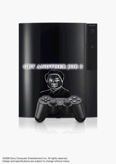
THE BESTmoku said:
moku said:
thorns said:i would think something subtler....
Me likes. But the spiderman font is not a deal breaker for me, that'd be ridiculous. :lolBlackbird said:had to be done.

Vexidus said: