-
Hey Guest. Check out your NeoGAF Wrapped 2025 results here!
You are using an out of date browser. It may not display this or other websites correctly.
You should upgrade or use an alternative browser.
You should upgrade or use an alternative browser.
Bad attempts at Attractive Character Design
- Thread starter Arc Christelle
- Start date
This made me laugh way waaaay too much. Thank you.
Not sure if this counts but it's honestly easier to make something like this than something normal with dark souls cc tools. Although if you have the patients to play around long enough you will get good enough to make decent looking characters.
like 99.99% of all female characters. Before, she had personality in her looks.
Bland. She's just bland now. Seriously, from love on first sight with her design to "uninterested" in seconds.
I actually like the design of Stella in the new version more than the older one. I think a pic of her full head would make things more clear. The only main changes I see is that they gave her a new haircut, and gave her younger looking eyes. Everything else is the same.
dragonbane
Member
You chose the worst picture didn't you? With longer hair she is really cute: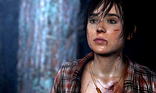
Everyone from Beyond Two Souls looked a little unnatural, but considering how heavily Ellen Page's involvement was pushed in this game her character model is really off putting.


That pic is actually a better one of her in U3 so it isn't a good example. It is really one of those things that you need to see in motion as everything is just "off". Obviously she never looked "real" but in U3 it was painfully obvious she was a video game creation.
I think the biggest change was in the eyes. They felt the UC2 eyes were too "alien", so they toned down a bit for UC3. As a result, her overall model became more prominent, and it somewhat removed the verisimilitude, though I personally wouldn't call it horrible by any means.
3D human character models will always be Treasure's greatest weakness. This is made painfully apparent in both Sin and Punishment games

It's a shame since Yasushi Suzuki's concept art for both games is pretty fantastic.
Treasure just can't do them any justice at all in 3D. (Mischief Makers is equally garbage looking)
Still my favorite series from them though
Also difficulty select in Ikaruga (GC version at least). Dat walk.
The screwed up characters of S&P seemed like they were deliberate to combine with the screwed up story. Kinda like in Pathologic where characters, text, etc were somehow off and it created a strong atmosphere of underlying wrongness which seems deliberate.
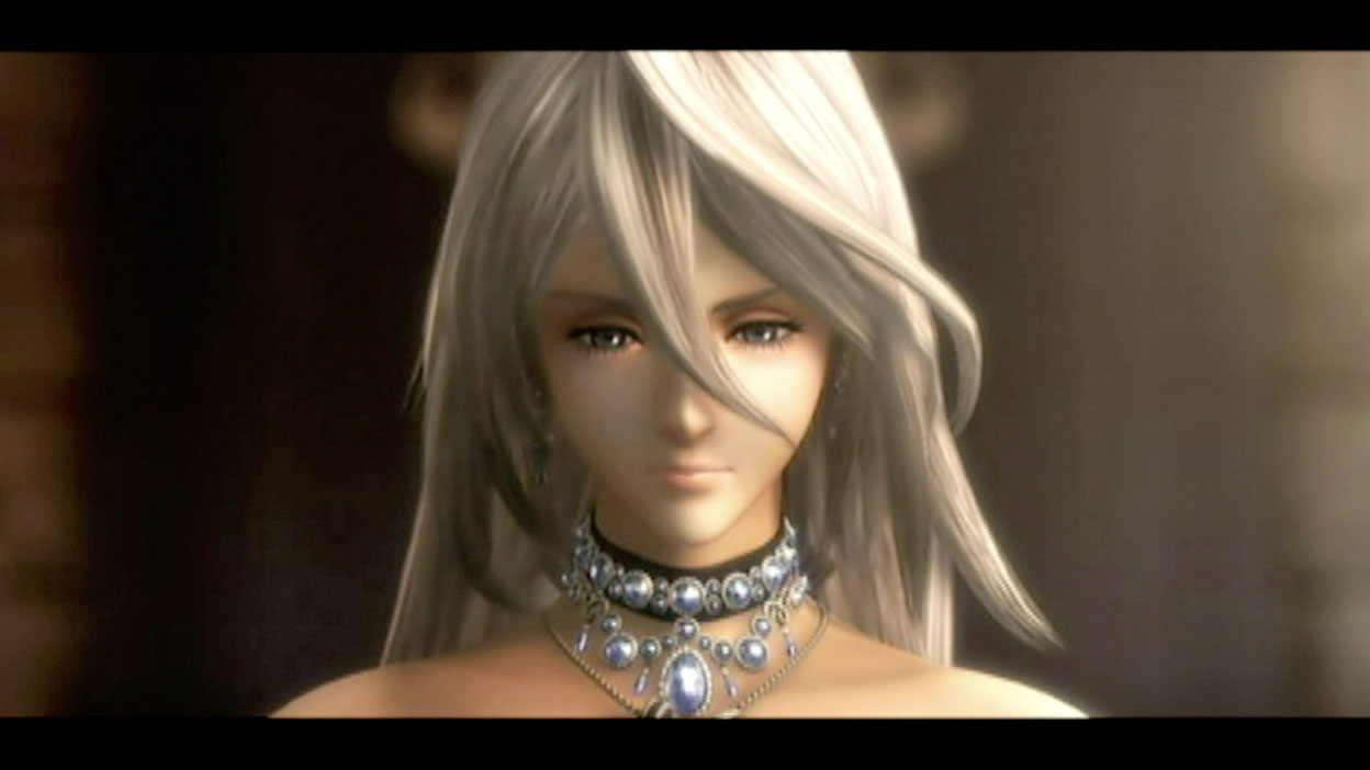
Lightning. The original design for her face had character and had the look of a bad ass. She also had a more saturated hair color which added to the look. They changed it to a generic doll face and lowered the saturation on her hair.
The first Lightning:

The final lightning design's face is more doll like, shoulders aren't as broad, and the arms are less muscular and slightly thinner.
The first Lightning:
The final lightning design's face is more doll like, shoulders aren't as broad, and the arms are less muscular and slightly thinner.
You chose the worst picture didn't you? With longer hair she is really cute:
This...is actually a bit scary. I definitely wouldn't call her cute in this pic.
This...is actually a bit scary. I definitely wouldn't call her cute in this pic.
What's scary about it?
Chû Totoro
Member
Eh, that was the first attempt at showing/rendering the character. He looks so much better now although still has the same kind of attitude, which if you didn't like it before then you wouldn't like it now.
But look-wise, he's a lot better now:

Yep I used to hate him but now his face is ok.
His look is just shit though... I guess it's so he can appeal to most of people but that makes him having no soul. Luckily that will change in the game while you're in control and you can see him following a path or another one you've chosen "for him"
")
Sub_Level
wants to fuck an Asian grill.
Disagree with the Chris Redfield, Sherry (RE6), and Ashley (ME3) mentions in this thread. Yeah Chris looked way better in REmake, but who didn't? Jill's best version? REmake (and even has a Nemesis costume for those who prefer that outfit). Wesker's best version? Well, personality wise probably 5 but he looked the most swag in REmake. Berry's RE5 Mercenary design was copied VERBATIM from REmake practically (and yeah that's an improper use of 'verbatim'). Sherry was freakin' cute in that Winter outfit much less DAT HOSPITAL OUTFIT. And Ashley was just plain sexy. Whether that sexiness actually fit the character or not is another issue. Even with the default pink armor, her design in the original was certainly more grounded and some people prefer that.
Your foster parents are dead.
Wow, I can actually kind of see it. But the game is still pretty far off, I have a feeling it may change again.
His face is fine to me too. He's like Donte but an actual original character. Not every male character needs to look dashing and mature and gruff. Pretty sure the guy from Second Son is still in his 20s. Plus he looks kind of Native American so that's neat.
"Wolfie's fine, honey, Wolfie's just fine. Where are you?"
Your foster parents are dead.
Went from a strong looking woman, to your typical, boring, characterless, blonde, big eyed female teen. :X
Wow, I can actually kind of see it. But the game is still pretty far off, I have a feeling it may change again.
Chû Totoro;88336545 said:Yep I used to hate him but now his face is ok.
His look is just shit though... I guess it's so he can appeal to most of people but that makes him having no soul. Luckily that will change in the game while you're in control and you can see him following a path or another one you've chosen "for him"
His face is fine to me too. He's like Donte but an actual original character. Not every male character needs to look dashing and mature and gruff. Pretty sure the guy from Second Son is still in his 20s. Plus he looks kind of Native American so that's neat.
Ming Numara from Lost Odyssey.
I dislike a lot of the character designs in LO, but this seems to fit the thread the most. She is supposed to be aQueen for those who did not know.n Immortal
Those veins will haunt my memory till the end of my days.
Arc Christelle
Member
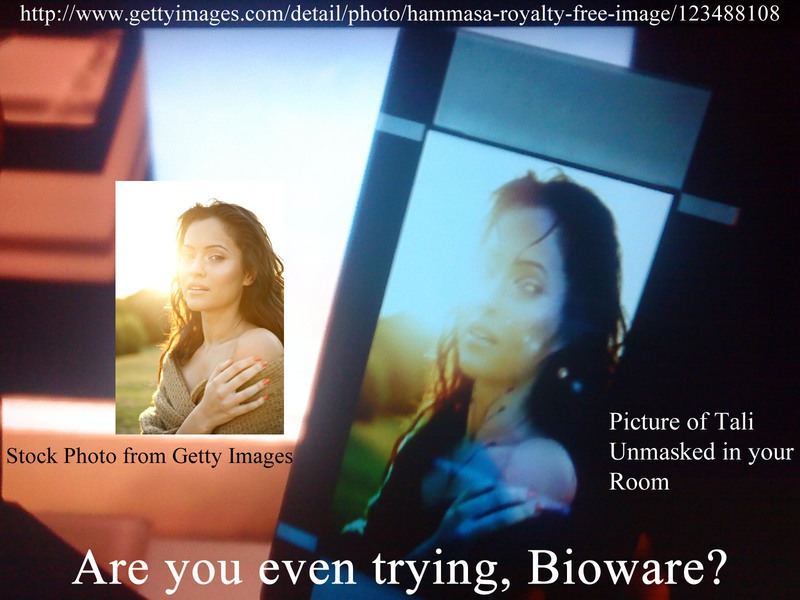
Fucking LOL.Tali unmasked from Mass Effect 3
He is boring as fuck. So is the actual story of AC.When you really think about it, this is actually the perfect design for Desmond. He is quite possibly the most generic character to ever grace fiction that Ubi can change his character model in each game (and by the looks of Revelations his race as well) and most people won't tell the difference. Hell I didn't even notice at first until someone brought it to my attention.
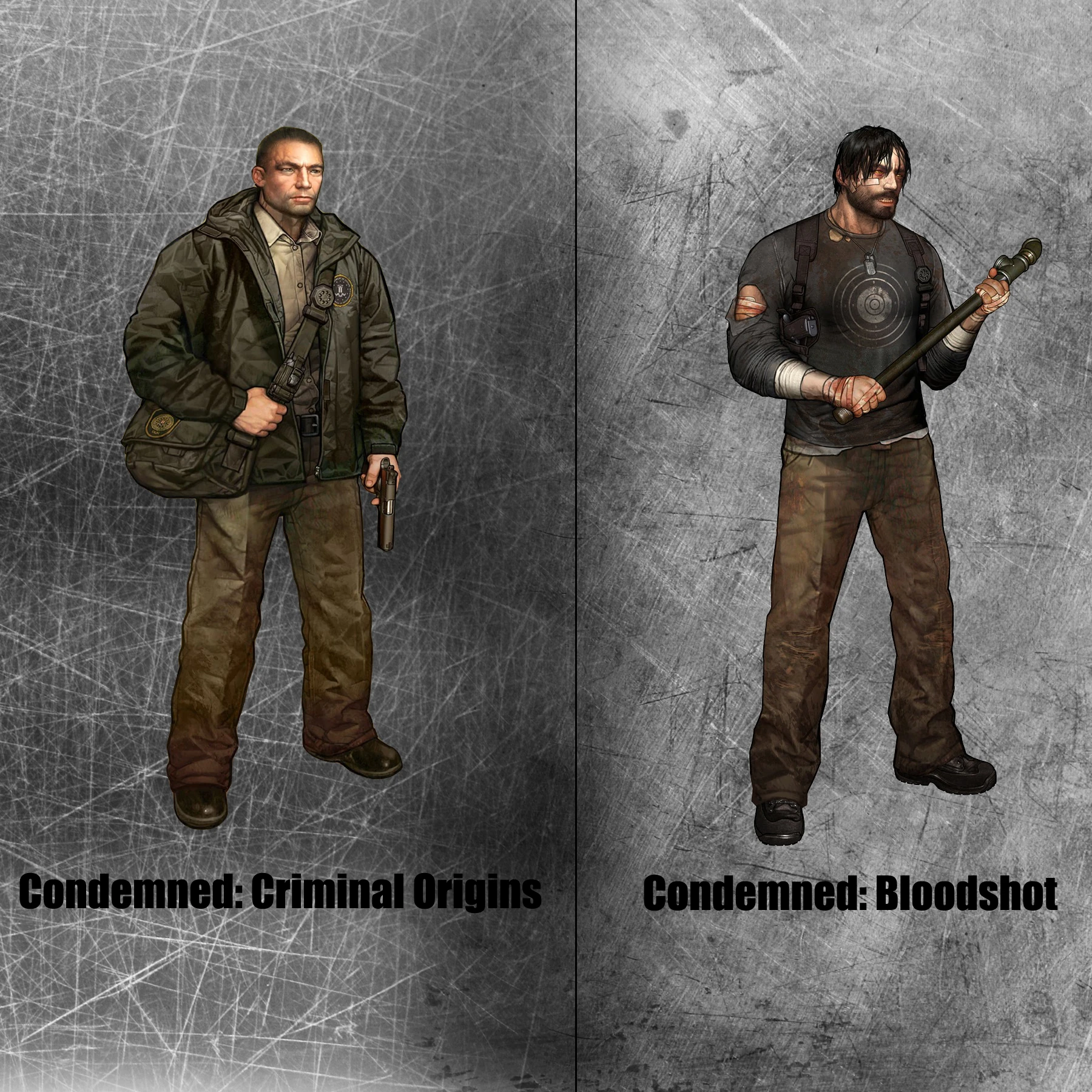
Those two games look damn near related and just as terrible. -shivers-Speaking of western developers trying to imitate Japanese design sensibilities (and falling straight on their asses):
I had the exact same experience.holyshit, the image loaded slow for me, so suddenly it popped up, spat out my drink as a result
Most FF characters look like J Pop Stars.Are these really supposed to be attractive though?
My vote goes to Serah. The model is well-crafted, but she looks like what Japanese people envision as the perfect blend of western and Japanese features, however the end result is more like a large-headed alien that skinned a human and is wearing her.
Actually it was hard to post this because of that but for some reason and I blame the protag, I just didn't like the designs at all.I actually did like the designs of Harry and Marcia. The protagonist, not so much.
So we can have a thread about ugly character models but not pretty ones? That's kind of fucked up.
Beauty can be a tragedy.Since the other thread got locked, is it OK to discuss good character design, then move to bad, or should we discuss bad only?
The scene itself is unflattering.What's scary about it?
NoirVisage
Banned
Tomb Raider 2 came out that same year.
Drives his point home.
Kadayi
Banned

WTF is up with her ears..they're frikken enormous. How did anyone doing the animation work not realise they were out of proportion...
NoirVisage
Banned
I like DmC Dantes design.
if you can call it that, the only effort they put into was "make an attractive, edgy Caucasian male and somehow get a jacket in there." I'd bet Its that attractive part that's got most DmC fans hearts aflutter about such a dull deviation from a character that normally seems like he's straight out of a comic book.
if you can call it that, the only effort they put into was "make an attractive, edgy Caucasian male and somehow get a jacket in there." I'd bet Its that attractive part that's got most DmC fans hearts aflutter about such a dull deviation from a character that normally seems like he's straight out of a comic book.
Nah dude new DmC Dante's design is great you're wacko.
Hahahahahahaha, oh man. What a brilliant fucking ad.
I... I'm not certain if you're being serious about that or not.
Hoooooohhh my god. Did anyone else watch this? Jesus, you've gotta love video game voice acting.
Well uhh...I like the pants on the new one.
In the concept art she looks totally fine I think. But in game, yeah, yeesh.
Someone mentioned Left 4 Dead, although that game has good character design, i liked the old Zoey model more than the final one:
old
http://www.slowdown.vg/images/Left-4-Dead-1-Old-Francis-Zoey.jpg[IMG]
new
[IMG]http://www.fhm.com/App_Media/Uploads/Images/Original/image/zoey-dating.jpg[IMG]
[U]old[/U]
new
[IMG]http://www.slowdown.vg/images/Left-4-Dead-1-Old-New-Comparison.jpg
I actually do like that old Zoey better if they cleaned up the model a bit, but overall I think the newer L4D cast is better.
Arc Christelle
Member
On the discussion of MOH Lady, there are things that work against the animation,
-the way she moves her eyes feel too scripted and unnatural as in pretending to display an emotion.
-she looks as if she may be struggling with her own face.
The Headturn
Notice how robotic it still looks
This is what I've gathered from studying that gif.
But when you see her and the husband..... lol suddenly it doesn't look realistic or even uncanny anymore.
EDIT: After doing the motion in the mirror, the body moving shouldn't even be that noticeable. It's not subtle at all. The look but not the subtlety of reality. A lot of people who chase "realism" in art usually fail in that area, in terms of details they make them too noticeable to the point it's off putting, instead of subtle.
-the way she moves her eyes feel too scripted and unnatural as in pretending to display an emotion.
-she looks as if she may be struggling with her own face.
The Headturn
Notice how robotic it still looks
- She only moves her head
- Her hair slowly responds
- Her neck and body catches up to her in a manner that looks like scaling or some shit.
- Imagine her neck stretching from her body and turning as it comes close to you, gets up to your face, then pulls up the rest of her body.
This is what I've gathered from studying that gif.
But when you see her and the husband..... lol suddenly it doesn't look realistic or even uncanny anymore.
EDIT: After doing the motion in the mirror, the body moving shouldn't even be that noticeable. It's not subtle at all. The look but not the subtlety of reality. A lot of people who chase "realism" in art usually fail in that area, in terms of details they make them too noticeable to the point it's off putting, instead of subtle.
SatelliteOfLove
Member
Nah dude new DmC Dante's design is great you're wacko.
The orders were "Make him look like the boss", then "Don't make him look like the boss, that got us laughed at.".
Hoya Destroyer
Member
The most obvious choice for me is the females from MK9.
I feel that NRS wanted to make them look good, but it just didnt work out that way.
Bad faces, bad textures, shoulders are too broad etc.
They need to look at the work Team Ninja did for DoA5 and copy that, as best they can.
I heard MK9 was a good game, but I skipped it because I didnt want the visual downgrade on attractive females (from DoA5).
Engine couldn't handle it. Which is what makes me so excited about PS4 when they finally dont have shitty moments like that.
Engine couldn't handle it? That scene was a pre-rendered cutscene in the game.
Only reason I can think of for the change in lighting is that the scene happens in the morning, and they had to make it look like it.
You chose the worst picture didn't you? With longer hair she is really cute:
I don't know if it's just me, but much of that game has such abysmal lighting that the characters consistently look like they are made from plastic or wax. It makes all of their intention go right into the toilet with everyone looking very uncanny valley.

Technoweirdo
Member
I don't know if it's just me, but much of that game has such abysmal lighting that the characters consistently look like they are made from plastic or wax. It makes all of their intention go right into the toilet with everyone looking very uncanny valley.
All the worse considering The Last of Us came out not long ago and had a better-looking Ellen Page than the game that actually has Ellen Page. lol
Someone probably already did this one and I missed it, but...
Lucy Stillman, AC1
What did they do to Kristen Bell? Arg, my eyes!
It only got worse with each iteration.
TetraGenesis
Member
I... I'm not certain if you're being serious about that or not.
I'm totally serious, hahaha. It's horrifying, captivating, and hilarious. I saw one picture of it and remembered it, going so far as to guess it was a Skittles ad, which is pretty damn close to Starburst. Hahaha
R
Retro_
Unconfirmed Member
Went from a strong looking woman, to your typical, boring, characterless, blonde, big eyed female teen. :X
She looks the same dude
dragonbane
Member
Seems like it is just you. The most real characters I have ever seen in a game (consistency wise). They don't look like plastic to me at all. Considering Beyond is pretty much the first game on current gen to use physical accurate shaders makes it even nicer to look at. What you mean by lighting probably refers to art direction, which indeed looks flat in some instances. But the lighting engine itself is pretty damn great, when you look at this:I don't know if it's just me, but much of that game has such abysmal lighting that the characters consistently look like they are made from plastic or wax. It makes all of their intention go right into the toilet with everyone looking very uncanny valley.


Certainly among the most impressive lighting I have seen on current gen as well.
Not sure if serious. Final Ellie doesn't even remotely look like Ellen Page anymore. Not to mention that real time Jodie absolutely trashes real time Ellie. Ellie looks nice in pre-rendered cutscenes.All the worse considering The Last of Us came out not long ago and had a better-looking Ellen Page than the game that actually has Ellen Page. lol
NoirVisage
Banned
Nah dude new DmC Dante's design is great you're wacko.
Where is the actual design? the necklace that Tameem owns an exact replica of? That lame jacket? or the hair? It works better as a fashion ad than a character design, the concept art is great, but the finished product is hardly a design, maybe you like him because you see yourself in him?
'The orders were "Make him look like the boss", then "Don't make him look like the boss, that got us laughed at.".
ha ha, then there is that.
Arc Christelle
Member
Where is the actual design? the necklace that Tameem owns an exact replica of? That lame jacket? or the hair? It works better as a fashion ad than a character design, the concept art is great, but the finished product is hardly a design, maybe you like him because you see yourself in him?
Hell nah. He just looks like a bum. I've noticed a lot of people on this forum actually approve of looking like a bum.
Some people even praise that one chick from Parasite Eve's original design by Nomura because she only wore a shirt and some jeans.
EDIT: Not everyone understands style or fashion. And use bad reasoning for arguments to defend certain things. Realism is the worse.
EvilKatarn
Member
Some people even praise that one chick from Parasite Eve's original design by Nomura because she only wore a shirt and some jeans.
This? This is great.

Arc Christelle
Member
This? This is great.
The art and character, what she's wearing, not so.
(I was pretty much referring to clothes.)
EDIT: Although I must note that it was acceptable for the time.
Not saying she has to be in a skirt and make up or a catsuit or something.
But she should be in something that she may feel is more appealing than a white tee and jeans.
That's default bum-wear at its finest.
Arc Christelle
Member
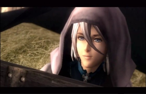
Calista (The Last Story)
What she was supposed to be.
What we got in game:
The CG's give her a liiiiiiiiiiiiiiiittle bit of justice. Not much, just a little.
But at the end of the day in-game TLS's covergirl loses to Syrenne, which is weird because she's the tough girl drunk, but looks best out of all the female characters.
What she was supposed to be.

What we got in game:


The CG's give her a liiiiiiiiiiiiiiiittle bit of justice. Not much, just a little.
But at the end of the day in-game TLS's covergirl loses to Syrenne, which is weird because she's the tough girl drunk, but looks best out of all the female characters.
Where is the actual design? the necklace that Tameem owns an exact replica of? That lame jacket? or the hair? It works better as a fashion ad than a character design, the concept art is great, but the finished product is hardly a design, maybe you like him because you see yourself in him?
I look nothing like DmC Dante, act nothing like him, nor strive to be anything like him. Dude just looks good. There's more to character design than "Check out this whacky visual flair!" His whole outfit and look is great. It's got a fluent fluid design, it's got some style to it, it looks nice.
What about it says to you that it's not an actual design? I'm not even certain that makes sense.
R
Retro_
Unconfirmed Member
DmC Dante's jacket makes him look like a bum
TheRedSnifit
Member
Ada from Damnation:

Not sure why they couldn't just keep her design from RE4 or even RE6.
Not sure why they couldn't just keep her design from RE4 or even RE6.
Arc Christelle
Member
Ada from Damnation:
Not sure why they couldn't just keep her design from RE4 or even RE6.
lol she got "bitchface". It's like an eternal scowl that feels as if it reflects "bitchiness".
DryvBy
Member

Funny every time I looked.
Tye The Czar
Member
Fairy Fencer F, MOTHER OF GOD!
 I wouldn't so much call it unattractive as it is overkill.

"Hey guys, Neptunia wasn't popular enough! What can we do for our next JRPG?"
"Make generic characters with more tits and gothic lolita fetish fuel!"
"FUCKING GENIUS!"
Added to the fact is that this is just another example of Japan's Sameface Character Syndrome.
"Hey guys, Neptunia wasn't popular enough! What can we do for our next JRPG?"
"Make generic characters with more tits and gothic lolita fetish fuel!"
"FUCKING GENIUS!"
Added to the fact is that this is just another example of Japan's Sameface Character Syndrome.
Speaking of western developers trying to imitate Japanese design sensibilities (and falling straight on their asses):

Yep, good catch. Those are bloody awful.
Arc Christelle
Member
It's not technically "sameface" it's just generic. The flatface artstyle really does make me sad when I see it used, abused, and spammed to the point where people think think it's the definitive Eastern Style, despite the work of so many artists there. I'm really not a fan, it's a shame, because the rest of the design looks nice, but the face needs a paper bag.Fairy Fencer F, MOTHER OF GOD!
I wouldn't so much call it unattractive as it is overkill.
"Hey guys, Neptunia wasn't popular enough! What can we do for our next JRPG?"
"Make generic characters with more tits and gothic lolita fetish fuel!"
"FUCKING GENIUS!"
Added to the fact is that this is just another example of Japan's Sameface Character Syndrome.
Reminds me of the angels in Killer 7.
well damn you changed the picture lol.
What platform is that on?
Yep, good catch. Those are bloody awful.
Reneledarker
Banned

Yep, good catch. Those are bloody awful.

I'd say the random NPC and glasses guy take the cake. The latter looks like a potato.
Jesus christ ppl mention Leifang but not Christie???!!!!


From smokin hot to Michael Jackson.
Is that Christie's old doll-faced head photoshoped onto the head of a model? Also the select character menu has terrible lighting, she looks great in game.
Arc Christelle
Member
This is a dumb thread, people post some of the best character models in the industry here.
Are you referencing to the Medal of Honor posts or some other choices? Because while a few are debatable and some are trolling, there's been a lotta good material posted.