Hydro_Alexis
Banned
Infernal Monkey said:Best and worst

:lol i ... did ... it ... mum lol its a got darn shame ...
and that keith cheggers is awesome, best game i have played this year.
Infernal Monkey said:Best and worst
Noel Edmonds is not a random schmuck.Son of Godzilla said:Also random schmuck on Deal or No Deal box is awesome.

Kyoufu said:In before Orange Box. My god that is ugly.
edit: damn beaten :lol
One of my faves for this year:

Windu said::lol what is that, some kind of educational game?
decon said:Worst
Just to be different, thread gets boring with all those orange boxes.
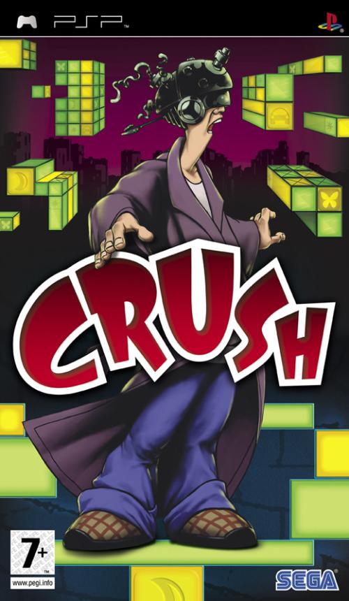
My thoughts exactly.Johnkers said:Oh so that's why nobody bought Crush
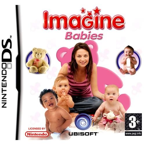
are you fuckign serious?medze said:Imagine Babies was much better when it still had the stock photo watermarks


Giant Robot said:are you fuckign serious?
did these ever get printed with the stock photo watermarks? ahhahaha

Yeah I agree this one's really uglyHitler Stole My Potato said:

 O box.


MicVlaD said:Best:
Worst:


Son of Godzilla said:God that Crackdown box is like Megaman 1 levels of bad. Also random schmuck on Deal or No Deal box is awesome.
And by Crackdown I obviously meant Shadowrun. I always confuse my silly B rate games.

Splatt said:BEST
WOW that's hot.Barry Lightning said:was this 2007? cause it's better than that silly kool aid man shit:

replayy said:Best:

I honestly think PSP may be the system with the best boxarts of all time. It's like devs are making the most amazing boxarts ever to encourage people to buy their games.Ninja Kn1ght said:Best:


Speevy said:Damn it you beat me to Ultimate Duck Hunting.

I would say for sheer absurdity in a modern box art, that's the top of my list.
People with taste read Vagabond. This is done by the same artist. The end.epmode said:It's definitely not the worst but the love for this cover confounds me. Reminds me of the elf soldier concept art from Kameo, though that's mostly due to the colored pencils or whatever they used. Even disregarding the questionable choice of materials, the image itself clashes with the logo. And the guy looks like he just finished crying. Do not want.
~Devil Trigger~ said:My Favorite


Is the giant dog head the last boss or something? It looks like it's about to eat him.JzeroT1437 said:DAMN YOU HUGE DISEMBODIED DOG HEAD!


I've seen some strange shovelware crap but I'm having a hard time believing this is for real despite the THQ logo on it. LOL.DevelopmentArrested said:Best and Worst:

ichigo kurosaki said:Good:
Bad:
I.
mugwhump said:WOW that's hot.
Lost Odyssey's is nice, too. So's RE:UC.
like these too
I honestly think PSP may be the system with the best boxarts of all time. It's like devs are making the most amazing boxarts ever to encourage people to buy their games.