I think it has them - if you look at the top of the eye there is a straightness to it - but the camera angle hides it somewhat.I get your point, but to be honest, the new model of the Crow has those 'evil' eyes if you look closely. I think that's all it needs, those slanting eyes to make it look aggressive. That is its defining characteristic to me.
I do think some of the complaints about enemies are due to the camera angle - if I remember right, the LTTP crow sprite was never actually correct if you thought about what it looked like compared to the camera location. This crow is oriented correctly for the camera, but it means some of the detail has been lost since he's not nicely in profile as a result.
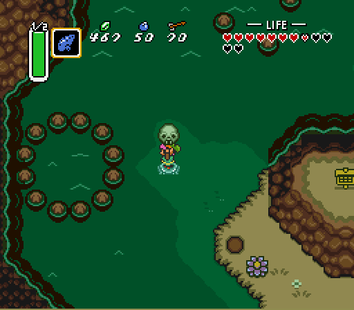
On a similar note, I've been trying to remember if the green blobs in the original had any orientation sprites or if they always stared right out of the screen at you; again, that's a difference that I can see people picking up on, and it's fundamentally down to the fact that they can now portray it correctly.