-
Hey Guest. Check out your NeoGAF Wrapped 2025 results here!
You are using an out of date browser. It may not display this or other websites correctly.
You should upgrade or use an alternative browser.
You should upgrade or use an alternative browser.
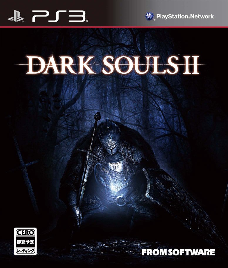
Dark Souls II Japanese Box Art
- Thread starter Sn4ke_911
- Start date
Parakeetman
No one wants a throne you've been sitting on!
Now that is some sexy shit right there folks!
The Japanese box art is perfection.gif.
If that's the US box art -- wow, yeah, the Japanese box art clowns it. What a shame. It could be worse, though, at least they didn't try to make someone holding a gun on the cover of the USA version.

Might not be final, but looks better than our box arts.
If that's the US box art -- wow, yeah, the Japanese box art clowns it. What a shame. It could be worse, though, at least they didn't try to make someone holding a gun on the cover of the USA version.
Noisepurge
Member
If that's the US box art -- wow, yeah, the Japanese box art clowns it. What a shame. It could be worse, though, at least they didn't try to make someone holding a gun on the cover of the USA version.
well yeah the sword is the equivalent of a guy with a gun in smoke&shrapnel -standard issue cover

sixteen-bit
Member
That box art is hot fire.


well yeah the sword is the equivalent of a guy with a gun in smoke&shrapnel -standard issue cover
The US box art, as box art tends to do in the US, depicts an intention to go kill something. That's the presumed selling point. The Japanese box art depicts the mood and emotion of the game in a more general sense, which I think is what stands out about Dark Souls -- The mood and overall feeling you get from the game is what stays with you.
It's sad but true. We get the derp box arts.
Johnlenham
Member
As the EU art wont load for me, Im hoping its like the JP one not the NA one.
The intro for Demon Souls has to be one of the best intros to a game aswell. The crazy ochestra music just makes it. Wonder if they will manage to top that?
The intro for Demon Souls has to be one of the best intros to a game aswell. The crazy ochestra music just makes it. Wonder if they will manage to top that?
DeadManWalking
Member
Might not be final, but looks better than our box arts.
Have to bad ass it up for western audiences.
sixteen-bit
Member
Have to bad ass it up for western audiences.
Well, they failed
Well, they failed
Do you guys think this badassing of the cover ACTUALLY helps? or is this just some kind of publisher rulebook for western releases and they just do it -- just because?
I feel like the Japanese cover makes the game stand out far more, even to a western audience. It looks unique. It sparks the imagination. You want to know more about what the game is. The US box art, by comparison, is just another action hero going off to kill things, and that makes it get lost in the mix immediately.
Hot Coldman
Banned
Much prefer the JP cover, but whatever.
K
kittens
Unconfirmed Member
Perfect.
indigo-cyclops
Member
I love this artwork. Will be using it as a custom image for my Steam copy!
Parakeetman
No one wants a throne you've been sitting on!
Do you guys think this badassing of the cover ACTUALLY helps? or is this just some kind of publisher rulebook for western releases and they just do it -- just because?
I feel like the Japanese cover makes the game stand out far more, even to a western audience. It looks unique. It sparks the imagination. You want to know more about what the game is. The US box art, by comparison, is just another action hero going off to kill things, and that makes it get lost in the mix immediately.
In Japan the original Demons Souls didnt attract the "average consumer" as much due to the daunting art. Pretty hilarious when I heard that.
So damn good, I really want to import. I honestly think this cover would stand out to westerners who aren't familiar with the game. Seeing someone so downtrodden on a game cover has got to make people more curious than the US "me too" design. The game's unique points of difference are what should be being advertised.
BumblebeeCody
Member
EU Collectors:

Best box art.
Very nice! That dude looks like he doesn't want to play anymore.
All three Souls games have such great box art. Easily amongst my favourites of the generation.
Jeez, is that real? Because that's hideous.
Typical Namco to ruin a good thing.
EU Collectors:
Jeez, is that real? Because that's hideous.
Typical Namco to ruin a good thing.
Honey Bunny
Member
Might not be final, but looks better than our box arts.
I wonder how many years it will be until we can move on from the CODbox
That Wont Fit In There
Member
Where's my "Prepare to Break Controller" Edition? ")
Probably never, at least until focus testing tells society that gray and brown are ugly.I wonder how many years it will be until we can move on from the CODbox
")
commanderpepper
Member
Just me or does his position make him look really fat? Hah.
Yeah I see it too. Makes the character look less heroic.
I've made a thread about this before, but I just want to reiterate. I love From's armor design so god damn much. Like, I don't even like Dark Souls that much, but even the default 'knight' they've been showing for 2 looks better than anything you can find in Dragon Age or the stuff they've shown for Project Eternity.
They need to just send From's artists to teach seminars on armor design to all these other RPG makers.
They need to just send From's artists to teach seminars on armor design to all these other RPG makers.
Acheteedo
Member
Might not be final, but looks better than our box arts.
Are those a joke?? I can't tell any more.
RealAre those a joke?? I can't tell any more.
The Japanese box art looks great. And there's no sense in complaining about the US box art. This thread renders all of those complaints moot: http://www.neogaf.com/forum/showthread.php?t=442713
sublimit
Banned
Very very nice indeed. Japanses one are really boxARTS.
7 month ago i posted this one on the custom boxart thread for the LE:

Wow this looks fantastic.
Are those a joke?? I can't tell any more.
Someone should post the GAF edited versions. Some of them were great.
DarkSoul520
Member
Guess I'm buying a second copy of Dark Souls 2...
Are those a joke?? I can't tell any more.
I wish.
So much disparity in that box art which suits it perfectly.
Heh, do you mean despair? The US cover is a better example of disparity

Yeah, I "that word does not mean what you think it means"'d myself there.Heh, do you mean despair? The US cover is a better example of disparity