IbizaPocholo
NeoGAFs Kent Brockman
Side by side comparison between the Game Boy Advance and the Super Nintendo versions of the game Donkey Kong Country.

Correct me if wrong but I don't believe thats what the GBA version should look like colour wise. The games were oversaturated at the source because the screen on the GBA wasn't great. So you really need a filter over it to see it how its would've looked on an actual GBA screen.
As an example:
I know some people prefer the raw pixels of old games when they emulate them and don't want to filter it, but this is a bit different, the games just look wrong unless you do this. Minish Cap was mental looking before I did it. The map's greens were like comedic toxic waste.

This is how it looks using mGBA's color correction and a RetroArch GBA shader:
Still bad colors, lower detail/resolution, missing background layers.
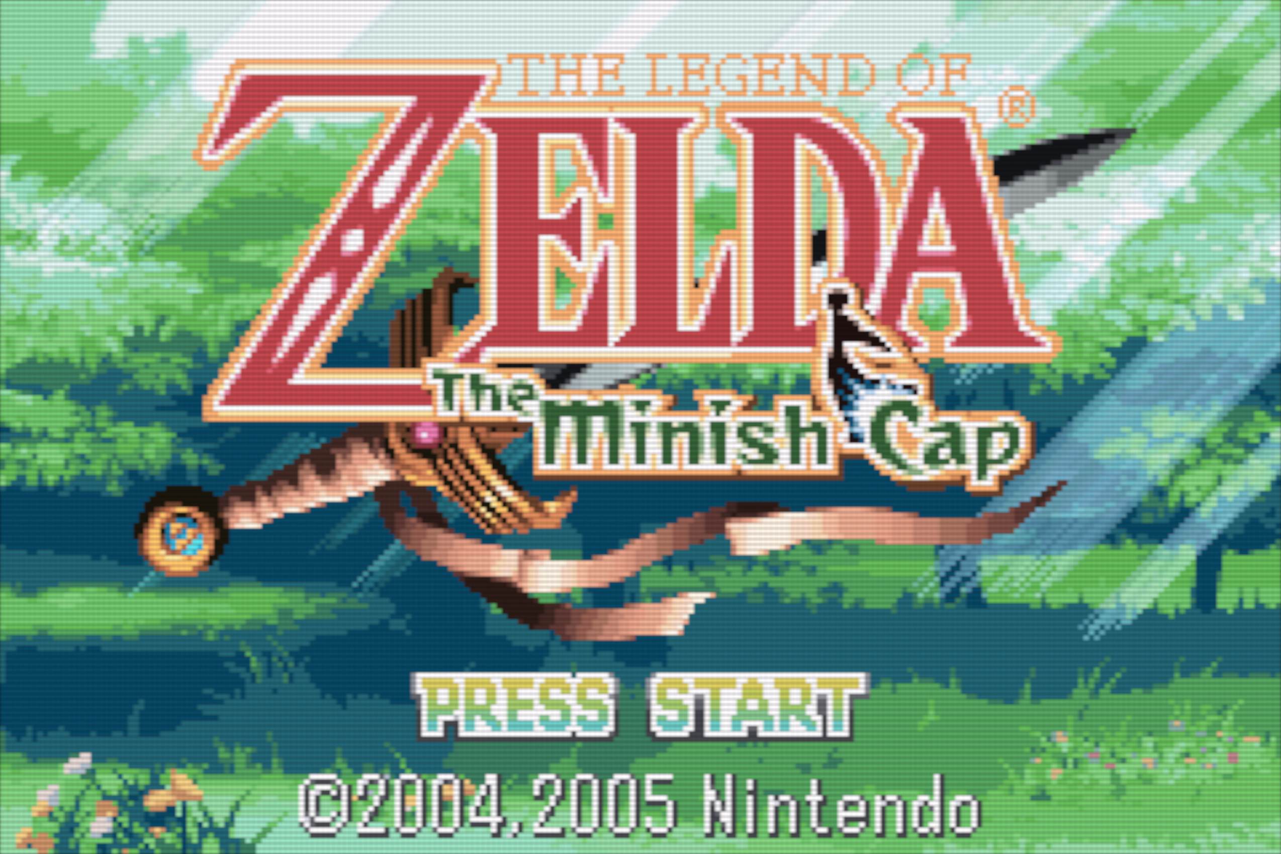
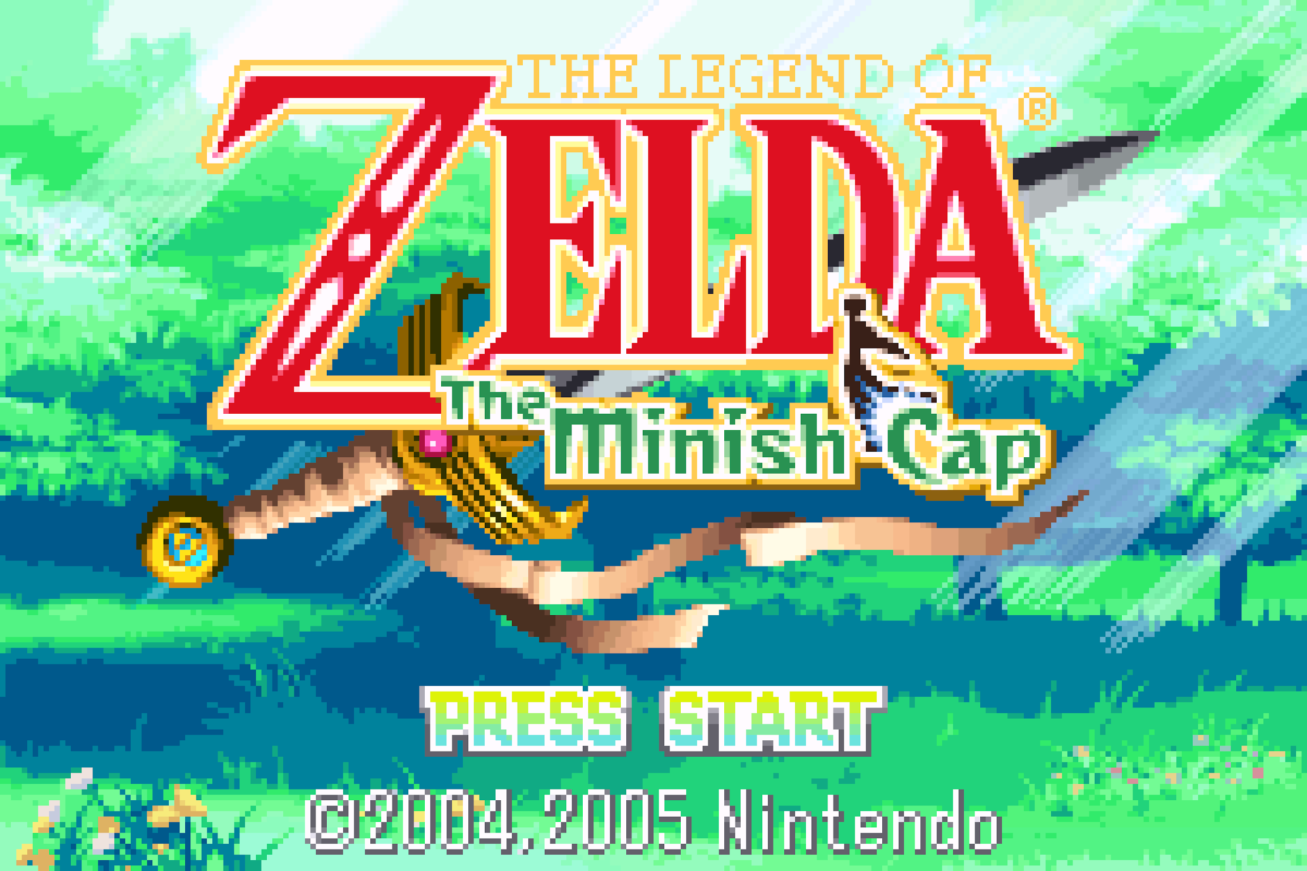

Been meaning to get Golden Sun (1&2) off the WiiU eShop. I bet it looks fantastic on the gamepad. Minish Cap looks great on it.Correct me if wrong but I don't believe thats what the GBA version should look like colour wise. The games were oversaturated at the source because the screen on the GBA wasn't great. So you really need a filter over it to see it how its would've looked on an actual GBA screen.
As an example:
I know some people prefer the raw pixels of old games when they emulate them and don't want to filter it, but this is a bit different, the games just look wrong unless you do this. Minish Cap was mental looking before I did it. The map's greens were like comedic toxic waste.
I'm glad I'm not the only one who is OCD about contrast, color, brightness, etc. Every time I start a game I have to tweak the settings. It really does make a huge difference, especially with older titles.Oh man, and thats accurate to how it looked? I remember I had to do a separate pass for colour correction because it looked so desaturated with the in-menu option. This is what I did for Minish Cap and I thought it was too much, but maybe not:
I couldn't get the GBA/dot filters to look good so I just modified a Hylian CRT filter. So it probably looked nothing like this but I like it
I literally just watched this yesterday
I don't understand which one is supposed to be the "correct" one. The one on the right looks too bright and washed out.Correct me if wrong but I don't believe thats what the GBA version should look like colour wise. The games were oversaturated at the source because the screen on the GBA wasn't great. So you really need a filter over it to see it how its would've looked on an actual GBA screen.
As an example:
I know some people prefer the raw pixels of old games when they emulate them and don't want to filter it, but this is a bit different, the games just look wrong unless you do this. Minish Cap was mental looking before I did it. The map's greens were like comedic toxic waste.
I assume the right side is the "source" and the left side is how it looks on the original GBA screen, in person.My God, it's like half the GBA library was ports.
I don't understand which one is supposed to be the "correct" one. The one on the right looks too bright and washed out.
I've had an original GBA, and I own a SP. The image on the right is what you'd see on a AGS-101 SP. But I'm used to side-by-side comparisons showing "before" on the left and "after" on the right, so I was a bit confused there. Also, the pics appear to be from different emulators, which doesn't help making the comparison clear.I assume the right side is the "source" and the left side is how it looks on the original GBA screen, in person.
Basically, the original, awful GBA screen would weaken the image. So devs had to increase saturation and brightness of the source to balance it out. And because we play with GBA emulators on much better screens than the GBA, we see the true colors that are over-saturated and brightened up. These emulators have a "color-correction" option that simulate how the colors would look on a GBA screen, thus the colors you were supposed to see, AKA, the correct ones.
On Switch screen tooDKC was amazing in '94 & still looks great today (On the SNES).
