

The Spoony Hou
Member
Yes and this! At least he wouldn't have looked obviously Solid Snake xD
Truefact: he was so much Solid Snake that I actually thought it was a ruse, like he was another clone or something.

Yes and this! At least he wouldn't have looked obviously Solid Snake xD
When did they redesign Stella? I thought there was no new images of her.
Truefact: he was so much Solid Snake that I actually thought it was a ruse, like he was another clone or something.
#justkojimathingsMe too.
So you're saying he was originally supposed to be the personification of a personification of a mouse.Mouse. He was the personification of Mickey Mouse. They scrapped that idea and put Mickey Mouse himself into game too.
That hair.
and old Elena looks way better than the redesign from UC3:

Truefact: he was so much Solid Snake that I actually thought it was a ruse, like he was another clone or something.
Basch from Final Fantasy XII. From this:

to this:


You mean the final design or the blonde?
Final design. I mean, when I was playing the dang game.
So much better than the ultra generic guy we ended up with.
When Versus XIII turned into XV IIRC.
Wait that's what Cole was supposed to look like? Wow. Now I want to suckerpunch someone. He looks way better.Basically self-explanatory - discuss some concept designs for characters that you much preferred than whatever they eventually turned out to be.
I for one (and I'm probably gonna take a lot of shit for this one) was really up for the tentative version of Cole in Infamous 2.

I mean sure, he kinda looks generic as hell, but I'd have much preferred something more representative of some character evolution rather than copping out back bald-gritty Cole due to the fan whiplash. Like if they gave this concept more of a chance, I think they could have tweaked it further to a point where strikes a balance that'll satisfy Infamous 1 fans in some way.
It was even more jarring that his new voice and dialogue for the game was clearly meant for this redesign.

The left one.
Thought so. The right one looks kinda bad (as do most character designs in FFXV so far, in my opinion).Left is old, right is most recent.

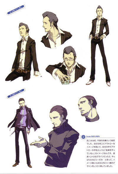
Persona has consistently good character design, particularly the fashion and stances, but it's all wasted on children.Oh, almost forgot this guy:
An early Kanji concept from Persona 4. While I like Kanji's final design (and indeed, he looks to be redesigned from the ground up) this guy oozes cool, and I'd have loved to see him in my party.
Edit: I'm talking about the bottom one.

Persona 2 Eternal Punishment might be your thingPersona has consistently good character design, particularly the fashion and stances, but it's all wasted on children.
I'd definitely go for a Persona game featuring older characters like the design above. The school setting is a real turnoff. >_>


Specifically that one on the right with the scarf. That would have made for a much more unique Nero than the Dante0.5 we got. Hopefully it'll be a costume in DMC4:SE.
I'm partial to the bottom left and right.
Mouse. He was the personification of Mickey Mouse. They scrapped that idea and put Mickey Mouse himself into game too.
Basically self-explanatory - discuss some concept designs for characters that you much preferred than whatever they eventually turned out to be.
I for one (and I'm probably gonna take a lot of shit for this one) was really up for the tentative version of Cole in Infamous 2.
I mean sure, he kinda looks generic as hell, but I'd have much preferred something more representative of some character evolution rather than copping out back bald-gritty Cole due to the fan whiplash. Like if they gave this concept more of a chance, I think they could have tweaked it further to a point where strikes a balance that'll satisfy Infamous 1 fans in some way.
It was even more jarring that his new voice and dialogue for the game was clearly meant for this redesign.


I guess what I'm trying to say is, the team at EAD3 made the right decision. You can still see elements of this design in the final Midna.

I liked the original design for Stella in FFXV more than the new one. She looked more mature.
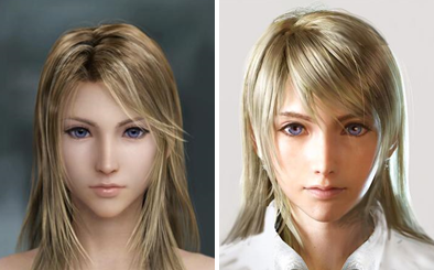
Edit: The original is the first one.

Epic Mickey ultimately didn't look anything like its concept art.
From this:
To this:
That is infinitely cooler than current DelsinI'm really fond of Delsin's concept art.
That hair.
Dragon Age: Origins

Was a lot younger and originally going to be a more naive about the outside world, having lived in the woods all her life. Even the first interviews with her voice actress talks about how much she loved poor little Morrigan.
Then suddenly the hood was down, the bikini was covered up, she was older, more wise and powerful, fully aware of where she was in the middle of things. She didn't need to be with Flemeth anymore, so it always felt weird that she was living there. There are even dialogue still in the game that reflects the former characterization between her and Flemeth.
She became this:

The game was badly rushed at the end, IIRC Rare wanted to deliver a big patch after launch but MS said no.I quite liked the original artwork that was released for Perfect Dark Zero:
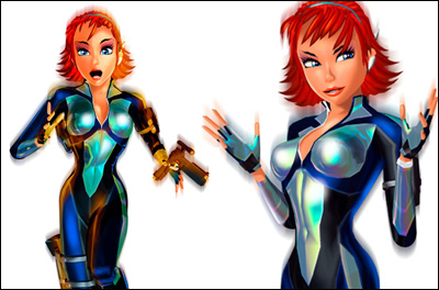
I felt that this art style really suited an evolution of the tone that made the original game fun. The time and energy wasted making the game more realistic and gritty should have been put into polish and refinement, but instead it just left the game feeling generic and rushed.

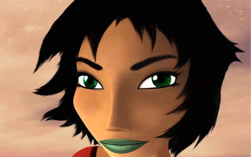
I always liked the top one.Oh, almost forgot this guy:
An early Kanji concept from Persona 4. While I like Kanji's final design (and indeed, he looks to be redesigned from the ground up) this guy oozes cool, and I'd have loved to see him in my party.
Edit: I'm talking about the bottom one.

Personally I like the right one more, it looks more real. It might be the lighting, but the left one looks like an anime doll, the right one looks more like a real person.
Yo, that's William Levy lolBasically self-explanatory - discuss some concept designs for characters that you much preferred than whatever they eventually turned out to be.
I for one (and I'm probably gonna take a lot of shit for this one) was really up for the tentative version of Cole in Infamous 2.
I mean sure, he kinda looks generic as hell, but I'd have much preferred something more representative of some character evolution rather than copping out back bald-gritty Cole due to the fan whiplash. Like if they gave this concept more of a chance, I think they could have tweaked it further to a point where strikes a balance that'll satisfy Infamous 1 fans in some way.
It was even more jarring that his new voice and dialogue for the game was clearly meant for this redesign.

The game was badly rushed at the end, IIRC Rare wanted to deliver a big patch after launch but MS said no.
Who pissed in Jak's cornflakes?

This is what working for Activision will do to you:

Wait THATS where the cool ass masks went to? Jeez.Dark Souls 2
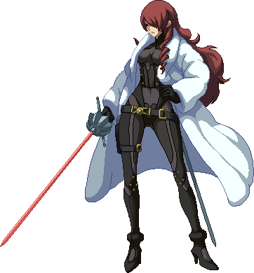
*fixedNew Spyro looks (strung out on) dope.
No fucking comment. His voice and his lines are terrible too.
This thread makes me wonder if any pokemon have been redesigned and never been put back into the game. Like, were there multiple Pikachu designs?

Easily Mitsuru in Persona 4 Arena
Phoenix Wright Ace attorney
specifically the one in the middle, I really prefer that design over the Maya fey we got, but beggars can't be choosers.
seriously.


*fixed


