I also don't like that every random minor male character in the game is Steven Blum but that's for another discussion.jett said:I don't appreciate every single character looking like they have HGH in their veins instead of blood. Character design/modeling is truly awful in both Arkham games.
-
Hey Guest. Check out your NeoGAF Wrapped 2025 results here!
You are using an out of date browser. It may not display this or other websites correctly.
You should upgrade or use an alternative browser.
You should upgrade or use an alternative browser.
Games with Bad Art Direction, potentially could've been good.
- Thread starter dmshaposv
- Start date
XANDER CAGE
Member
Dark Octave said:Vandal Hearts: Flames of Judgment.


Holy shit that is bad. Like, hasn't-learned-basic-drawing-fundamentals bad.
Always-honest
Banned
haha, not THAT bad, but yeah a very very mediocre artist or art director.BigJiantRobut said:Holy shit that is bad. Like, hasn't-learned-basic-drawing-fundamentals bad.
Oh almost forgot: i Hate how oblivion looks.
Pie and Beans said:This is also why I'm not feeling Skyward Sword. Ever since that demo area was showcased with the inoffensive generic giant mushrooms seemingly directly borrowed from NSMB dotted around, it felt like the Nintendo of old with bold design had given away to this washed out 'in-offensive to the point of blandness' look to all of it's major projects. I get that its going for a pastel look, but its not strong enough, and certainly won't assert its look in SD.
You're complaining specifically about an unfinished demo build from 2010?
BigJiantRobut said:Holy shit that is bad. Like, hasn't-learned-basic-drawing-fundamentals bad.
Those designs actually made me laugh in RL. They remind me of the marionettes in Team America. It's the massive heads that get to me.
Oblivion has a generic European-style fantasy look with some of worst character modeling and animation. I never really got into the game mainly due to the uninspired art.
Skyrim is looking a million times better already, with a conan/Hyborian style feel, character models with a bit more personality (from the races thread) and hopefully better animation. However, this is Bethesda - they have the worst animators (besides the fact that the large scale of their games limit more fluid/expressive animations) in the industry even though their tech is good. Here is hoping.
Skyrim is looking a million times better already, with a conan/Hyborian style feel, character models with a bit more personality (from the races thread) and hopefully better animation. However, this is Bethesda - they have the worst animators (besides the fact that the large scale of their games limit more fluid/expressive animations) in the industry even though their tech is good. Here is hoping.
sublimit
Banned
Slamtastic said:This is a pretty diverse sampling.
What art direction DO you like?
Ico
Shadow of the Colossus
Armored Core games
Demon's Souls
Silent Hill 1-4
All Siren games
Dragon Quest VIII
Mostly all FF games (with the exception of some character designs from XII and XIII)
All Resident Evil games
All DMC games
Onimusha 1,2,4
Monster Hunter series
TLOZ:WindWaker
Lost Winds
A Shadow's Tale
Fragile
Muramasa
Mirror's Edge
Uncharted 1+2
Valkyria Chronicles (the first one)
Spyro 1-3
And a few more

Dark Octave said:Vandal Hearts: Flames of Judgment.
Guy on the right is like "Awwww, man!"
I agree and disagree with darksiders.
I liked the world design, the angels, most of the side characters and monsters, it was just really war himself I didn't care for, he was to over designed and bulky. I've always been a fan of joe mad though, and thought his art transferred well into a game. So far I think death is a vast improvement over war for darksiders 2.
I liked the world design, the angels, most of the side characters and monsters, it was just really war himself I didn't care for, he was to over designed and bulky. I've always been a fan of joe mad though, and thought his art transferred well into a game. So far I think death is a vast improvement over war for darksiders 2.
BertramCooper
Banned
The two styles are absolutely nothing alike, and I can't believe anyone would compare them.Pie and Beans said:
This is also why I'm not feeling Skyward Sword. Ever since that demo area was showcased with the inoffensive generic giant mushrooms seemingly directly borrowed from NSMB dotted around, it felt like the Nintendo of old with bold design had given away to this washed out 'in-offensive to the point of blandness' look to all of it's major projects. I get that its going for a pastel look, but its not strong enough, and certainly won't assert its look in SD.
Leona Lewis
Banned
This game could've been the next Lumines if it hadn't looked like microwaved dog shit. Visually, everything about this game was just...dire.


jett said:I don't appreciate every single character looking like they have HGH in their veins instead of blood. Character design/modeling is truly awful in both Arkham games.
Couldn't agree more. Honorable mentions for Darksiders and Oblivion as well.
MoonsaultSlayer
Member
Actually, I do kind of like it. Sure, people like to compare nuDante to whatever flavor of the month celebrity they dislike but I compare him to the likes of young John Connor/Edward Furlong or someone from an old NIN video/concert. To each their own I guess.Dacon said:ITT We all learn that taste in art is pretty damn subjective.
I will admit though, don't see how anyone can like the art in DmC so far.
EatChildren
Currently polling second in Australia's federal election (first in the Gold Coast), this feral may one day be your Bogan King.
-PXG- said:Graphics engine =/= art direction
Mods should sticky that shit.
Isn't that exactly what people have been discussing, and the purpose of this thread?
Rahxephon91
Banned
I hate FFVIII. But I don't hate the art. How is it hit or miss? The character designs are probably Nomura's best. They look stylish and are not completely overboard as he's gotten in recent times. That and they feel like they belong in the jpop infused story. The world also looks pretty fantastic and is not only varied, but also unique and varied. From the very interesting semi 1920's modern world of some areas to the high tech areas seen latter in the game. These area's have their own feeling.X26 said:and more commonly you see people whine when they see a game they like listed
So how is the game hit or miss?
goldenpp72
Member
Anyone who mentioned new mario bros (ds or wii), pdz and darksiders are also on the mark, the guy who mentioned skyward sword is insane however.
I'd also throw in brutal legend now that I think about it.
I'd also throw in brutal legend now that I think about it.
XANDER CAGE
Member
Dacon said:WHAT THE FUCK.
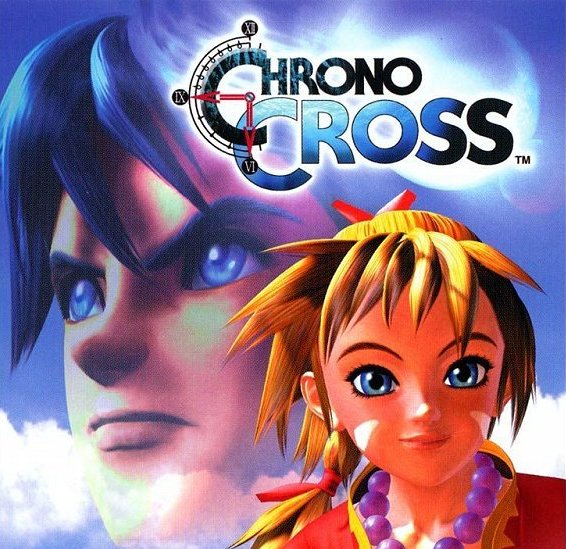
How can ANYONE say Chrono Cross has bad art. I can't even begin to comprehend that nonsense.
Granted, bad 90s CG renders aren't helping it much, but I always found it rather gaudy.
I may get shit for this, but any Halo after 1.
I love the series, it's one of my favorites - but the human art direction made it look like some industrial train station as opposed to the 'futuristic sleek' designs from Halo CE (like the Warthog, Pelican, and the Pillar of Autumn)...
Also, the forerunner architecture and art direction was a lot nicer in CE in my opinion, though Reach does have a lot of that return to form..
Dark Octave said:Vandal Hearts: Flames of Judgment.
It almost looks like an RPG using 360 avatars.
Mama Robotnik
Member
DarkOctave said:
My God... Its like Doctor Breen has a Mini Me.


EatChildren said:
Its clean and easy to look at, but I truly loath the art direction of New Super Mario Bros., both on the Wii and the DS. Its so sterile and bland, like a 3D Modelling and Texturing 101 vision of recreating the Mario universe on modern hardware, devoid of any noteworthy spark of life to the style.
Its a shame the games went in this direction, when both Super Mario Galaxy games are rich and varied in visual style, and Kirby's Epic Yarn is one of the most gorgeous 2D platformers ever.
*high-five*
nincompoop
Banned
Why wasn't Sudeki the first reply


Dacon said:How can ANYONE say Chrono Cross has bad art. I can't even begin to comprehend that nonsense.
I don't like Chrono Cross's art either. What I don't like about it is the character designs. The rest of the game's art is fine, but the character art is horrible. I've never been a fan of the game's character designer and I never will be. I haven't seen any of her art yet that I've liked.
Khezu said:2 and 4 are great, would have liked them way more then that crazy mess they actually went with.
my twin!
Night_Trekker
Member
Body Harvest. It's insanely garish and ugly, but the game is amazing.
DiipuSurotu
Banned
Her? It was Nobutery Yuuki, the guy from Seiken Densetsu 3.B.K. said:I don't like Chrono Cross's art either. What I don't like about it is the character designs. The rest of the game's art is fine, but the character art is horrible. I've never been a fan of the game's character designer and I never will be. I haven't seen any of her art yet that I've liked.
Admiral Bone to Pick
Banned
Prototype.
There was such a great potential to create a vibrant, interesting Manhattan that you could explore for hours. Instead, it felt like endless rows of grey towers, and nothing you did actually made a difference in the city.
There was such a great potential to create a vibrant, interesting Manhattan that you could explore for hours. Instead, it felt like endless rows of grey towers, and nothing you did actually made a difference in the city.
Sapphire Dreams
Member
Gauntlet: Dark legacy


Bland and stupid.
Bland and stupid.
The Last Remnant.
Everyone looks like a reject FFX/FFXII NPC. Everything else is a hodgepodge of randomness. Ok let's add some elaborate armor like in European fantasy... ok now throw in a Chinese priest with a fan... ok now we need some races that aren't human so uh... how about a frog with rabbit ears and a cat with four arms. It tries to blend fantastical with a bit more realistic fantasy (like Suikoden) but fails. Everything is also pretty damn bland. You often find yourself in some dank cave or barren field.

Everyone looks like a reject FFX/FFXII NPC. Everything else is a hodgepodge of randomness. Ok let's add some elaborate armor like in European fantasy... ok now throw in a Chinese priest with a fan... ok now we need some races that aren't human so uh... how about a frog with rabbit ears and a cat with four arms. It tries to blend fantastical with a bit more realistic fantasy (like Suikoden) but fails. Everything is also pretty damn bland. You often find yourself in some dank cave or barren field.
LightofRohan
Member
Those look neat.. but I hope you know that artists dont have free reign to throw anything they want into something. There are a ton of constraints. Bulky clothes, lots of scarves, hair, is a nightmare...AAK said:Yeah, I did not like Bayonetta's design at all. Wish they went with some of the other concept art out there:


I prefer the real Bayonetta design much more. Those designs remind me of the character artwork for APB.AAK said:Yeah, I did not like Bayonetta's design at all. Wish they went with some of the other concept art out there:


I don't want to shit on the game, because it looks like great fun, but it was a huge financial failure, and I think the art design had a lot to do with that.
This game has gameplay similar to, but as good or better than Braid, World of Goo, or Limbo. It could have had just as much success as them, but as it is, the guy that devoted four years of his life to developing it is quitting making games.
revolverjgw
Member
I really love Arkham Asylum, but I really hate the character designs. I know all comic book characters have muscles the size of pumpkins, but it looks really offputting in such a realistic game. Not remotely appealing.
Instead they went the opposite extreme and made her a grotesque giraffe-human hybrid
jett said:Those Bayonetta character designs would be nice if she was supposed to be a midget.
Instead they went the opposite extreme and made her a grotesque giraffe-human hybrid
sixteen-bit
Member
Yeah, Boyonetta
TheShampion
Member
Ninja Gaiden Black and other games in the Ninja Gaiden series just look so terrible to me. All the people look like creepy dolls, and the enemy designs look like they are Ultraman/Power Rangers rejects. The gameplay is really fun, but just looking at the game is just sad. Always hated the art direction for those games.
The ironic part is that NG: Dragon Sword actually managed to have art direction that looked fine to me. Nothing special, but it is beautiful compared to the later games.
The ironic part is that NG: Dragon Sword actually managed to have art direction that looked fine to me. Nothing special, but it is beautiful compared to the later games.
What the...Zoc said:
I don't want to shit on the game, because it looks like great fun, but it was a huge financial failure, and I think the art design had a lot to do with that.
This game has gameplay similar to, but as good or better than Braid, World of Goo, or Limbo. It could have had just as much success as them, but as it is, the guy that devoted four years of his life to developing it is quitting making games.