• Hey Guest. Check out your NeoGAF Wrapped 2025 results here!

Gaming HUDs - the good, the bad and the ugly

Post screens of some of the best and worst HUDs you've seen.

Dead Space has a slick, clean looking HUD.
07837980C56602798DA8A24C6B58D1FF25DFEFCD

Armored Core V is just... WTF am I reading on my screen?

Split/Second with a very simple interface for an arcade racer.

 
Best is when you can enable/disable with a key. Don't have to go in to the options everytime, just press the key when you need it or when you don't.
 
Star Wars Republic Commandos was cool. I loved the visor wiper effect when bug guts were all over your face. Also had ammo info on the guns and that was cool.
 
Armored Core V is just... WTF am I reading on my screen?

ACV's standard HUD is actually very good and well streamlined.

bteSo.jpg


The screenshot you posted is while the AC is in Scan mode, where you are intentionally fed a glut of information about everything in your view at the cost of the ability to fire anything.
 
I can tolerate most huds but can't understand what's so complicated about including an opacity slider. There are quite a few plasma owners and it's just a basic courtesy.
 
Bad:

zelda-skyward-hud.jpg


Good:

zelda2.jpg


Every game should let you customize your hud. Also, every game where you have health should have a health bar. It doesn't make sense when you're playing an adventure game or RPG and there's no health bar. I dislike games that have no HUD whatsoever -- that's looks over functionality. Likewise, it shouldn't be too much. It should show you all that you need to know, which depending on genre can be things like a mini-map, a health bar and ammo meter.
 
Armored Core V HUD is for the scan mode, it's over complicated by design, it's part of the aesthetic. I submit this as bad/ugly/over complicated.

0.jpg

SSX (2012)

Syndicate (201X) looks cool. Same with Deus Ex: Human Revolution.

I agree with this, especially about the Syndicate HUD. It might look really complicated at first glance (especially in co-op) but everything being displayed is relevant information which is easy to understand while looking futuristic and sleek at the same time.

Syndicate-Review-gauss.jpg
syndicate-dart_mode.jpg
 
It's the small stuff that kills everything... it might look identical to the blind eye, but the difference is huge when you actually play the game.

Good:

NR0Ub.jpg


Bad:

jhx4A.jpg
 
Anything that uses the default Xbox font: bad (Crackdown comes to mind).

Ridge Racer UnBounded was pretty bad too. Showing the hud displayed on buildings while driving...sure it's neat but...why? Get's really annoying after five minutes.
 
It's the small stuff that kills everything... it might look identical to the blind eye, but the difference is huge when you actually play the game.

Good:

Bad:

It would be interesting to say why, for those who haven't played both games.
 
It would be interesting to say why, for those who haven't played both games.
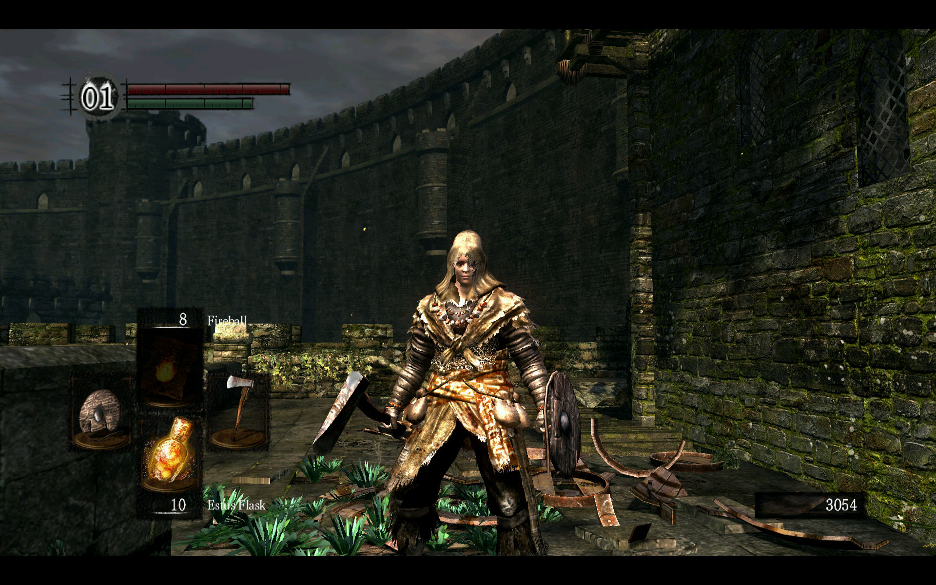
It's just the way everything about the Dark Souls HUD is slightly bigger, and more transparent than makes it much worse. It's almost impossible to see the difference in screenshots, though.
 
It's just the way everything about the Dark Souls HUD is slightly bigger, and more transparent than makes it much worse. It's almost impossible to see the difference in screenshots, though.

Eh, the hud in Demon's is as bad as the Dark Souls one for the same exact reason. They're both too big. I don't understand this at all :P The weapon/item + texture is a bit uglier in Dark Souls though.
 
Eh, the hud in Demon's is as bad as the Dark Souls one for the same exact reason. They're both too big. I don't understand this at all :P
Then you're one of those who never noticed, good for you. I know some people who have the exact same complaints as me, and it's really frustrating. To go into exact specifics, the hud in Dark Souls is slightly bigger, the contrast around the square-shaped icons are much darker and the transparency around the middle parts is way too high. It all adds up.

It's not the same.
 
It's the small stuff that kills everything... it might look identical to the blind eye, but the difference is huge when you actually play the game.

Good:

NR0Ub.jpg


Bad:

jhx4A.jpg
These are possibly the worse pics to choose to defend your opinion i've ever seen on any game discussing videogames ever.And i've played both.The only thing i could say is Dark Souls is dpad area did not need to get bigger compared to Demon's.Seriously if i showed this to someone that has never played either Souls game do you know how fucking crazy you would look?
 
Seriously if i showed this to someone that has never played either Souls game do you know how fucking crazy you would look?
Yes. Now, was there anything else you'd like to say, Zaventem?
 
It's just the way everything about the Dark Souls HUD is slightly bigger, and more transparent than makes it much worse. It's almost impossible to see the difference in screenshots, though.

Woops brain fart, thought second pic Twilight Princess.
Sorry!
 
Quickly jumpin in about the dark/demon souls pics: it's large by design so that it would work on SD. It's one of those things that the HD generation has caused lots of headaches for UI asset creation.
 
Quickly jumpin in about the dark/demon souls pics: it's large by design so that it would work on SD. It's one of those things that the HD generation has caused lots of headaches for UI asset creation.
Weird... I played DS on SD the first 200 hours without problems ._.
 
Then you're one of those who never noticed, good for you. I know some people who have the exact same complaints as me, and it's really frustrating. To go into exact specifics, the hud in Dark Souls is slightly bigger, the contrast around the square-shaped icons are much darker and the transparency around the middle parts is way too high. It all adds up.

It's not the same.

They're different... in the same way that different coffees are different from each other.

But at the end of the day, relative to all other beverages in the world, they're still just coffee.
 
They're different... in the same way that different coffees are different from each other.

But at the end of the day, relative to all other beverages in the world, they're still just coffee.

CoLgZ.png
 
Bad:

http://www.aeropause.com/wordpress/archives/images/2010/08/zelda-skyward-hud.jpg

Good:

http://zelda.com/skywardsword/img/media/gallery/zelda2.jpg

Every game should let you customize your hud. Also, every game where you have health should have a health bar. It doesn't make sense when you're playing an adventure game or RPG and there's no health bar. I dislike games that have no HUD whatsoever -- that's looks over functionality. Likewise, it shouldn't be too much. It should show you all that you need to know, which depending on genre can be things like a mini-map, a health bar and ammo meter.
While the bottom one is better it's far from good. I also disagree about always having my health/magic showing (not exactly what you said but you get my point). Do I really need to see it when I'm not losing/gaining hearts or in a fight? No. Also, I can't stand seeing the rupee counter all the time. I liked that SS let us minimize the hud but it didn't let us go far enough.
 
The thing about a lot of HUDs is that they are very standard. Because there's not a lot of concepts that vary between a lot of mainstream games, they'll have a lot of the same elements. Healthbars/screen-dimming, ammo counts, objectives. The only real way to make interesting ones is to combine form and function in the way a game like Dead Space does.
 
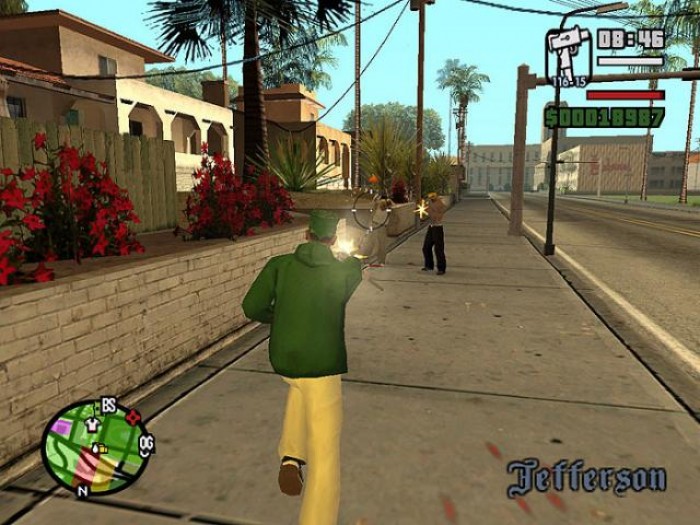
I always liked the HUDs in the PS2 GTAs

gta_san_andreas-screenshot.jpg


Weapon, Ammo, Time, Armour, Health, Money, Location and Minimap, all without cluttering the screen up imo
 
I always thought Street Fighter X Tekken's HUD was just abysmal.
I don't think a single screenshot explains how bad it looks but Capcom tried to go for a very busy-looking HUD where the bars were sizzling, crackling and being electrified. The end result is a distracting and very ugly looking HUD. When I first saw the HUD in earlier builds, I was sure that it was just a placeholder but eventually, the game came out and it was still there. Awful.
 
I just wish more HUD's were like Darksiders 2 (as a recent example) when you need the HUD - during fights for example, it's displayed on screen giving you all the information you need. After a short time without fighting anything, the HUD fades away. Perfect. As was Skyrim and its disappearing health/mana/stamina bars and its ability to make the compass at the top more transparent.

I wish all HUD's were made like that. Just give you the info when you need it.
 
Top Bottom