

-
Hey Guest. Check out your NeoGAF Wrapped 2025 results here!
You are using an out of date browser. It may not display this or other websites correctly.
You should upgrade or use an alternative browser.
You should upgrade or use an alternative browser.
Gaming HUDs - the good, the bad and the ugly
- Thread starter MagicWithEarvin
- Start date


CadetMahoney
Member
I always thought Street Fighter X Tekken's HUD was just abysmal.
I don't think a single screenshot explains how bad it looks but Capcom tried to go for a very busy-looking HUD where the bars were sizzling, crackling and being electrified. The end result is a distracting and very ugly looking HUD. When I first saw the HUD in earlier builds, I was sure that it was just a placeholder but eventually, the game came out and it was still there. Awful.
Yea sfxt is just awful in general tbh.
My favorite HUD options in games are when I can customize everything.
This is something WoW has always been great about, you can replace the Blizzard UI for every feature if you want to.
Example pictures!
UI I am using right now, kind of a work in progress
Random stock UI screenshot from google
This is something WoW has always been great about, you can replace the Blizzard UI for every feature if you want to.
Example pictures!
UI I am using right now, kind of a work in progress

Random stock UI screenshot from google


Black_Stride
do not tempt fate do not contrain Wonder Woman's thighs do not do not
Split/Second already mention, playing the game maxed out is still a treat today years after its release.
Im bringing some old school love.
Star Wars Republic Commando:
Plus i loved the whole vital details towards the bottom instead of towards the top like some shooters do today, i dont know why i feel more comfortable glacing down to see Ammo than looking up.
FEAR
Rage - only when in cities
Im bringing some old school love.
Star Wars Republic Commando:
I just loved it, i felt so in it.

Plus i loved the whole vital details towards the bottom instead of towards the top like some shooters do today, i dont know why i feel more comfortable glacing down to see Ammo than looking up.
FEAR
Suits the game perfectly and isnt intrusive

Rage - only when in cities
And yes i was trying to recreate what people thought was the Bullshot from before launch...i think i got pretty close.


Lactose_Intolerant
Member
Pretty much any game with the hud not next to the edge of the screen because of overscan.

Yoshichan
And they made him a Lord of Cinder. Not for virtue, but for might. Such is a lord, I suppose. But here I ask. Do we have a sodding chance?
Link the original "bullshot"?And yes i was trying to recreate what people thought was the Bullshot from before launch...i think i got pretty close.

Escape from Butcher Bay. It's pretty much perfect. Laser dot for your crosshair and the screen fades to blue to let you know your hidden. Not to mention starbreeze actually makes you feel like your controlling a character as opposed to looking through just a camera as so many other first person games do.

Sapphire Dreams
Member
FF XIII-2

Looks pretty slick.
Looks pretty slick.
Black_Stride
do not tempt fate do not contrain Wonder Woman's thighs do not do not

Yoshichan
And they made him a Lord of Cinder. Not for virtue, but for might. Such is a lord, I suppose. But here I ask. Do we have a sodding chance?
Not bad! Good work.Close no?
H_Prestige
Banned
It's the small stuff that kills everything... it might look identical to the blind eye, but the difference is huge when you actually play the game.
Good:

Bad:

This makes no sense. It's literally the same HUD. If anything, Demons' Souls HUD is more busy with location name on the top right and extra MP bar
Black_Stride
do not tempt fate do not contrain Wonder Woman's thighs do not do not
It's the small stuff that kills everything... it might look identical to the blind eye, but the difference is huge when you actually play the game.
Good:
Bad:
I havent played either game so im really really really curious what the deal is.
To me they both suck, the HUD is like 90% of the screen i cant even see shit on screen.
But seriously do you mind explaining why one is better than the other.
br0ken_shad0w
Member

:lol If I didn't click the topic, I would have easily guessed Call of Duty.
KennyLinder
Member
The HUD in Ico is good.

GW2 has one of the best MMO UI's / HUD's I have seen, so clean.
FriedCalamari
Member
I've always been a fan of GTA Vice City's HUD. Really nice use of colour:

GW2 has one of the best MMO UI's / HUD's I have seen, so clean.
I agree, its functional and just a joy to use because its so damn pretty. The best ui/hud I've ever seen.


I always thought Street Fighter X Tekken's HUD was just abysmal.
I don't think a single screenshot explains how bad it looks but Capcom tried to go for a very busy-looking HUD where the bars were sizzling, crackling and being electrified. The end result is a distracting and very ugly looking HUD. When I first saw the HUD in earlier builds, I was sure that it was just a placeholder but eventually, the game came out and it was still there. Awful.
I think it was actually a placeholder, they even recycled the SF4 fonts, but then Capcom rushed the release and they were forced to keep it.
Speaking of fighting games, I don't understand why so many devs put characters portraits near the lifebars. I guess it's a kind of tradition, but they're totally useless and take precious space. When you have 2 or 3 meters, icons and other stuff on screen already, it's masochistic to add portraits to the hud.
My favorite HUD options in games are when I can customize everything.
This is something WoW has always been great about, you can replace the Blizzard UI for every feature if you want to.
Example pictures!
UI I am using right now, kind of a work in progress
Random stock UI screenshot from google
I hate spatial text. I know it probably can't be done any other way, but it's immersion killing and seems like the last resort / cop out when a game designer has no clue how communicate his ideas to the player.
If movies taught us the importance of show don't tell, games should be do don't show. In the great scheme of things it's do >>> show >>> tell (>>>spatial text).
Immediately puts me off playing the game, kind of a pet peeve.
Meatvillain
Banned
It's the small stuff that kills everything... it might look identical to the blind eye, but the difference is huge when you actually play the game.
Good:
Bad:
These are both vomit-inducing, though I assume the first is more functional, which I can't argue with you about because I haven't played both.
ACV HUD is fine. As someone mentioned already that's a picture of the Scan mode in use (in the OP), which disables weapons so you won't be fighting with that HUD.
Scan mode's also pretty easy to read after a few minutes with the game. All the information in red is information about your opponent's weapons and defenses.
Scan mode's also pretty easy to read after a few minutes with the game. All the information in red is information about your opponent's weapons and defenses.
Messofanego
Banned
I like games where the HUD disappears after a few seconds. I'm trying to think of one, but can't off the top of my head.
KennyLinder
Member
I have the Dark Souls Pyromancer flame burned into my Panny plasma. I don't fucking like it THAT much 
Wind's Howling
Member
I like games where the HUD disappears after a few seconds. I'm trying to think of one, but can't off the top of my head.
Uncharted?
The weapon display only pops up when you are in combat.

Haunted
Member
I'm a fan of minimalist HUDs. Integrated into the world, no fake screen overlays. Metroid Prime, Dead Space, great stuff.
I even take some form over function, because it shows commitment and balls from the developers, e.g. Far Cry 2's map system.
I even take some form over function, because it shows commitment and balls from the developers, e.g. Far Cry 2's map system.
They're both bad, not really an important distinction why one is really bad and the other is really really bad (it's even bigger and even more intrusive).I havent played either game so im really really really curious what the deal is.
To me they both suck, the HUD is like 90% of the screen i cant even see shit on screen.
But seriously do you mind explaining why one is better than the other.
GTA4 putting armor and health around the map was really slick.
Similarly, Brink put the clip ammo count, and reload time data on the reticule, which is fantastic.
Yes, important stuff like that should not be too far from the main locus of attention of the player, or you get a split attention effect, therefore Brink (but also Half-Life 2 way before it) is right to have it near the reticule.
Arguably the fact that it was around the map in GTA, and this was considered useful, stresses what was wrong with that game.
efyu_lemonardo
May I have a cookie?
the definition of bad hud design, impractical, ugly as hell yet good because, you know...
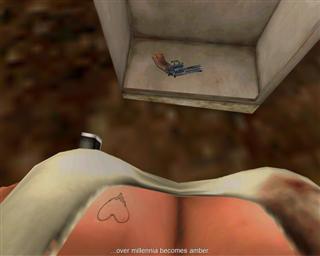
the definition of bad hud design, impractical, ugly as hell yet good because, you know...
Nice, a gun
Yoshichan
And they made him a Lord of Cinder. Not for virtue, but for might. Such is a lord, I suppose. But here I ask. Do we have a sodding chance?
I've done that two times in this thread already.But seriously do you mind explaining why one is better than the other.
SIGH.Flawless trolling by Yoshi.
MagicWithEarvin
Member
Dragon's Dogma's is very cluttered. Thank god they let you adjust it.
I removed everything.
efyu_lemonardo
May I have a cookie?


MagicWithEarvin
Member
Cool, a dinosaur.
Yoshichan
And they made him a Lord of Cinder. Not for virtue, but for might. Such is a lord, I suppose. But here I ask. Do we have a sodding chance?
Is that a Velociraptor? I can't tell.this one better?