
Game name? Is it a Diablo game (I never played the series), since it looks like that and FFX had a grotesque baby.
-
Hey Guest. Check out your NeoGAF Wrapped 2025 results here!
You are using an out of date browser. It may not display this or other websites correctly.
You should upgrade or use an alternative browser.
You should upgrade or use an alternative browser.
Great games with horrible UIs
- Thread starter vato_loco
- Start date
Kane Zakharov
Banned
Game name? Is it a Diablo game (I never played the series), since it looks like that and FFX had a grotesque baby.
Path of Exile
Zombegoast
Member
I didn't like Oblivion's UI

LightningXCE
Member
Halo Anniversary's HUD changes were disgusting.

Things were the wrong shade of blue, which impacted visibility a lot, weird reticle size changes, everything was beveled, different shaped, and the god awful fonts they used.
Things were the wrong shade of blue, which impacted visibility a lot, weird reticle size changes, everything was beveled, different shaped, and the god awful fonts they used.
Khalifa Jayy
Banned
For all that's represented they handle it really well. I, for one, like it just fine.Are people seriously saying Destiny has good UI?
Overloaded


The Grand Theft Auto series. Ridiculous that for a series whose budgets and technical merits have increased a thousandfold, the HUD and notifications haven't evolved an inch since GTAIII. And it sure ain't sticking around because GTAIII's were fantastic. We should have something a bit more readable and way, way more stylish at this point.

Really? That's pretty hilarious.They actually forgot to make a finished version and shipped with the dev menu :lol
bobawesome
Member
Anything Sakurai's wife has touched.
Persona 3 and 4 show this to be an untruth.
All Japanese PS1 and PS2 games. All of them.
Persona 3 and 4 show this to be an untruth.
RedRedSuit
Member
Xenoblade's UI is kinda rough.
Xenoblade's UI is god awful and I'm not afriad to say it
Ultra horrible damage font, gigantic everything detracting detracting from the scenery.
XCX at least looks a lot cleaner with much better fonts.
Yes. Xenoblade immediately came to mind. I won't say the UI is the thing that made me stop playing -- it was more the lack of engagement by the battle system (which either felt intractable if under-leveled or boring if over-leveled, with a happy medium -- where skill gets one through -- apparently available but hard to access). I will say that the UI doesn't help my enthusiasm for the game whenever I consider getting back into it.
I am one of those people that likes to mess with people's builds and gets surprising amounts of satisfaction optimizing equipment and such (e.g., messing with materia slots in FF7), but Xenoblade makes this annoyingly hard to pull off in the menus. It always feels like the needed info is just out of view. The crafting system and inventory system feel complicated just for complexity's sake (which isn't in itself a UI problem, but the UI is supposed to clarify and make complex things fun). I seem to recall some kind of emotion/skill system thing... I forget the details... but the UI made it utterly impenetrable for me.
I was playing Ni No Kuni on PS3 the other day; now there is a brilliant set of menus. Everything is clear as can be and beautiful and stylish too. Granted, it appears to be a much simpler game than Xenoblade, but we are talking about UI here.
Bomber Bob
Banned
Has nobody seriously brought up Playstation All Stars? Somebody in a high school photo shop class could muster up something better than this.

lol WTF is this shit
looks like unity3d default gui
the_sun_king
Member
Dragon Age Inquisition's inventory screen makes me want to stop playing tbqh (although obviously this is just hyperbole)
Bioware have consistently been awful when it comes to inventory/storage in their big RPGs. And I don't understand why.
GodParticle
Member
Path of Exile's skill tree is the most bizarre thing ever. So annoying to navigate
Really? That's pretty hilarious.
Yeah, IGA explained it in that DoubleFine Devs LP on Symphony of the Night, they had gotten so used to the screen by then that no one thought to change it for something else
Shin-Ra
Junior Member
Looks nice, looks Dead Space. Maybe not so great if you're playing with a mouse.What the hell happened in the transition from Borderlands 1 to Borderlands 2?
I'd disagree if the game in question loaded quickly.Any game that jumps you straight to gameplay before letting you actually use the menu is a fail.
I love the minimal but textured styling of Shadow Fall's HUD and menus, apart from the screenshot-menu-backgrounds which look a little low-res and don't provide a nice contrast. The gameplay HUD's difficult to read against a bright environment, even playing close to a monitor though.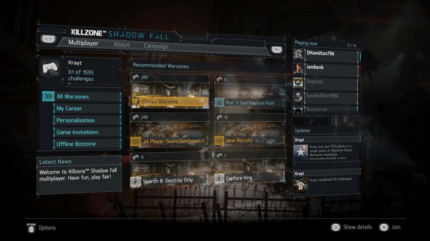
KZ SF wasn't really that great, but the UI was the worst I have ever seen.
The font (right bottom corner) was so tiny that I couldn't read anything on a 40 inch sitting pretty close to it.
Does anybody know why so many devs choose to use tiny fonts?
They actually forgot to make a finished version and shipped with the dev menu :lol
Is that actually true? That explains a lot... I loved the game, but sorry, the menu sucked ass.
Is that actually true? That explains a lot... I loved the game, but sorry, the menu sucked ass.
Yep. Watch this: https://www.youtube.com/watch?v=bqheYYeA4k4
IGA explains a lot about the development of the game, it's a good watch.
What the hell happened in the transition from Borderlands 1 to Borderlands 2?
I don't have any issues whatsoever with the Borderlands series UI, I think it's pretty great and unobtrusive!
John Kowalski
Banned
What the hell is wrong with people complaining about Sakurai's menus.
Bloodborne's menus are... well... functional.
Incredibly functional. They allow you to find exactly what you need and apply it to your person mid-action. Being able to swap out your weapons and armour literally on the go is great.
DS2 however is very bad. Trials Fusion is also clunky as hell.
First of all, you can rotate that map and it's very clear looking when you do so. It's actually the best map screen I've ever seen.
Second of all, they do show you. Every time you go in front of a door, you see a preview of where it goes. If it doesn't show you a preview, then it means it's a new door, a secret door, or you will go to the area that is currently in the background of the game screen.
I agree with you completely, I love 3D maps and this game has one of the best.
NinjaBoiX
Member
Gran Turismo 5.
I had to stop playing it was so bad.
The worst designed front end I've ever encountered, it wasn't even consistent in it's ineptitude.
They're like, effective UI design 101.
I had to stop playing it was so bad.
The worst designed front end I've ever encountered, it wasn't even consistent in it's ineptitude.
Destiny
I have no idea what you guys are smoking. Both these games have gorgeously slick and understated yet entirely informative UI's.Skyrim
They're like, effective UI design 101.
Vulcano's assistant
Banned
Gran Turismo 5.
I had to stop playing it was so bad.
The worst designed front end I've ever encountered, it wasn't even consistent in it's ineptitude.
I have no idea what you guys are smoking. Both these games have gorgeously slick and understated yet entirely informative UI's.
They're like, effective UI design 101.
Skyrim UI is form over function 101. Looks pretty, but it's a chore and everyone mods it.
I love dragons dogma, but i think its UI and menus are ass.
came to post this, also couldn't finish ME1 because of the UI
LurkerPrime
Member
I have no idea what you guys are smoking. Both these games have gorgeously slick and understated yet entirely informative UI's.
They're like, effective UI design 101.
I'm sorry, WHAT!?
Skyrim is functional, but far from good or even decent. As SkyUI has shown, there many ways it can be improved into genuine "good" territory. By default, everything is trapped in its own menu and even mundane tasks are bothersome. Because every single thing in the menu works via scrolling, large amounts of anything presents formidible problems for vanilla Skyrim's UI - which is odd, because this is one game where players are sure to get a bunch of weird odds, ends, & loot management.
Is all this "Skyrim has good UI" insanity coming from controller players or something? Because, far as I know, it controls the same and is thus an identical nightmare to KB&M controls.
Don't mistake looking good with being good. They are two separate things - form and function - and are needed in equal measure to make legitimately good UIs. In such a game, it will look nice and give you everything you can think to ask for while playing.
Are people seriously saying Destiny has good UI?
Overloaded
Destiny's UI is fantastic. It's probably one of the best game UI's in recent years.

Has nobody seriously brought up Playstation All Stars? Somebody in a high school photo shop class could muster up something better than this.
I knew somebody would be stupid enough to post this despite the title of this thread