Jubenhimer
Member
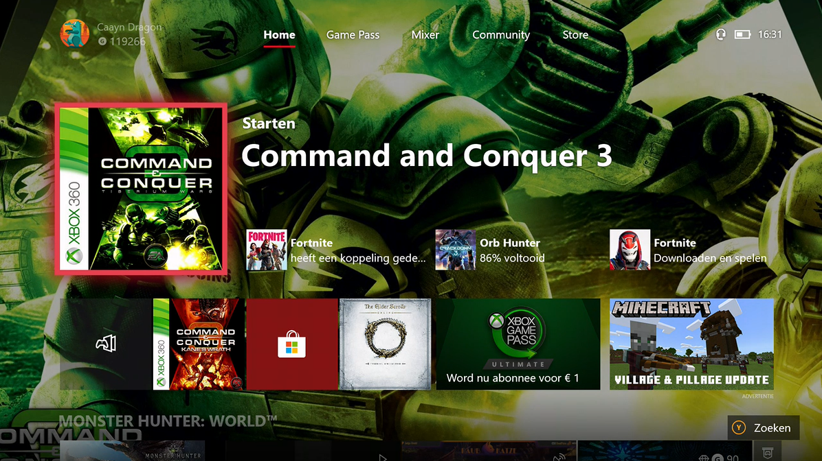
It's no secret, that the Xbox One currently has the worst UI design of any major gaming platform at the moment. Even after three major revamps, this slow, clunky, labrynthy mess of a Dashboard feels more like a glorified App Store than a personal home console interface. With Scarlett on the horizon, Microsoft really needs to fix its UI problems for the next generation. And here's how I think they can do it.
1.) Bring back the Windows Tiles - I always thought Microsoft's tiles were a unique take on app icons. The Xbox One's launch Dashboard carried them over from Windows 8, and they still exist on Windows 10. It begs the question why Microsoft decided to get rid of them for future Xbox One dashboards. I'd say bring them back, make them as customizable as on Windows. Let the users arrange them in groups, and folders. Which leads me to.
2.) Make it feel personal - A major problem with the Xbox One Dashboard is that it never feels like its "your" console. The severe lack of customization and simplicity makes it feel like Microsoft's console they're just letting you use. It's cluttered with a bunch of useless ads, recommendations, and info that gets in the way of you just trying to see your damn library. Cut the bloat, just show me all the stuff I want on the home screen right away. You can save ads and what not for the Store when I poke around there, just put my content first before anything else.
3.) Keep it simple - This ties in with #2. You don't need to bloat the Dashboard with useless garbage nobody cares about. No Xbox, I don't give a shit about the fact that Jason245 played Ori and the Blind Forest for 43 hours, so don't have that be the first thing I see on the home screen. Basically, get rid of the weird store-style layout they have currently. Give me a home screen more akin to the Nintendo Switch or PS4. Where its just all the tiles of your games and apps, arranged how you want them, with all the extra stuff contained in easily accessible task buttons.
That's pretty much it. The PS4 and Nintendo Switch UI's have their share of problems, but the Xbox One dashboard is quite honestly a Joke, and it's something Microsoft despreately needs to fix for Scarlett.
 I hated the use of tiles later on - Xbox, Windows, anywhere....tiles are shite