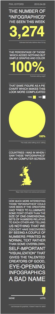
Well, not all infographics. But lately I've noticed that they're becoming increasingly more popular. It seems people are going out of their way just to think of subjects to turn into infographics. And most of these things dumb down the facts to the point where they're no longer useful, they stop short of coming to any useful conclusions, and they are made first to look good, not to convey information.
Take this one titled "Is your boss older than you?" Only the first two data points are relevant. It then goes into stick figures of varying shades of pink to demonstrate nothing.
Here we have a graphic that doesn't actually use graphics to visualize any information. It's just 20 names with words floating around.
Did you know pie charts are not clear enough, and actually need to be encircled by bar charts to become useful?
I get the impression that there are armies of graphic artists out there competing to make the worst infographic so they can get their 15 minutes on digg. I apologize for wasting your time with this complaint, but man it's annoying.