-
Hey Guest. Check out your NeoGAF Wrapped 2025 results here!
You are using an out of date browser. It may not display this or other websites correctly.
You should upgrade or use an alternative browser.
You should upgrade or use an alternative browser.
Illegible or ugly fonts
- Thread starter Phediuk
- Start date
AtomicShroom
Member
Witcher 3
Code:[IMG]https://i.ytimg.com/vi/HiApH-znl74/maxresdefault.jpg[/IMG]
What the fuck are you doing CDPR. Subtitles in general are absolutely dreadful in video games, to be honest. They're tiny and don't have proper, thoughtful line breaking. So you end up with this kind of garbage which is pretty much unusable at an average viewing distance.
So many devs/pubs just don't give a fuck about allocating the necessary resources for something that I honestly consider to be very important in text/dialogue heavy games.
This shit angers me to no end! Subtitles are meant to be an ACCESSIBILITY feature. I understand that the artist who came up with font size was sitting just 30cm away from his 32" high-end PC monitor, but when you're playing this on any regular TV from your comfy couch(tm), it's totally fucking useless!
Compare to how big subtitles are in TV shows and movies:

This is how it should be!
This was going to be my pick too.
Etrian Odyssey 1 for DS had a weird font.
It was a really ugly choice, and I'm glad the sequels didn't use it.


And Culcept Revolt hasn't been released yet but the font they use in the preview screenshots is pretty awful.
It just seems like such a weird choice - the letters aren't even clear.
The awful shit they did to Tales of Symphonia's font in the Chronicles re-release.

Tales of Symphonia's original NA font. Oddly enough I found the image from NeoGAFs last font thread.

Much better in the remaster, some sort of serif font now. Too bad about the 30 fps huh.

The awful shit they did to Tales of Symphonia's font in the Chronicles re-release.
heh
LiamExe
Member
The old Final Fantasy logos:


Ah, yes, my favourite game series, Banal Lantasy.
Dice//
Banned
...bad example.
The old Final Fantasy logos:
I'mma just snowball this one on top of there.
It's beautiful but it makes me go cross eyed
This was going to be my pick too.

Yeah that's definitely no good
Admittedly not the best screenshot, but FreeSpace 2's font is hell to read at higher resolutions:
Yes it looks rather blurry.
That is a technical issue though, the font was perfectly legible when the game was new.
Also, anybody who is reading this should play Freespace 2.
SquallLeonE
Member

This shit angers me to no end! Subtitles are meant to be an ACCESSIBILITY feature. I understand that the artist who came up with font size was sitting just 30cm away from his 32" high-end PC monitor, but when you're playing this on any regular TV from your comfy couch(tm), it's totally fucking useless!
Compare to how big subtitles are in TV shows and movies:
This is how it should be!
Exactly. The people working on this stuff don't seem to follow any subtitles/accessibility guidelines. But at least they should realize when your subtitles are going to be fucking useless FFS. Life is Strange is literally the only game I've played that has subtitles approaching professional quality.

But still not quite what the average blu-ray looks like.

Still has too many words per line, but it's better than the rest.
Can't you change the text shadow or something?How about the PS4 dashboard with almost every theme:
Bending_Unit_22
Member
I wish I could recall what game it was but it had white on white text.
EDIT: It was Bridge Constructor but I can't find pics of it.
EDIT: It was Bridge Constructor but I can't find pics of it.
That's what I was thinking. My TV is a little large but I sit a little further away so it averages out and I had to squint constantly playing it.I couldn't comfortably play Xenoblade Chronicles X due to the small font size.
Ultima 7 is probably the classic example.
wtf were they thinking with that shit? Literally every bit of dialogue is displayed in that unreadable faux-Gothic script. It's a black mark against a great game.
Luckily, there is a mod to change the font:
Now that's better.
post more.
Seriously? I have no issue reading that, but then yutes today can't read cursive so I guess it makes sense. EDIT: I'm focusing on the illegible part, I agree that it's ugly but your comments indicate illegibility was an issue so the point remains.Pool of Radiance is pretty dreadful too, though slightly more readable than Ultima 7.

digitalflame
Member
Literally so small it's illegible if you sit more than a meter away.

NormalFish
Banned
I see Xenoblade and MH3U on the 3DS have been mentioned. Those are definitely the ones I'd look to. It's bizarre games still release with bad fonts given there's such a massive pool of reference for good (and tiny) fonts.
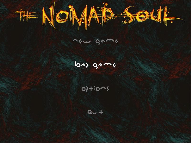
Behold, Omikron: The Nomad Soul!
I suppose these are kind of readable, if difficult, but if you go into Options...
Oh and some of the text in game (not all of it, though, to make it worse, somehow) is displayed like THIS
edit:
Damn it, I must've missed this in scanning the thread.

I suppose these are kind of readable, if difficult, but if you go into Options...

Oh and some of the text in game (not all of it, though, to make it worse, somehow) is displayed like THIS

edit:
How about this shit font that would sometimes show up in several paragraphs of text you would need to read in this shitty game.
Damn it, I must've missed this in scanning the thread.
drangleic tourism
Member
Pool of Radiance is pretty dreadful too, though slightly more readable than Ultima 7.
The amount of commas in that screen cap is slightly concerning.
playingwithfire
Member
It's not illegible, but the way BotW uses the Zelda logo font for a lot of its in-game text looks really strange to me.
In Diablo II, it's almost impossible to read a 5 as a 5 unless you see a 6 next to it.
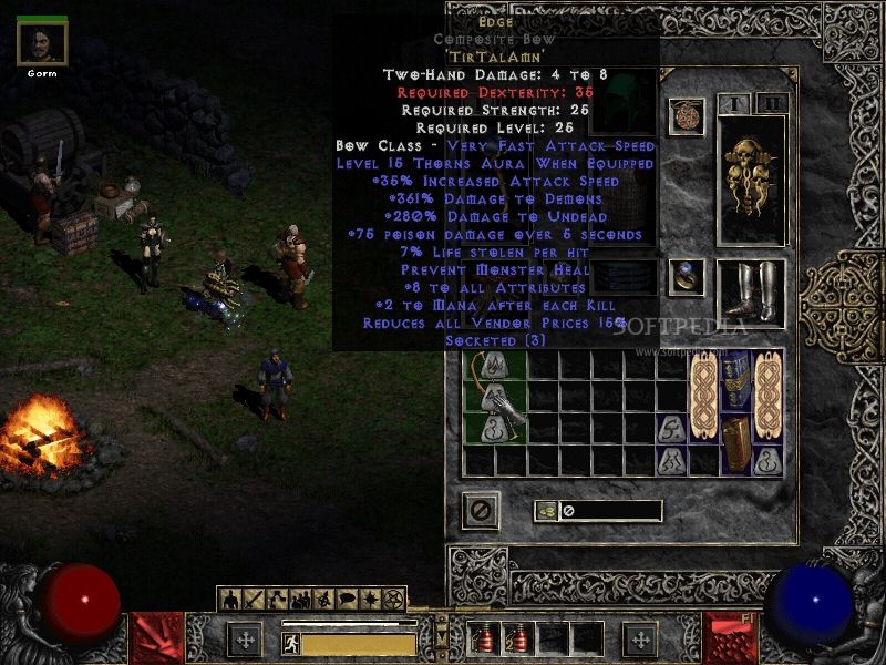
God, I forgot how difficult it was to distinguish that. I get the font choice for the game, it looks great to some extent... but just not that.
spazchicken
Member
Someone here had to tell me what this said. I wasn't even sure it was in English.
Daamascus Gear, while not as bad as other examples here, can sometimes be difficult to read due to poor kerning.

yo, that kerning is bullshit
Ah, yes, my favourite game series, Banal Lantasy.
I'm getting more of a 3qñpC Joontasg
Daamascus Gear, while not as bad as other examples here, can sometimes be difficult to read due to poor kerning.
I'venoideawhatyoumean.
arts&crafts
Member

Someone here had to tell me what this said. I wasn't even sure it was in English.
Team15
I know it is Team17 but if I didn't know the brand I would say 15.
Triforce141
Member
It's one thing to have tiny font that's barely readable far away, but giant font that covers a chunk of the screen is equally annoying
Holy crap, it's the Dark Cloud font

Holy crap, it's the Dark Cloud font
Valkerionseven
Member
The first two Wild Arms games used an ugly font (which I remember being installed on the Mac Performa my family had when I was a kid).

What I came to post. Recently beat Wild Arms 2, it took me 10 hours to discern the b's d's and h's among other letters. Completely ridiculous font.
Dino Crisis has this weird, stretched out typeface for the inventory menus. It really bugs me.
Yeah, this always bothered me too. I always felt the resolution was out of whack in the menus for it.
Special mention to Dragon's Crown title, cool looking until you try to read it.
I can't find a picture for it but the fonts available for you to customize signs with in Planet Coaster are unbelievably awful. There are 6 or 7 of them and only one looks remotely normal, as there's a pirate themed font, a wild west font, a space font, etc. No plain sans serif or anything. It's extremely frustrating given that the game is supposed to be all about customization. At least they recently patched in the ability to use any picture as a billboard, but getting proper fonts for signs should be a super easy fix.
I can't find a picture for it but the fonts available for you to customize signs with in Planet Coaster are unbelievably awful. There are 6 or 7 of them and only one looks remotely normal, as there's a pirate themed font, a wild west font, a space font, etc. No plain sans serif or anything. It's extremely frustrating given that the game is supposed to be all about customization. At least they recently patched in the ability to use any picture as a billboard, but getting proper fonts for signs should be a super easy fix.
You just reminded me of the exact same problem in the Forza livery editors. For the longest time they sat with utterly ugly, hyper-specific fonts and nothing generic you could use for most logos. It's not much better now.
EDIT: What is anyone supposed to do with this garbage?


Sun Bather
Member
Silent Hill Downpour had some legit fucking disgusting fonts.

On the other hand, the font is very fitting for a game, that thought having Korn in it was a good idea. What a change
On the other hand, the font is very fitting for a game, that thought having Korn in it was a good idea. What a change
Not font related, but subtitles in Last of Us.
https://youtu.be/aUZ3MKvUjx8?t=1272
There are at least 3 conversations being subtitled at the same time.
https://youtu.be/aUZ3MKvUjx8?t=1272
There are at least 3 conversations being subtitled at the same time.
blummer102
Member
When I was a kid the Gameboy Pokemon font kinda bothered me. Felt too stretched-out and fat.
I also wasn't a huge fan of the all-italics Link's Awakening font and was glad when they went with a non-italics version in the Oracle games.
The font that Sierra used to use in all of their old adventure games (here is King's Quest IV) also wasn't my favorite.
Ironically while I didn't like these fonts at the time now I can kinda appreciate them for their pixelated/antiquated vibe. I guess I wouldn't out-right call them "ugly" - just didn't like 'em when I was younger.

I also wasn't a huge fan of the all-italics Link's Awakening font and was glad when they went with a non-italics version in the Oracle games.

The font that Sierra used to use in all of their old adventure games (here is King's Quest IV) also wasn't my favorite.

Ironically while I didn't like these fonts at the time now I can kinda appreciate them for their pixelated/antiquated vibe. I guess I wouldn't out-right call them "ugly" - just didn't like 'em when I was younger.
Someone here had to tell me what this said. I wasn't even sure it was in English.
This also reminds me of how it took me around 20 years to finally see that the first letter in the Disney logo was in fact a D. It always looked like a backward 6 with a small line through it, or some inbred combo of music clefs.
DyslexicAlucard
Member
Have you ever played Monster Hunter 3 Ultimate on Wii U off-TV?
This reminded me that the font on MH3U for 3DS was just unacceptable. It was squished to all hell, to the point of being almost unreadable. I know it's a port of sorts, but the fact that the devs knew the exact resolution they were working with for every 3DS makes it inexcusable to me. Luckily, they fixed it in MH4U.
This also reminds me of how it took me around 20 years to finally see that the first letter in the Disney logo was in fact a D. It always looked like a backward 6 with a small line through it, or some inbred combo of music clefs.
I actually had this same problem as a kid. I always saw a backwards "G," I don't even know why. I see it as a "D" now though.
Jawmuncher
Member
Dino Crisis has this weird, stretched out typeface for the inventory menus. It really bugs me.
What I came to post. Recently beat Wild Arms 2, it took me 10 hours to discern the b's d's and h's among other letters. Completely ridiculous font.
Yeah, this always bothered me too. I always felt the resolution was out of whack in the menus for it.
Special mention to Dragon's Crown title, cool looking until you try to read it.
I'm issuing a warning to you two
whiteninja
Member
The first two Wild Arms games used an ugly font (which I remember being installed on the Mac Performa my family had when I was a kid).
Had a hard enough time trying to decipher this shit on a small sd tv. I wish someone would of make a font patch or something.
playingwithfire
Member
This also reminds me of how it took me around 20 years to finally see that the first letter in the Disney logo was in fact a D. It always looked like a backward 6 with a small line through it, or some inbred combo of music clefs.
Haha me too. I still have trouble trying to visualise that as a D
Weltall Zero
Member
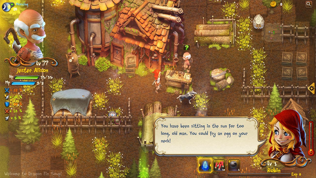
Dragon Fin Soup is hard to read already on PS4. On Vita the entire screen is shrunk wholesale rather than zooming in, and while most of it is therefore turns into a super busy, indecipherable mess, the text in particular is straight up "what the fuck were they thinking" unplayable territory.
Consider that unless you have a tiny monitor, you are viewing the above images at considerably larger than Vita screen size.

Consider that unless you have a tiny monitor, you are viewing the above images at considerably larger than Vita screen size.
How about this shit font that would sometimes show up in several paragraphs of text you would need to read in this shitty game.
This was what immediately came to mind.
This shit angers me to no end! Subtitles are meant to be an ACCESSIBILITY feature. I understand that the artist who came up with font size was sitting just 30cm away from his 32" high-end PC monitor, but when you're playing this on any regular TV from your comfy couch(tm), it's totally fucking useless!
Compare to how big subtitles are in TV shows and movies:
This is how it should be!
Would just like to say this angers me as well. I don't have bad eyesight, but every time I see a game with subtitles that place aesthetics over legibility it makes me feel bad for the folks that actually need/use them. Netflix does it right.
AtomicShroom
Member
Most Monster Hunter games.

Hated Mario 64's font. But I love the big mario block letters.
Yeah it looks bad when viewing the game at a higher res and on a monitor, but when most people played this on a CRT TV back in the day, the TV added a lot of natural blur that made the font come out fine.
FelixTheSexranger
Member
All modern games.
Please, developers. Give us option to change subtitle size. We all don't have 1000000 inch Mega super duber TV.
Please, developers. Give us option to change subtitle size. We all don't have 1000000 inch Mega super duber TV.