• Hey Guest. Check out your NeoGAF Wrapped 2025 results here!

ios 7 - beta 2 - now for ipad / ipad mini - impression thread

Status
Not open for further replies.

Flek

Banned
Ok i figured we could need a thread for beta 2 because ipads are now supported.
so post impressions guys :)

i have to say iam soooooo dissapointed with ios7 (ipad mini) - its relativly slow, its ugly and just doesnt make sense at all. As a designer myself i always looked up to ive, i considered him one of the best current (industrial)designers but holy shit is IOS7 poorly designed. I know he isnt a graphic designer but boy i thought he had tase at least?

Iam seriously considering a downgrade to ios6.xx now. So i would say be happy with what you got in ios6.x i didnt find anything i liked at ios7 and i would call myself a apple fan
 
Slow, buggy, unstable.

But its a first beta release so all of that should be expected and accepted.

I like iOS 7's look overall, though. However it is almost an eyesore non-Retina. Definitely a different beast (an ugly one) at lower DPIs.
 
Am I crazy or does all points of the ios 7 UI design point to a bigger phone in the near future?

Feels like they are changing things to make it easier to 1 hand stuff... idk. Just this feeling.
 
The bottom swipe up thing is good for quick access to stuff, the rest is just minor visual changes that make it look a little fresher. I'm fine with it so far
 
iOS 7 Beta 1 for iPhone was really full of crashes and overlapping effects and really gnarly unexpected behaviors, but wasn't unusable and it was to be expected since it was a first beta. iOS 7 Beta 2 for iPhone seems much improved with performance and visuals so far, and I haven't come across any big errors or crashes since updating last night.

I'll wait for another Beta release before trying it on iPad, or I might just wait for the final release on my iPad.
 
Not sure how anyone can honestly say "i didnt find anything i liked at ios7"

Seriously now...

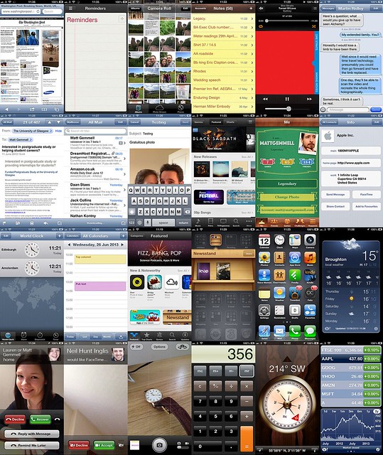
9025739956_f90cce7276_z.jpg

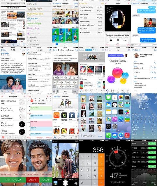
9025739882_d7596b0b8d_z.jpg

There are a few kinks (it's a beta, after all), but the overall design language and aesthetic are infinitely better than the stale mess that was iOS6.

vs.


Night and day.
 
Not sure how anyone can honestly say "i didnt find anything i liked at ios7"

Seriously now...


There are a few kinks (it's a beta, after all), but the overall design language and aesthetic are infinitely better than the stale mess that was iOS6.


vs.


Night and day.

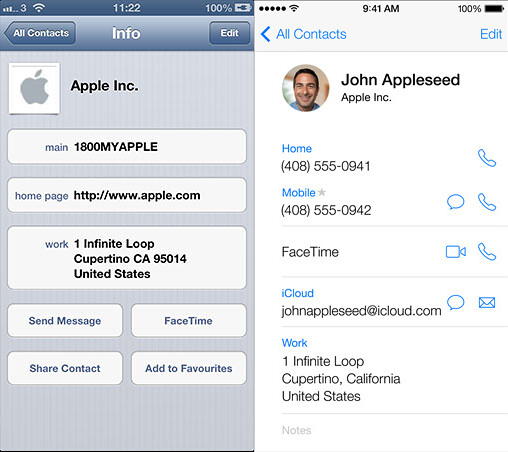
The default icons could use some work. Doesn't seem entirely consistent with their overall 'vision'. Other than that, I really like the ocular parallax that they're incorporating.

I'm hoping that it can be disabled though, for performance.
 
The default icons could use some work. Doesn't seem entirely consistent with their overall 'vision'. Other than that, I really like the ocular parallax that they're incorporating.

I'm hoping that it can be disabled though, for performance.

thats it its inconsistent. It is not entirly flat, the typo doesnt work, the icons dont match and look shity, parallax is nice but just another trendy design thing.
 
Apple wasn't going to get better at iconography and visual design than they already were. Their icons have always been shitty, and their software visual design has always been awkward. At least they are relatively consistent (yet fluid) with their style again.
 
Not sure how anyone can honestly say "i didnt find anything i liked at ios7"

Seriously now...


There are a few kinks (it's a beta, after all), but the overall design language and aesthetic are infinitely better than the stale mess that was iOS6.


vs.


Night and day.

Wow it looks soooo slick. Can't wait for the final release!
 
Apple wasn't going to get better at iconography and visual design than they already were. Their icons have always been shitty, and their software visual design has always been awkward. At least they are relatively consistent (yet fluid) with their style again.

Consistency between apps is huge. I love my HTC One but the consistency of the Apple experience is unparalleled.
 
Apple wasn't going to get better at iconography and visual design than they already were. Their icons have always been shitty, and their software visual design has always been awkward. At least they are relatively consistent (yet fluid) with their style again.

That's your opinion. I've always thought their icons were light-years ahead of those on Android phones; the new icons look good for the most part, barring the occasional hideous engimas such as Safari.
 
Ok i figured we could need a thread for beta 2 because ipads are now supported.
so post impressions guys :)

i have to say iam soooooo dissapointed with ios7 (ipad mini) - its relativly slow, its ugly and just doesnt make sense at all. As a designer myself i always looked up to ive, i considered him one of the best current (industrial)designers but holy shit is IOS7 poorly designed. I know he isnt a graphic designer but boy i thought he had tase at least?

Iam seriously considering a downgrade to ios6.xx now. So i would say be happy with what you got in ios6.x i didnt find anything i liked at ios7 and i would call myself a apple fan

If you are not submitting bug reports for the issues you have, then you have no business being a beta tester.
 
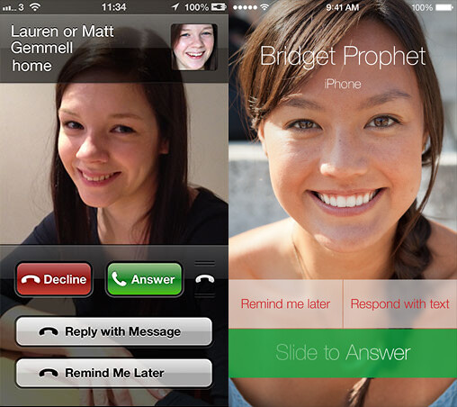
Bridget Prophet is cute.

iOS7 overall is more consistent than iOS6 due to half the overly skeuomorphic mess being jettisoned. But damn is the typography all over the place in iOS7, and some of the icons...I don't really like.
 
That's your opinion. I've always thought their icons were light-years ahead of those on Android phones
Well, I didn't say they weren't. I agree with you on this. Even just having a standard shape and size makes them look so much better.

I like the new icons for their consistency and style, but there are dumb mistakes like the moire pattern in Voice Memos as that icon changes size and buttons having the same color scheme but no logical connection (Camera/Settings, Clock/Stocks, Game Center/Reminders).
 
I question whether this really needed a new thread.

That said, I do feel that the interface was designed more with the iPhone in mind and transferred to the iPad.

I guess you could argue that about iOS in general. ;even though the iPhone was very likely born from tablet research.
 
battery could be better, it's a bit slow on the 4S and buggy (which is to be expected). I love the overall feel of it. I wish it required less of a swipe to get the lockscreen camera to open
 
New version is superior in terms of performance to beta 1. Still having some issues with apps that are irreplaceable for me (Wikipanion is non-functional in iOS 7 which BLOWS) but I'm very happy with it.

My iPhone feels like a "new phone" for the first time in a very long time. The previous OS was really, really dated. Seems like battery life is much better in Beta 2. In Beta 1, my phone was almost always exceedingly hot -- something was just constantly draining the fuck out of the battery. They've fixed that.

I hate the change to Spotlight -- it makes 0 sense and the removal of "Search Google" "Search Wikipedia" etc. from that contextual search was an absolutely awful decision that makes zero sense.
 
The thing that really bugs me is that they halfassed the refresh, there are still drop shadows (eg. Icons), and embossed text. They really have no place in the design language they are trying to imitate. And those inconsistent Game Center bubbles, oh god.
 
The thing that really bugs me is that they halfassed the refresh, there are still drop shadows (eg. Icons), and embossed text. They really have no place in the design language they are trying to imitate. And those inconsistent Game Center bubbles, oh god.
What? The whole design metaphor is about "layers" - not universal flatness. Subtle, light shadows are a necessity to maintain that idea.
 
Really? It's easier to get to and it functions like every Search in almost every app now.

The current change isn't intuitive at all IMO and they removed multiple features from the search while they were at it. The fact you can pull it up from any of your windows is nice though. If they'd simply decided to still allow you to access it by swiping to the right from your home screen, it would have made more sense. That allows for less clutter when looking at the search results as well.
 
I get what you're saying, but I think Spotlight's a thing for experienced people. Siri and the icon grid are enough for most people, so Spotlight is rightly hidden by default at the top just like Search is hidden at the top in most apps.
 
People said the same thing about netbooks. Apple doesn't follow trends like that.

I guess it all depends on demand and potential. They said they would never change the 3.5" screen format before... And galaxy note is crazy successful.

I really doubt they needed the ipad mini but from the announcement, they clearly are out to fight android 7" tablets with that.
 
It's a Beta.

There are bits of the iPad version that are clearly unfinished - it's an alpha at best. Never really had an iOS one of those before.

The iPhone version is much improved, but you get the impression that this was supposed to be where they were at the announcement, and they still haven't done anything with feedback yet. At least I hope so - they still need to fix calendar dots, and a lot of other stuff to be honest.
 
The colors are just bizarre to me. I do like the interface in general though...

but those colors. yelch! Reminds me of bubble gum. BubblegumOS7.
 
Much better on my iPhone 4. All round smoother. Still getting crashes when facebook wants to load the camera but other than that no major issues.
 
I've been enjoying it so far on my 5. Seems pretty stable for my day to day use other than a few hiccups here and there, but hey it's a beta. Beta 2 seems okay so far. Haven;t had issues with battery life. I love that I can stuff newsstand in a folder. Finally.

I guess my only complaint so far would probably be that I don't like how safari went fullscreen in landscape before, now that bar is always there across the top.

Haven't gotten it on my iPad 2 yet, forgot to bring a cord with me where I'm staying. I expect it to run poorly.
 
I've been getting this strange bug that causes my music to fast-forward randomly. There is no way to stop it either unless I turn off my phone.
 
IOS7 is HOT. As in awesome. I usually don't put betas on this early, but this time I couldn't resist putting it on my iPad, which isn't mission-critical like my iPhone is. I'm really liking it.
 
Not sure how anyone can honestly say "i didnt find anything i liked at ios7"

Seriously now...


There are a few kinks (it's a beta, after all), but the overall design language and aesthetic are infinitely better than the stale mess that was iOS6.


vs.


Night and day.


Simply gorgeous.
 
I've been getting this strange bug that causes my music to fast-forward randomly. There is no way to stop it either unless I turn off my phone.

I've been getting an issue where it automatically tripled my music library. I had to eventually switch back to iOS6. Here's hoping the issue doesn't repeat itself with 7.02.
 
Status
Not open for further replies.
Top Bottom