• Hey, guest user. Hope you're enjoying NeoGAF! Have you considered registering for an account? Come join us and add your take to the daily discourse.

MS prepping a Win 10 design refresh for later this year (early screens leaked)

Status
Not open for further replies.

Vanillalite

Ask me about the GAF Notebook
The Verge

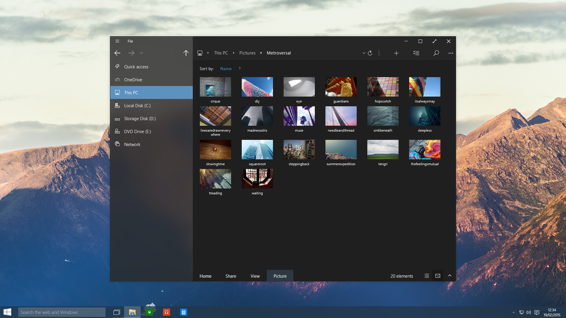
Microsoft is currently planning to refresh its Windows 10 user interface elements in an update that will arrive later this year. The software giant will make more use of animations, and visual blurring elements from the Aero Glass era of Windows Vista and Windows 7 in what’s described internally as Project Neon. MSPoweruser has obtained screenshots of concept ideas that Microsoft is currently experimenting with after Windows Central reported on Project Neon last year. The concepts include the ability to blur parts of the navigation areas of apps.

Microsoft is reportedly introducing a new component branded “Acrylic” to the overall Windows 10 design, which will act as a method for developers to further customize the appearance of their universal apps. Project Neon also focuses on Microsoft’s efforts with 3D and HoloLens, tweaking UI elements in places where you interact with a mouse pointer.

projectneon1.0.png


projectneon2.png
 

AyzOn

Neo Member
I like it and since I´m also using groove pretty often I wouldn´t mind being able to customize it a bit more.
 

RivalCore

Member
The first image is very reminiscent of Zune (which I still use, GOAT music player on Windows).

I hope this scales well to higher resolution displays. I really like with the Zune player that you make the application window quite small, but it still fits everything without having to scroll too much up and down.
 

diablos991

Can’t stump the diablos
They need to move the minimize maximize close controls the the top corner of the window. Other than that it looks clean.
 

Sulik2

Member
Windows 10's OS still at times feels like it was designed with a touch screen instead of a mouse in mind. As long as the UI changes don't make that even worse I'm down for an update.
 

Chittagong

Gold Member
Funny story. many of the people who did the Zune UI and Metro philosophy left to Nokia, and worked on the Nokia N9 UI. Eventually Microsoft acquired Nokia's phone division, and some of the people who worked on Nokia N9 UI are working now on the Windows UI, while some are at Amazon working at their UI.

But possibly most notably, Peter Skillman, who headed Palm Pre UI and Nokia N9 UI, is now in charge of Windows Core UX:

https://www.linkedin.com/in/peterskillman

It really is a full circle, possibly even many circles.
 

Jzero

Member
I just want them to be consistent in their design throughout the whole OS. I hate having some things be semi-transparent and some things being opaque.
Cough *Chrome* Cough

I'm still waiting on something like this:

Yea that looks sweet, reminds me of certain flavors of linux. Too bad we're still stuck looking like Windows 7 on Windows 10
 

Woffls

Member
Looks awesome, and Zune vibes are ++++

My main wish for this refresh would be a unified Settings/Control Panel experience. I feel like there's a lot of overlap, but there's still things that you can only do in one and I regularly get directed to the Metro UI settings thing. It's confusing and annoying. Keep both interfaces, but they should both do everything and never direct to the other.
 

Alpha_eX

Member
The close max/minimise buttons are so far from the edge, looks off.

I stopped using Windows because of the inconsistency in text and sharpness, sometimes text would look horrible and blurry, other times crystal clear. Surface Pro 3.
 

Skinpop

Member
its disastrous how looks are more important than functionality these days. I lose hope in humanity when I see people get excited over this stuff.
 

Ixian

Member
This will be nice; some of the Windows 10 stuff is overly plain looking at the moment and I'm also a former Zune lover myself.
 
D

Deleted member 17706

Unconfirmed Member
I just want them to figure out DPI scaling for high res displays. It's atrocious.
 

Erebus

Member
Looks slick and pretty. If they also disable the forced updates (it was rumored before a while), I might upgrade from the 7 in the summer.
 

jstripes

Banned
Here's one showing the full desktop and the mail app. Looks pretty good.

OMfkAu6.png

https://mspoweruser.com/project-neon-windows-10-first-look/

It looks good there, but I fear UI designers for various apps will still manage to muck it up.

its disastrous how looks are more important than functionality these days. I lose hope in humanity when I see people get excited over this stuff.

Are you one of those people who still use the Windows 98 theme in Windows 7?
 
Status
Not open for further replies.
Top Bottom