It's mainly because they all have plastic eyeballs that haven't settled into their sockets properly.
Could also be the shiny, plastic skin they have.
It's mainly because they all have plastic eyeballs that haven't settled into their sockets properly.
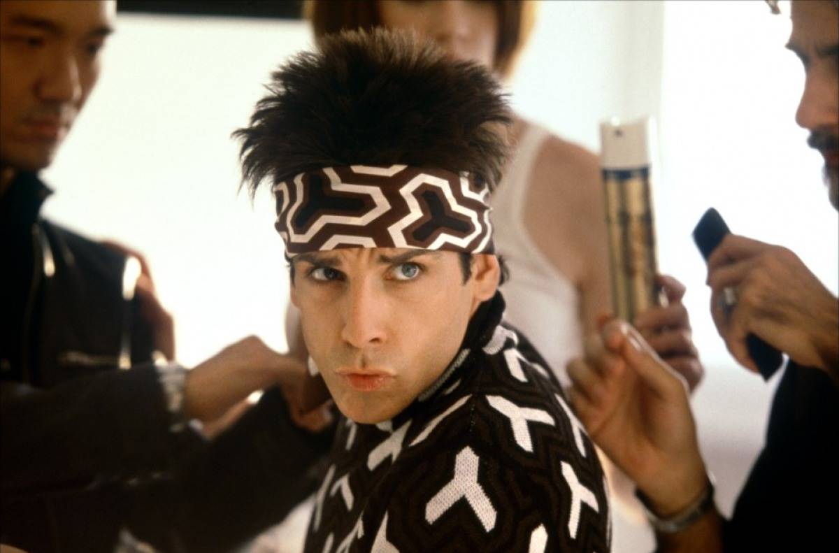
Oh hey it's Zoolander
I'm fine with her body shape. It's not like we're dealing with Dead Or Alive here.Does every woman need to have giant breasts and exposed cleavage in these games?
SMH.
Because it's literally the central piece if the game, given that it's online only. Both quantity and quality matter to keep the game fresh, and we've only seen three. It's ridiculous.
Her being content with the number of maps means absolutely nothing.
I'm fine with her body shape. It's not like we're dealing with Dead Or Alive here.
BUTI do have a gripe:
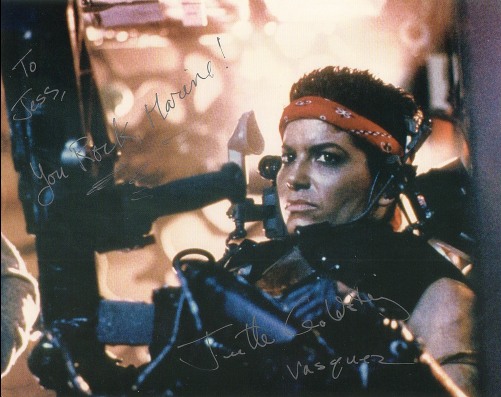
Would militia soldiers fighting for survival really bother with all that eyeliner?
Sure considering where she's ranked. Nothing wrong with trying to look good to keep morale up.
Would militia soldiers fighting for survival really bother with all that eyeliner?
Titanfall lore speculation
As a child, Sarah lost several close members of her family to incidents in which the IMC displaced Frontier citizens by force. As a result, she vowed to take revenge on the IMC at every possible opportunity, refusing to rest until they have been removed from the Frontier. For most of her career, she served in Covert Operations for the Militia, before moving into the command ranks of the Militias Marauder Corps. Her long list of successful attacks on IMC installations landed her on the IMCs High Value Target List, where she remains listed as one of the 50 most dangerous Militia operatives still at large.
I like what I see. These people almost look real.
You're still speculating as to why she has eyeliner on, tho.
We will look for clues into the vast depths of Titanfall lore upon release.

Happy to see that hopelessly generic looking characters will be a continuing trend well into generation 8. I can already hear his evenly keeled American accent telling me what to do.
You're still speculating as to why she has eyeliner on, tho.
We will look for clues into the vast depths of Titanfall lore upon release.
They seem shockingly bad. I thought this was a high budget game?

I was just joking about the eyeliner. I like her design most out of the three. But am I the only one who thought of this?

Titanfall Tactician class:
So much pandering. She should have her whole face covered.
She looks so....so perturbed
Markman what are you doing in Titanfall?MARKMAN CONFIRMED
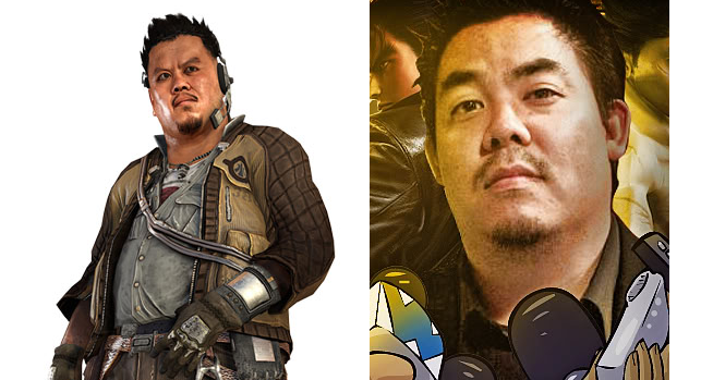
They kept his pony tail?
WHY THE HELL WOULD A ROBOT HAVE A PONY TAIL?
I like them. Not the standard run of the mill designs.
This game's art design is just horrendous. The aesthetic is immensely displeasing; it looks like a budget title. It better not drop a fucking frame.
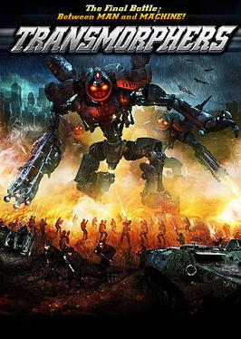
It looks like if the studio behind transmorphers decided to make a game. Awful design, I definitely would leave that one off my portfolio.

It looks like if the studio behind transmorphers decided to make a game. Awful design, I definitely would leave that one off my portfolio.
His head seems oddly disproportionate. Kind of disturbing.
Happy to see that hopelessly generic looking characters will be a continuing trend well into generation 8. I can already hear his evenly keeled American accent telling me what to do.

That's why this is awesome
Hideous. But then again.. it's a multiplayer FPS.
where is that from?
The Order?
The quality of these images is hiding some of the high frequency detail on the clothing but a lot of the materials do have a plain photo-texture look without any extra detail layered on.The woman is the only one that has decent textured clothing
")


