• Hey Guest. Check out your NeoGAF Wrapped 2025 results here!

Nidhogg 2 announced; will be playable at Twitchcon

Ok so is something like this what you guys thought/were hoping you were going to get?

CtjOx0mUsAAeuJJ.jpg


I only spent about an hour on it, and I think it looks nice enough for a sequel ... but Id rather see something more original like what they did.

dont fit the theme.
 
Wait, is this Nidhogg 2? Really? The background is nice and the worm looks menacing, but the characters though. I'm open minded about art styles but...the characters are jarring in a way.
 
I like that the devs are taking risks, but that design is just plain ugly.

Less is more.

Ok so is something like this what you guys thought/were hoping you were going to get?

CtjOx0mUsAAeuJJ.jpg


I only spent about an hour on it, and I think it looks nice enough for a sequel ... but Id rather see something more original like what they did.

This is too much like Towerfall to me.
 
Fun implies a certain tone and mood IMO. Like I'm wouldn't call SOMA, This War of Mine, or TIS-100 fun games, but they all are enjoyable and engaging in their own ways

Those games all have art styles that match the tone of the content. The gap in tone between the art of Nidhogg 1 and 2 is a giant chasm, even though the type of game Nidhogg is has effectively not changed between the two titles. So one is left wondering what audience the developer is trying to attract by changing the aesthetic so completely.
 
Thats cool, it still looks like ass though. You do realize that the gameplay is wholly seperate from the aesthetics surrounding it right?

Ive been making art for videogames for over ten years now, so you're gonna have to explain that one to me.
 
Those games all have art styles that match the tone of the content. The gap in tone between the art of Nidhogg 1 and 2 is a giant chasm, even though the type of game Nidhogg is has effectively not changed between the two titles. So one is left wondering what audience the developer is trying to attract by changing the aesthetic so completely.

Streamers. It just screams "WACKY FUN" to me.

I can already see a youtuber's head with that grotesque
head
dragon beside it, with some bold font choice and the title: GROSS. And a bunch of recommended videos beside it with variations of the same thing.

Ugh. UGH!
 
Ive been making art for videogames for over ten eyars now, so youre gonna have to explain that one to me.

I think it seems pretty obvious personally. A game can have great mechanics and still be ugly.That's what prototypes often are. A game can look good but have ass gameplay. I'm not sure why people are acting like it's a crazy observation.

Maybe I am slightly biased, because I work in the sound department? I mean, I can make a gun feel cooler with sound design and sound should be considered in how it relates to gameplay, but at the end of the day the gameplay needs to stand on it's own.

I mean, the original Nidhogg had cool art, but the mechanics were considered good by PLENTY people who subjectively disliked the art.
 
Those games all have art styles that match the tone of the content. The gap in tone between the art of Nidhogg 1 and 2 is a giant chasm, even though the type of game Nidhogg is has effectively not changed between the two titles. So one is left wondering what audience the developer is trying to attract by changing the aesthetic so completely.
I don't think that's true. The devs have stated that while the basics are the same, this game is very a different beast than Nidhogg 1, and that they didn't want it to look like the first game
 
Love Nidhogg and was super excited when I saw the thread title

Just saw the trailer now and... what the fuck, what's up with the god awful artstyle? Looks incredibly bad and cartoony compared to the original, what a misfire.
 
Man, the first game had such a cool aesthetic, this really clear and compelling look to it. This one's art is really well built but it's a huge departure from the first game's tone in just about every way.

I'm sure it's still going to be fun, but the tone change from serious to wacky is going to affect the feel of the game an awful lot. Nidhogg felt like you were in fencing duels straight out of a movie or something. Nidhogg 2 seems like it's leaning more into the wacky humor angle, like what I'd expect a steam game named Fencing Simulator to look like.
 
Ok so is something like this what you guys thought/were hoping you were going to get?

CtjOx0mUsAAeuJJ.jpg


I only spent about an hour on it, and I think it looks nice enough for a sequel ... but Id rather see something more original like what they did.

this has far less character than the official art style. it's more staid -traditional - and lacks funky pizazz.

I like the new art style. They're going for something way different
 
I think it seems pretty obvious personally. A game can have great mechanics and still be ugly.That's what prototypes often are. A game can look good but have ass gameplay. I'm not sure why people are acting like it's a crazy observation.

Maybe I am slightly biased, because I work in the sound department? I mean, I can make a gun feel cooler with sound design and sound should be considered in how it relates to gameplay, but at the end of the day the gameplay needs to stand on it's own.

I mean, the original Nidhogg had cool art, but the mechanics were considered good by PLENTY people who subjectively disliked the art.

You can absolutely have a good game with bad art. Its been done many times, but thats not the right way to approach things in the slightest. What I consider to be the best games ever all have a deep connection between design and art. Many decisions an artist or designer make should be tied with the other, it impacts emotional investment, readibility, difficulty ... everything.

To me, Nidhogg 2 looks very much like our gameplay sessions were while playing Nidhogg 1. Chaos, yelling, lots of random crazy shit. I think it ties to the experience very, very well and it makes me more excited for the game and everything still has a good level of contrast and its easy to read whats going on.
 
Just saw the trailer now and... what the fuck, what's up with the god awful artstyle? Looks incredibly bad and cartoony compared to the original, what a misfire.

I'm sure it's still going to be fun, but the tone change from serious to wacky is going to affect the feel of the game an awful lot. Nidhogg felt like you were in fencing duels straight out of a movie or something. Nidhogg 2 seems like it's leaning more into the wacky humor angle, like what I'd expect a steam game named Fencing Simulator to look like.
Really seems like people are projecting. Like this was a game where you'd do flying dive kicks or roll under thrown sabers to trip your opponent to break their necks, with wildly exaggerating sprays of blood, garishly colorful levels, and win by getting eaten by a giant sky worm.

Nidhogg was never this smooth serious fencing game that people seem to remember. It was a hectic frenetic bloodbath version of tug-of-war

Streamers. It just screams "WACKY FUN" to me.
It is harder to imagine that an aesthetic or gameplay style was driven by artistic desire than it is to assume some lowbrow intention?
 
Yeah, it sort of looks ugly, but I'd chalk the issues up to the characters. The backgrounds seem to look like they're going for a more dingy medieval look, and that's not really an issue with me, but the characters are weird naked puppets which don't match their setting.
 
I'm really not a fan of the look. I think the weird and grotesque art looks cool on its own, but I really don't like how it works for Nidhogg in this trailer. The simple style of the original game complemented the gameplay with its easy readability. The animation here honestly looks like a step down, and the garish colors and fine detail just make it a bit too messy.
 
It is harder to imagine that an aesthetic or gameplay style was directed by artistic desire than it is to assume some lowbrow intention?

Eh, when it's a meteoric shift in a different direction I'm inclined to think it had some greater purpose beyond "let's be different."

As I see it, it's sort of tugging on stuff like Goat Simulator, where the sheer absurdity of the visuals will draw double-takes. Like, I mentioned this in a different thread, but you've got the meme dragon, Homer Simpsons, and nudity; at least one of these things has a good chance of making people look twice. It is perfect for streamers.
 
And anyway, why should you tell the creators what their game was?

To speak very broadly, when indie developers make direct sequels to their games, nine times out of ten they exhibit that they have no idea why the original was popular enough to warrant a sequel. Most notable example of this would be Hotline Miami 2 making a whole game out of the crap final couple of levels from the original, removing what most people enjoyed out of the original.
 
To speak very broadly, when indie developers make direct sequels to their games, nine times out of ten they exhibit that they have no idea why the original was popular enough to warrant a sequel. Most notable example of this would be Hotline Miami 2 making a whole game out of the crap final couple of levels from the original, removing what most people enjoyed out of the original.
Escape Goat 2, Momodora series, Five Nights series, Divinity Original Sin 2, Geometry Wars 2 and 3, Space Pirates and Zombies 2, Torchlight 2, Euro Truck Simulator 2, Siralim 2, Legend of Grimrock 2, Samorost 3...

Direct indie sequels are incredibly rare in the first place, usually reserved for either very successful games or very niche games. Hotline Miami 2 (debatably) and Audiosurf 2 are the only major examples that I can think of, of what you're talking about. What are the other hugely different direct indie game sequels?
 
I'd also like to say that part of what made the first game's humor work (for me anyway) was the contrast between the stark and minimalist presentation/low-stakes premise and the ridiculous stuff that occasionally happened, like flinging swords and giant worms and whatnot. This sequel is all wacky all the time, which makes those elements less absurd by comparison.
 
I'd also like to say that part of what made the first game's humor work (for me anyway) was the contrast between the stark and minimalist presentation/low-stakes premise and the ridiculous stuff that occasionally happened, like flinging swords and giant worms and whatnot. This sequel is all wacky all the time, which makes those elements less absurd by comparison.

It essentially feels in on its own joke, which can be poison for most things. I think it's a bold change and I'll have to play it quite a bit before deciding if it's the right one.

Loved the minimalist nature of the last game, which was just about perfect.
 
To speak very broadly, when indie developers make direct sequels to their games, nine times out of ten they exhibit that they have no idea why the original was popular enough to warrant a sequel. Most notable example of this would be Hotline Miami 2 making a whole game out of the crap final couple of levels from the original, removing what most people enjoyed out of the original.

Maybe the intention isn't always to make 'more of the same', it's to expand on what the developer liked and wanted to create? I think that trying something different and new is a perfectly valid outlook and leads to some interesting and creative outcomes. The ability to let creators create what artistically intrigues them rather than capitalising on the exact popular aspects of the first game is a huge benefit to indie game sequels over AAA sequels that can't take big risks. The original Hotline Miami will always be there, as will Nidhogg.

I wasn't expecting a Nidhogg sequel at all, but if you had told me there was a sequel without showing me this trailer I would have expected it to look like the first. This is a departure which is really interesting and surprising, and I'm really glad it happened, not necessarily because it's better (time will tell!) but because it's different.
 
Excited when I read the title, but that trailer killed all the hype.
Horrible art direction on the character with horrible sound effects.


I'll just stick to the first one thx
 
You had me until the point I saw the actual gameplay. That art style turns me off so bad. I want to like the game too because the first was absolutely great.
 
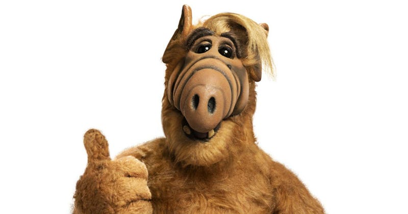
Since Homer Simpson's been referenced a ton, I'll be contrarian and say that the characters remind me more of Rob from Don't Hug Me I'm Scared. Has the same creepy/weird factor to it.

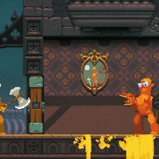
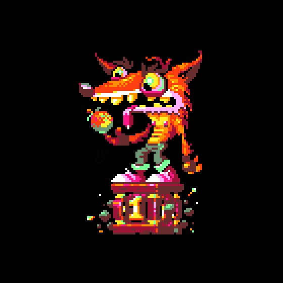
After watching the trailer a few times, I think I'm coming around to it, or at least getting what it's trying to accomplish. The overall art style is great, but the character designs themselves take some getting used to. The minimalist design of the original lent itself to people's imagination much more easily, and I don't think people imagined the stickfigures to really be slightly pot-bellied, stout, big nosed weirdos.

At the same time, though, it does feel like a logical extension. Nidhogg, at least to me, always felt a bit grotesque, hiding a pretty dark, twisted world behind its minimalism. Everything is dark, grimy, blood and bodies dissipate after a while to the ether, and you're fighting to be sacrificed to a giant worm. Hell yeah a more detailed art style would have creepy, weird shit going on. It might just be that it veers a bit too much into cartoony or farcical rather than grotesque and creepy.

Seeing some more continuous gameplay might help. I'm interested in seeing if the overall gameflow/game speed is kept, the character animations currently feel a bit stiff/sluggish to me compared to the original but that's just from a snapshot. More detail tends to make animations a bit more difficult to keep fast and fluid.
 
Original Nidhogg felt like a game that you'd play while drinking tea and announcing "good nidhogg" to the winner.

This just looks too unsophisticated aesthetically. A true duelist wouldn't stamp on the corpse of their opponent. Where would be the honour in that?
 
This makes me wonder if the developers ever knew what was great about Nidhogg 1 in the first place. Art style of 2 is especially a misstep.
 
I like it, it's something different. Nidhogg was a simple game, they needed a big change for the sequel and this art style gives the game a bit more character.
 
Wow that was the fastest I went from ultra hyped to crashing-back-to-earth in a long
time.

They went from fantastic graphics in one to horrendous art style that assaults the eye in that trailer. The gameplay and sounds are still top notch it seems so if they can just include a graphics toggle, we might be in for another great game (fingers crossed)
 
This is incredibly petty, but I don't even wanna play it unless they really change up the art style. Luckily there is a decent amount of time till release.
 
Top Bottom