You're going to miss out on the pure fun and elegant mechanics because you don't like the goofy character art
Ok
lmao the elegance is fucking gone my dude
You're going to miss out on the pure fun and elegant mechanics because you don't like the goofy character art
Ok
Because they wanted to, and this is what they envisioned from a sequel. Making a sequel doesn't have to be solely about pleasing your established audience, and Nidhogg 1 will still exist.Nidhogg 1 had a fantastic art style and nobody would have complained if they had gone with something similar for Nidhogg 2, so I really, really don't get why they changed it so drastically.
+1^The original Nidhogg had a sense of elegance to it. The same cannot be said for 2.
Same. Sadly a pass for me.. or for like 3 bucks
You're going to miss out on the pure fun and elegant mechanics because you don't like the goofy character art
Ok
not digging that art-style.
I wish they just pushed the pixel stuff and made it come out to something like Dead Cells.

lmao the elegance is fucking gone my dude
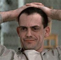
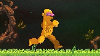
Not sure how anyone can look at this and find it even remotely appealing. Looks like a deformed freakish Homer Simpson...
Hard pass.
It's still Game Maker and far as I know.Those tools look very nice, does anyone know what they are using ?
Not sure how anyone can look at this and find it even remotely appealing. Looks like a deformed freakish Homer Simpson...
Hard pass.
They really fucked up with their character designs. How can they not see how unappealing it is?
https://blog.us.playstation.com/201...y-new-art-style-for-nidhogg-2-out-august-15//You may have noticed that Nidhogg 2 looks ever-so-slightly different from its predecessor. It's the number one thing that people ask about, so Kristy and I wanted to give you the story behind Nidhogg 2's art direction.
Born of Limitation
- We were proud of the original Nidhogg's visual style, but that's not to say we weren't a bit surprised by how well the chunky, featureless pixels were received. We were pushing the limits of old-school aesthetics, after all. What many people didn't realize was that Nidhogg's style actually grew out of practicality more than some daring vision.

Nidhogg was a game of fast reactions and precision, so fluid animation was a major priority. The flat style meant that I could iterate quickly, drawing and adjusting animations on the fly without having to worry about matching dozens of intricate design elements between frames.
Rather than setting up mechanics and then moving on to art, I'm someone who needs to be able to tweak both constantly. The major drawback to this approach is that adding any sort of detail, like a piece of armor or a mask, means hours upon hours spent redoing animations again and again. While these limitations helped to define Nidhogg's distinctive style, we felt constrained.
New Game, New Process
- When Kristy and I started thinking about Nidhogg 2, we looked back at our general to-do list from the original game. As always, there were a lot of items that had drifted from "Gotta hav this," to "Wanna do this if we have time," and on to "Can't really do this, but man it would be cool." Of everything on that list, a new animation process sat at the top.
I had been experimenting with 2D bone animation programs, which allow you to independently animate separate body parts instead of redrawing entire character sprites. This makes it infinitely easier to combine things like fencing footwork, various upper-body stances, and weapon types. Plus, it means you can swap out the sprites without breaking the animation.

It seemed silly to use all this potential on pixelated stick figures. So, instead of minimalism, why not try out some maximalism? Animated faces, sweet outfits and hairstyles, bustling environments – the doors had swung wide and Nidhogg 2's visual style was born.
While it might take a few moments to adjust to the new look, we think you'll enjoy this lively new world with all its visual absurdity and fun character possibilities. I know that we've certainly had a blast creating it.
Lol. Graphics horses in this thread.
Lol. Graphics horses in this thread.
just open the friggin link on PS blog ... they explain why they choose this design there
EDIT for the lazy:
https://blog.us.playstation.com/201...y-new-art-style-for-nidhogg-2-out-august-15//
just open the friggin link on PS blog ... they explain why they choose this design there
EDIT for the lazy:
https://blog.us.playstation.com/201...y-new-art-style-for-nidhogg-2-out-august-15//
Art-style and graphics are entirely different things
People are criticizing the art, not the graphics.
I still can't get over the art style.
just open the friggin link on PS blog ... they explain why they choose this design there
EDIT for the lazy:
https://blog.us.playstation.com/201...y-new-art-style-for-nidhogg-2-out-august-15//
just open the friggin link on PS blog ... they explain why they choose this design there
EDIT for the lazy:
https://blog.us.playstation.com/201...y-new-art-style-for-nidhogg-2-out-august-15//
Hardly, we're splitting hairs about what the appropriate retro style is.
You're going to miss out on the pure fun and elegant mechanics because you don't like the goofy character art
Ok
On the contrary it seems like they're well aware that people prefer the old style and why, they just want to experiment with something different. Considering how focused and self-contained Nidhogg is I feel like calling the more experimental next game Nidhogg 2 instead of positioning it as a spin-off is the key mistake.My takeaway from the article is that even Sony are concerned about the new graphical style. Hence the damage control.
And that the amazing art style in the first one was an unintentional fluke. Perhaps they still don't understand why it was great?

Interesting, nearly as many people are playing Nidhogg 1 as Nidhogg 2
Interesting, nearly as many people are playing Nidhogg 1 as Nidhogg 2
People are criticizing the art, not the graphics.
You're not allowed to post whole articles on GAF