tiggerkiddo
Member
I like dual blades but I prefer its prevolution to this one. It looks more like it should be a crest on a shield Pokemon.
Also take out Meowth since he is a cat, Porygon since it is clearly stated to be man-made and Elekid since his ears happen to resemble a plug, he is not one, just as Vanilluxe happens to resemble Ice cream, but it's not one.oh my god can someone quickly pull Rotom out of that thing holy crap
he literally possesses man-made objects. it's in his description. i can't watch this
This is as bad as Magneton and Klinklang.
And as it was said already, a comedian:Wobbuffet is essentially a punching bag doll. The kind that are weighted to the ground so they pop right back up after you hit them. That's why it's a counter pokemon. You hit it and it bounces right back and hits you.

Bulbapedia said:Wobbuffet may be based on the late Japanese comedian 林家三平 Sanpei Hayashiya, who was famous for repeatedly touching his hand to his forehead while saying one of his trademark lines, そうなんす、奥さん sō nansu, okusan, "That's the way it is, ma'am." In addition, its form and available moves may be based on a punching bag; that is, when it is hit, it bounces back. Alternatively, it may be based on the concept of Karma as it can only cause damage if it is attacked first. Wobbuffet may also be based on an Okiagari-koboshi doll, a Japanese traditional doll with squinted eyes that stands back upright when pushed over.
People, relax, there's no need to be hon edge.
I don't get why there aren't more Foongus fans. Sick of random patterns, well here's a Pokemon with barely any detail at all!

Love Foongus. Thing's a Goddamn tank.
Yeah. They were also bad, even as a Kid thought they were lazy designs. But sshhh... Our complains about design are bad because G1 did it also.
Yeah. They were also bad, even as a Kid thought they were lazy designs. But sshhh... Our complains about design are bad because G1 did it also.
It's the food part that makes it a problematic for me.
I've had this idea for a Pokemon for a long time.
It is fire type and tt has one evolution.
It's first form is a floating slice of pizza with two pepperoni pieces for eyes:

Zippizza (Zippo + Pizza)
It's evolution is a full pepperoni pizza with the toppings making the face:
Magmazzarella (Magma + Mozzarella)

Hahaha
Jeeze. I guess I shouldn't be surprised after the amount of people that were bending over backwards to defend the ice cream and gear pokemon. GameFreak's got it figured out, wait long enough between games and people will feverishly defend anything.
Now you're just being silly.
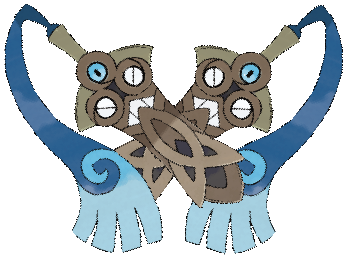
If they brought the shield to the front it would've looked more obvious and distinct:
Such a shame that it gets compared to the likes of Dugtrio or Magneton. This one makes sense (its pre-evo already hints it), has a theme (coat of arms), and has a great motif (it carries over the pseudo face)... but sadly you have people who don't digest the design properly.
I'm sorry if the design doesn't "fit" to your perspective.

I think it's more "Stop whining about designs getting worse than G1, G1 did it too." You can not like a design; I think Braixen and vivillion have unappealing designs. It's just obnoxious seeing the same stupid "Pokemon was better when I was a kid" behavior with every single newly revealed one. And it's always disguised by these silly, arbitrary reasons like "too many inanimate objects" or "too colorful" or "not colorful enough".Yeah. They were also bad, even as a Kid thought they were lazy designs. But sshhh... Our complains about design are bad because G1 did it also.
This is where I disagree. First, trash is way less ridiculous than sewage; just imagine the funk that wafts off Grimer, Jesus. Second, I like ridiculous designs. It makes me giddy that I can use a mustached moai, a clicker zombie cicada, a punching bag comedian, and an ice cream sundae all on the same team.But he does have a point.
While some designs like that cog can at least be partly understandable, there are Pokemon i just do not agree with; like that Trash-Pokemon or that Icecream-coan. The latter being on the same level as Sats Pizza-Pokemon.
I love these guys, but man... Bastiodon confused the heck out of me for a long while. I kept thinking that those four symbols above the spike were it's eyes, and that that spike was a mustache. It looked extremely weird with that giant nose and all.
Nah, they just made hundreds of species to serve as food for Galvantula.So much Poke-hate going on in here over certain gens/styles.
Shame Nintendo didn't make like... hundreds upon hundreds of these so there's something for everybody...
Yup. Pretty awesome, imo.They're meant to look like the windows of a fort and his whole face is like the wall...Bastio-don...Bastion. Right?
Ghost got a slight passive buff though iirc as they can't be trapped. Ergo this would be immune to magnet pull.Unfortunately its Typing got nerfed...Steel is no longer resistant to Dark and Ghost, so it has those as weaknesses since Ghost is weak to Dark and itself.
Hmm, I already like the original but that small change improved on it greatly. It even kind of incorporates the partial covering of Honedge's teeth in it's base form.If they brought the shield to the front it would've looked more obvious and distinct:
So... 100% chance this thing learns Swords Dance?
If they brought the shield to the front it would've looked more obvious and distinct:
The shield part actually looks like Yamask's mask.
I like dual blades but I prefer its prevolution to this one. It looks more like it should be a crest on a shield Pokemon.
Can't wait to use this guy. A lot of thought was put into this design, its a shame that the Pokemon based on objects get so much hate.
Ah, my least favorite fossil by far, we meet again.
Holy fucking shit, I need this.Our savior has arrived.
Our savior has arrived.
Our savior has arrived.
Our savior has arrived.
Our savior has arrived.
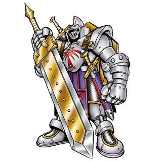
Looks like a Final Fantasy end boss.Our savior has arrived.
Our savior has arrived.
Honedge needed an evolution similar to Knightmon:
.
Looks like a Final Fantasy end boss.
Would tryOur savior has arrived.
") Wall of Swords is great:
Wall of Swords is great:So what will we call it?Our savior has arrived.
No Pokemon needs any evolution to be similar to anything ending in "Mon".
Too late. Garchomp, Tyrantrum, and several others already resemble Digimon. Most Pokemon that take cues from Digimon tend to be fan favorites.