-
Hey Guest. Check out your NeoGAF Wrapped 2025 results here!
You are using an out of date browser. It may not display this or other websites correctly.
You should upgrade or use an alternative browser.
You should upgrade or use an alternative browser.
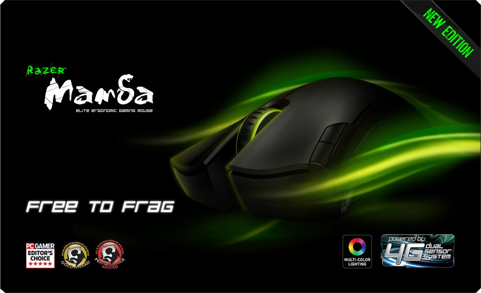
Rockstar has made the best custom XB1/PS4 yet...
- Thread starter Shpeshal Nick
- Start date

Cave Johnson
Member


My god that's horrible.
I once owned this - this was a piece of art, the artwork was embossed into the console, it wasn't just a big sticker on top:
Sold it for a stupid amount of money.
This is the worst looking custom console ever created. How you sold that for a stupid amount of money is beyond me, the guy must have been stupid lol

justsomeguy
Member
This is the worst looking custom console ever created. How you sold that for a stupid amount of money is beyond me, the guy must have been stupid lol
Genuine limited edition - each console numbered, hence collector's item. edit: also I know the pic doesn't look that good, but it was amazing "in the flesh".
I think ND's custom PS4 was really slick:

That double title and pointlessly highlighted "PS4" kind of bring down the design. Starts to look more like a rally car than a well-designed custom console. Plus that small text on the side there. Is that copyright information? Please tell me it isn't.
jts
...hate me...
I think ND's custom PS4 was really slick:
Yeah, that looks better.
Although I'm not a fan of the PS4 sticker. Nothing wrong with leaving the logo as it is on the console (which is actually a great design feature).
Also, hehhh about "The Last of Us" being there twice.
Basically, keep the decal on top, get rid of the rest.
RedAssedApe
Banned
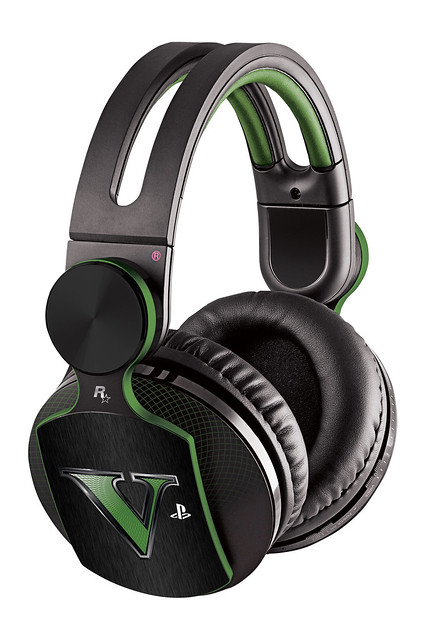
they do a good job with their branded stuff. i liked the look of their gtav pulse elites
Broder Salsa
Banned
Ugh that's ugly as hell. It's crazy how all the new consoles are that ugly
Maybe without the text it would look alright.
I think ND's custom PS4 was really slick:
Maybe without the text it would look alright.
SolVanderlyn
Thanos acquires the fully powered Infinity Gauntlet in The Avengers: Infinity War, but loses when all the superheroes team up together to stop him.
I, too, find vomit green to be a beautiful color.
Stairouais
Member
Custom consoles are always garbage. Always.
My god that's horrible.
I once owned this - this was a piece of art, the artwork was embossed into the console, it wasn't just a big sticker on top:
Sold it for a stupid amount of money.
You must've sold it to the blindest man on earth.
JonathanPower
Member
Now, that's how it should be. Green is usually associated with the Xbox brand, while blue is usually associated with the PS brand.
It would be terrific if they dropped all the text. Just use the image.I think ND's custom PS4 was really slick:
Saint of Killers
Member
Yeah. The "subtle V" does looks nice. Shame about the in your face, eye ache inducing carbon fibre effect. I do like the idea of using a different colour for upper portion of the base of the console, though.
Mugatu
Member
I think ND's custom PS4 was really slick:
I think that looks really awful.
The Rockstar ones look good but if you could get that design with whatever color you wanted it would be a big improvement.
Memorabilia
Member
V for Victory?
I dont think it looks too bad. I actually sorta like the Xbone. But the PS4 needs blue not green. Yeah I know its supposed to signify money. But...meh.
I dont think it looks too bad. I actually sorta like the Xbone. But the PS4 needs blue not green. Yeah I know its supposed to signify money. But...meh.
Nah, this is still the best PS4
Some one here on GAF got that ps4
I think that looks really awful.
I think I'm quite happy with just a plain looking PS4.
YuriLowell
Member
I disagree i think it looks ugly
.
Messofanego
Banned
Colors are a cornerstone of any society in the world, we've ascribed a lot of meaning to them. For example, look at blue and pink when gender-coding toys and things for boys and girls.I find it amazing how some people can feel so strongly about colors.
This is a fantastic article about blue and pink in advertising in relation to girls in gaming.
Polygon: No girls allowed
Are the writers of Kotaku colorblind? I won't ridicule them if they are. Colorblindness is no laughing matter.
Otherwise, what the hell Kotaku? That's one of the ugliest designs yet.
Is the green light distracting you that much?
The bump effect is really nice on the surface. The finish is a soothing matte. Even the giant V is fine.

Snkfanatic
Banned
Ehhhhh
I liked the Destiny set a lot. Not a fan of the texture they did on these.
I liked the Destiny set a lot. Not a fan of the texture they did on these.
speculawyer
Member
You're money and you know it!
PsihoPerihelion
Member
Nope. Love R*, Love GTA, but those things look fucking ugly.
Gnome Scat
Member
That's pretty cool, I love how they did the V.
Dead Prince
Banned
i would be fine of the accent color would light up. at least the strip for ps4 lights up. would remove the other green part.
I disagree i think it looks ugly
Looks fugly to me
They're both ugly as sin.
Ugh that's ugly as hell. It's crazy how all the new consoles are that ugly
http://www.youtube.com/watch?v=IIeqhNw1LXM
REMEMBER CITADEL
Banned
Ugh, not even close.