• Hey Guest. Check out your NeoGAF Wrapped 2025 results here!

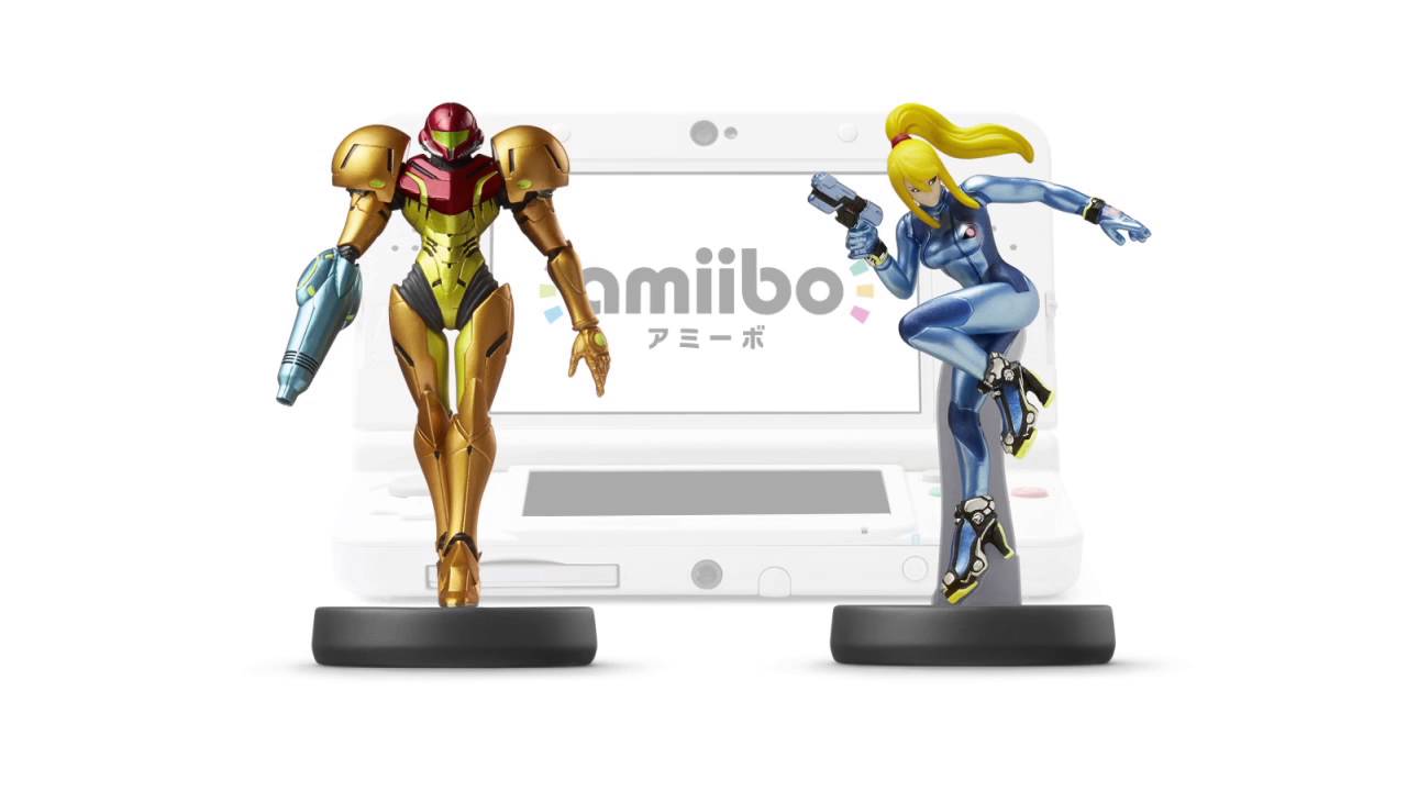
Samus amiibos look tragic. Why?

Both Zero Suit and Varia Suit amiibos are tragic looking, especially if compared to other amiibos.

The Animal Crossing and Splatoon amiibos are full of life and rich in details. Megaman and Waluigi are awesome too.

Why did Nintendo pay dust to Metroid?

EDIT:

Og4h0JI.jpg


Lack details and the painting is horrible.

Now look at this:

9OArwAQ.jpg


TzZHhbx.jpg


I mean the difference is clear. 👀
 
They are reflecting the feelings of the Metroid fans in figure form.

Sadly.

Although the Varia Suit Smash one looks fine.

EDIT: Sammy are you mad there is no Yokai Watch amiibos again?
 
The original Samus amiibo is one of my favorites. Only problem is finding one without a lean because of the lack of support.
 
They were a part of the garbage Smash series. If Metroid eventually gets its own amiibo line, they will look way better. Guaranteed.
 
Almost all the more humanoid Amiibo look terrible. Especially the earlier ones, those original Link ones are horrific.
 
Both of my Metroid amiibo look fine. They certainly came out better than most of the fire emblem ones.

The real crime is how few accessories the zero suit figma got.
 
What's wrong with them? They look like their Smash Bros character art.

I guess you could complain about the Smash Bros designs, but the actual Amiibos look about as decent as those cheap-ass figurines can look.
 
You don't even use pictures in your OP and this sounds like another bitter as hell remark about Metroid. For God's sake, this is turning into a freaking meme at this point.
 
The Smash ones are based on the Smash renders likely made before they knew they would become figures.
The armored Samus looks great and ZSS is well done as well, anyways
 
The OP's problem is that he is comparing other Amiibo to Waluigi. Of course anything else is going to be disappointment when compared to Waluigi.
 
ZSS seems fine for its size. It was obviously never going to be Figma-grade.

Samus, though, was definitely a victim of the laxer guidelines for Amiibo in the first wave, and unlike Marth and Villager, it never got a correction for the biggest problem (the gangster lean), and in general, tries to pack too much detail in too small a sculpt.
 
Explanation is simple.

The humanoid characters looked terrible in the first generation amiibo. They've later learned how to scale down the art style appropriately, but unfortunately, there's no reason for them to make new Metroid amiibo just yet.

So the next batch of Metroid amiibo will likely look 10 times better than the very first generation amiibo that Samus was part of.

That said, I think the original Samus (not the skanky Zero Suit one) amiibo looks pretty okay!
 
Explanation is simple.

The humanoid characters looked terrible in the first generation amiibo. They've later learned how to scale down the art style appropriately, but unfortunately, there's no reason for them to make new Metroid amiibo just yet.

So the next batch of Metroid amiibo will likely look 10 times better than the very first generation amiibo that Samus was part of.

That said, I think the original Samus (not the skanky Zero Suit one) amiibo looks pretty okay!
Zero Suit Samus wasn't first generation though. And she look great.

I hope with get one with the Fusion Suit.
 
I like how they look.

I just wish they realized to give Samus supports sooner because armored Samus looks disappointing with the lean they've got going on.
 
Varia Suit looks ok, but yeah, it could look better. Her Zero Suit thou... I hate the base plastic thing on her leg, like they could put the base below her boots and it would look 1000 times better... now that I think about it, that's my only complain, not so bad I guess.

But hey, at least it looks better than the F4F Zero Suit lol.
 
Top Bottom