Are we looking at the same screens?Yeah that game kind of looks like shit too, especially since it's a strategy title without much action going on. This game looks like it's being designed for a 5 or so year old mobile device, just like it's predecessor Adventures of Mana.
Yes they are different genres but those screens are all in a limited environment in or near a castle, one has 4 characters in a very very small room, the other has dozen of characters in a way bigger environment and looks way better and more detailed.
You are making the correlation not faithful=bad looking, that's not fair, the 2d android game maybe doesn't have all the details and the atmosphere of the original version but it definitively looks better, at least in that castle screen, the 3d one tries to replicate the 2d android game so that's also not too faithful to the original but we agree that it could have looked a lot better.It's not about how dark it is, it's about the detail and the nuances which haven't been carried over in the remake, and even the Android version still has a lot of detail that isn't being addressed. I just don't feel like this is doing justice to the game.
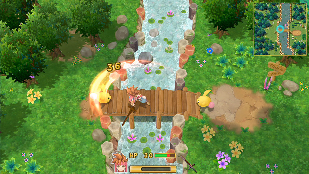
The outdoor areas a little better and seem more vibrant, but even there it's not very impressive... the textures are bafflingly poor for such simple visuals. You'd think that with so little going on that they'd at least have clean, sharp texture work. Instead, it looks lower res than the original GC Wind Waker. I've yet to see a shot where I don't think the original looks better and has more charm:
The colors are bolder and more intense, yet it manages to still be more coherent than the remake.