MaschinenZimmer
Banned
Console looks ok, controller looks sexy.
Can't wait to play Crimson Dragon and Dead Rising 3 on that baby~
Can't wait to play Crimson Dragon and Dead Rising 3 on that baby~
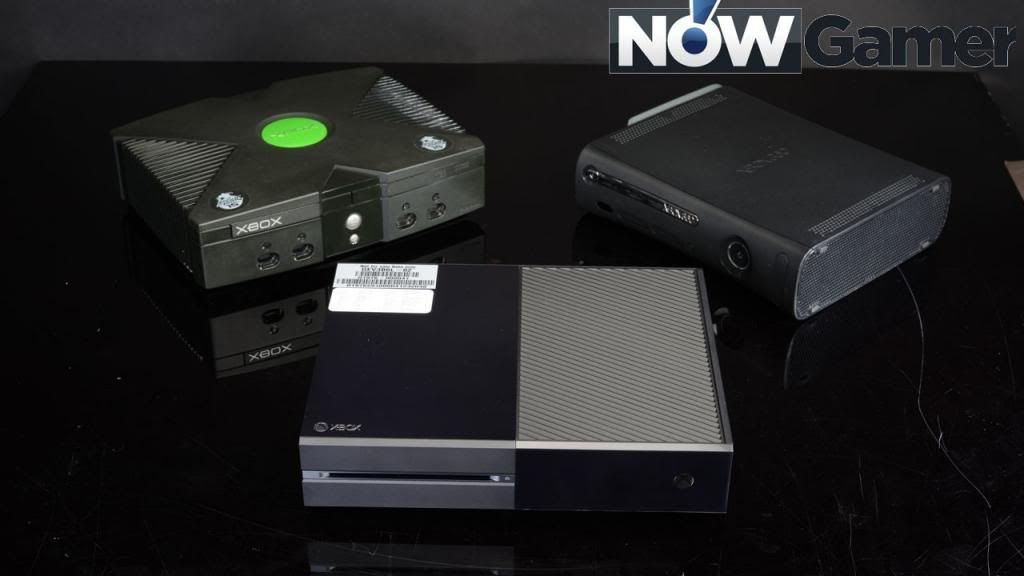
The Xbox Family:
I called the PSP sexy once. Then my uncle made fun of me.
Never called electronics sexy again.
The Xbox Family:
The Xbox Family:
controller looks nice. The console looks like a dated DVR. Actually, the Direct TV DVR looks sleeker. At least there's some neon in there. heh

Yikes, the new Xbone is massive.
micro usb charging?
WTF, this dude has huge hands. I hope...
I don't know. Having neon lights on a console can become an eyesore after a while. Specially when playing at night.
It is pretty big but I like the way it looks too.
Its not actually THAT big when you see it.
They had it on display at PAX AUS.
Controller looks amazing. The big lettering on the face buttons is surprisingly fresh for a Microsoft product.
The Xbox Family:
We know it is big though, its one of the biggest consoles ever made, no?.
micro usb charging?
The more I see the console the uglier it gets.
It's interesting seeing the two consoles with a similar idea for design, but how large the gap is with actual execution. One looks sharp and distinct and one looks cheap and amateurish.
Yes, but its not as big of a deal when you see it IRL.
I hate the big lettering. Looks Fisher-Price. Babbys first controller.
Wut.
Sexy ...
The Xbox Family: