Warning: A super-rare negative Neiteio thread.
I want to politely vent about something. Maybe others feel similarly and have their own examples of this with other games.
Recently I've been enjoying Snake Pass, a game that feels like something Nintendo and Rare would've made back on the N64. The charming cartoon visuals and mystical David Wise soundtrack remind me of vintage Rare, while the innovative mechanics and sim-like focus on play control reminds me of experimental Nintendo titles like Steel Diver and Star Fox Zero (and I mean this as a compliment).
However... A recent patch has changed the home menu icon for Snake Pass. And I can't stand it now.
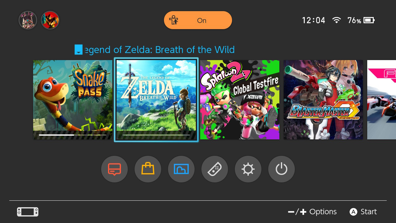
Before, the home menu icon showed the title of the game and the main character against a backdrop of ruins and greenery. It was nice and detailed and blended in perfectly with the home menu icons for other games like Mario Kart 8 Deluxe.
But now, after the patch, the home menu icon is just a huge image of the snake's face against a bright blue backdrop, with no title and no other detail.... Just a huge image of the snake's face with his bulbous eyes and goofy grin. It looks cheap and tacky, like a popup ad for those cheap shovelware games I have to x out whenever I use abload.de. Like a cheap Flash game or something.
Next to the other home menu icons, with their names and detailed compositions, it sticks out like a sore thumb. And sadly, it makes me not want to play the game, because playing the game means bumping this eyesore to the front of the list.
Yes, this may be petty, but you could liken the effect to an arcade cabinet. My digital collection on Switch is like my own personal arcade; the home menu is the arcade itself, and all of the home menu icons are like arcade cabinets. Presentation is key — and right now, as of the new update, Snake Pass has one ugly-ass arcade cabinet.
Apparently there's been a bit of backlash on Twitter. Hopefully Sumo Digital is listening and will restore the previous icon in a future update. In the meantime, I can't help but feel irritated every time I see that obnoxiously huge image on my home menu...
At any rate, that's me and Snake Pass. I'd rather be making a thread about how awesome this game is, because it IS awesome, but man, all I can think about right now is that icon.
Are there any other games (be it on Switch, Steam, etc) where the home menu icon just sort of sullies the experience for you with its cheapness?
EDIT 1: Thanks to True Fire for finding an image of the new home menu icon:

EDIT 2: And thanks to oti, here's the original icon that I want back:

I want to politely vent about something. Maybe others feel similarly and have their own examples of this with other games.
Recently I've been enjoying Snake Pass, a game that feels like something Nintendo and Rare would've made back on the N64. The charming cartoon visuals and mystical David Wise soundtrack remind me of vintage Rare, while the innovative mechanics and sim-like focus on play control reminds me of experimental Nintendo titles like Steel Diver and Star Fox Zero (and I mean this as a compliment).
However... A recent patch has changed the home menu icon for Snake Pass. And I can't stand it now.
Before, the home menu icon showed the title of the game and the main character against a backdrop of ruins and greenery. It was nice and detailed and blended in perfectly with the home menu icons for other games like Mario Kart 8 Deluxe.
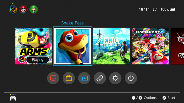
But now, after the patch, the home menu icon is just a huge image of the snake's face against a bright blue backdrop, with no title and no other detail.... Just a huge image of the snake's face with his bulbous eyes and goofy grin. It looks cheap and tacky, like a popup ad for those cheap shovelware games I have to x out whenever I use abload.de. Like a cheap Flash game or something.
Next to the other home menu icons, with their names and detailed compositions, it sticks out like a sore thumb. And sadly, it makes me not want to play the game, because playing the game means bumping this eyesore to the front of the list.
Yes, this may be petty, but you could liken the effect to an arcade cabinet. My digital collection on Switch is like my own personal arcade; the home menu is the arcade itself, and all of the home menu icons are like arcade cabinets. Presentation is key — and right now, as of the new update, Snake Pass has one ugly-ass arcade cabinet.
Apparently there's been a bit of backlash on Twitter. Hopefully Sumo Digital is listening and will restore the previous icon in a future update. In the meantime, I can't help but feel irritated every time I see that obnoxiously huge image on my home menu...
At any rate, that's me and Snake Pass. I'd rather be making a thread about how awesome this game is, because it IS awesome, but man, all I can think about right now is that icon.
Are there any other games (be it on Switch, Steam, etc) where the home menu icon just sort of sullies the experience for you with its cheapness?
EDIT 1: Thanks to True Fire for finding an image of the new home menu icon:
EDIT 2: And thanks to oti, here's the original icon that I want back:


")