• Hey, guest user. Hope you're enjoying NeoGAF! Have you considered registering for an account? Come join us and add your take to the daily discourse.

Somewhat new PS4 UI/PS app screenshots

Killthee

helped a brotha out on multiple separate occasions!
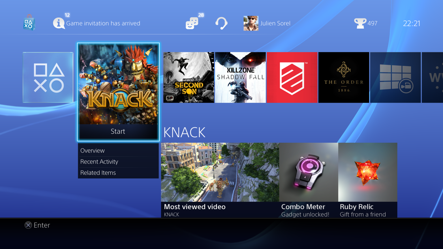
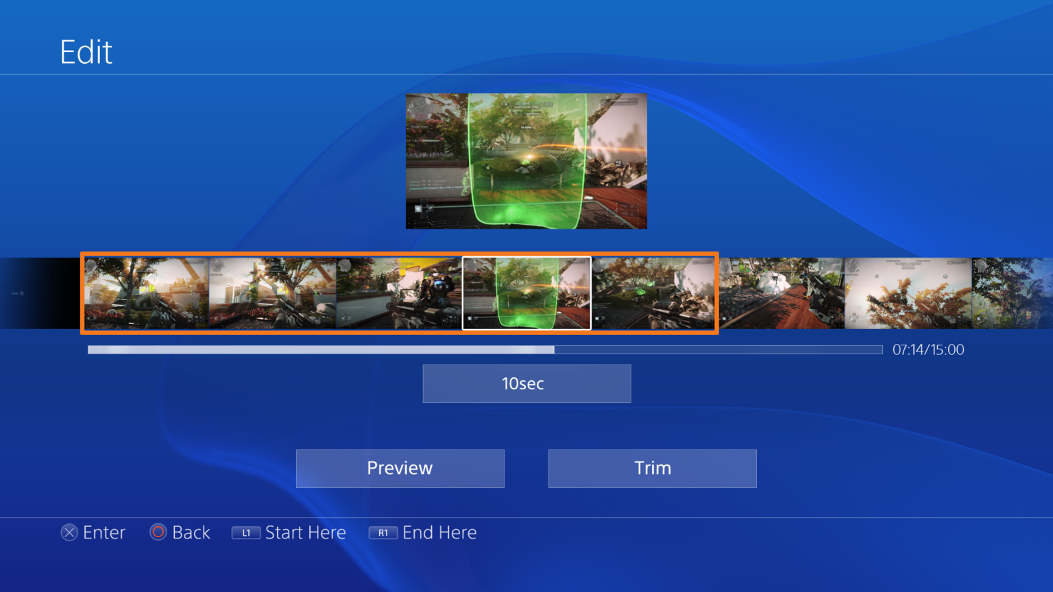
I say somewhat new cause these all look like old screenshots retaken to reflect a more current/polished version (near final?) of the UI.


Source: https://twitter.com/Envisager_/media/grid

bu_ibiacaaekcbw.png_otwush.png


bu_isvqcqaay7_k.png_o3vut7.png


bu_iygxcyaauisg.png_oj7uhx.png


bu_jojwcaaa-1io.png_oyaujq.png


bu_i_zacyaa8poa.png_or4u46.png


bu_isgfciaepjx7.png_ofeu9n.png


bu_jhnccmaamqgt.png_omzup1.png


bu_iix9cuaaqrlz.png_oluu14.png


bu_ji72cuaezd9n.png_oi1u4i.png


bu_jzlqcaaatnxk.png_o0auot.png


bu_j3whccaacvao.png_of4ujw.png


bu_jqlbcyaa2w9c.png_o57uqt.png
 

ThatStupidLion

Gold Member
quote that sh*t mang!

also, am i the only one turned off by the ps4 GUI? looks as much of a slopfest as teh current store. :(
 

slider

Member
I haven't seen these before (in any form) but I don't pay too close attention.

What's that PS4 Lovers thing?

Also...

Notification: Sarah Greene has changed the colour of her hair.
 

NotLiquid

Member
Not a fan. Looks way too much like the new, crappy PSN Store, which in turn looks too much like the dash Microsoft is going for. Their console UIs are starting to look incredibly similar.
 

PureGone

Banned
So is there any way to hide other peoples Trophies from showing up on my wall. The one in the UI screenshot looks like spoiler to me.
 

RoboPlato

I'd be in the dick
I like everything except for the mess of boxes that is the social media ticker. I really hope that my connection is OK for streaming. It seems like it could be a cool feature that I want to give a shot.
 

def sim

Member
i'm legit debating whether or not i would use my real pic in video game profiles

that's probably a great way for people to find your facebook after wrecking them in street fighter or whatevs
 

Killthee

helped a brotha out on multiple separate occasions!
Looks awesome. The shade of blue they use now is much better. The old blue made everything look bad. The app is ugly though, mainly because of the shade of blue being used.

So is it DRIVECLUB or is it #DRIVECLUB? Someone make up their minds.

The name has always been DRIVECLUB. #DRIVECLUB is just for marketing. Why would they use a hashtag in the official name?
 

Majine

Banned
Looks terrible. Every possible visual style crammed into one. Flat icons and 3D ones, gradients, Italic and non-italic text, glow, Solid boxes and transparent ones, etc.
 

legacyzero

Banned
I think it's all the BLUE that's getting to me. If I can customize the colors, or put in custom backgrounds, I'll be fine with it.
 
I feel almost embarrassed that the first thing I noticed was Sarah Greene was a different person. The Link comparison made above is amusing :D

Not sure how I feel about the UI so far, seems kind of a mess and I much prefer what the One has going on. Of course this is just scattered screens which can't say much for usability. Excited to get my hands on the systems in a month in a half! Hope both have dynamic backgrounds, XMB has some brilliant ones.
 

Tsundere

Banned
These were proven fake yesterday in another thread.


These images are being discussed in that very thread. Not that I don't like the look but some or all were proven fake.

There were fake ones among the ones posted in the old thread, but these ones are real. The fake one can easily be spotted with the fake "X" "options" buttons at the bottom and the terrible photoshopping.
 
Top Bottom