


entremet
Member
Just noticed this today while reading.
Not all the titles are converted yet, but this is a huge improvement.
My biggest gripe with the Kindle has always been the sloppy typesetting.
These changes should improve readability.
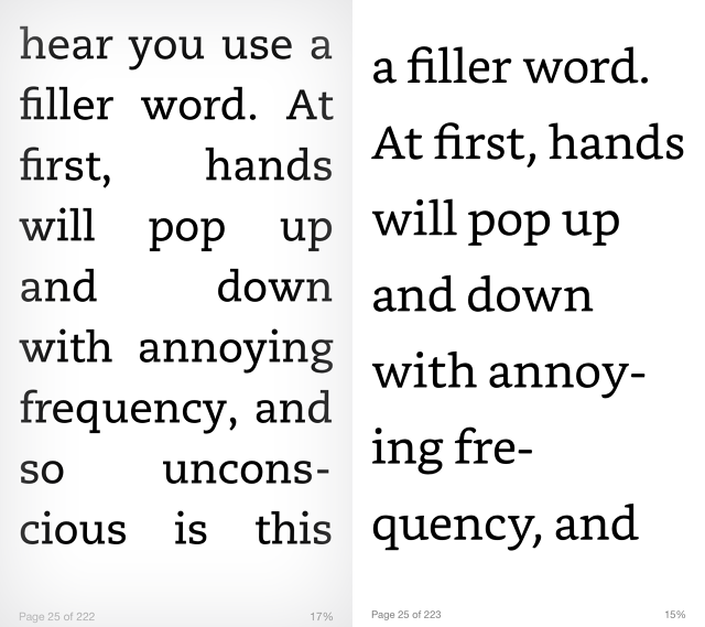
Left is old/Right is new.
New Font
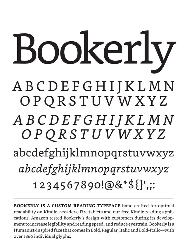
http://www.fastcodesign.com/3046678/the-kindle-finally-gets-typography-that-doesnt-suck
Not all the titles are converted yet, but this is a huge improvement.
My biggest gripe with the Kindle has always been the sloppy typesetting.
These changes should improve readability.
Left is old/Right is new.
New Font
Amazon's Kindle e-reader is a lovely single-purpose gadget, with an industrial design ethos that, in its singular focus on the purity of e-reading, even Dieter Rams could love. The iOS and Android apps are even great. But no matter what gadget you read on, the Kindle's typography and typesetting has always been a bit of a disaster, with six different typefaces, that are barely suitable for reading an actual book. (Who reads books in Futura, anyways?) As for the typesetting, "hideous" is the word many type lovers would use to describe it.
But today, Amazon is making a big step towards better typography on the Kindle. Not only are they unveiling Bookerly, the first typeface designed for the Kindle for scratch, but they're finally solving the Kindle's typesetting problems with an all-new layout engine that introduces better text justification, kerning, drop caps, image positioning, and more.
http://www.fastcodesign.com/3046678/the-kindle-finally-gets-typography-that-doesnt-suck

