• Hey Guest. Check out your NeoGAF Wrapped 2025 results here!

The XMB is really one the best designed console UIs.

entremet

Member
This generation I was mostly a 360 guy. Dead Rising and Gears sold my on the system. Plus I loved the really great multiplayer online experience on it.

I still gave my PS3 love, but recently I've gone full digital on the Triple, buying more Day One games on it, and the interface really shines here. Accessing my digital library of PSone, PSN and Retail titles is just so snappy. The interface really shines when you start amassing of lot of ready to play games.

I also enjoyed this with my former PSPgo.

Since I don't resell my games, this really cements my venture into full DD next gen. With OSes better suited for quick game switching, it will only get better.

Kinda sad they ditched this design with the Vita. It just works.
 
It makes sense to ditch XMB for Vita because of the touch screen. They didn't do a great job coming up with a replacement though.
I agree, I really like the UI, was very simple and intuitive to use.
 
One of the best cases of designing a digital interface to correspond with the language and visuals of the direct/human interface, in this case the d-pad and horizontal & vertical movement. XMB owns.
 
I found it a little sterile.

For whatever reason, the 360 UI feels more alive.

It takes too long for your friends list to load.
 
I like how fast it is, but I think the original Xbox 360 OS (The one that defaulted to the games page, had no ads, and had a link to arcade titles as the first option after "start game") was the best overall. It became bloated over time, and now the 360 dashboard is a mess.

As of today, I think the PS3/PSP has the best OS of the bunch.
 
Yeah, I love it. The Vita's UI is so bad in comparison, it's a shame. PS4's looks to be pretty good at least, I'll reserve final judgment until I get my hands on it though.
 
XMB is my most fav UI in gaming systems.

Too bad they are scrapping it :(

They are? ;)

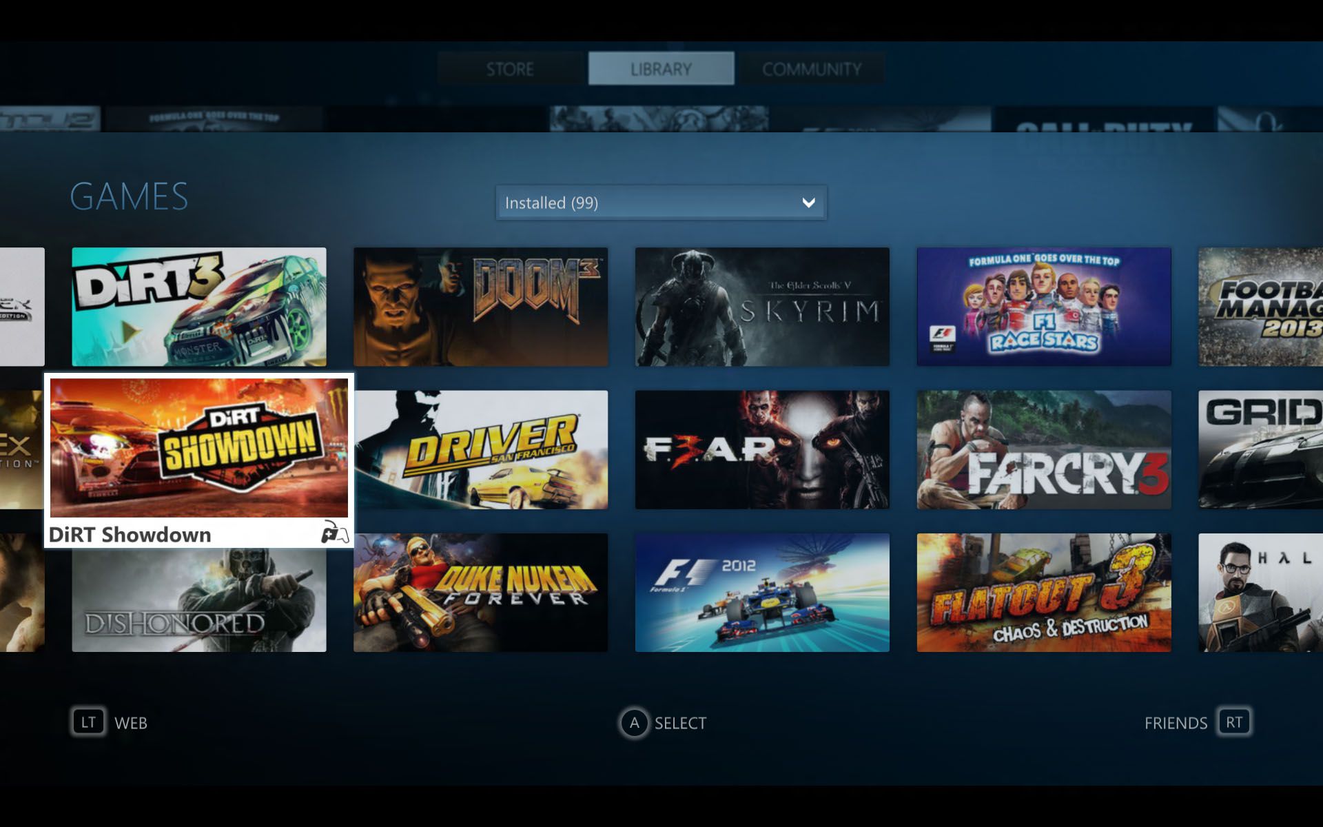
Screen-shot-2013-08-20-at-6.11.29-PM.png
 
XMB is handy, but I do like the large images 360 has got now in the games library. Browsing your games list feels great, more impressive than on PS3. Though sometimes some of those cover images take a while to load or don't show up... but the design is great.
 
I likewise love the XMB. Simple design, but highly efficient. I love how it lacks the clutter as well of so many other UIs. It's a shame the performance wasn't there while in game, but that usage was limited anyway I suppose.

Yeah, I love it. The Vita's UI is so bad in comparison, it's a shame.

Agreed. It's an unfortunate compromise for touch controls. (Which I do actually use on the front end I suppose) I think it would be fine if the "bubbles" weren't such a bad aesthetic. Ultimately though, the performance is great, so that's something.
 
I'd like a poll. If there hasn't been one already. What was the best console interface experience. I would bet on the blades of (glory) Xbox 360.
 
The 360 gets crap for the ads, but I like being told what new games are out.

Each day turning the 360 on feels different.

The PS3 UI only has the changing scroll in the top right corner.
 
I love that I don't have to click on anything to see what movies games or pictures I have. It's all in front of me to see. I dislike the 360's because you have to click and wait for a separate page to load.
 
Its pretty shit actually, especially once you have a ton of stuff to go through. It was fine in the beginning, but as the generation moved on things for worst and worst.
 
I think its pretty terrible if you have to go through a list thats more than 10 items long.
The design is also incompatible with pointer(move) and touchpad(DS4) controls.
 
I love the XMB, it's nice and fast. Once you get accustom to it you just know where everything is. The only major problem I've had with the PS3 is trophy syncing.

Oh, and the sparkles are dope as hell.
 
I like it but it has its flaws. I wish I could hide the things I don't want/use to get rid of the clutter.
 
XMB is good because it's simple and straight to the point and that's all it needs to be. Everything you want is right there and easy to select. And if you feel it's to bland then spice it up with a dynamic theme or go on pc and you can make dynamic themes of your own. Only thing is syncing trophies is terrible at times and quicker than the flash at other times.
 
The default XMB with the ugly ass flat icons looks boring and cheap to me. However, Sony was smart enough to allow it to be fully skinned and once you add some decent high quality 3D icons and slick navigation sounds available in some of the custom themes, it became the best console UI I've ever used. Really simple, fast, and intuitive. If you had a lot of items in a folder, the scroll speed increasing was pretty useful to get through it quickly. The Xbox UI on the other hand just kept getting worse and less intuitive to find what I wanted with each iteration until I just stopped turning the damn thing on. I really missed the original blades.
 
XMB is really good. I can't believe the current PS Store was made by the same company, and a lot of things about the Vita UI make no sense to me.

I'm slightly nervous about the PS4.

I like it but it has its flaws. I wish I could hide the things I don't want/use to get rid of the clutter.

Seriously, this. And it seems to be the same with pretty much every UI out there.
 
Enjoying the "game folders" doesnt make XMB one of the best designed consoles UIs.

But yeah the full screen theme before launching a game is cool.
 
No, it isn't.

Far too often you're four or five rows away from where you need to be and there's no quick way to get there. It's a terrible design. That does not mean you cannot like it, or prefer it. But it does not work well at a basic level.
 
No, it isn't.

Far too often you're four or five rows away from where you need to be and there's no quick way to get there. It's a terrible design. That does not mean you cannot like it, or prefer it. But it does not work well at a basic level.

Is it to hard to hit left or right on the d-pad?
 
Couldn't disagree more to be honest. Back at launch it was fairly decent but since then everything's just been tacked on. The thing has become incredibly bloated.
 
Vita's UI is terrible. Hopefully it gets a complete overhaul to coincide with the launch of Vita TV and PS4. Synonimity between PS4/PSV would be nice.

PS4's UI seems like a nice take on the classic XMB design. It needs to have much better folder and sorting options than PS3, though. Fully customizable folders plus an option to quickly sort things alphabetically.
 
XMB is handy, but I do like the large images 360 has got now in the games library. Browsing your games list feels great, more impressive than on PS3. Though sometimes some of those cover images take a while to load or don't show up... but the design is great.

Yeah, the XMB is not very pretty. I much prefer the 360, especially in terms of a the more visually attractive games library with the digital cover art.
 
I like it visually, but functionally I find it is quite the mess. It isn't intuitive, and sacrifices too much for elegance. You get used to it eventually, but that shouldn't be the case - it should work out the box.
Watching my parents try to use my hand-me-down ps3 over the course of a month or so was extremely eye opening (they eventually just stuck it in the back room). My dad was incredibly excited for it - he even imported a playTV.

General consistency is a mess (eg the two sets of media controls) and there is quite a bit of redundancy (I believe there are ~8 ways to view photos?). Friend/message handling, etc is archaic at best.
The PS store is simply unacceptable. I have no idea how it got released in the state it is still in.

It really doesn't scale well - I feel it was fine on the psp for this reason.
Once you start navigating a deep tree of content on a remote pc, you really realise how messy it gets. And I can't stand singstar being unremovable and no.1 in the games list. :P

end rant. :P
 
Top Bottom