nkarafo
Member
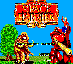
Fired up Space Harrier again after some time and i just remembered...

..man that looks atrocious. The guy who made this simply took a few in-game sprites, plastered them on the screen and then took the time (5 minutes) to draw this strange figure on the shoulder of this robot. It just doesn't look like the title screen of a game that was the state of the art when it was released...
..man that looks atrocious. The guy who made this simply took a few in-game sprites, plastered them on the screen and then took the time (5 minutes) to draw this strange figure on the shoulder of this robot. It just doesn't look like the title screen of a game that was the state of the art when it was released...