• Hey, guest user. Hope you're enjoying NeoGAF! Have you considered registering for an account? Come join us and add your take to the daily discourse.

"We remade this thing in 8 bits NES style!" And then it looks nothing like it.

you can get mad about generation accuracy now, but you'll miss it in 5-10 years when pixel art is most widely known as 'Minecraft Graphics' by the generation who grew up on it.
And on that day, I'll know that the world is beyond saving....
200w_d.gif
 

Koren

Member
Actually, VVVVVV was designed to look like a Commodore-64 game - note the tall two-color sprites, which were common on C-64.
Indeed... I have several very similar games on my old 8bit computer (which wasn't even a C64), and VVVVVV would definitively not feel out of place.

I actually think Shovel Knight is a good bit too advanced for an NES game.
I agree, I have no doubt it couldn't be done on NES, but I don't see an issue with it, and it's still reminiscent of that era. It could be run on a strong 8bit hardware of that era, it's just NES is quite limited.
 

KingV

Member
Indeed... I have several very similar games on my old 8bit computer (which wasn't even a C64), and VVVVVV would definitively not feel out of place.


I agree, I have no doubt it couldn't be done on NES, but I don't see an issue with it, and it's still reminiscent of that era. It could be run on a strong 8bit hardware of that era, it's just NES is quite limited.

I actually prefer the 8 bit feel with modern convenience. A lot f NES games are very rough to play.
 

Jockel

Member
I don't think that is fair. Samson is one of the best looking NES games, and very, very late in the system's lifespan. 99% of NES games don't look that good.

And then again, 99% of NES games look better than the image on the left.
 

Mega

Banned
Actually, this kind of thinking bothers me. I don't think it matters if indie games look like real games that were on the NES so long as they still look aesthetically pleasing. Like, neither Fez or VVVVVV look anything like old games, but they both still look good.

That's not what I was going for. Trust me, I don't care if any of these games are strictly accurate to a certain console's aesthetics and limitations. I like stuff like Fez, Shovel Knight, etc. My problem is the retro fad being largely composed of HIDEOUS, poorly designed games using "retro/8-bit" as a crutch for lack of art talent and uninspired direction and a misunderstanding of what old-school games really look like. They're going for NES/SNES era and missing the mark in a huge way.


I don't think that is fair. Samson is one of the best looking NES games, and very, very late in the system's lifespan. 99% of NES games don't look that good.

Black box (launch era) NES games look better than the game on the left.
 
And then again, 99% of NES games look better than the image on the left.

but "retro" doesn't necessarily just mean NES. There was a wide range of graphical styles and hardware back in the 80s that have their own distinct look.

I think sometimes they are just going for a look that evokes a certain era. Steel Assault and, say, something like Axiom Verge if you want to get picky have certain graphical effects that would be impossible on older hardware, but they both get the point across of giving you that feeling of older hardware. I think that's the point.
 

Murugo

Member
To be truly 8-bit in NES style, you're restricted to these colors (which vary slightly by television.
Yes, no yellow
):

the_NES_palette_by_erik_red.png


...and are constrained to four 4-color background palettes (sharing one background color) and four 4-color sprite palettes (sharing one transparent color) defined and modifiable by software. The smallest graphical unit (disregarding raster methods) allowed by the NES PPU is an 8x8 tile which must be assigned to an appropriate palette whether it's a background tile or sprite tile. Each 32x32 block of pixels in the background layer must share the same background palette. Each 8x8 sprite tile is free to choose any of the four available sprite palettes.

You're only allowed 512 unique 8x8 tiles on screen at a time, 256 usually for background and 256 for sprites, although there's a PPU flag that allows switching between these two banks mid-frame when drawing the background (usually on a zero-sprite hit). In addition, 64 sprites can be rendered at once, but only 8 sprites per scanline, else sprites that overflow on the scanline will start flashing on screen.

There are missing or possibly inaccurate details here, but the bottom line is that NES hardware is incredibly restrictive, especially on color choice. There are details that most pixel artists don't, and shouldn't, care about when going for an 8-bit style. I also agree that 8-bit isn't restricted to NES, since there were other consoles with 8-bit architectures such as Atari 2600 and Commodore 64.
 

hesido

Member
I'm not really bothered by it, to be honest. What really grinds my gears is when different pixel sizes are used.

Like this:

screen568x568.jpeg

I'm also bothered by rotated sprites as in Flappy Bird, instead of animating the rotation, they just rotate the sprite itself.
 
8-bit STYLE. "Style" being a key word. Don't take it to mean anything more.

Kind of like when certain music videos go for a videogame style without actually being possible or realistic at the times. You get the gist based on its style.
 

Mega

Banned
Or you know, a decent inspired example like La Mulana. There will always be bad examples to pick, although simplistic pixel art is often used to mask weak art design/budget.


(Actual MSX game on right)

I know there are good examples of retro-inspired games among the many bad. I said as much in my next post.
 

scaffa

Member
As someone who makes pixel art for a game I really don't care about color palettes, rotating pixels, different pixel sizes or other limitations. I only care about the end result looking great.

I only want to evoke or make something in the similiar style but not abide by the hardware limitations of an older system.

Saying the graphics are nes style then that is fine with me since over the years that is just something that is used for ease to describe that your game looks more like an older game/ is pixelated.

It would be a different case if you, for example, use a bulletpoint/usp stating that you are abiding by those rules/limitations and you are not. Only then it's a problem for me.
 

Koren

Member
I actually prefer the 8 bit feel with modern convenience. A lot f NES games are very rough to play.
I agree, but I'm pretty sure the rough gameplay partly comes from the fact that they were still refining the handling. There may be a lack of CPU cycles (or available bytes for the code) sometimes to do what you want, but games don't have to be rough to play on a 8bit console.

To be truly 8-bit in NES style, you're restricted to these colors (which vary slightly by television.
Yes, no yellow
)
There's still a possible tweak, you can play with intensity of red, blue and green signals on top of this palette... So in fact, you have access to eight slightly different ~55 colors palettes:

full_nes_palette2.jpg


And technically, since you can change the color emphasis bits during the refresh, the above example can be displayed on a real NES (although I doubt a game has really used the possibility of changing those bits in the middle of the image). The image is actually coming from legit NES code which can be used to test emulators color rendering.
 

PooBone

Member
This just screams "no budget! Use 'OLD STYLE' as an excuse!"

No thanks. Nice post OP. There's tons of this shit out there to be aware of,
 

retroman

Member
You mean like in Punchout?

punchout-spot2.gif

I'll just repeat the previous post I made in response to Simbabbad. Just replace Popeye with Punch-Out.

I've also added a relevant quote by Weltall Zero.

Touché :)

At least Popeye's graphics are consistent (high-res sprites, low-res backgrounds). The pixel size of that single sprite in my example is all over the place.

Ugh, kill it with fire. That one is guilty of all three of what I consider the pixel sins, and different pixel sizes is the smallest of them. It has:
1) Different pixel sizes.
2) Misaligned pixels.
3) Rotated pixels (not like the SNES could do, but literally taking an asset meant to emulate a sprite and rotate it in HD).
 

RM8

Member
Yeah it bothers me, and yeah I do realize it's pretty unimportant for most people.

I don't think that is fair. Samson is one of the best looking NES games, and very, very late in the system's lifespan. 99% of NES games don't look that good.
The image on the left doesn't look like early 8-bit games either, though. Absolutely not even close.

I'm also bothered by rotated sprites as in Flappy Bird, instead of animating the rotation, they just rotate the sprite itself.
Ugh, this is the worst.

I'm not really bothered by it, to be honest. What really grinds my gears is when different pixel sizes are used.
This too :[ Don't touch pixel art if you don't know anything about pixel art! It's not a "low budget" clutch, or at least it shouldn't be.
 

MrBadger

Member
That's not what I was going for. Trust me, I don't care if any of these games are strictly accurate to a certain console's aesthetics and limitations. I like stuff like Fez, Shovel Knight, etc. My problem is the retro fad being largely composed of HIDEOUS, poorly designed games using "retro/8-bit" as a crutch for lack of art talent and uninspired direction and a misunderstanding of what old-school games really look like. They're going for NES/SNES era and missing the mark in a huge way.

Fair enough. But I still think it's a little unfair to rag on indie games for using simplistic art styles as a crutch for the creator lacking artistic talent and money. I mean, most people that make these kinds of games are amateurs who most likely can't afford to hire artists, or don't want to waste money on something that's a passion project. If the end result is something that isn't faithful to its era, I'm not bothered if it looks good. If it looks shitty, then it looks shitty. But most pixelly indie games that actually do make a name for themselves look fine aesthetically, with the exception of mobile one hit wonders like Flappy Bird
 

Koren

Member
Whenever anyone talks about losing weight, the true scientific term for what they mean is mass.
Try replying to the question "what's your weight?" from a doctor by an answer in newtons...

There's plently of examples in everyday's life, and you have to live with those, but the most bothering one here is that we call insulated bags "isotherm bags" when they're actually not isotherm (T= cst), but rather adiabatic (Q=0). It create a mess in students studying thermodynamics like nothing else :/
 

Chao

Member
Wow guys, thanks for all the information on the actual limitations of NES graphics, it's very instructive!
 

CHC

Member
Just sounds like you're mad because of technicalities that most people don't care about at all. "8-bit" just means pixel art now, nothing that can really be done even if it's not accurate.
 

Roto13

Member
What bugs me is games where the art style and music don't match. So many games out there with 16-bit art styles with NES-style chiptunes.
 
People seem to say anything pixelated is 8-bit. Any actual pixel artist knows 8-bit relates to color palette.
A good way to tell is more than 24 different colors at one time. SMW has 16 x 16 palette options.
This... Is wrong.

8 bit can refer to pixel color depth... But when it's referring to retro games and graphics it's referring to a specific sub set of consoles.

NES could do no where near 256 colours (8-bit color) but rather closer to 6 bit (64 colors, though I think more correctly it was 56 or so total off the to of my head)

A truly 8 bit style game had to take into consideration more than just color limitations, but also things like ram and tile limits. Of your 8bit game has 50 sprites on screen at once, it's not really 8bit. Likewise if all of your sprites have different color palettes in excess.
 

RedSwirl

Junior Member
What's important is making something aesthetically pleasing. If you're purpose is to actually make an NES game, then do the research and make sure you know what that means. Otherwise, it's just "pixel art" and should be advertised as such.
 

Dynamite Shikoku

Congratulations, you really deserve it!
I don't understand why people make a game based on the limitations of some old system, but then break some of those limitations to make cooler effects. What is the point of limiting yourself if you aren't going all the way?
 

Koren

Member
NES could do no where near 256 colours (8-bit color) but rather closer to 6 bit (64 colors, though I think more correctly it was 56 or so total off the to of my head)
8 variations of a 55-56 colors palette, they're above... but it's not even an easy task to display all of them on the same screen.

Of your 8bit game has 50 sprites on screen at once, it's not really 8bit. Likewise if all of your sprites have different color palettes in excess.
Technically, both NES and Master System handle 64 sprites, and Atari 7800 one hundred. And you can multiplex them if you want ^_^

And there's a mode on NES that allow different palettes for each sprite IIRC (although all sprites palettes come from a single palette if I'm not mistaken).

But you're right...

Try answering the same thing from a scientist.
I've already done it with a doctor, and I'm doing it a lot with students... Still, for people close to Earth surface, the difference is an almost-constant, so that's not such a big issue.
 

Coreda

Member
I don't understand why people make a game based on the limitations of some old system, but then break some of those limitations to make cooler effects. What is the point of limiting yourself if you aren't going all the way?

It's a style in its own right when done well. Pixel art itself is based around limitations and those eras were influencial to many players and developers alike so it's no wonder games are made that harken back to the period. Not too disimilar to other forms of art that are inspired by earlier eras but add their own mark. Even programmers can find projects that impose limitations bring about creative/elegant solutions and hacks, although in these games it's more about a visual goal than technical.
 

M3d10n

Member
Eh, I don't really have a problem as long as it looks consistent. This anal retentiveness about "either stick to the NES specs or go HD hand painted" bothers me to no end.

Can't we just pretend a game like Shovel Knight was an arcade game or something? There were countless different arcade boards with all sorts of variations in term of CPU and graphics capabilities and better-than-NES-but-not-quite-Mega-Drive graphics.
 

Aeana

Member
I actually think Shovel Knight is a good bit too advanced for an NES game.

It nails certain aspects (the movement and jumping is very reminiscent in feel to NES games) but certain things are much more advanced. Specifically, I think the bosses are way too advanced. Plague knight does way more than I would expect from an NES game. Also, sprites are kinda big.

A lot of the criticism levied toward games like Steel Assault and Shovel Knight has already been directly addressed by the developers of those games. I mean, yes, it's legitimate criticism, but the developers are not trying to pull the wool over anyone's eyes. They're very honest.

Here is an article about how Shovel Knight breaks specific NES restrictions on purpose: Breaking the NES for Shovel Knight

And the guy who's programming Steel Assault has programmed lots of tech demos that actually run on real NES hardware, including his FMV movie stuff, and has made posts on this very forum detailing how what he's doing is feasible on the console, even if not realistic.

I just don't think these are the right targets for people's ire when there are games out there that make bold claims and don't seem to actually understand the restrictions of the hardware they're trying to emulate in the first place.
 

Audette

Member
Odallus: The Dark Call on steam.

This game does a fantastic job to its commitment to believable retro pixel graphics, limited colour pallet and difficulty of the systems from generations long ago. While some enemies do use rotating sprites for spell graphics, overall it a fantastic example of how to do retro sprites well. So far a lot of Castlevania throw backs in this game.

I totally agree that pixel sprites are used too often in place of actual art, likely to keep at amount of effort down, but also to capitalize on the fad of retro gaming.
I hope this starts to go toward the minimalist polygon style of the 32bit consoles hehe.
 

Simbabbad

Member
I don't understand why people make a game based on the limitations of some old system, but then break some of those limitations to make cooler effects. What is the point of limiting yourself if you aren't going all the way?
Because:

1) If you really wanted to emulate 8-bit games, you shouldn't even see the damn pixels anyway, the Rare collection is a good reminder of it:

Rare-Replay-Battletoads-CRT-filter-comparison.jpg


Pixel art back then wasn't meant for you to see the pixels, it was a real impressionist artwork, each pixel was a blurry spot that made sense only in a whole CRT image. Displaying it on LCD without a filter is already a betrayal of the intent anyway. So if you're making pixel art now without a blur filter, you're already working in a different context, and for different purposes. "Square" pixel art has a specific quality, and artists may want to exploit this quality without necessarily adhering to system limitations.

What "old" system is supposed to run FEZ anyway? And yet, Pixel art in FEZ looks great and fits the game perfectly.


2) The mindset is totally different.

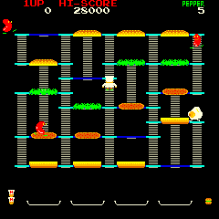
When I played BurgerTime back then, in my head I didn't see this:

BurgertimeInPlay.png


But this:

burgertime-usa.png


In their context of release, those graphics were the best we had, and it wasn't entirely satisfying. So games tried more to evoke things, characters and universes, create a context for the player's imagination, rather than merely be just what you saw on screen.

Game designers knew this and exploited it, for example in arcades with cabinet art:

mario-bros.jpg


Or even in the game itself:

Punch_out_%28arcade%29.png


Miyamoto himself explained it: the top screen in Punch Out was there just so the player mentally replaced the insufficient graphics on the bottom screen by the nice graphics on the top screen. And it worked: the overall impression was much better.

It's the exact same for, say, the manual for a game like Zelda. You read the Zelda manual, and then your imagination replaced everything you saw in the game with the stuff you saw and read in the manual - and more.

So, when a "retro" game like Bit. Trip Runner says it's inspired by Atari but shows this:

ss_f83047933eb456d53a985706f542563bd69e5c15.600x338.jpg


... it's not a "betrayal", it actually adapts much more faithfully how you saw games at the time than if it actually looked like a genuine Atari game, because now we don't see beyond the graphics in a game, we take them literally, whereas before they were just ground for suggestion. Those sort of "augmented retro" universes fit perfectly my experience of the times.


Short version: making a literal game that could be run on an old system isn't "faithful", because we don't use the correct screens to view them so the art is seen (and created) completely differently anyway, and because the context and therefore mindset is completely different, so the graphics would mentally be seen differently than in the genuine 8-bit context anyway.

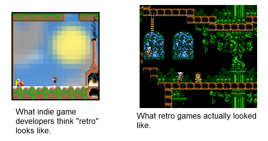
This doesn't look terrible because pixels are tilted or different sizes:

screen568x568.jpeg


It looks terrible because it's ugly. It's bland, it's not consistent, there is no sense of balance, it feels like a terrible patchwork of things stolen here and there. Whereas Super Mario Maker has tilted pixels and shadows, and yet it looks great (and pixels are different sizes in Popeye or Stormlord, etc).
 

PokéKong

Member
Misnaming the style is one thing, but it bothers me way more when they mix in stuff like sprite rotation and scaling, sprites of wildly different sizes and level of detail, sprites that are moving too smoothly, making it clear that they exist on a plane of a much higher resolution than their own pixel density or that of the background implies, and throwing in other high tech physics or particle effects. Using too many colors than old hardware could display is all fine with me as long as it's all in a nice pleasing cohesive aesthetic.
 

danielcw

Member
Was the Final Fantasy 6 castle pick already posted in this thread?

The pixels:
1LLpZbg.png


How it is supposde to look:
NcPEkjH.png


Technically, both NES and Master System handle 64 sprites, and Atari 7800 one hundred. And you can multiplex them if you want ^_^
How many sprites per line before it has to flicker?
 
Obviously people can choose it out of preference without lowering themselves to the barbaric standards of processors from 30 years ago. It can even be done better than it could have been done on the original hardware. The average player doesn't care.
 
I think the reason you see a lot of nostalgia for that sort of pixel art, despite the games never really looking like that on our 30 year old televisions, is that pixel art was even around back then, and in a lot of cases like old NES covers, it was sort of presented as an idealized form of the graphics of the time. The original "bullshot" in a lot of ways. So it makes a lot of sense that when people go back to try and create modern games with a retro aesthetic they are going to look to that as inspiration.

That look has become synonymous with "retro" graphics, even though in a lot of cases it's nostalgia sort of clouding the way we really remember things. I see it happen a lot with PSone and N64 graphics as well. A lot of people seem to remember those graphics the way they look when they are running on PC emulators with resolutions bumped up, rather than the jaggy and blurry messes they really were.
 
Top Bottom