• Hey Guest. Check out your NeoGAF Wrapped 2025 results here!

What's the most readable font?

Status
Not open for further replies.
i've really liked franklin gothic this year.
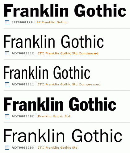
franklin-gothic.gif


nice replacement for helvetica. different enough that it's clearly not helvetica, but clean that it doesn't stand out.

franklin gothic book at 11pt with 18pt leading is some mighty fine reading.
 
i've really liked franklin gothic this year.

franklin-gothic.gif


nice replacement for helvetica. different enough that it's clearly not helvetica, but clean that it doesn't stand out.

franklin gothic book at 11pt with 18pt leading is some mighty fine reading.

Those "C"s are pretty awful.

I'm a fan of Futura.

futura_sign.jpg
 
Just saw some pictures and it looks good. I think I'll try it out.

Looks like it's included in google-webfonts?

Inconsolata? Yeah. In fact the Web Fonts version adds bold, which was missing before.
 
Nah, my mind has long since made the insoluble link that "Forums = Verdana (11pt.)"

Glad to hear. Thought I was missing out on something great while reading this thread.

Edit: Whoa, mines Times new roman 16pt.
Edit2: NM, I had auto choose on.
 
THAT'S where I know it from. When I made this:

It was also the font that Ikea used for all it's catalogues up until 2009.

I agree that it's best for headlines and posters which is how I use it. Very readable and classy.
 
How do you guys keep track of your font collection? I just have an endless list in Photoshop and whatnot, it's easy to lose track and oversee some font when I'm scrolling a massive list with tiny previews.
 
How do you guys keep track of your font collection? I just have an endless list in Photoshop and whatnot, it's easy to lose track and oversee some font when I'm scrolling a massive list with tiny previews.

Suitcase. Just activate what you want. Separate typefaces into categories. Preview them.
 
How do you guys keep track of your font collection? I just have an endless list in Photoshop and whatnot, it's easy to lose track and oversee some font when I'm scrolling a massive list with tiny previews.

here's a list. I personally like AMP Font Viewer, and Linotype FontExplorer X.

It also helps to use a duplicate finder, to see what dupes you have >_> (I'm still categorizing my font hard drive)
 
How do you guys keep track of your font collection? I just have an endless list in Photoshop and whatnot, it's easy to lose track and oversee some font when I'm scrolling a massive list with tiny previews.
reduce the number of fonts you use/rely on.
 
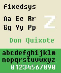
I still love Fixedsys.
250px-Fixedsysfontpreview.svg.png


It may not be pretty, but I'll take hard and pixelated over shitty color fringing from cleartype horse shit any day. Source code pro looks nice though.
 
Dead on. Pretty much the definition of how you are taught to write the alphabet in schools worldwide. No unnecessary tweaks or curves. One of the most readable fonts out there.


A more readable font is one with tweaks and curves.

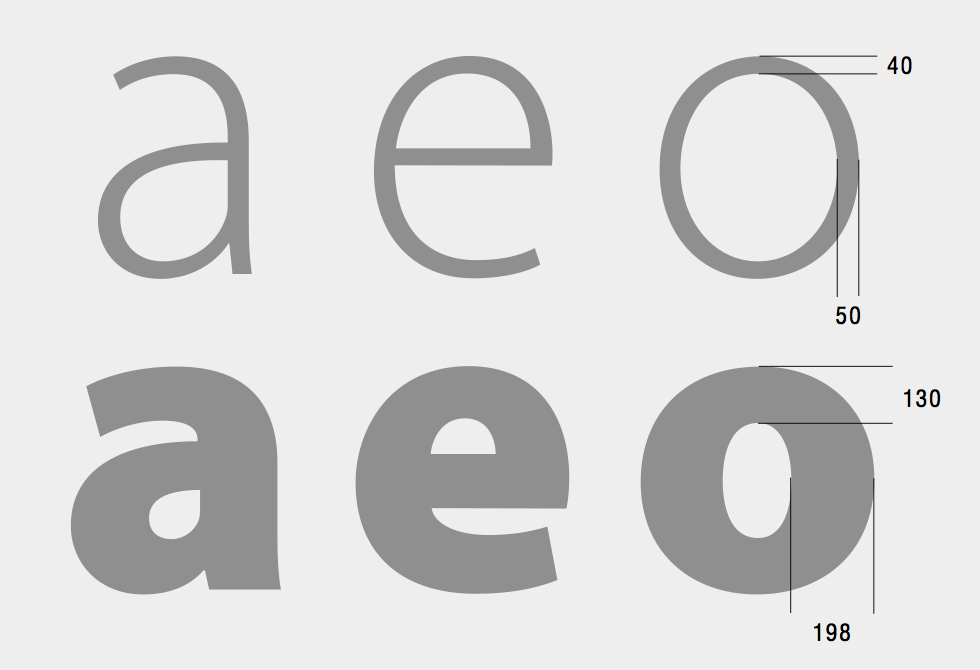
Difference between letters is a huge factor in readability. The visually impaired especially find serif fonts a lot easier to read.
 
http://1.bp.blogspot.com/_4z-770POb1Q/TGbbHeqT7fI/AAAAAAAAABs/-yvWqJST8zs/s1600/myriad-pro.gif[/MG]
[IMG]http://upload.wikimedia.org/wikipedia/commons/2/28/HelveticaSpecimenCH.svg[IMG]
[IMG]http://guijarrodesign.com/wp-content/uploads/2011/01/Segoe-UI.gif

aaahhhhghghgh there's no S

The sentence doesn't work without an S

'Segoe' doesn't count
 
Calibri.

I went through all of college using that. Best part is, no teacher noticed that it wasn't Times New Roman, and Calibri is a BIGGER font than Times New Roman, so I typically got an extra half to a full page solely based on the font being bigger than Times New Roman.

Fucking amazing.

^HE KNOWS
 
How do you guys keep track of your font collection? I just have an endless list in Photoshop and whatnot, it's easy to lose track and oversee some font when I'm scrolling a massive list with tiny previews.

If you are going through any design process you should have an idea of what type of fonts, or specific fonts you want to use.

You really shouldn't ever be scrolling though in photoshop, ever.
 
Status
Not open for further replies.
Top Bottom