-
Hey Guest. Check out your NeoGAF Wrapped 2025 results here!
You are using an out of date browser. It may not display this or other websites correctly.
You should upgrade or use an alternative browser.
You should upgrade or use an alternative browser.
Worst video game covers of all time?
- Thread starter warcrow
- Start date


Gamecocks625 said:I'm sorry, but your sports game cover athlete should not be laughing and smiling...

On the flip side they should not scare women and young children.


")
Viceroy Fizzlebottom
Member
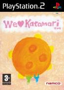
How about compared to the Japanese version of "We Love Katamari"?
http://ec1.images-amazon.com/images/P/B0009NUP2G.09._AA280_SCLZZZZZZZ_.jpg
I like both, but if I had to choose I'd go with the NA cover.
http://ec1.images-amazon.com/images/P/B0009NUP2G.09._AA280_SCLZZZZZZZ_.jpg
I like both, but if I had to choose I'd go with the NA cover.
As much as I hate and fear Western box art, turnabout is fair play.
Either a masterpiece of minimalist design, or a poor box:

(Japanese version of The Ooze.)
Monkey Punch (creator of Lupin III) is a living legend, but Microsoft had no business giving him the Crackdown cover to do.

Either a masterpiece of minimalist design, or a poor box:
(Japanese version of The Ooze.)
Monkey Punch (creator of Lupin III) is a living legend, but Microsoft had no business giving him the Crackdown cover to do.
Viceroy Fizzlebottom
Member
Aokage said:Monkey Punch (creator of Lupin III) is a living legend, but Microsoft had no business giving him the Crackdown cover to do.
:lol :lol :lol
Wonderful.
revolverjgw
Member
White Man said:This is one leather-clad Nazi away from being Tom of Finland quality.
Thanks for making me google ''Tom of Finland''. FAP FAP FAP
Mr_Moogle said:I've always thought the box for We Love Katamari sucks. I dont know what they were smoking.
The PAL version is pretty cool, though...

lordfroakie
Member

lordfroakie
Member
vectorman06 said:
I always shake my head at the japanese version of mike tyson's punch out. just silly.
And come on white man, don't expect most people to know what tom of finland is.
John Master Lee
Banned
btrboyev said:
I think this might be a tie with mega man.
I swear to god I've seen that face somewhere before too. Was it modeled after some actor, or were there just a lot of guys who looked like that in the 90's?
John Master Lee
Banned
alistairw said:The PAL version is pretty cool, though...
You serious? You actually like this? I'll bet that if this was the American box art, and the Japanese one was different, people would be like, this art SUX! :lol
starchild excalibur
Member
John Master Lee said:You serious? You actually like this? I'll bet that if this was the American box art, and the Japanese one was different, people would be like, this art SUX! :lol
No way, because the one you quoted was
1) The PAL version and
2) The Japanese cover art is the shittiest of all three (I'm preparing myself to be amazed at the first person to say the Japanese version is actually better)
Pipomantis
Member
Oh, be amazed, I LOVED the japanese boxart, with the giraffe on topof the Namco office.
I think this PAL box shows the huge amount of love inside the game. Bizarre, coprophagic love, but love.
Oh, btw, having a "worst cover thread" repeating itself is not bad. But having the same covers each time IS wrong.
Kudos for Aztec Challenge, though :lol
I think this PAL box shows the huge amount of love inside the game. Bizarre, coprophagic love, but love.
Oh, btw, having a "worst cover thread" repeating itself is not bad. But having the same covers each time IS wrong.
Kudos for Aztec Challenge, though :lol
HisshouBuraiKen
Member
John Master Lee said:I swear to god I've seen that face somewhere before too. Was it modeled after some actor, or were there just a lot of guys who looked like that in the 90's?
A little from column A, a little from column B.

No mention of ANY Phoenix games?
http://www.phoenixgamesgroup.com/uk/index.html
Games are Cheezy AND the art is Cheezy too!
http://www.phoenixgamesgroup.com/uk/index.html
Games are Cheezy AND the art is Cheezy too!
John Master Lee said:You serious? You actually like this? I'll bet that if this was the American box art, and the Japanese one was different, people would be like, this art SUX! :lol
Yeah, I really like it a lot. I don't think the US one accurately reflects the game with its design choices, but the PAL cover does a great job of it.
beelzebozo
Jealous Bastard
Mr_Moogle said:I've always thought the box for We Love Katamari sucks. I dont know what they were smoking.
have to disagree. it's colorfully goofy and accurately reflects the game's theme that the people have come to the prince and the king of all cosmos wanting more katamari goodness. plenty of bad box art in this thread, but this ain't one of 'em.
Hydro_Alexis
Banned
AgentOtaku said:
A pagen, a storm trooper and chewbacca wow ...
IfAllElseFailsUseFire said:
:lol At deejays face.
I think it's pertinent to observe that most of these covers are seemingly done by artists who don't see the value of, or don't know how to, apply stylization and abstraction.
The prime example of this is the Bomberman NES cover. It just has to be so "realistic" and "gritty" or else it ain't "cool".
Compare this to the original Japanese Bomberman covers for the MSX and PC Engine, which are small masterpieces of minimalist whimsy.
The prime example of this is the Bomberman NES cover. It just has to be so "realistic" and "gritty" or else it ain't "cool".
Compare this to the original Japanese Bomberman covers for the MSX and PC Engine, which are small masterpieces of minimalist whimsy.


Yup lol. Great shooter but damn that cover:lolwarcrow said:


Father_Brain
Banned

AgentOtaku said:all of you fools fail!

You could put that on a can of soda and I'd buy it.
I think I'd buy anything that had that image on it.
Why didn't the 360 version have this cover? It would have destroyed Gears with cover alone!
.


Blimey, the artist even saw fit to sign it, as if he were proud.Father_Brain said:
We Are Ninja
Member
What in the...?!? That's really disturbing for some reason. It kinda gives me the heebie jeebies...Father_Brain said:
We Are Ninja
Member
Yup. A winnAr is you.neopokekun said:
Father_Brain said:
You clearly win this thread. Haha. I actually cant stop laughing at that horrible ... thing
PorscheThunder
Banned
We have winner!warcrow said: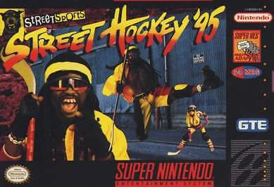
Lil' Jon back in the day?
Wow....just wow.:lolwarcrow said:
Lil' Jon back in the day?
Shard said:There are no words.

Are you crazy? That cover is awesome.


Supervlieg
Member
I would have to say all master system games, but that Karnaaj one is truly horrible.
anyway, here is another terrible master system one:

anyway, here is another terrible master system one:
Supervlieg
Member
and another


QFT.Ben Sones said:Are you crazy? That cover is awesome.Shard said:There are no words.
It might not look like Capcoms rendition of humanoid Pacman, but I think the style fits very well.
And graphically the cover is just pure gold.