-
Hey Guest. Check out your NeoGAF Wrapped 2025 results here!
You are using an out of date browser. It may not display this or other websites correctly.
You should upgrade or use an alternative browser.
You should upgrade or use an alternative browser.
Your Favorite Videogame Title Logos
- Thread starter ULTROS!
- Start date


alexbull_uk
Member
An old one, but I love it:

Thank you good sir/madamNo love for Okami?
The HD part shouldn't be there though, just the Okami logo
sixteen-bit
Member
Pulseman's is pretty cool with the tv static


Hedonism Bot
Member
I always really liked the mirror's edge logo, and I think the catalyst subtitle is a great one:
Also this:
Also this:


This one is really simple but brilliant because of the way they designed the III.


Ordinaryundone
Member
Mine will forever be Omega Labyrinth:

Class. Defined.

This right here.

atomic moth
Member

I love the use of negative space. Willy was quite the artist.

Simple, clean, effective.

Great answer...blew me away when I first got a 360
Great answer...blew me away when I first got a 360
I freaking LOVE Bioshock! One of my favorite games of all time. I'd kill for a remake!

Much better than the thin crescent moon-looking logo used nowadays.
yup

Feel free to avatar quote me if you must, but I think the Dragon Quest logos are absolutley fantastic:
If I've posted too many logos let me know and I'll get rid of most of them.
vagabondarts
Member
The greatest:
Agree, I love them all.
Feel free to avatar quote me if you must, but I think the Dragon Quest logos are absolutley fantastic:
If I've posted too many logos let me know and I'll get rid of most of them.
Agree, I love them all.


Violence Jack
Member


Conkerkid11
Member
Agree with the Persona posts. So much style in those games from slick designs to godly color palettes.
Hibiki Kurosawa
Member
This one is magnificent.From the first time I saw it I always loved FF XII's
I also love P4G's. I'm probably forgetting tons that I love.


Srey Plaughtered
Member
Persona 5
TPP. Really like how it's etched in.

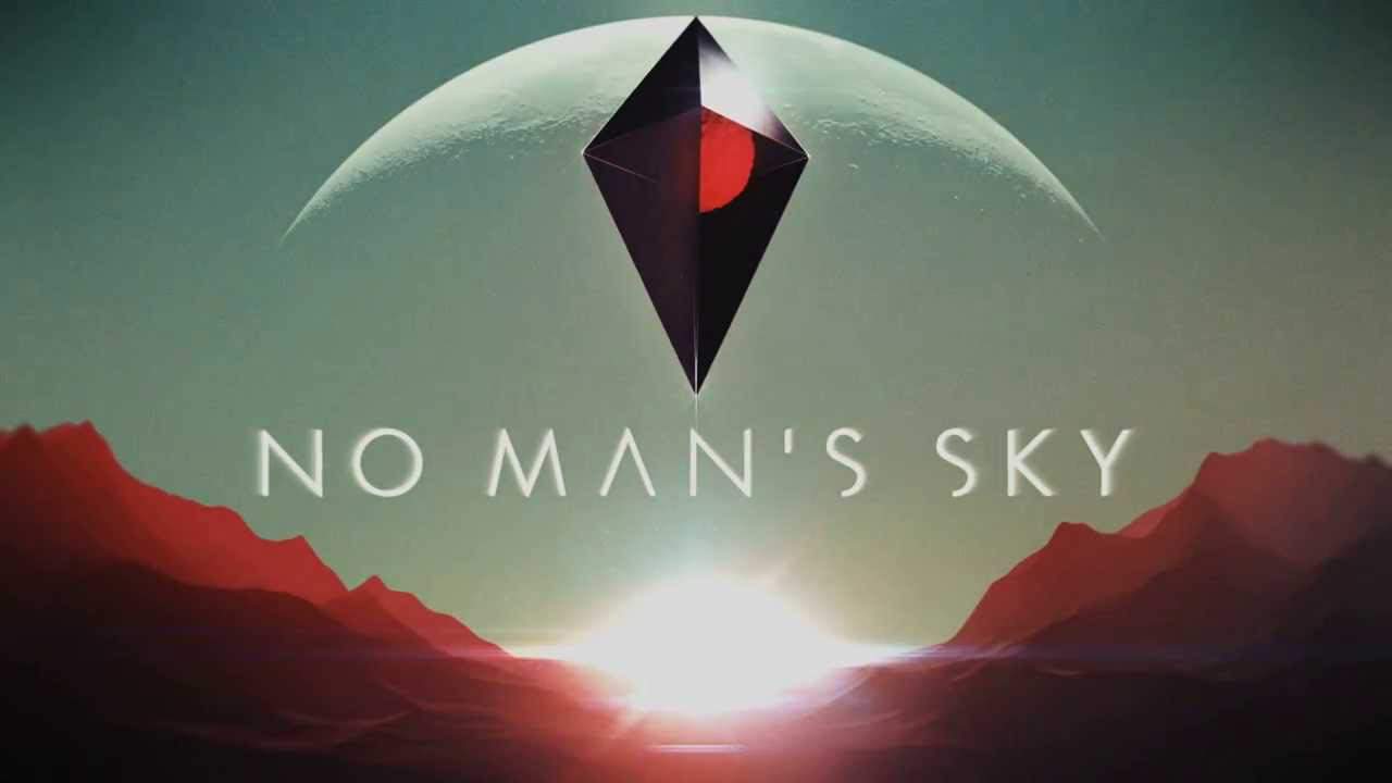
No Man's Sky.

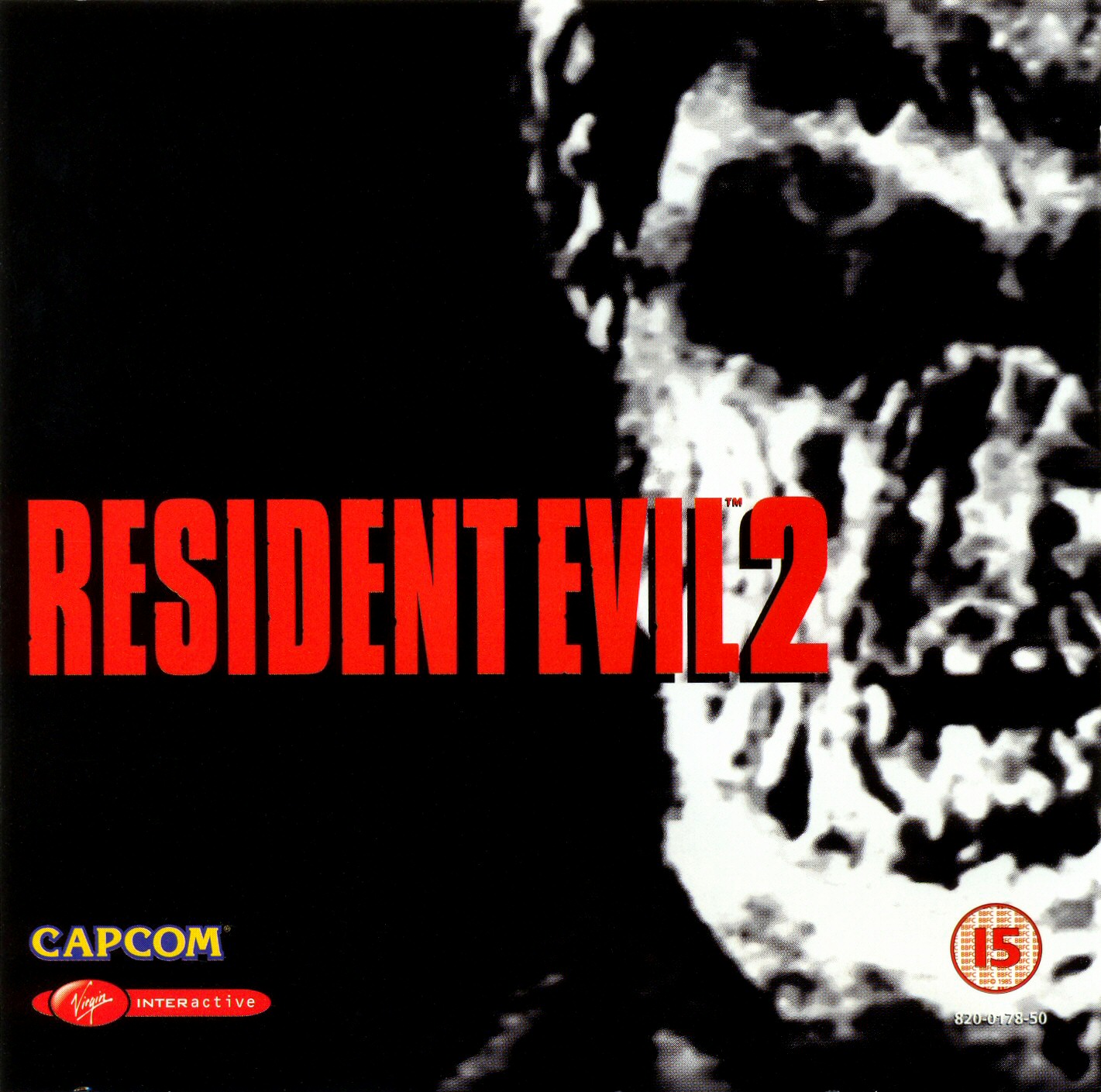
Demon's Souls. This is the best souls title. Bloodborne could've been the best but they decided to put it together with the Hunter.


TPP. Really like how it's etched in.
No Man's Sky.
Demon's Souls. This is the best souls title. Bloodborne could've been the best but they decided to put it together with the Hunter.
bennywhatever
Member
This has always been my favorite because of the detail in the sword & shield and the embossing of the letters.
.png/revision/latest?cb=20100209032116)
This has always been my favorite because of the detail in the sword & shield and the embossing of the letters.
I agree that this logo is amazing (for the same reasons!), but it's not really a title screen logo considering this is what's used when you boot up ALttP:

Sunset Overdrive comes to mind. I always enjoyed the font in particular.

bennywhatever
Member
Übermatik;175920471 said:I agree that this logo is amazing (for the same reasons!), but it's not really a title screen logo considering this is what's used when you boot up ALttP:
Good point. The title screen isn't quite as cool.

Good point. The title screen isn't quite as cool.
That's the one! I got side tracked and for some reason posted the wrong game entirely. Ah well, point made.
Lightning Count
Member
Lightning Count
Member
Best logo.
Lightning Count
Member
Surprised I'm the first to post this.
thoseAREmySHOES
Member
Two that have already been posted, but are some of the first I thought of when entering the thread:
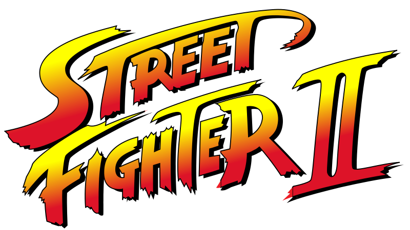
V and III: New Challengers stylize the 'Street Fighter' text a lot better, imo. I posted V's earlier.Surprised I'm the first to post this.


PAL Wipeout title treatment was much better than the US. Wipeout 3 made them nearly the same, but in the EU they called it "Wip3out" instead.

I always thought the KSP logo caught the genuine feel of real space agency insignia.

Klart
Member

Excellent choice!
RedNumberFive
Banned
PAL Wipeout title treatment was much better than the US. Wipeout 3 made them nearly the same, but in the EU they called it "Wip3out" instead.
I really miss the Designers Republic.
Looks at avatar. I'm not biased I swear!
I agree. Everytime I saw the logo coming up when I started the game I was allDemon's Souls. This is the best souls title. Bloodborne could've been the best but they decided to put it together with the Hunter.

I like the Professor Layton logo too. It's simple but looks nice
This one is amazing.
This one is also pretty cool: