-
Hey, guest user. Hope you're enjoying NeoGAF! Have you considered registering for an account? Come join us and add your take to the daily discourse.
You are using an out of date browser. It may not display this or other websites correctly.
You should upgrade or use an alternative browser.
You should upgrade or use an alternative browser.
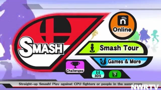
Games that have bad menus or UI
- Thread starter AuthenticM
- Start date
CitizenCope
Member
Dungeon Defenders 2. Holy Hell!!
Bethesda games have horrible UI that try way too hard to be cute/"slick".
Great, you "impressed" me for the first 30 min and now I have to live with this unnavigable monstrosity for the next 100 hours.
Generally style > function is the cardinal sin that way too many AAA games commit
Great, you "impressed" me for the first 30 min and now I have to live with this unnavigable monstrosity for the next 100 hours.
Generally style > function is the cardinal sin that way too many AAA games commit
Spieler Eins
Member
Breath of the Wild. Have fun repeatedly scrolling through dozens of item pages. Also, all the quick commands for changing things outside of the menu are completely unintuitive until the end.
Metroid Prime 2's menus look pretty, but they're a fucking pain in the ass to actually look through, rotating the orbiting options that often overlap. Especially in the logbook, where you have to go through several menus just to get to any one entry.

I can't think of another menu that better embodies form over function.
I can't think of another menu that better embodies form over function.
Choppasmith
Member
I prefer the new one.
But why.gif
Seriously though I'm curious. How does the new one look better to you?
Breath of the Wild. Have fun repeatedly scrolling through dozens of item pages. Also, all the quick commands for changing things outside of the menu are completely unintuitive until the end.
Eh, aside from wishing there was a way to equip sets of armor at once and not bothering with the quick equipping for weapons (but I do it all the time for Runes and Bows/Arrows) I can't agree with that.
I do agree with Xenoblade X though. Blech!
The worst part is that you can't use the touchscreen.I'll give it that it's colourful and stuff but... Man it's terrible:
I'll give it that it's colourful and stuff but... Man it's terrible:
Yeah, no touch screen support and no ability to use the C-Stick to move the camera around makes it really daft. Brawl also had the issue of not being able to use the Wii pointer, but at least the UI was good.
The à¹ÛBronx
Member
Yet it won design awards in the industry for its UI.Destiny: mouse/keyboard UI for a controller game.
FireBeaver
Banned
Ahahahahahaha

KainXVIII
Member
Playing Way of Samurai 4 right now and UI looks pretty bad (and uncomfortable to use)
WOTS3 in comparison looks slicker.

WOTS3 in comparison looks slicker.
jayj
Banned
A lot of games seem to have bad menus these days.It's either AAA games with too much production or indie games that make you feel like you are interacting with Windows 95, there's a balance that is needed for menus and a UI to really work.
It just needs to give you a good amount of information without feeling too cluttered, and it needs to perform quickly without feeling too basic.
It just needs to give you a good amount of information without feeling too cluttered, and it needs to perform quickly without feeling too basic.
Really hard to get across in images what is making some of the menus here bad.
Like the MVC one, the newer one looks like it should function a lot better and is a significantly cleaner and easier to use looking UI/menu design. But I guess I will have to trust people that their thoughts on it are not a reflection of the poor character design and that the UI functions terribly somehow, perhaps a description of why the new one is so much worse would be helpful.
Like the MVC one, the newer one looks like it should function a lot better and is a significantly cleaner and easier to use looking UI/menu design. But I guess I will have to trust people that their thoughts on it are not a reflection of the poor character design and that the UI functions terribly somehow, perhaps a description of why the new one is so much worse would be helpful.
Conkerkid11
Member
Fortnite
Inventory management of TW3 at launch was god awful.
I cant think of another game that requires so much item management with so awful a menu system as The Witcher 3 (even post-patch), whether recent or ancient, indie or AAA (or AA). Thankfully on PC you can use mods to remove weight limits and weapon damage, give yourself necessary money/items, and automatically apply/equip potions/oils/bombs.
edgefusion
Member
Fortnite
Good god, this. Fortnite is an absolute disaster, such an ugly clusterfuck of menus.
Danjin44
The nicest person on this forum
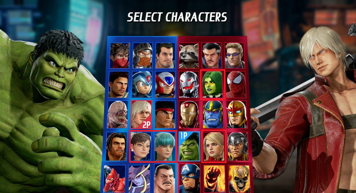
This is hilariously bad, even for a Kickstarter indie game. For a AAA game made by one of the biggest third parties, for a Marvel game.... it's just the funniest thing I've seen all week. I love seeing Capcom do stupid ass Capcom things.
WTF is wrong with their faces!!!? I was hoping they would improved up on last MVC graphic style instead we got this uncanny valley going on. Why!!?
Metroid Prime 2: Echoes has one that's absolutely form over function, because it looks pretty cool - a rotating sphere of words that you move to the front to select - but is an absolute disaster to try to navigate through the several layers of menus in the logbook.
http://www.youtube.com/watch?v=R9gfBIY4ckU&t=1m0s
http://www.youtube.com/watch?v=R9gfBIY4ckU&t=1m0s
PhantomKnight
Member
Fallout 4
ScaryShark
Banned
Most modern sports games.
SatoAilDarko
Member
I'll give it that it's colourful and stuff but... Man it's terrible:
In addition to weird placements...
WHY CAN I NOT TAP ON THESE BIG COLORFUL ICONS ON A TOUCHSCREEN!!!
3DS does this, the Wii U version has an entire paint feature. Why wasn't this a thing?!
Leona Lewis
Banned
Why is Jedah's portrait a completely different art style?
This is hilariously bad, even for a Kickstarter indie game. For a AAA game made by one of the biggest third parties, for a Marvel game.... it's just the funniest thing I've seen all week. I love seeing Capcom do stupid ass Capcom things.
SchrodingerC
Member
Mass Effect Andromeda has some of the worst menus and in-game UI that I've seen in a long time.
The crafting menu is close to unusable.
If there's one thing from MEA I cannot defend, it would have to be the UI.
My god is it clunky af, and kinda laggy.
When I wanted the game to be essentially ME1 2.0 I didn't want the UI issues to return as well.
AtomicShroom
Member
Witcher 3 is one that comes to mind in recent memory. It's just god awful, doesn't have any sort of basic ergonomics applied, is slow, clunky, stutters, fonts too small for TV play, tutorial dialog boxes that look like they're part of the standard UI, making you wonder why controls are not working until you realize there's one tucked away in the corner of the screen that you need to acknowledge first, map access requires two button presses, it's very very sluggish, doesn't provide button press feedback, has poor or no transitions between many pages and elements, and did I mention it has very poor performance and is absolutely dreadful to navigate?, even the health bar stutters when it replenishes (how can you possibly fail at making something so basic?), it's often confusing where the actual cursor focus is, the map takes too long to show up, the minimap is too zoomed in, the subtitles are not curated and just dump entire paragraphs on screen at a time, most texts lack contrasting outlines, making them hard to read depending on the background.
That UI is a sin and whoever is responsible for it should be fired. Dear CD Projekt Red, please look at how smooth, clear, big, and fast menus are in BOtW. This should be your basic benchmark!
That UI is a sin and whoever is responsible for it should be fired. Dear CD Projekt Red, please look at how smooth, clear, big, and fast menus are in BOtW. This should be your basic benchmark!
I cant think of another game that requires so much item management with so awful a menu system as The Witcher 3 (even post-patch), whether recent or ancient, indie or AAA (or AA). Thankfully on PC you can use mods to remove weight limits and weapon damage, give yourself necessary money/items, and automatically apply/equip potions/oils/bombs.
ehhhh...ME1 was miles worse with inventory management. Also almost any RPG with a fully list based inventory instead of icons.
Shining Force 1 comes to mind for inventory stuff too, each character couold only hold 4 items, which is fine and tactical, but in the first game it wouldn't automatically pass items on to other characters when opening chests and whatnot, so you had to manually trade them between each other CONSTANTLY.
ProgenitorCastle
Banned
The Wonderful 101
IMO that's heresy!
My pick for this thread is fucking Clock Tower 3. A good chunk of it's menus to me are slow as molasses, generally ugly in design, and sort of messy layout wise. Thankfully, the game, IIRC, doesn't need you to often go into it, but I still find it annoying anytime I want or need to.
Randall365
Member
Breath of the Wild - not the aesthetic but the fact that cooking is such a chore, choosing the arrows to use is not intuitive and they switched the a and b buttons around.
Every time you try out a new mobile game and you're greeted with this type of awfulness.
That's way too clean:

Salty Rice
Member
Im most likely gonna get crucified but i really do not like the current character select screen for Dragon Ball FighterZ.
Overall its fine but they should do the character portraits straight facing to the screen rather than this angle. Especially with more characters its gonna look messy.

Overall its fine but they should do the character portraits straight facing to the screen rather than this angle. Especially with more characters its gonna look messy.
this abomination
Hahahaaa. What am I even looking at? lol
BlackRainbowFT
Member
Pinball arcade's new UI is awful.
To Far Away Times
Member
Breath of the Wild is a great game but it has two pause buttons each with seperate tabs and functions.
170 hours in and that shit is still confusing.
Like, why would you ever do that?
170 hours in and that shit is still confusing.
Like, why would you ever do that?
Rushersauce
Banned
That shit game called ARK.