malboroking
Banned
this abomination
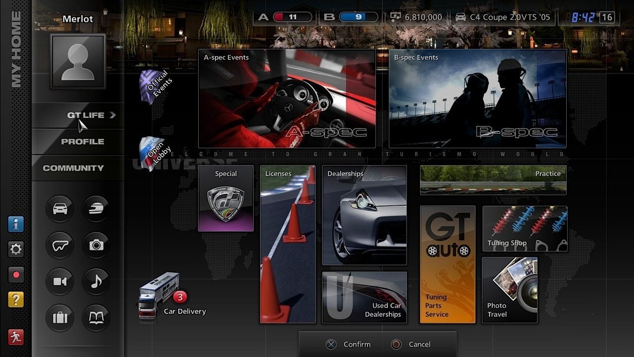
Other than the menu boxes not being the same size, I never had a problem with GT5s menu and thought the criticism was completely overblown.
this abomination
Yep. And Destiny's, if you ask me. The cursor, the long press to interact with the items, grid-based layout... It makes navigating and managing your inventory a chore.
They could have unified the portrait style for all characters. The Darkstalkers guy next to Red Arremer, Mega Man X and Zero, Spencer... they all look like characters from a completely different game. MUGEN-tier indeed.
This.Inventory management of TW3 at launch was god awful.
I'll give it that it's colourful and stuff but... Man it's terrible:
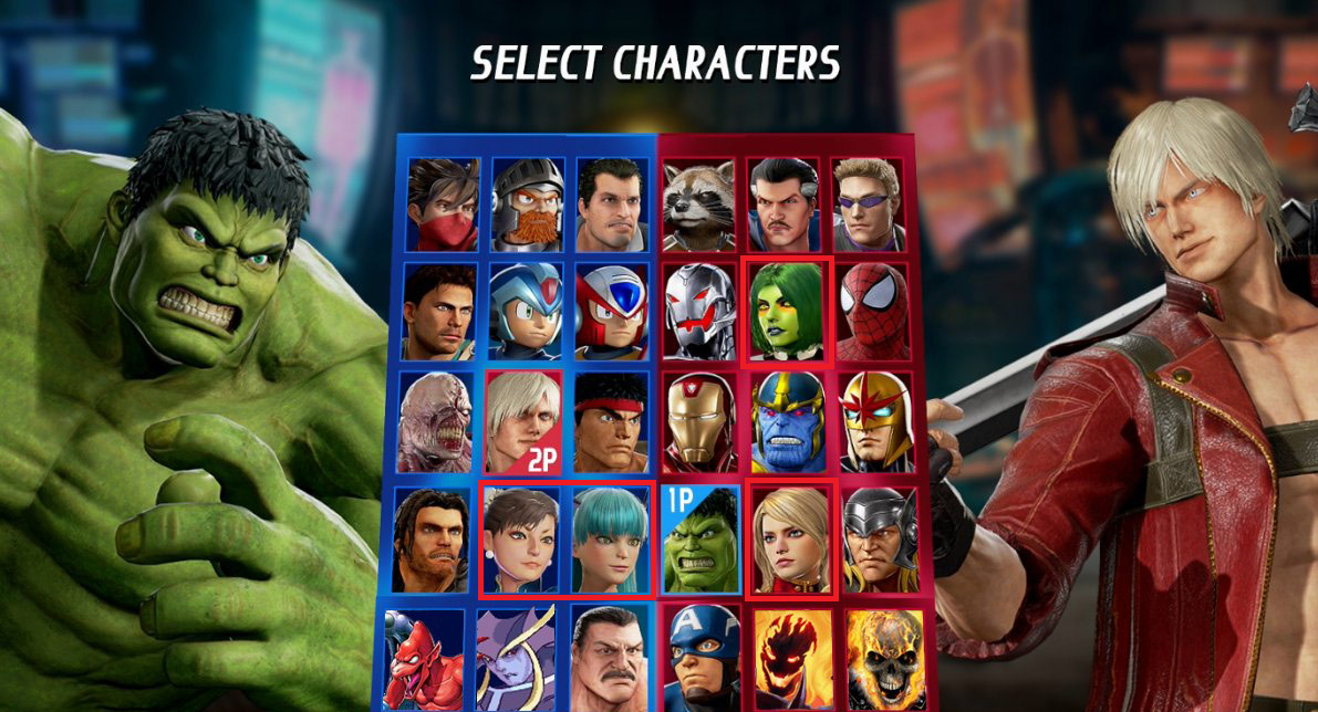
This is hilariously bad, even for a Kickstarter indie game. For a AAA game made by one of the biggest third parties, for a Marvel game.... it's just the funniest thing I've seen all week. I love seeing Capcom do stupid ass Capcom things.
Breath of the Wild is a great game but it has two pause buttons each with seperate tabs and functions.
170 hours in and that shit is still confusing.
Like, why would you ever do that?
Hahahaaa. What am I even looking at? lol
Mass Effect 1 inventory drove me nuts.
the criticism is less about the visuals and more about how many clicks it takes to do everythingOther than the menu boxes not being the same size, I never had a problem with GT5s menu and thought the criticism was completely overblown.
Hahahaaa. What am I even looking at? lol
This is hilariously bad, even for a Kickstarter indie game. For a AAA game made by one of the biggest third parties, for a Marvel game.... it's just the funniest thing I've seen all week. I love seeing Capcom do stupid ass Capcom things.
It's a pretty straight forward character select screen. It's not particularly pretty, but it's a perfectly fine UI. Also, the image you selected is pre-release footage that has been mocked up by Maximilian, so chill.
How we went from
to
I will never know.
Capcom doesn't know how to make attractive menus anymore. SF5's is dull as hell too.
That's exactly it. Capcom had a strong flair for striking character select when it came to marvel, but this seems incredibly lazy in comparison to what has come before. Even SF5'S has more flair than this one since it furthers the "V" motif the game has going on. It's very disappointing.
this abomination
Yes, fuck Skyrim's UI. The worst thing for me was having multiple 'notes', so I had to open all of them before I got the right one. Why not tell me which one is the newest, or give them different names or something, geez.
WHY NO TOUCHSCREEN?!?!I'll give it that it's colourful and stuff but... Man it's terrible:
WHY NO TOUCHSCREEN?!?!
I can not believe you couldn't just tap those massive colourful icons on your Gamepad.
Why is Jedah's portrait a completely different art style?
He's also the only character whose art breaks the bounds of his portrait box, making him look like he's been badly photoshopped in.
This is hilariously bad, even for a Kickstarter indie game. For a AAA game made by one of the biggest third parties, for a Marvel game.... it's just the funniest thing I've seen all week. I love seeing Capcom do stupid ass Capcom things.

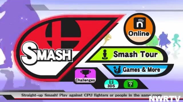
Ew @using the Wii u gamepad for smash.
Sakurai's wife is responsible for the Smash menus and others. The UI is certainty recognizable.
Ignore Superstar in this image his wife didn't do that one.
Off-TV play. Also needed for 8-player Smash without GameCube controllers.
Someone will post Persona 5 for being "overdesigned" or some shit and I'll be pretty salty