North American
Europe
http://blog.us.playstation.com/2011...evealed-demo-with-battle-los-angeles-blu-ray/
http://blog.eu.playstation.com/2011/05/18/resistance-3-box-art-revealed/
Update
http://www.neogaf.com/forum/showpost.php?p=27906032&postcount=108
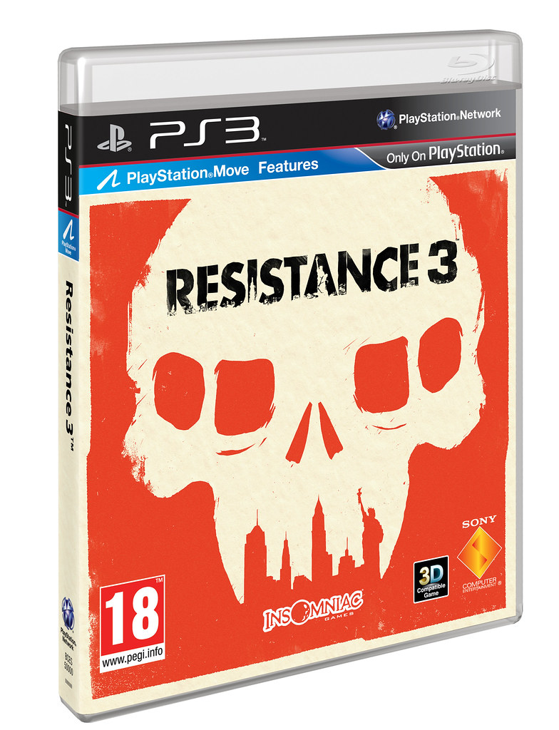
Europe
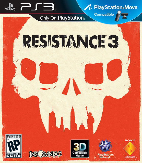
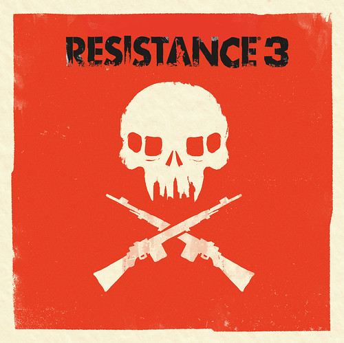
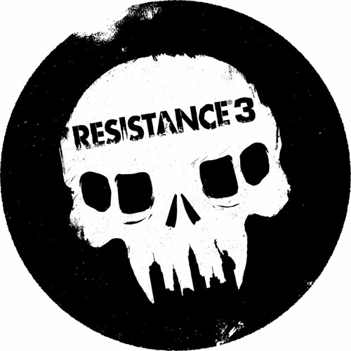
Today were proud to reveal the Resistance 3 box art that you can hold in your hands when the game hits store shelves in September. You should recognize right away that this graphic version of the Chimeran Skull with the New York skyline depicted as its teeth, as well as the stylized version of the Resistance franchise logo, isnt your typical rendered hero box art. To create this new look, we partnered with Olly Moss, a talented British artist, to create a bold vision of the Resistance 3 boxart for both the North American and European territories.

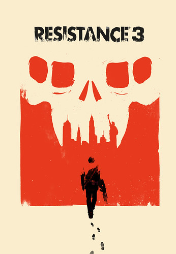
The Resistance team worked closely with Olly to share our vision for the Chimera-occupied 1957, and Joesph Capellis journey across the destroyed USA to his destination, New York City. Youll see this in the alternate version of the art below, which shows Capelli walking towards the NYC skyline.
We wanted Ollys work to reflect that in Resistance 3, YOU are the Resistance. Resistance 3 isnt a military shooter, as the United States Army and SRPA have been destroyed. Instead, R3 is about the remnants of humanity finding any way possible to survive in a brutal world.
This work coincides with Ollys first art show in Hollywood at the Gallery 1988 (which runs until May 20th, if youre in the LA-area). Were excited about the new look of the box art and expect to see additional Resistance 3 art by Olly throughout the campaign. You can find out more info about Olly, and see more of his fantastic art, by checking out www.ollymoss.com.
You may have also heard that we will be bringing exclusive early access to a nearly half-hour single-player demo straight to your PS3 on June 14th! The demo will be included on specially-marked Blu-ray Disc copies of the Sony Pictures sci-fi action thriller Battle: Los Angeles (which you may recall from the now memorable Resistance 3 billboard spotted on a Sony film set). The demo level is the entire boat ride sequence of the game, as Joseph Capelli and Dr. Malikov discover a flooded town, infested with Chimera. We hope when you play it, youll enjoy the small taste of the atmosphere, environmental story-telling and exciting action sequences youll see in the final version of Resistance 3 in September.
As we lead up to E3 and the games launch, theres still more news to come, so keep it tuned to eu.playstation.com, our twitter page, Facebook and sign up to Join the Resistance for all the latest updates on Resistance 3.
http://blog.us.playstation.com/2011...evealed-demo-with-battle-los-angeles-blu-ray/
http://blog.eu.playstation.com/2011/05/18/resistance-3-box-art-revealed/
Update
http://www.neogaf.com/forum/showpost.php?p=27906032&postcount=108
jstevenson said:I will inquire about a cleaner in-lay version in case you want to reverse it. we'll see where we can go with it

