• Hey, guest user. Hope you're enjoying NeoGAF! Have you considered registering for an account? Come join us and add your take to the daily discourse.

Mario Kart 8 is beautiful.

As mainly a PC gamer I can say:

You are correct. Is by far the most beautiful game I've played on a current gen console.
It is great fun as well!
 

dralla

Member
Yes it is. It has so much character and personality and it's an absolute joy to look at.

Super Mario 3D World has has a similar look, also beautiful.
 

VanWinkle

Member
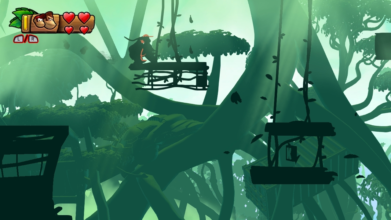
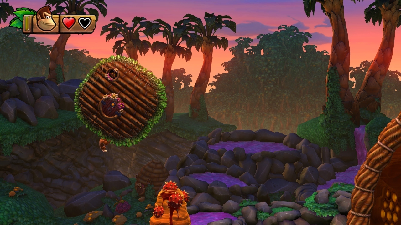
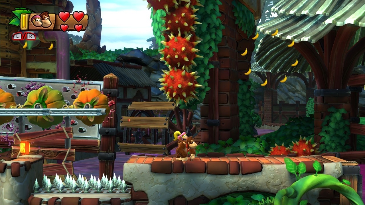
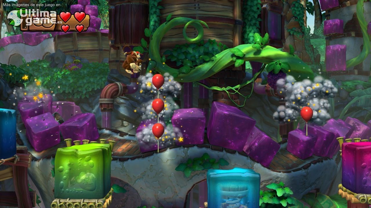
It looks pretty good. Its not up there with the best looking Wii U games, though, which are Pikmin 3, DKCTF, and SM3DW.

Image quality ruins MK8, though it still looks good. Those jaggies and no AF really bring it down.
 
Yep, it sure is really really pretty. I've heard some complaining about the jaggies (and those that follow me on twitter know i really hate jaggies) but they haven't bothered me here.
It makes me hopeful for what is capable on the system.
Oddly enough, it makes 3D World look really bad in comparison (IMO)
 

nkarafo

Member
I see many people complain about AA and jaggies.

So if, supposedly, Dolphin supported WiiU and you could play this game with AA enabled on even greater resolutions, would you agree with the OP?
 

dwells

Member
Love the bright colors and art in this game, but the jaggies are really a shame. It seems strange to me that there's no AA solution whatsoever when the previous first party WiiU titles have had rather good image quality.

For those curious what the game would look like anti-aliased, I went ahead and rerendered a few scenes with anti-aliasing on. Anti-aliased versions are on the right.

GhL.jpg
HhL.jpg

IhL.jpg
JhL.jpg

KhL.jpg
LhL.jpg
 
I know many people don't like the redone rainbow road but I think that track is so beautiful, with the bright city below and the train going along the side of the course.
 

Hiltz

Member
I remember being impressed by its visuals when I played the title at GameStop's demo station. Although, I did notice some jaggies on the bushes to the right at the start of the race in Waterway Park If I remember correctly.
 

SoldnerKei

Member
yeah, game looks pretty good, and the gameplay is pretty good, I hated Mario Kart Wii with passion because it was an unbalanced mess, but this one is pretty good
 
To those saying that the game is "beautiful in motion," isn't that redundant? It's a kart racing game, it's almost guaranteed you'll be in motion. (Only time when you're not is when you're waiting for the race to start).

Beautiful game indeed. I can't ignore the jaggies on my 55-inch set, though.
 
Love the bright colors and art in this game, but the jaggies are really a shame. It seems strange to me that there's no AA solution whatsoever when the previous first party WiiU titles have had rather good image quality.

For those curious what the game would look like anti-aliased, I went ahead and rerendered a few scenes with anti-aliasing on. Anti-aliased versions are on the right.

MK8 is the most beautiful game currently out. There was lack of AA because Nintendo's priority was 60fps in 2p split screen. If it was single player at 60 fps, AA could be easily implemented. For those who say that other games are more beautiful, do those games have split screen at 60 fps, if at all?
 

Atcha

Member
It looks good, but nothing mind-blowing; there is a lot of clipping and bad color-banding issues. At the end of the day though, it looks better than most of the other entries, so enjoy it. It's all about the gameplay though, and if you think it's good, then that's great!

The game on the gamePad is just ... WOW !
 

jay

Member
People with Little King's Story avatars should be immune to bans regardless of how bad their posts are.
 

phanphare

Banned
To those saying that the game is "beautiful in motion," isn't that redundant? It's a kart racing game, it's almost guaranteed you'll be in motion. (Only time when you're not is when you're waiting for the race to start).

Beautiful game indeed. I can't ignore the jaggies on my 55-inch set, though.

I thinks it's more just telling people who haven't played the game to not judge it based on its screens because they look jaggy as fuck. also most of the games visual appeal, for me at least, is the lighting and character animations and those need to be seen in motion to appreciate.
 
It looks good, but nothing mind-blowing; there is a lot of clipping and bad color-banding issues. At the end of the day though, it looks better than most of the other entries, so enjoy it. It's all about the gameplay though, and if you think it's good, then that's great!

"Most of the other entries" in what... the MK series? Which one looks better than MK8?
 
I just don't see it. Tropical Freeze's graphics are not more impressive than Mario Kart 8. Not technically or artistically.

Artisically Tropical Freeze is far, far superior, in my opinion... Far more detail per square inch, more bold, saturated colors, more unique assets and far more content in terms of unique visuals (63 long levels vs 32 racetracks, half of which are based on old games). But yes, it is a matter of opinion. Technically, MK8 is superior, that is unquestionable, except in the area of animation I would say Retro has EAD beat.
 

phanphare

Banned
Artisically Tropical Freeze is far, far superior, in my opinion... Far more detail per square inch, more bold, saturated colors, more unique assets and far more content in terms of unique visuals (63 long levels vs 32 racetracks, half of which are based on old games). But yes, it is a matter of opinion. Technically, MK8 is superior, that is unquestionable, except in the area of animation I would say Retro has EAD beat.

I don't see how you could say that. watch a MKTV clip of characters doing tricks, hitting others with items, and passing other characters. the animations are just amazing. imo. I love the animations in Tropical Freeze as well (it's my favorite game on the console) but sometimes they seem a little too goofy and over the top.
 

AdanVC

Member
I've been playing it non-stop since May 30 and I'm still amazed over how good it looks. Yeah, there's graphically better looking games out there but MK8 has an impressive mix between art direction/detail/graphics never seen on the franchise that you can't help but get amazed, especially when you compare it to MK Wii. I will never forget the first time I raced through Cloudtop Cruise, I got goosebumps, man! Plus the music during that track is just hnnnnghh! It is now my favorite Mario Kart track of all time. Jaggies are literally non-existent when the game is in full motion, wich is on 98% of the time so it's all good.
 

Asbear

Banned
It looks good, but nothing mind-blowing; there is a lot of clipping and bad color-banding issues. At the end of the day though, it looks better than most of the other entries, so enjoy it. It's all about the gameplay though, and if you think it's good, then that's great!

And like the RnC games on PS3 I kept feeling like the game felt like an SD game (mechanically) but with HD graphics (but that's probably purely subjective)

I think the graphics are pretty stunning however, if you can excuse the 720p resolution and lack of AA compared to some vibrant PS4 titles. I just think it looks rough around the edges overall, probably the color-banding and clipping etc. like you mention.

I think that was a problem in Nintendo Land, Mario 3D World and unfortunately I also saw signs of it in that Zelda U trailer.
 

phanphare

Banned
Looks nice, great art.

But best looking game? Come on now.

yeah what a crazy thing to say. sheesh. it comes off like some kind of opinion or something. totally crazy.

people value different things. some value art over tech. some value tech over art. neither is more right than the other.
 
YES! The more I play it the more I am impressed.

I have been playing a lot on the gamepad with the pro controller, great to have off tv play in 60fps!!
 
I just don't see it. Tropical Freeze's graphics are not more impressive than Mario Kart 8. Not technically or artistically.

not technically but I don't know how people can state with total resolve that MK8 is ahead of Tropical Freeze when it comes to art style


i'm omitting shitloads of beautiful and memorable moments and locations here. just a small sample from an incredibly varied game. and this is a game that doesn't look like total hell in screenshots. just saiyan
 
I just don't get it. It looks like Mario Kart. Maybe it's the Nintendo games in HD effect? I don't know, but it looks ok to me.
 

ZAMtendo

Obliterating everything that's not your friend
It looks good, but nothing mind-blowing; there is a lot of clipping and bad color-banding issues. At the end of the day though, it looks better than most of the other entries, so enjoy it. It's all about the gameplay though, and if you think it's good, then that's great!

Are you serious mate?
 
MKWii track selection was quite mediocre.

Yea well this is Nintendo so you can't really expect too much sometimes. What I'm saying is that it should be expected that the latest entry in a series will have the features of previous games and more. Maybe that's just me.

a Mario Kart game looks like Mario Kart?!?!?!?!?!


I'm only half kidding

Clever girl...what I'm saying is that Mario Kart never was particularly interesting to begin with. It looks like Mario Kart which in turn looks like Mario, etc. Also, the idea that this is somehow a new look or something is absurd.
 
Clever girl...what I'm saying is that Mario Kart never was particularly interesting to begin with. It looks like Mario Kart which in turn looks like Mario, etc. Also, the idea that this is somehow a new look or something is absurd.

Alright, now you've lost me. None of the other Mario Karts look quite like this stylistically. Something close, maybe, but the lighting and geometry in this game do lend it a look that's pretty unique even among its franchise. Don't know how you can't see that.
 
Alright, now you've lost me. None of the other Mario Karts look quite like this stylistically. Something close, maybe, but the lighting and geometry in this game do lend it a look that's pretty unique even among its franchise. Don't know how you can't see that.

Lighting and geometry? That's just the extra power. Stylistically it's the same.
 
Lighting and geometry? That's just the extra power. Stylistically it's the same.

Today I learned that lighting lends absolutely nothing to the style and look of a game.

This games lighting alone differentiates its look from other Mario Karts pretty well. It's not just indicative of a power bump, it helps to give the game its bright, poppy, often watercolory look, and no, the other games don't look quite the same. Same goes for the clean, sharp geometry chock with smooth curves and background objects/track elements with more of a sense of weight and place to them. Stylistically it's not the same, especially when you factor in stages that go heavy into the anti-grav gimmick. Have you played the same game I have? Would you care to make a few image comparisons so I can see what you mean? You've well and truly lost me.

Show me how Mario Kart 64, Double Dash, Mario Kart Wii, and Mario Kart 8 are stylistically the same.

lolol
 

Wasp

Member
I'm fine with the jaggies in single player but in 2 player splitscreen they look worse and in 3 or 4 player splitscreen they look much worse. I'm not sure why, probably due to having more detail in a much smaller area.
 
Clever girl...what I'm saying is that Mario Kart never was particularly interesting to begin with. It looks like Mario Kart which in turn looks like Mario, etc. Also, the idea that this is somehow a new look or something is absurd.

Have you played MK8 though? Even if it is "Mario Kart's style".. The animation and lighting is just way beyond anything ever seen before. It is a new look in terms of attention to detail and delivery. It's not just a technical upgrade, it's just ... Seriously, have you played MK8???
 

Plinko

Wildcard berths that can't beat teams without a winning record should have homefield advantage
My 65" panasonic plasma is amazingly calibrated. And MK is a jaggy fest imho. Totally ruin thé overall look

Funny--my 60" Panny plasma is also calibrated and I don't see many jaggies.
 

majik13

Member
I think its the best looking Nintendo game technically. As well as most polished. Mainly because it is the first Nintendo game to use deferred rendering/lighting. So you get much more natural and dynamic lighting with some sort of track bounce light/global illumination.

its also very detailed in animation, and background details. With some of the most unique crazy and unique course designs.
 
Top Bottom