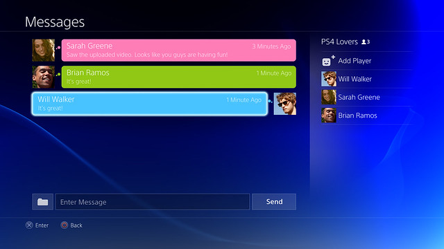
"Mathilde Willson launched a game for the first time."
12 likes and 5 replies. The reason I don't use and why I dislike Facebook.
I like the light blue colour in the background but the layout isn't that spectacular, but that's just me.
What the hell are you people on? The only difference between the PS4 interface and the Myspace screens you're quoting is the user profile along the left side.
The interface looks horrible. A massive downgrade from the XMB. Hell, at this point I would prefer Microsoft's cluttered UI.
She just got her console, people are welcoming her to the community? Fuck me, right?"Mathilde Willson launched a game for the first time."
12 likes and 5 replies. The reason I don't use and why I dislike Facebook.
She just got her console, people are welcoming her to the community? Fuck me, right?
I don't think we have seen the home screen yet?
I'm guessing the Watchdog images are PS4s version of the game list on PS3, with the Knack image being a highlighted individual game and then we have the "social network" feed images.
I'm hoping the homescreen has some horizontal/vertical movement going on like XMB, but the touchpad on the controller will probably lead to a single page Vita-style layout.
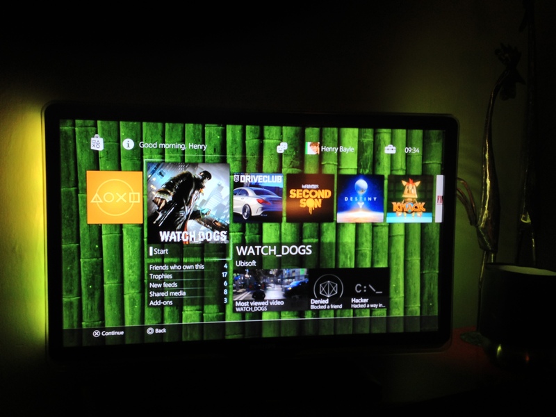
This looks like the homescreen to me. Along the horizontal are the games you own, web browser, Sony's Video Unlimited, etc. On the lower half is some content and links related to the content (trophies, game videos, DLC, etc).
It also seems to line up with the new screenshots. Look at the top of the image a few posts above mine and you can see game images along the horizontal, similar to how they are in the home screen.
Hopefully there is an easy to sort the content or something, or this isn't actually the homescreen. It seems like if you have a lot of digital content, it will be a pain to find what you want.
You're not actually explaining yourself here, just reiterating your opinion from before. Why is MySpace more intuitive? Why does horizontal have a more clean look? Why is it easier on the eyes?You are not looking at it right. Look again, they are hardly the same in anyway. The layout for Myspace is way more intuitive and easier on the eyes than the way it looks on the PS4. Plus its horizontal opposed to vertical which gives it a more clean look. Right now, it looks like a hot mess.
Well the good thing is sony will keep updating the ps4, so if the os sucks they can update it over time.God this os looks terrible.
Will sony ever have a good os ?
God this os looks terrible.
Will sony ever have a good os ?
If that is the homescreen, people complaining about the lack of hierarchy and sorting options in the XMB and praising this better really think their position, that would be a terrible homescreen. Just one long horizontal scroll for everything? No thanks.
Well the good thing is sony will keep updating the ps4, so if the os sucks they can update it over time.
I love the main OS menu, personally.
Even went as far to see how it would look on my screen.

Not saying that this would be my 1st pick in a home screen layout - but I love the lack of ads, and not having any non-gaming focused crap that I have to wade through before being presented with my games.
This!Sony always allow backgrounds and theme to be customized, so it will probably get better looking once people start making themes.


I think I understand it from that video too.
Here's the XMB as soon as you turn on.

It looks like it has a TV apps section, possibly video gallery or chat app? etc.
In the video if you push down you move to the "social network".

If you push right on the XMB you could possibly go to the Knack screen (notice it has the same row of icons in the same positions at the top shaded)

But the main thing, I believe is if you press (X on) the start button above, it turns orange and pushes you here -
Notice there isn't a row of shaded tiles at the top!!
And you could set this as your load-up screen if you wish.
Only problem is the new "social network" image has the shaded icons at the top. Could mean they have made it an icon in the XMB?
I love the main OS menu, personally.
Even went as far to see how it would look on my screen.

Good analysis, but I think it's important to note that the images with custom backgrounds are remade in Photoshop by a gaffer for the sake of experimenting with background images, and will possibly not be 1000% accurate with the real thing.
Also, the Knack screen with the tiles on top is a tablet interface, not the TV interface.
Yeah, travisbickle, it doesn't look like there will be any wording or areas for things like music, games etc. Everything will be on that one line of boxes. :/
whats wrong with that?
Well the good thing is sony will keep updating the ps4, so if the os sucks they can update it over time.
Bunching everything together like that is not a good setup imo. It would be much better if there were separate sections.
aren't they still spaced out.
Everything is lined up in one row with no information on what it is.
The icons give it away on what it is.

This colour palette is seriously eww.
Have they shown the xbox ones interface running in real time? I'm pretty sure they faked the demo at the original reveal.I prefer the Xbox One even if it has ad's but this is much better than XMB
That colour palette is seriously eww.
I'm sure you'll be able to change it.
Have they shown the xbox ones interface running in real time? I'm pretty sure they faked the demo at the original reveal.
